
aladdin2007
Well-Known Member
At least it doesn’t have a sliding automatic door at the entrance? Lol
that has always bothered me at tutto italia
At least it doesn’t have a sliding automatic door at the entrance? Lol
At least it doesn’t have a sliding automatic door at the entrance? Lol
But we're not critiquing crêperies in France. We're critiquing the crēperie (sic) Disney just opened. Crêperies in France have all kinds of looks--some are stylish, charming and classy; some are generic, dull, and tacky. So what? Disney's theming should be stylish, charming, and classy. This isn't.I'm not so sure they're trying to show something ugly or generic. Maybe this is what a Crepe shop actually looks like in France?
Everyone is ok that Via Napoli just looks like a Cheesecake Factory though right? Also the inside doesn’t match the structure at all. And the sliding automatic doors at the front? *chefs kiss*.
View attachment 582952
 www.eater.com
Just stop. Seriously. You’re not an Imagineer so you can’t criticize them. They want it this way on purpose because it ties into the backstory of Jacques Mandelbaum Jr., propriety of La Crêperie de Paris and landlord of the Mâison Bleùe across the street. Jacques father, Jacques Mandelbaum Sr., was renowned for his lifting strength. To honor his father, Jacques Jr. decreed that elements of his buildings, like bases and doors, are to be lifted up off the floor.I just dislike the ticky-tacky quality of the design and execution. I feel it’s below the standard set by the company in the past.
They wanted a “modern Parisian crêperie”?
Fine.
Then execute it to the highest standards of interior finish work. This is not an odd or overly critical commentary. I’d think most people would be dissatisfied if they just moved into a custom built home and there was a gap between the base trim and the flooring. Simply shouldn’t happen on new construction built by contractors who care. I’d like to meet the Imagineer and/or Design Professional who did the punch list.
But did he visit Epcot as a child?Just stop. Seriously. You’re not an Imagineer so you can’t criticize them. They want it this way on purpose because it ties into the backstory of Jacques Mandelbaum Jr., propriety of La Crêperie de Paris and landlord of the Mâison Bleùe across the street. Jacques father, Jacques Mandelbaum Sr., was renowned for his lifting strength. To honor his father, Jacques Jr. decreed that elements of his buildings, like bases and doors, are to be lifted up off the floor.
 www.wdwmagic.com
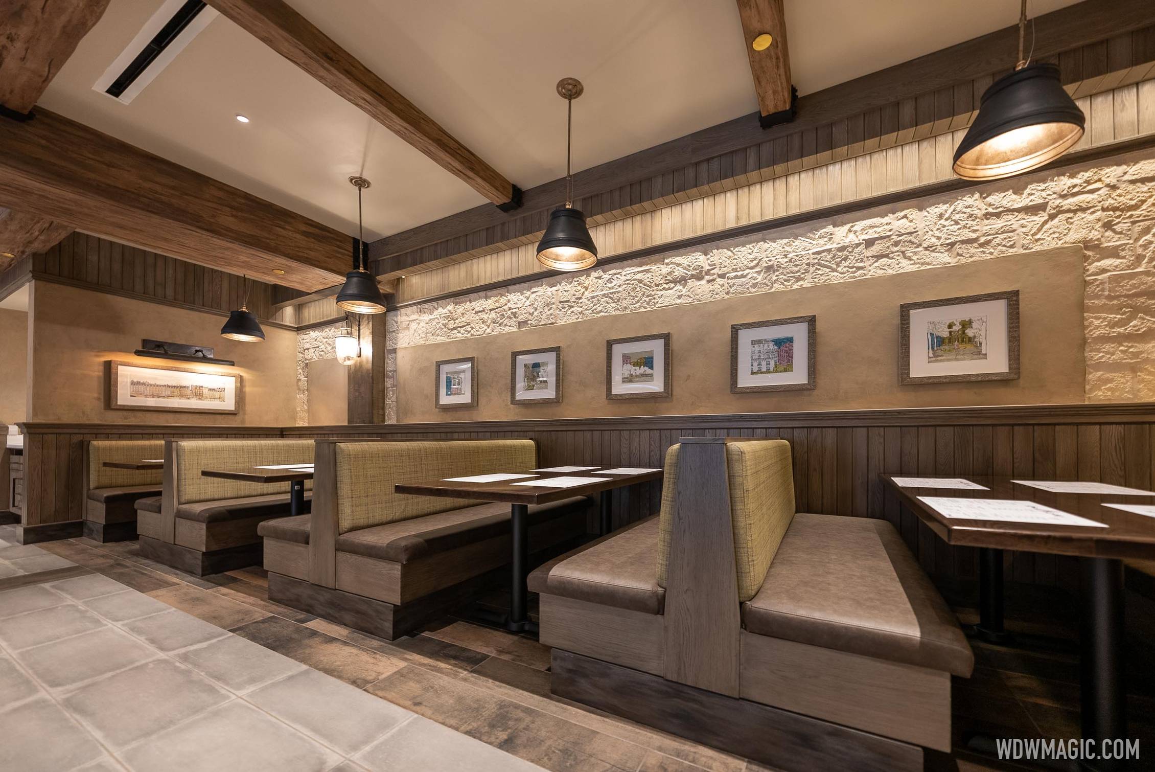
Ah…Panera.A better look at the interior design.
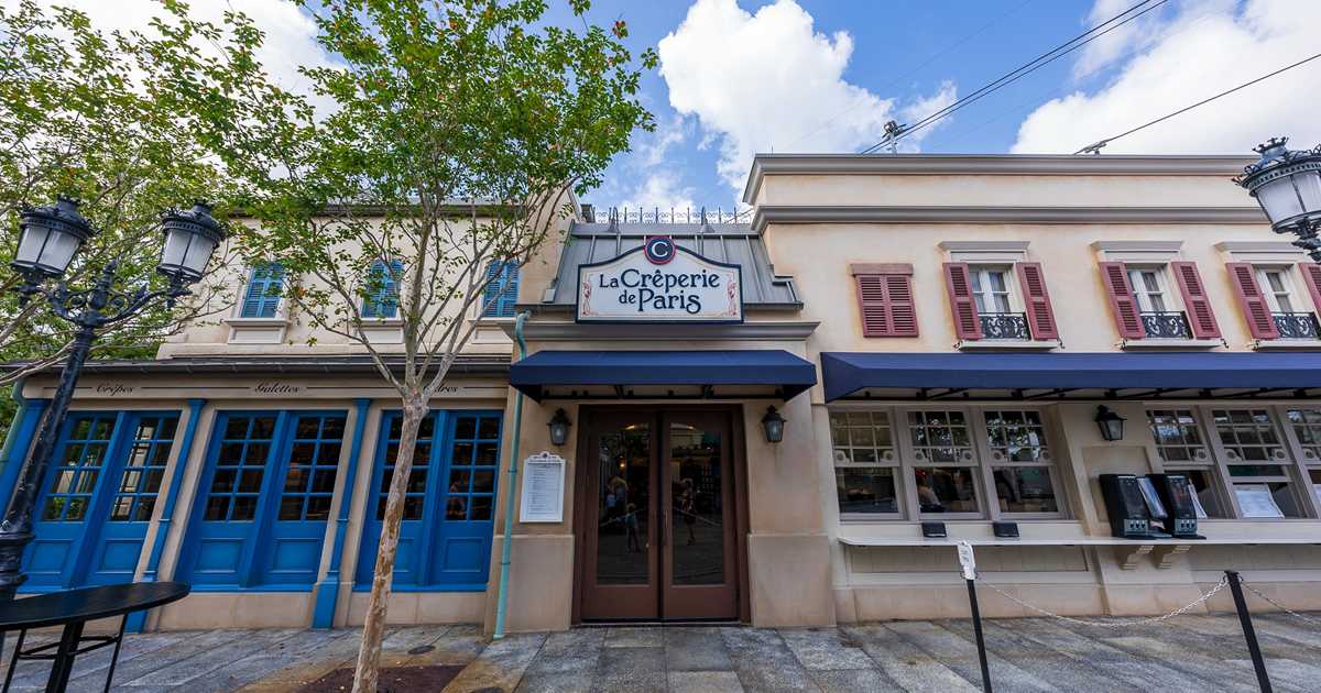
La Crêperie de Paris exterior and dining room
La Crêperie de Paris exterior and dining room
I'm getting a Cheddar's vibe.Ah…Panera.
I was thinking Ruby Tuesday.I'm getting a Cheddar's vibe.
In Panera, "You Pick Two" only costs $8.59 and gets your choice of a sandwich and soup or salad.Ah…Panera.
My local Panera's charges $11.98 for the pick two....In Panera, "You Pick Two" only costs $8.59 and gets your choice of a sandwich and soup or salad.
In EPCOT, "You Pick Two" costs $15/person and gives you your choice of Living with the Land, Journey Into Imagination, or The Sea with Nemo and Friends.
It is depressingly generic. It's also a lot of brown. And there really are some baffling architectural incongruities with the ceiling beams.A better look at the interior design.
La Crêperie de Paris exterior and dining room
La Crêperie de Paris exterior and dining room

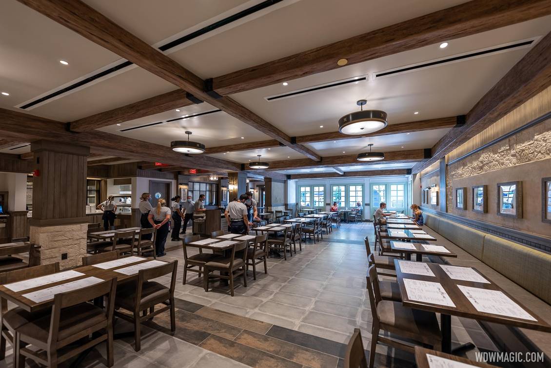

Are you saying you don’t like the very shiny gold sprinkler cover plates on the faux beams?It's not just that the styling is bland and uninspired, but even the basic building systems are done sloppily. In addition to the nonsensical faux-architectural details that have already been discussed in this thread, the air conditioning vents are plainly visible and distracting on the flat ceiling.
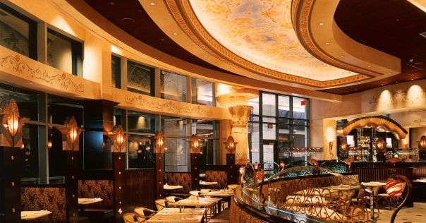
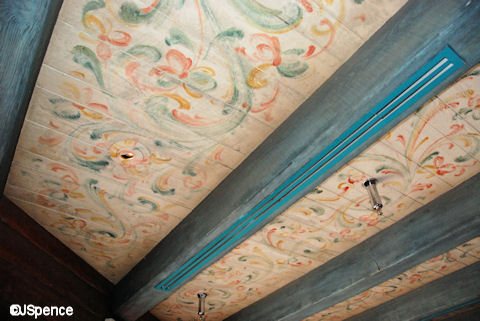
One of Disney's classic tricks that they've used in countless buildings throughout the parks is how they "hid" its HVAC vents in the faux wooden beams:
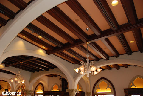
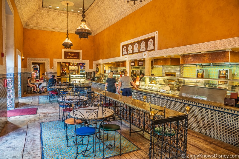
As an alternative, Tangerine Cafe "hid" them along the border where the white sloped parts meet the blue flat ceiling:
None of these examples truly hide the vents from view, but instead they do that magical thing that tricks your eye into looking beyond the obvious and seeing something that isn’t really there.
Meanwhile, the new creperie just sort of places them randomly all over the place. They're not incorporated into the theming, nor are they evenly spaced between the beams. They're just sort of there, taking up space.
In this area, they don't even seem to run between the beams, but are oriented perpendicular to them:
It's not like this building has unique structural constraints that wouldn't allow a solution like this; it’s new construction and a simple box of a building. They clearly cared enough to make them the long linear vents, rather than the standard square or rectangular vents found in most commercial construction, and then just sort of gave up after that.
Yes, of course it's more difficult to incorporate things like that: it takes the foresight to anticipate where the utilities will be located, coordination to obscure them from view, and detailed work to install and maintain them. It takes designers who are experienced enough to know in advance that it will be an issue, creative enough to find a solution, and dedicated enough to ensure it is done.
It's not the easy thing to do, but it's literally the Disney Difference that set their parks apart from their competitors. The Disney Difference was never truly about the characters or the flashy shows, it was the way that they concealed the necessary-but-ugly infrastructure in a way that tricked your eye into ignoring it and focusing elsewhere. That was Disney's bread and butter for so very long that it came to define the brand.
And now they're not even getting the most basic elements of it right.
Are you saying you don’t like the very shiny gold sprinkler cover plates on the faux beams?

They were too busy painting the Creations mural.
They couldn't paint them light brown?
You can’t paint them but a variety of colors are available.
They couldn't paint them light brown?
Register on WDWMAGIC. This sidebar will go away, and you'll see fewer ads.