EPCOT Remy's Ratatouille Adventure coming to Epcot

nickys

Premium Member
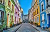
The blue color I'm not so sure about. I don't know if that color is used much in Paris. It looks more like New England than France. Perhaps the designers were aiming to hit a slightly jarring color note in order to energize guests and keep them moving towards the ride. Compare for example to a Zen garden whose harmonious, subtle colors invite people to slow down and contemplate.

Hmmm, you got me thinkimg. I googled “colour schemes in Paris” and got this paragraph in an article:


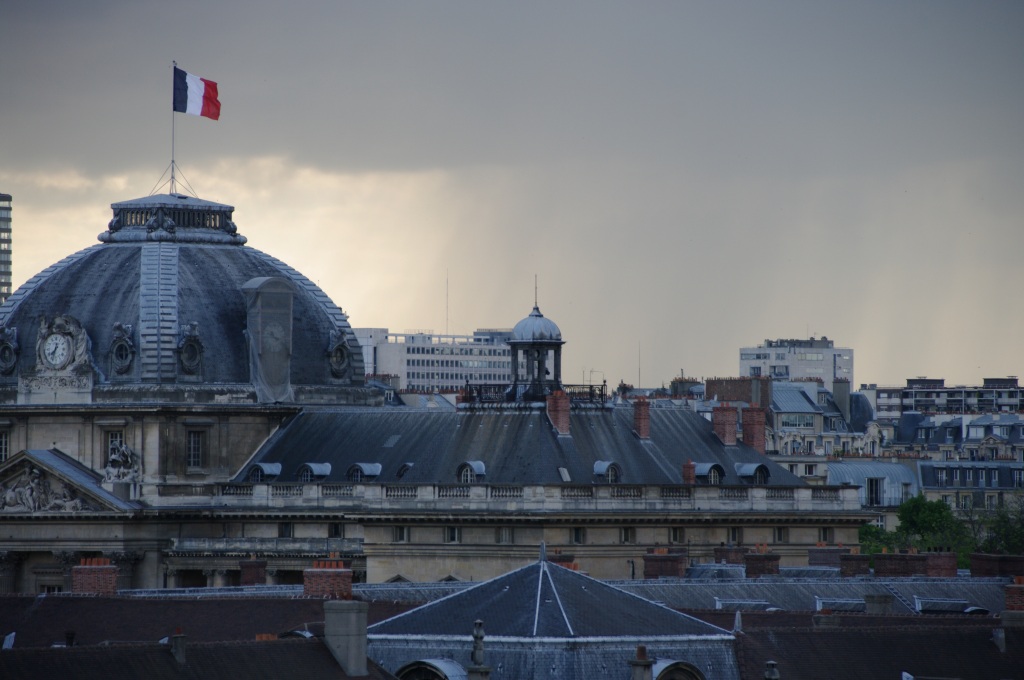
One of the many things I love about Paris is her colour scheme. Wherever you look, whether from street level or above, you’ll see consistent colours. Beautiful hues. The neutral sort.
There is no doubt about it – charcoals, mid-greys, slate blues, russets, taupes and sands dominate your view. These colours are everywhere – on buildings, in paths, on roofs, in decor stores. And I’m convinced that this colour chart not only adds to Paris’ charm but also underpins the city’s elegance.


I’m not convinced this blue could be described as a neutral shade of blue. But maybe they are onto something. 🤔
 

Josh Hendy

Well-Known Member
I’m not convinced this blue could be described as a neutral shade of blue. But maybe they are onto something. 🤔
The "slate blue" in the article appears to be referring to the rooftops, which are I assume literally made of slate on large public buildings. Or perhaps lead sometimes.

I looked at street views for several neighborhoods in Paris and I couldn't find any buildings painted blue. On typical side streets every single building is one of: white, cream, yellow, beige. When the building has a business on the ground floor, then that floor alone is often painted in a loud color such as red or green, with matching awnings. On a single building I found blue shutters on the upper floors.

Maybe Joe Rhode or somebody did a research trip to Paris, found a single blue building, came home and fought for this ...
 

UNCgolf

Well-Known Member
I didn't see any blue buildings last time I was in Paris, but that doesn't mean they don't exist. In fact, I'm sure there are blue buildings somewhere; it's a huge city.

The color isn't the biggest problem, though -- the building itself doesn't look Parisian. I think the blue color makes it more noticeable, but it looks like a building you'd find in Boston, not in Paris.
 
Last edited:

G.L.A.D.I.O

Well-Known Member
All the cities of the world are not composed of the same architectural style especially in a city as rich as Paris
===>Rue Crémieux.
 

Attachments

  • Rue-Crémieux-MonsieurMada.me_.jpg
    Rue-Crémieux-MonsieurMada.me_.jpg
    81.7 KB · Views: 225
Last edited by a moderator:

Timothy_Q

Well-Known Member
I don't think the door will be very noticeable given the angle it is at relative to people walking along to take the Remy ride. I assume they will be walking down the "street" toward the fountain and would have to look up at 45° over their left shoulder ... with trees in front.

So just like any 2nd story window in any building anywhere.

This isn't any different than Main Street.
The window will be very noticeable
 

UNCgolf

Well-Known Member
Small clue for the only people in the world who can’t locate their own country on a map nor know that all the cities of the world are not composed of the same architectural style especially in a city as rich as Paris
===>Rue Crémieux.

That doesn't make Disney look any better.

First, as I mentioned above, the color itself wasn't really the problem; the architectural style is. The building at Disney doesn't look like those buildings.

Secondly, even if it did, it would still be a failure because of the juxtaposition. It doesn't make any sense to have buildings of one style and then randomly put in a building of a completely different style in the middle (even though that certainly can happen in a real city -- it's not supposed to be a real city; it's a themed environment and that kind of thing detracts from it).
 

Josh Hendy

Well-Known Member
Small clue for the only people in the world who can’t locate their own country on a map nor know that all the cities of the world are not composed of the same architectural style especially in a city as rich as Paris
===>Rue Crémieux.
Thanks for the tip.

And in the interests of international harmony and goodwill, I think I speak for many people in the English speaking world when I say ... you're welcome for saving Rue Crémieux from the Germans! (twice) 😁😁😁😁
 

Josh Hendy

Well-Known Member
First, as I mentioned above, the color itself wasn't really the problem; the architectural style is. The building at Disney doesn't look like those buildings.
Secondly, even if it did, it would still be a failure because of the juxtaposition.
It appears that in the transition from concept art to actual construction and painting ... "something went terribly wrong". As they say. Would you like to be a fly on the wall in the meeting where a boss came in and told the imagineers ... "Um, yeah. Let's switch up the color scheme, change the window panes to Jolly Olde New Englande style, and we're gonna put a door right ... here."
20200308_215238.jpg

20200308_214001.jpg
 

trainplane3

Well-Known Member
It appears that in the transition from concept art to actual construction and painting ... "something went terribly wrong". As they say. Would you like to be a fly on the wall in the meeting where a boss came in and told the imagineers ... "Um, yeah. Let's switch up the color scheme, change the window panes to Jolly Olde New Englande style, and we're gonna put a door right ... here."
View attachment 454936
View attachment 454937
The windoor was there before they started working on the surrounding buildings. I do wonder what it's use is and why it couldn't be modified.
Capture.JPG
 

Nunu

Wanderluster
Premium Member
It appears that in the transition from concept art to actual construction and painting ... "something went terribly wrong". As they say. Would you like to be a fly on the wall in the meeting where a boss came in and told the imagineers ... "Um, yeah. Let's switch up the color scheme, change the window panes to Jolly Olde New Englande style, and we're gonna put a door right ... here."
View attachment 454936
View attachment 454937
I'm hopeful that the painting of the buildings isn't finished. The paint job looks too new and crisp, specially the blue one. Maybe a patina wash (ideally a copper one), will be added afterwards to make it look more cohesive with Paris' architecture and the concept art.

Also, the top row windows in the rendering, appear arched, which looks charming and more architecturally accurate, imo. But, as we all know, we rarely get exactly what we see in concept arts.
 

Little Green Men

Well-Known Member
It appears that in the transition from concept art to actual construction and painting ... "something went terribly wrong". As they say. Would you like to be a fly on the wall in the meeting where a boss came in and told the imagineers ... "Um, yeah. Let's switch up the color scheme, change the window panes to Jolly Olde New Englande style, and we're gonna put a door right ... here."
View attachment 454936
View attachment 454937
There were pipes on the side of the building, looks like the addition was to cover them and the door allows access to them.
 

CastAStone

5th gate? Just build a new resort Bob.
Wikipedia has it at 2,200 pph, but who knows how reliable or accurate that is — or if ops will be able to reach that number.
I understand the Paris one run at about 2/3 that, but that’s third-hand.

In any case, very minor changes can impact throughput, so I’d say it’s strongly TBD.
 

Register on WDWMAGIC. This sidebar will go away, and you'll see fewer ads.

Back
Top Bottom