When will Epcot renovate their entrance?

FettFan

Well-Known Member
Original Poster
"This place is so retro, it might actually be cool if it were on purpose."

Generally speaking....the pastel yellow-on-gray has got to go. The architecture itself is pretty bland, but wouldn't be so bad if they would do something with the color.
ec_tickets_703.jpg

Maybe put a few climbing rose bushes or something to hide those bare pillars.


And the blue and silver signs with the "futuristic" font?
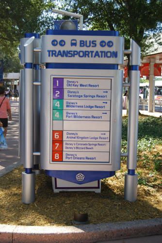
Epcot_Bus_1_2009_1.jpg

Not so futuristic anymore.


Heck, even the toll plaza could use a makeover.
DSC02989-560x373.jpg

Thank goodness it actually spells out "WELCOME" since you'd never know you were being welcomed to the park otherwise! While one could make the same argument about DHS's minimalist parking entrance, at least they have the retro Hollywood architecture going for it....and the fact that "Disney's Hollywood Studios" is long enough to take up enough space across the entire toll area.
 

The Empress Lilly

Well-Known Member
I agree with you on every aspect BUT...I wouldn't changea thing. This places holds such fond memories for me as a child, when my father and I used to come. I love every time I walk through the past's version of the future. These are purely selfish reasons, though. I'd still come every chance I got, if they changed it.
That's not selfish. That's the strongest emotional attachment anybody has to Disney.
I too want to take my kids and see and do the things in Disney that my father did with me. (That's three things left in EPCOT then, those that haven't been replaced by 'hip and edgy' stuff - the garish nineties look of which by now looks more outdated than the timeless orginal EPCOT Center parts)
 

Killnme

Well-Known Member
I wish they would move/extend their bag check area. It can be a real cluster with monorail people arriving, bus people arriving, car people arriving, and don't forget the Brazilian tour groups arriving all with 5 minutes of each other. I think they should at least put a bag check in down near the bus area to cut down on it now.
 

PUSH

Well-Known Member
I've thought that the color scheme is very bland throughout Future World. The building's exteriors of Innoventions just bore me. And the entrance really does need something to make it look better. At the very least add some landscaping. Oh and take down those nets up above, they look tacky and screw up my pictures.
 

BryceM

Well-Known Member
I've thought that the color scheme is very bland throughout Future World. The building's exteriors of Innoventions just bore me. And the entrance really does need something to make it look better. At the very least add some landscaping. Oh and take down those nets up above, they look tacky and screw up my pictures.
I agree about the nets.
 

luv

Well-Known Member
I am a fan of the color yellow and like to see it used. :)

Otherwise, the whole entrance really could use some updating. I don't think it looks "retro." I think it looks old. And please, God, get rid of the tombstones.

All that wonderful music and everything you see is dull.
 

Tim Lohr

Well-Known Member
I like the 1970's/1980's/Syd Mead style of original EPCOT, it gave the place it's own identity. I just wish they would've stuck with that look instead slapping up whatever they thought looked cool or "futuristic" at the moment they did something new, like those tombstones and the Mission Space building don't relate visually to everything else around it
 

englanddg

One Little Spark...
I like the 1970's/1980's/Syd Mead style of original EPCOT, it gave the place it's own identity. I just wish they would've stuck with that look instead slapping up whatever they thought looked cool or "futuristic" at the moment they did something new, like those tombstones and the Mission Space building don't relate visually to everything else around it

Why can't I like something more than once?
 

Register on WDWMAGIC. This sidebar will go away, and you'll see fewer ads.

Back
Top Bottom