Updated rooms are boring!

Jambo Dad

Well-Known Member
The Contemporary has by far fared the worst out of these recent refurbishments... hopefully they learnt a lesson from this one, GF, CB and BC have all been much more subtle.
Agreed. Don’t even understand what they were trying for. If they had created midcentury furniture of high quality that had the look of the Incredibles movie, with a more subtle nod to the characters- it would have been a home run. Instead - we got giant fat head wall stickers. I was a fan of the previous incarnation. They might as well rename the hotel to Incredotel. And don’t get me started on the Edna Mode rooms!
 

GimpYancIent

Well-Known Member
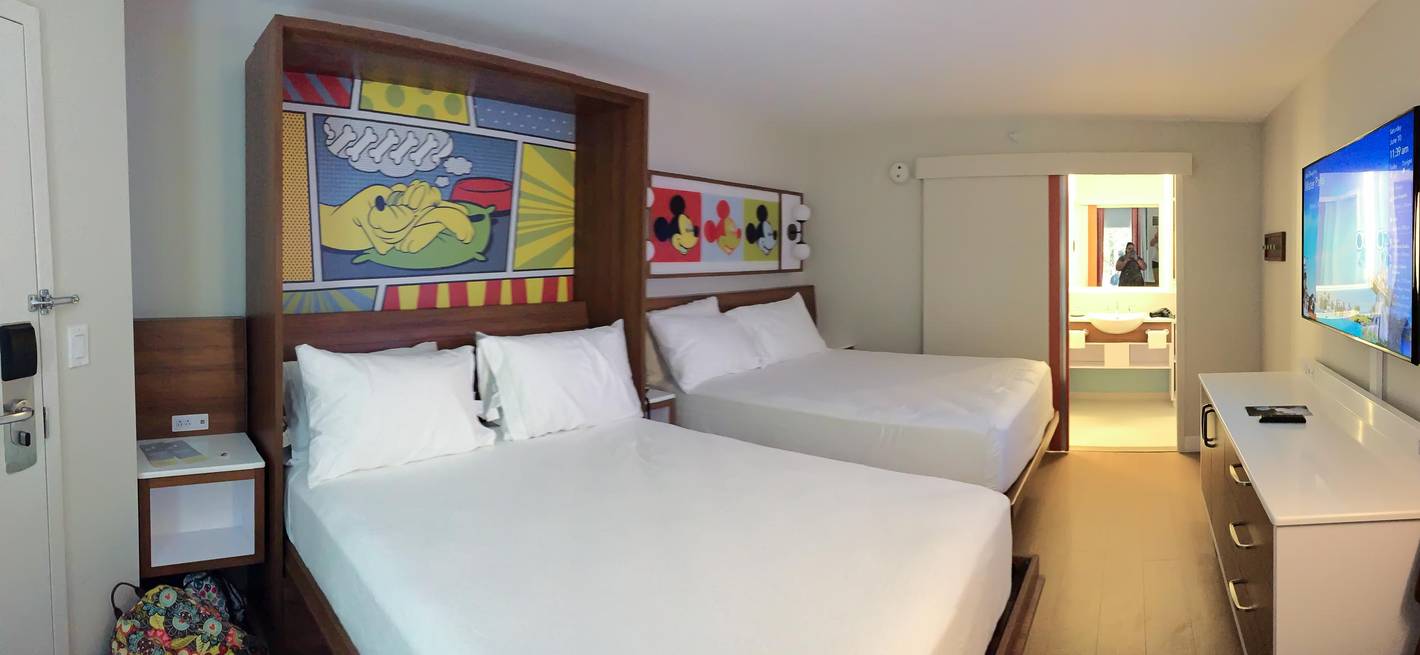
Contemporary minimalism....I'm not a fan of it and it really loses the charm and comfort a Disney resort room looked liked..

The old way...Warm colors, a golden light, a comfortable way to feel relaxed and ready for the next day..
Disneys-Pop-Century-Resort_Full_30369.jpg


The new rooms..I feel like I just got into a sterile hospital room with clip art Mickey pics and a sliding prison door to the washroom area..
Disneys-Pop-Century-Resort_Full_30368.jpg
Yes, exactly. A hospital children's ward.
 

CuteAsMinnie

Active Member
Wilderness Lodge used to be the cutest with Chip and Dale images across the room, now is just plain blah.
The WL rooms were great even before Chip n Dale came along. We haven’t stayed since they ripped up the old quiet pool. 😂😂
They should have kept the bunk beds tho. Kids loved them!

I know the OG Poly lovers miss the beautiful waterfall and various theming of the good ole days, but we’re Poly newbies and only arrived at The Poly postmortem and we love it.

The generic all white/ beige are AWFUL and the fake wood floors are horrible on bare feet. Hopefully next set of interior design interns are from a different school and have known idea what a Fairfield inn looks like.🤦🏼‍♀️

CR rooms are a new level of yuk!😂
 

Register on WDWMAGIC. This sidebar will go away, and you'll see fewer ads.

Back
Top Bottom