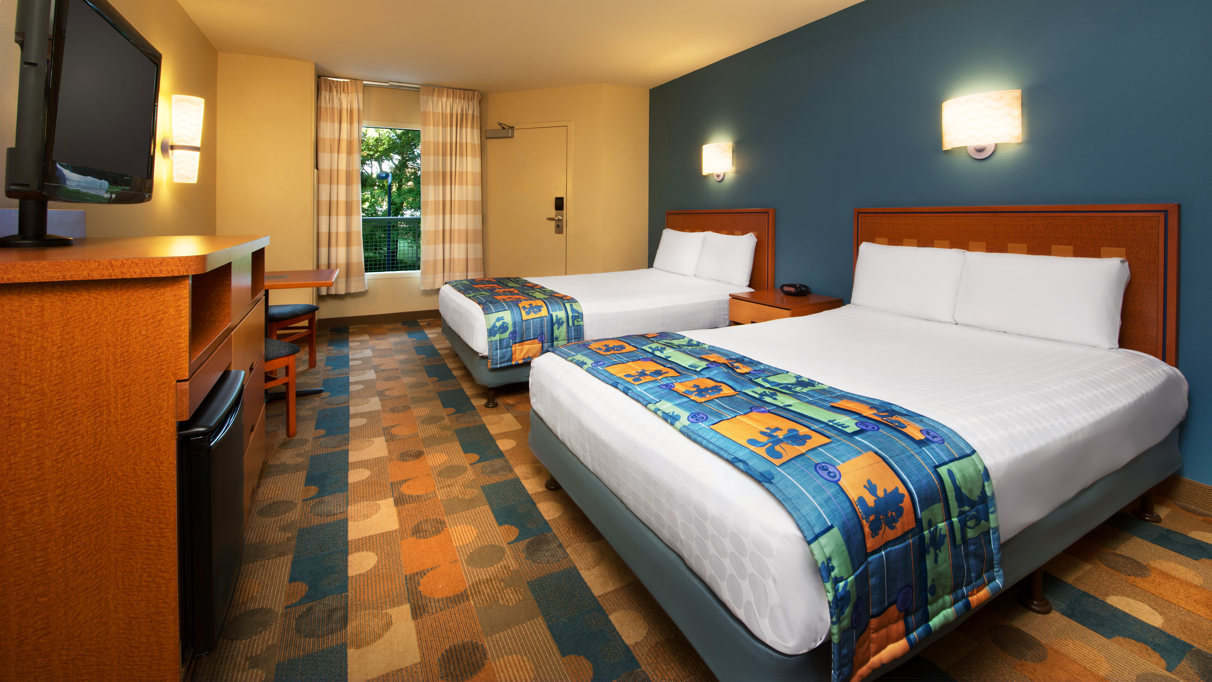
Yet it was still better than those nasty vinyl floors. Especially after a big rainstorm.Yup, the carpeting that came off the giant rolls at Home Depot…carpeting so bad, the bed bugs won’t even burrow into it…
Last edited:
Yet it was still better than those nasty vinyl floors. Especially after a big rainstorm.Yup, the carpeting that came off the giant rolls at Home Depot…carpeting so bad, the bed bugs won’t even burrow into it…
Seriously. Clearly the people who made these decisions never stayed in a value or moderate.I would like an entry area rug/mat as you walk into your room at a Value or Moderate. Entering directly from outside always brings in leaves and pine needles especially when it’s wet outside. Not a problem with interior corridors.
You mean "clean" bare floors.lots easier to clean "wooden" floors
Has anyone else noticed (with the exception of the Moana themed Poly rooms) that the room updates at various resorts are so BORING! All the imagineering magic seems to have disappeared from the boring wooden floors to the standard furniture. Yes they've added a character themed picture or curtains here and there but I'm just not feeling the magic in these rooms


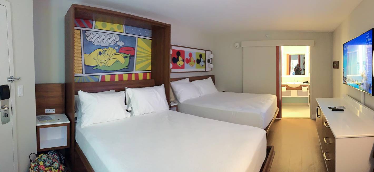
You call it Contemporary minimalism, I call it Contemporary IKEA…as far as the sterile medical resemblance, YES, but at least they’re not asking for our medical insurance cards when we make our room reservations…YET…Contemporary minimalism....I'm not a fan of it and it really loses the charm and comfort a Disney resort room looked liked..
The old way...Warm colors, a golden light, a comfortable way to feel relaxed and ready for the next day..

The new rooms..I feel like I just got into a sterile hospital room with clip art Mickey pics and a sliding prison door to the washroom area..

I'm somewhat mixed.I prefer subtle theming and soft colors to the more cartoonish and clashing designs of the past, which screamed "1980s/90s" to me, regardless of what the theme was supposed to be. From both a functional and decorative standpoint, I also like the switch from the old, ugly fold-out sofas to attractively-framed and far-more-comfy Murphy beds in many DVC studios.
However, I agree that many of the newer rooms (with a few notable exceptions, like Grand Floridan and Polynesian) look UNTHEMED, UNIFISHED and CHEAP, with over-reliance on vinyl flooring with no area rugs, Wayfair-grade furniture of the formica-covered-particleboard variety, and an absence of fun theming details, even subtle ones (sorry Disney, but a peel-and-stick mural here and there does not a cohesive theme make!). Plus, the lack of bespoke decorative pillows or bed throws (often pictured in room photos on the Disney website, but long abandoned by the time anyone checks in) make the white-on-white beds look more like a pop-up medical clinic at the Motel 6 (because I'm sure that's a thing, LOL!), than a luxurious place to sleep. And how is it, after all this time, that Disney still hasn't figured out how include enough bathroom towel hangers/bars or entryway coathooks to reasonably accommodate the number of guests staying in a room?
And while I'm totally aware of how nit-picky these kinds of complaints sound, from me or anyone else, I do think that guests who are paying hundreds or even thousands of dollars more to stay onsite have earned the right to judge whether they're getting the benefit of their bargain, even if their opinions on the matter will inevitably be wide-ranging and diverse.
The new rooms look nice and modern. The rooms that haven't been updated look dated. The style is more clean these days.
Not all the new rooms are overly themed - they definitely theme the deluxe most, moderate second, and value last - but that's out it's always been.
You're right about AoA - it's the exception for value resorts. But they're also more expensive. And instead of theming maybe I should have said design for deluxe resorts. A lot more thought went into color palettes, furniture, textures, fabrics, etc.I would politely disagree with this, I'd say it would be the other way around, the AOA rooms are DRIPPING with theming from every inch, whereas Grand Floridian rooms have always been barely themed.
I agree in this case, but only because the old “boring” at the Contemporary was actually well-themed and much nicer than the new “Incredibles” rooms that are anything but “contemporary.” Here is what part of my Contemporary room looked like 10 years ago:I'll take boring over the atrocity that are the Incredibles rooms at the Contemporary.
This version of the rooms was not well themed. It was simply inoffensive and made some degree of sense given the Contemporary’s reputation as the “conference” hotel.I agree in this case, but only because the old “boring” at the Contemporary was actually well-themed and much nicer than the new “Incredibles” rooms that are anything but “contemporary.” Here is what part of my Contemporary room looked like 10 years ago: View attachment 728526
They were themed to “Contemporary,” although I know some would argue that. But they were nice and definitely more appropriate than the current rooms for the same reasons you explained.This version of the rooms was not well themed. It was simply inoffensive and made some degree of sense given the Contemporary’s reputation as the “conference” hotel.
The rooms now technically have more theming and lean into the midcentury vibes a bit more, but they are horribly executed and look incredibly cheap for a resort billed as deluxe. The decals look like they belong in Art of Animation, the custom throw pillows feel like they’re constructed out of pleather, the floors are ugly and show tons of dirt, the furnishings look cheap, and there’s no warmth at all from any of the fixtures or finishes. The bathrooms are at least good, I suppose.
Register on WDWMAGIC. This sidebar will go away, and you'll see fewer ads.
