News Tomorrowland love

marni1971

Park History nut
Premium Member
Original Poster
no actually originally 1970s it was an aqua color to go with the original RCA Space Mountain...I am absolutely positive of this.
original attraction key colors were a navy blue, orange and aqua... even the lights in the interior queue were a special order teal/aqua color.
over the years in repaints they lightened it up to a bluer tone... I have pictures of it somewhere...
Not to be argumentative but....

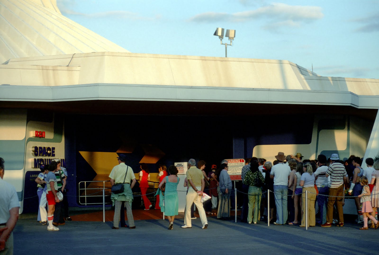
1975:

IMG_6937.jpg


Which also matched the trim around the satellite building:

IMG_6938.PNG
 

Bocabear

Well-Known Member
it seems like I remember them more teal too, but they may have been the darker blue as that was in the color palette for the land. I remember the ceiling of the peoplemover being orange and then as it transitioned into the buildings it was graphic stripes of aqua, then blue then navy then black...
 

Bocabear

Well-Known Member
Not to be argumentative but....

1975:

View attachment 174820
Film color was not as accurate then...I don;t know...in my pictures and as I remember it, it was the same color as the aqua used in the entrance graphics... and this picture the color is off too and looks paler blue, but it was actually a sort of aqua...
003+-+Space+Mountain+entrance+-+dusk.jpg

so it seems to have went from an aqua to a more true blue...slight color difference but in the same ballpark...
 

Bocabear

Well-Known Member
I spent a lot of my youth there...I think I am a designer because of it... I was fascinated with the color styling. Seriously...it's like the picture above that someone thinks was yellow...that is the sunlight cast on the wall...no portion of the exterior was ever painted yellow.
the pictures you have look slightly paler and desaturated... it was indeed blue, but an aqua hue...not straight on powder blue as they are using now... but this sure isn't worth arguing over :) There are tiny details you remember your whole life... the combination of rich blue, Aqua, Yellow-Orange and red-orange was a striking color combination that was hard to forget... combined with the definitive aqua lighting within the queue areas.. it was beautiful.
 

Bocabear

Well-Known Member
If sunlight is making the wall yellow why isn't the whole mountain yellow?

Lets agree to disagree.
ok but seriously you don't think parts of Space mountain were painted yellow, do you? lol
we dont have to disagree... you can believe a person that was there and saw it...in person.
i also posted a picture showing the aqua tone on the walls on the backside of the mountain...and yes, sun does reflect different colors depending on what is around it...not necessarily the same color caste to everything in a picture....Marni I totally dig you and your postings, but seriously...I was there.
 

brihow

Well-Known Member
I can't speak for the blue - but the lower part of Space Mountain was never yellow. Look at this close-up from the above pic. The 'rib' support that extends down turns from white to yellow as it bends the corner. You can see that the yellow is actually the white as it appears in the angle.
 

Attachments

  • Screen Shot 2016-11-13 at 12.31.48 PM.png
    Screen Shot 2016-11-13 at 12.31.48 PM.png
    26.7 KB · Views: 158

Bocabear

Well-Known Member
The blues look the same to me. Today and in 75. Like I said agree to disagree.
we don't have to disagree...I was there... I saw it, even posted a picture clearly showing it. I am a designer and artist, I deal with photo reproduction and color adjustments on a daily basis... Knowing what you know historically about WDW, you should also catch on that if they styled SDpace Mountain with a certain color palette they would have most likely carried it throughout the structure... that was one of the things the early imagineers did exceptionally well. I am telling you, it was that particular color combination that struck me...actually made me study the color styling they were using throughout the park... I am not wrong about this...lol
I like the pale blue though...it's in the spirit of the original for sure...
 

marni1971

Park History nut
Premium Member
Original Poster
. Knowing what you know historically about WDW, you should also catch on that if they styled SDpace Mountain with a certain color palette they would have most likely carried it throughout the structure....
Absolutely they did. The pale blue trim around the satellite and the main sign, the yellow on the ceiling of the WEDway station and some of the trackway ceiling. Like I said, the blue colour seems the same to me in your photo, my photo and the one from last week too.
 

Bocabear

Well-Known Member
Absolutely they did. The pale blue trim around the satellite and the main sign, the yellow on the ceiling of the WEDway station and some of the trackway ceiling.
sigh... never thought i would have a disagreement with you.
were you there? did you see it and notice it?
it's a little different looking at photographs...and you are the one other person that I feel gets it...like I do...
and I don't want to seem argumentative...but this is a detail I am sure of.
img_6938-png.174821

does the canopy roof look light blue to you?
it was white...that's a shadow...the lighter blue graphics on the wall are actually aqua...
 

thehowiet

Wilson King of Prussia
sigh... never thought i would have a disagreement with you.
were you there? did you see it and notice it?
it's a little different looking at photographs...and you are the one other person that I feel gets it...like I do...
and I don't want to seem argumentative...but this is a detail I am sure of.
img_6938-png.174821

does the canopy roof look light blue to you?
it was white...that's a shadow...the lighter blue graphics on the wall are actually aqua...
Hmm...not taking sides here, as I enjoy both of your posts a lot, but it was always the light blue IMO. Throughout the 80s my family stayed at the Contemporary with MK view for a week every year (it was much more affordable back then!), so I saw that structure a lot. I'll have to see if I can grab some pics from my old man when I see him over Thanksgiving.
 

NearTheEars

Well-Known Member
we don't have to disagree...I was there... I saw it, even posted a picture clearly showing it. I am a designer and artist, I deal with photo reproduction and color adjustments on a daily basis... Knowing what you know historically about WDW, you should also catch on that if they styled SDpace Mountain with a certain color palette they would have most likely carried it throughout the structure... that was one of the things the early imagineers did exceptionally well. I am telling you, it was that particular color combination that struck me...actually made me study the color styling they were using throughout the park... I am not wrong about this...lol
I like the pale blue though...it's in the spirit of the original for sure...

I honestly have no idea what color it was, but here's a photo from opening day.


IMG_0046.JPG
 

HiYa Pal

Active Member
sigh... never thought i would have a disagreement with you.
were you there? did you see it and notice it?
it's a little different looking at photographs...and you are the one other person that I feel gets it...like I do...
and I don't want to seem argumentative...but this is a detail I am sure of.
img_6938-png.174821

does the canopy roof look light blue to you?
it was white...that's a shadow...the lighter blue graphics on the wall are actually aqua...

I do see the aqua right below the RCA logo, but more importantly it's nice to see park goers not in yoga pants and tank tops or much much worse ;)
 

Register on WDWMAGIC. This sidebar will go away, and you'll see fewer ads.

Back
Top Bottom