News Tomorrowland love

Daveeeeed

Well-Known Member
If I am remembering the exact ordering, the large trees were removed before the projections, due to Wishes being more castle-centric than Fantasy in the Sky. They were replaced with smaller trees (magnolias, I think? That's when the twinkly lights went away). Then they started the new hub project to manage the hoards in the Hub and the bypass that for some reason, since August, is hardly ever open, even during parades. The hub project finished with small shrubs in the hub, and soon thereafter, even they left (too tall for the 2-year olds watching Wishes at 10 pm just about year-round nowadays?). At least we got all those large trees in the periphery with the twinkly lights back.

To their credit, I think the new turrets they built assist in the forced perspective a bit by growing the castle out a bit. The scale of the castle works pretty well for me once I'm in the hub itself. From Main Street, not so much, but then the forced perspective on the buildings themselves still do their job of making the castle seem further away than it is. All told, I find the overall project to be necessary and I do think the hub project righted some mistakes that had been made in the past. If only the lighting towers weren't so obtrusive, but we probably should avoid that can of worms.

For anyone who has been during MNSSHP or MVMCP, the huge hub provides ample viewing for the fireworks you are paying for and allows maximal enjoyment of the perimeter fireworks. Goodness, those fireworks shows have impressive finales.
Definitely. While the original hub was just flawless in design it severely lacked capacity for today. I miss the trees, and having ducks walk from the water to your table at Casey's a corner, but it had to be expanded. Like you couldn't even breath before, and this is not even during Christmas time, pretty much any not super slow day. Now you have space and can avoid most people walking in the center while still being able to take in the castle.
 

tirian

Well-Known Member
Definitely. While the original hub was just flawless in design it severely lacked capacity for today. I miss the trees, and having ducks walk from the water to your table at Casey's a corner, but it had to be expanded. Like you couldn't even breath before, and this is not even during Christmas time, pretty much any not super slow day. Now you have space and can avoid most people walking in the center while still being able to take in the castle.
Sadly, it did need to be expanded. The waterways are gone, but at least now you can physically walk during the fireworks.
 

wdwmagic

Administrator
Moderator
Premium Member
Here is the work taking place on Space Mountain

IMG_8217-1.jpg
 

ᗩLᘿᑕ ✨ ᗩζᗩᗰ

HOUSE OF MAGIC
Premium Member
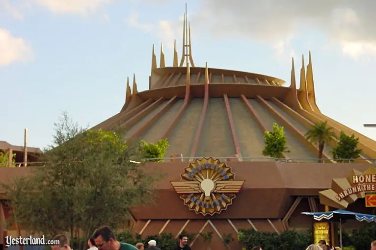
Always wondered what Space Mountain would look like with the trimwork painted blue. With a color scheme of silver, white and blue. Not sure why I just always envisioned it that way in my head. Anyone know if SM is being painted newer colors? (and hopefully not Gold. Bleck!)
 

Bocabear

Well-Known Member
Really glad to see the whole area get love...for me, MK's Tomorrowland is my number one issue with that park. Here's hoping they do something creative as well...something that is new and bold yet respectful of the "look" of space mountain.

Then again...I actually LIKED the copper on DL's version...
In the concept art and photographs, the copper paint looked great...in person however, you were too close to it...unlike our version here, Disneyland's mountain is much smaller and you are right up against it... The copper paint just made it look dingy and sad...
 

brihow

Well-Known Member
I think Space Mountain would look FANTASTIC painted a super bright silver. It always bothered me a little that it's one of the only white things in our Tomorrowland. I think the silver would help tie it in better but wouldn't be sooo different than the white that it would stick out badly (like the copper).
 

Daveeeeed

Well-Known Member
in person it just looked dirty....
In photo it looks dirty. Could be done well if in a place like Discoveryland in Paris, but if they're going for that they need to completely redo and not just paint it. Silver and even bronze can look good if done properly, but that does not. The white looks sleek and futuristic, but clashes with Disney World's a Tomorrowland. Perhaps a more metallic look could work.
 

Register on WDWMAGIC. This sidebar will go away, and you'll see fewer ads.

Back
Top Bottom