-
The new WDWMAGIC iOS app is here!
Stay up to date with the latest Disney news, photos, and discussions right from your iPhone. The app is free to download and gives you quick access to news articles, forums, photo galleries, park hours, weather and Lightning Lane pricing. Learn More -
Welcome to the WDWMAGIC.COM Forums!
Please take a look around, and feel free to sign up and join the community.
You are using an out of date browser. It may not display this or other websites correctly.
You should upgrade or use an alternative browser.
You should upgrade or use an alternative browser.
Tom Fitzerald présente la rénovation de Phantom Manor
- Thread starter RobotWolf
- Start date
The Visionary Soul
Well-Known Member
Reportedly the original ballroom music was restored today, no word on the seance room though
This is wonderful news!!!
EPCOTCenterLover
Well-Known Member
What a great move to go back to the original music throughout! One of the parts I love best about the attraction.
britain
Well-Known Member
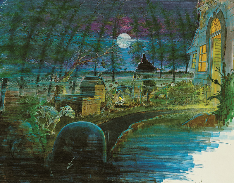
I agree. I can't stand the western town part... Give me the backyard graveyard.
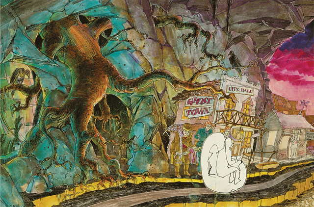
I like the ghost town - but why is it so left-leaning? Not enough to see on the right side of the track. Maybe it's all an illusion, but it sure seems smaller than the graveyard room.
AndyS2992
Well-Known Member
I know I’m in the minority here but I actually liked the Haunted Mansion music in there, I find it much creepier and the Phantom Manor tune plays all the way through anyway so it was nice to switch it up a bit, but I’m not going to complain too much about it switching back since that’s how it always has been and how it’s supposed to be.
PiratesMansion
Well-Known Member
The main thing I noticed on this viewing was the lighting. There's nothing inherently wrong with it, but there was too much of it. It felt very over-lit, and in some areas, especially the ghost town, the colors were a little goofy. I think the attraction calls for more subtlety.
I think some of the exterior lighting I saw in the video I watched was a bit much (DLP Welcome POV). I'm not sure if that lighting is meant to be permanent or just for the reopening, but it reminded me of a chintzy Halloween Haunt light job with greens, blues, and purples, like I'd see at Kings Island. Here's hoping that lighting's not permanent, as I thought it wasn't in keeping with the attraction.
HOWEVER, I think that that in the refurbished attraction the lighting was generally solid. When I went on the attraction in 2015, I felt the ride was severely underlit, and I couldn't tell if that was the design intent or if the lights were low to hide the maintenance condition of the attraction. It made it difficult to see the full extent of the stretching room and even to make out the detail in, say, the endless hallway. The lighting is now much more vibrant and easy to see, which for me is a net positive.
The misses mostly relate to the music. If they've restored the original ballroom music, fabulous. But IMO the weakest parts of the original PM were when it was trying to call back too overtly to HM. So the fact that they've added MORE references just cheapens the ride for me, making it less distinct and less interesting. Maybe more of these will be phased out based on feedback, and I'd be all for it. But it definitely feels like some of the key people behind the refurb didn't get what made PM unique and interesting. I'm not saying I found the original presentation (or at least, what I saw in 2015) to be better than HM. But it definitely seems less distinct now than it once did, and that's a shame.
Sir_Cliff
Well-Known Member
I'm glad I'm not the only one who feels this way! I can see adding western scenery to the graveyard, but adding a cartoony miniature haunted Frontierland was a bit much.I agree. I can't stand the western town part... Give me the backyard graveyard.
Disney Analyst
Well-Known Member
I'm glad I'm not the only one who feels this way! I can see adding western scenery to the graveyard, but adding a cartoony miniature haunted Frontierland was a bit much.
Like, how does it even make sense... why is there a mini western town?
The_Mesh_Hatter
Well-Known Member
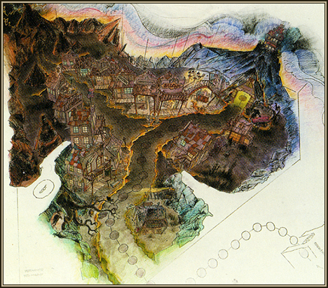
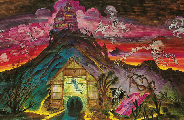
There’s two graveyards in the ride. From the Bride’s room, you enter the Manor’s graveyard, where the Phantom is waiting for you with a grave prepared. You fall backwards into the inferno. You then find yourself in “Phantom Canyon,” the Underworld’s version of Thunder Mesa, which has been consumed by an earthquake. You begin in the outskirts of town at the local graveyard (underworld version), then move into the town’s square. Finally, you come full circle back to the Manor and renter thru the crypts (because you’re reentering the real world from the land of the dead). I didn’t get it the first, or even the fourth, ride thru, but that’s what happens.


Last edited:
Sir_Cliff
Well-Known Member
Thanks for the explanation!There’s two graveyards in the ride. From the Bride’s room, you enter the Manor’s graveyard, where the Phantom is waiting for you with a grave prepared. You fall backwards into the inferno. You then find yourself in “Phantom Canyon,” the Underworld’s version of Thunder Mesa, which has been consumed by an earthquake. You begin in the outskirts of town at the local graveyard (underworld version), then move into the town’s square. Finally, you come full circle back to the Manor and renter thru the crypts (because you’re reentering the real world from the land of the dead). I didn’t get it the first, or even the fourth, ride thru, but that’s what happens.
I think this reflects the way in which WDI became somewhat too obsessed with linear storylines during the Eisner era. This continues to seep into many areas of the park where over-elaborate storylines are created for everything from attractions to food stands. I don't think this is how the parks were originally designed and indeed the original HM is a perfect example of how some of the best attractions just created a compelling sense of place. What you described for the PM makes sense, but it is too complex to be communicated visually on the ride itself. Most guests will just see a colourful haunted western town pop up at the end of the ride.
I think the original version was far more clever in just putting you in the midst of a swinging wake taking place in a graveyard.
Disney Analyst
Well-Known Member
Thanks for the explanation!
I think this reflects the way in which WDI became somewhat too obsessed with linear storylines during the Eisner era. This continues to seep into many areas of the park where over-elaborate storylines are created for everything from attractions to food stands. I don't think this is how the parks were originally designed and indeed the original HM is a perfect example of how some of the best attractions just created a compelling sense of place. What you described for the PM makes sense, but it is too complex to be communicated visually on the ride itself. Most guests will just see a colourful haunted western town pop up at the end of the ride.
I think the original version was far more clever in just putting you in the midst of a swinging wake taking place in a graveyard.
They should have just fully converted the manor to a normal haunted mansion but with the phantom storyline inserted
yensidtlaw1969
Well-Known Member
I actually think Phantom Manor was the rare exception where the story paid off - the ride was compelling enough on its own to do the job as a spook-house, but everything tottered on the edge of this crazy rabbit hole . . . you kinda needed to know the story to "get" the story, but you didn't need to know the story to "get" the ride. Dark, creepy, Haunted House with a Phantom-Of-The-Opera-like circumstance dripping with Gothic Romance that goes off the rails into some dark, bizarre, verging-on-surreal territory.Thanks for the explanation!
I think this reflects the way in which WDI became somewhat too obsessed with linear storylines during the Eisner era. This continues to seep into many areas of the park where over-elaborate storylines are created for everything from attractions to food stands. I don't think this is how the parks were originally designed and indeed the original HM is a perfect example of how some of the best attractions just created a compelling sense of place. What you described for the PM makes sense, but it is too complex to be communicated visually on the ride itself. Most guests will just see a colourful haunted western town pop up at the end of the ride.
I think the original version was far more clever in just putting you in the midst of a swinging wake taking place in a graveyard.
You could ride 100 times and still get chills, but there was also the chance that you picked up a little bit more of the story each time . . . it wasn't trying to tell you everything that happened over the 13 minutes you spent in the the building, which was the secret to its richness. The story was in there, waiting to be discovered instead of forcing itself on you. Similar to the endearing qualities of Pirates and The Haunted Mansion, where you read into relationships between the characters and situations, only this time it was done with the intention that you might draw conclusions along a more specific line. With The Haunted Mansion your brain is filling in blanks, but with Phantom Manor your brain is filling in the blanks, if you get what I mean. It's a slight but distinguishing difference, but still on the right side of the line between "experience-ride" and "storytelling-ride".
I don't really think rides are really a storytelling medium - the idea now that rides are like a 3-6 minute long "movie" that you're in along with the main characters is, to me, less dramatic, less exciting, and less fulfilling than the idea of you going on an adventure through a unique space and time and experiencing something amazing. There can be a plot as a sequence of events that build on each other in order - but there's no need for a traditional "story", where you see the cause and effect of the events of the plot as you follow them with the characters. There's just not enough time in a ride setting to put that in the mind of the viewer in a way that's satisfying.
Which is why Phantom Manor worked - it was a well-rounded supernatural experience, but there was this great lore beneath the surface as a total bonus, and they left you enough room to connect the dots in the way that felt right to you (the ride was always more satisfying to me when I let myself believe The Phantom was not Henry Ravenswood, but that's just me). Try that against something like most of the Finding Nemo rides, where instead of enjoying the unique experience of being underwater with all these great characters Marlin and Dory are hampered by a repurposing of the movie's plot into a miniature reenactment that barely doubles as a fun "look and find".
The best place for story within the ride medium, I would say, is in putting you in proximity of great stories, not trying to take you through them and relate them to you as they are happening. Which is, I think, what Phantom Manor did.
Last edited:
180º
Well-Known Member
A few new thoughts:
I’m so glad they restored the séance and ballroom music. The new piano still sounds a little out of place, and it isn’t recognizable enough as the wedding march to justify it as a story improvement.
The new paintings are okay if bland. The “duel” changing portrait, however, is awful. The change is far too drastic and the effect is like a limited animation comic book cartoon scene. And I don’t know why they changed the transition to lightning, as there are no windows in this hall. Overall downgrade in this room.
Finally, I don’t get the ending tableau. Barry Claude broke out of his crypt? Is this a punch line to something set up earlier? I’m confused. It is so prominently featured and yet seems to not relate to the story in any way.
Anyone else miss the “Pointing Bride” cue? It’s gone now. I almost wish this stayed and if necessary took the place of the exit music too. It’s not as lilting and mysterious, but I like how it seems to say “You’d better get out of here while you can!”
As to other comments I’ve seen:
In the old version, I believe we were to assume Phantom’s smooth skull face was a party mask, and only in his last scene did he unmask and we see his true, decomposing visage.
I like the English and French, and I like the new story clarity improvements THAT WORK. Some of them don’t work. It’s about half and half.
The neon in the foyer is a little jarring.
I’m a fan of the new stretching room.
Putting Melanie on the grand staircase was a great move. Talk about simple staging that works. It’s clear she’s looking out the window expectantly and worried, and the wind blowing through her dress is the only animation it needs.
And I think that about does it!
EDIT: One more! Hitchhiking Melanie’s line delivery is detrimental. The looniness and laughing would suggest she’s in on the Phantom’s crimes, but the tone of the attraction relies on Melanie being a victim not of murder, but of grief. “Will you marry me?” can still work. After all, it’s in character for her to be constantly courting suitors. However, the line delivery should be sad and desperate.
Between hitchhiking Melanie, the US Pirates chicken auction, Tropical Hideaway’s Rosita, and the new DLRR, Imagineering seems to have a dialogue and voiceover problem.
Last edited:
Twilight_Roxas
Well-Known Member
The reason for the hitchhiking Melanie is most likely in the Phantom Manor lore that losing all her suitors by the Phantom drove her to insanity.
MotherOfBirds
Well-Known Member
Warning: I'm about to get really nitpicky and I'm not sorry.
Now that we have really great quality low-light videos, I'm noticing what they've done with Ballroom Phantom. He's standing way too close to Melanie. I get what they were going for, but it doesn't work very well in a visual/theatrical context such as this. He's mostly hidden by Melanie, but they're both too far away for that to be effective. Personally, I liked his old position on the second to right window because it was way more dynamic and interesting, and IMHO it should have been kept. His old position implies dominance by being both above her and to the right, which is a big part of the story that they're now trying to hammer home. Regardless, if the team was dead-set on changing it, they could have arranged the two better.
Also, Ballroom Phantom looks like a Spirit Halloween prop, especially with those glowing red eyes. Not to be a broken record, but in his old position, you could really only see his silhouette until the odd flash of lightning revealed his face. The old effect was genuinely spooky and got the message across: Her fiancees disappeared and her life was ruined. Why? *flash of lightning* Oh s*** That guy. It's ok that he's a static figure at this point. This is his second appearance in the ride, so we shouldn't be seeing this much of him. We'll be four feet away from a killer AA in about two minutes.
I mean, I would love for Spirit to carry a static Phantom figure so I could put it in my living room and upset my family members, but I'm not a world-renowned attraction designer. And now here he is, posed awkwardly under a spotlight like he's about to perform a monologue for his parents at his high school drama show.
I'm not sure what was added by replacing the first Melanie figure in that alcove before the endless hallway with the haunted armor. It's fine, but that space could have been better utilized. There's nothing wrong with having it in PM; A wealthy 19th century family would absolutely want to flaunt it with expensive items from Europe. It's just a weird thing to draw that much attention to, especially for what amounts to another HM reference.
Creepy/Sinister Melanie at the end is odd too because she's a tragic character. It's giving me Vietnam-style Constance flashbacks
Am I overthinking all of this? Yes, yes I am.
Animaniac93-98
Well-Known Member
I would have preferred the Phantom in the alcove instead of the armor. Maybe a "jump scare" effect, where it's just black until lightning flashes and you see him up close in front of a window. Then Melanie could be standing by herself in the endless hallway again.
I'd also prefer the Phantom's staging in the ballroom before and having the skull mirror back. I agree with all the criticisms that he shows up too often and not in the best places.
I'd also prefer the Phantom's staging in the ballroom before and having the skull mirror back. I agree with all the criticisms that he shows up too often and not in the best places.
EPCOTCenterLover
Well-Known Member
The original story of PM fir in the context of DLP's amazing Frontierland. The whole land felt very unified without feeling "in your face". Imagineering at its best. In fact, the whole park is a work of art.
Sir_Cliff
Well-Known Member
That music was very good and suitably spooky. I am glad, though, that they got rid of the Pointing Bride herself. I can see how that might have worked in the concept art, but it just looked bizarre in execution.Anyone else miss the “Pointing Bride” cue? It’s gone now. I almost wish this stayed and if necessary took the place of the exit music too. It’s not as lilting and mysterious, but I like how it seems to say “You’d better get out of here while you can!”
I also think this is a big improvement, and really prefer the new stretching portraits. The original Haunted Mansion portraits were always far more evocative in their style and use of "real world" dangers looming just below the surface. In the original PM portraits, the bright colours and things like the swamp monster and skeleton bursting out of the grave were just kind of silly and cartoony. The new ones are great, though!I’m a fan of the new stretching room.
That was my take, too, and I think it is really effective! A big improvement over the old hitchhiking ghosts.The reason for the hitchhiking Melanie is most likely in the Phantom Manor lore that losing all her suitors by the Phantom drove her to insanity.
PiratesMansion
Well-Known Member
The restored audio in the seance and ballroom definitely helps, though I still miss the overpowering organ music from before. It was overwhelming in the best possible way. I also agree that the original staging of the Phantom in that scene was superior to what is there now.
Register on WDWMAGIC. This sidebar will go away, and you'll see fewer ads.
