MinnieM123
Premium Member
As always, thanks for these awesome comparsation shots!!
I second that. Thank you, @WDWtraveler for sharing your comparison shots. They're quite thought-provoking, and I always look forward to seeing them.
As always, thanks for these awesome comparsation shots!!
Me too, but when I see them the first thing that comes to my mind is... where are all those trees and foliage that everyone talks about that used to be there? It seems to me, that in spite of some removal of trees it is still way more lush then it was early on.I second that. Thank you, @WDWtraveler for sharing your comparison shots. They're quite thought-provoking, and I always look forward to seeing them.
Twenty-sixth photo pair. Then: October 1973. The Magic Kingdom hub from the castle gate. Finally, the hub construction is complete and this photo pair can be posted. There wasn't a castle stage to speak of back then. The ground level forecourt was much larger. Of course, the trees and planter beds in the hub were much larger. The four huge planter beds were each surrounded by concrete benches. In the center of the hub was a small circular planter with concrete benches; and no statue.
View attachment 146301
Now: June 2016. Almost 43 years later....the buildings of Main Street are clearly visible. The gray platform in the foreground is the edge of the castle stage.
View attachment 146302
Absolutely. Alot of the pictures in this thread that were taken in the early 70s in areas around the castle other than the middle of the hub look alot more stark and barren than they are now. I love the fact that the trees and foliage in MK are as lush as they are-it makes a large property like MK feel a bit more cozy and inviting.Me too, but when I see them the first thing that comes to my mind is... where are all those trees and foliage that everyone talks about that used to be there? It seems to me, that in spite of some removal of trees it is still way more lush then it was early on.
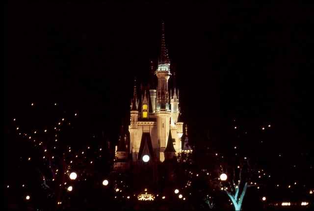
A park, water, trees, with twinkling lights....(Then)
The Magic Kingdom at night circa mid 1990's.

The Magic Kingdom back in the 90's looked alot more lively since it used to have trees which would sparkle and twinkle at night. The Cinderella Castle also used to look more pretty with the old lighting.
(Now)

I like both. I mean, the new changes were needed to accommodate growing crowds. While I somewhat prefer the older setup, I still like the new one. Still conflicted on which lights on the castle I prefer, both look nice, so either way I like it. Really, it would take a lot to ruin the Main Street area of the Magic Kingdom for me (though, getting rid of the bakery for a Starbucks was very disappointing).(Then)
The Magic Kingdom at night circa mid 1990's.

The Magic Kingdom back in the 90's looked alot more lively since it used to have trees which would sparkle and twinkle at night. The Cinderella Castle also used to look more pretty with the old lighting.
(Now)

The old lighting looks a mess! Almost looks like they used fluorescent lighting on the top spire. I wish there were more twinkle lights today but I prefer the current view - especially at night.(Then)
The Magic Kingdom at night circa mid 1990's.

The Magic Kingdom back in the 90's looked alot more lively since it used to have trees which would sparkle and twinkle at night. The Cinderella Castle also used to look more pretty with the old lighting.
(Now)

Why did they ever get rid of that stone pavement anyway?Twenty-seventh photo pair. Then: October 1973. The view of Fantasyland from behind the castle.
View attachment 157335
Now: July 2016. Almost 43 years later, aside from differences in paint colors, the most obvious difference is the missing cables and gondolas for the sky ride in the background. But wait, there's more! The shop on the right has added a seating wall with a flower planter behind it, including two new lights. There is a hanging sign at the corner of the store now. And the gray stone-patterned concrete pavement in the foreground of yesteryear is now just tinted smooth concrete.
View attachment 157336
Judging by how uneven it is, I would guess that people were tripping over the individual stones, getting injured and expecting to get their week comped.Why did they ever get rid of that stone pavement anyway?
"People" ruin everything it seems. Animal Kingdom is fairly uneven as well and I hope it never changes. Adds a lot to the theming.Judging by how uneven it is, I would guess that people were tripping over the individual stones, getting injured and expecting to get their week comped.
It was just a guess on my part, but, it surely wouldn't surprise me at all."People" ruin everything it seems. Animal Kingdom is fairly uneven as well and I hope it never changes. Adds a lot to the theming.
Animal Kingdom appears to be the only park at WDW that remains unchanged with its looks and design since 1998."People" ruin everything it seems. Animal Kingdom is fairly uneven as well and I hope it never changes. Adds a lot to the theming.
Register on WDWMAGIC. This sidebar will go away, and you'll see fewer ads.
