The Town Center construction

RandySavage

Well-Known Member
I would be interested in others' thoughts and opinions about this as well. The architectural placemaking looks really nice, but I can see how one might view it as feeling "outside the bubble"/un-Disneylike. Indeed, I have been wondering how this aspect would work out since the project was announced.

Do the retail brand stores/signs prevent Town Center from creating immersive placemaking? Are The Landing and/or Marketplace areas more immersive/Disneylike by comparison (even with the non-Disney stores)?

I don't think the retail stores/signs prevent immersive place-making nearly as much as the lack of (understanding of) traditional architecture does.

A successful immersive environment will correctly-implement various architectural styles, most-often grounded in history (including imagined ones). It requires rigorous research and a guiding vision. Liberty Square, Main Street, Italy at EPCOT, Hogsmeade, etc., etc.,: all successful themed environments because they followed (and theatricized) established, recorded and understood design elements of those periods & places.

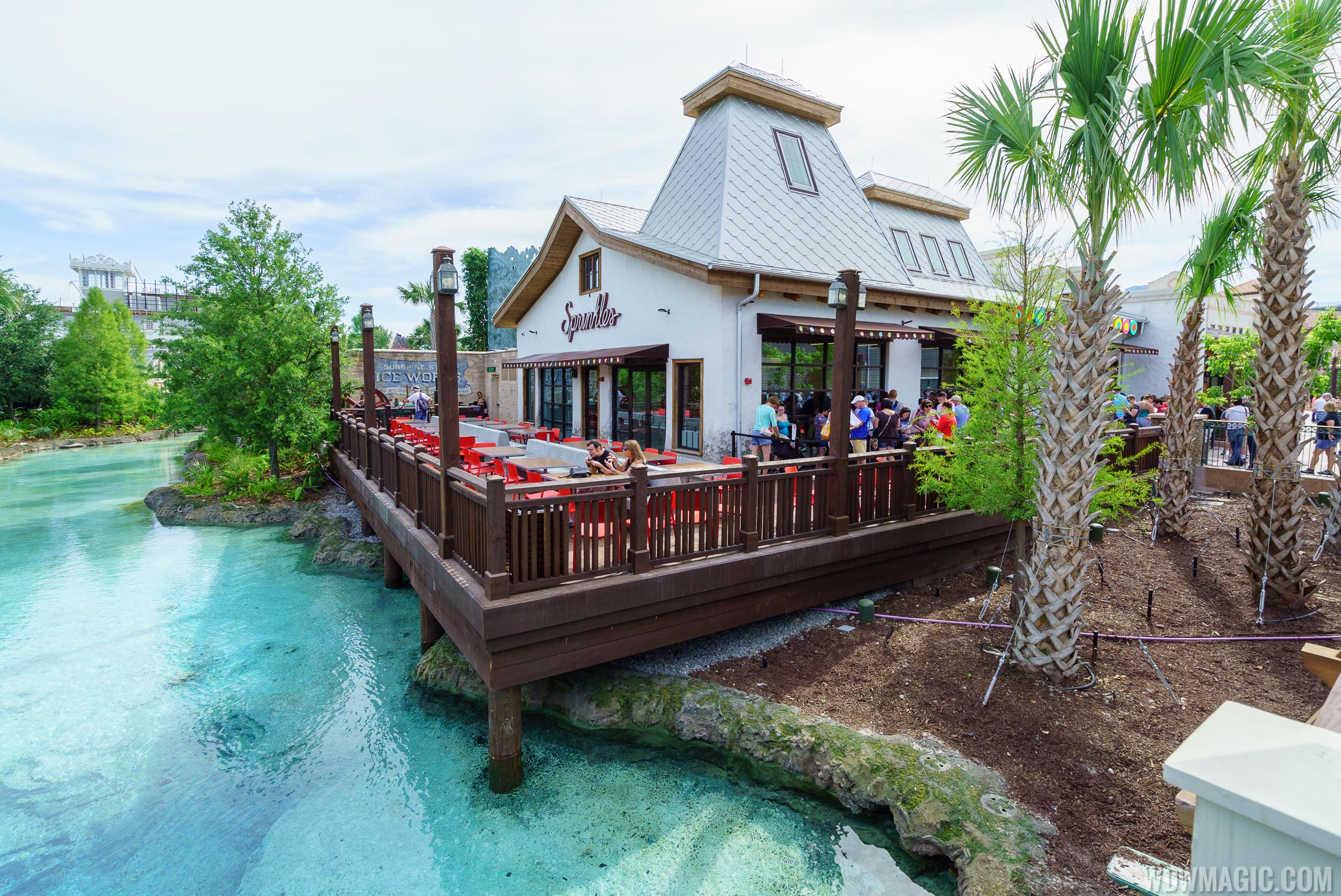
Judging just from the photos (I know, I know...) Disney Springs won't transport anyone to "a historic Florida town that has grown organically around the spring over the decades" - because a number of prominent buildings don't really work with the above theme. A few, like the glass kiosk and this thing, are downright bizarre:
disney-springs_Full_27699.jpg

Can anyone explain this roof... I'm pretty well-versed in architectural history and have never seen anything like it. I assume one of the designers, working in sketchup, extruded it and thought... "this looks kinda cool." It somehow passed muster. This seems to be representative of Modern Architecture, everywhere.

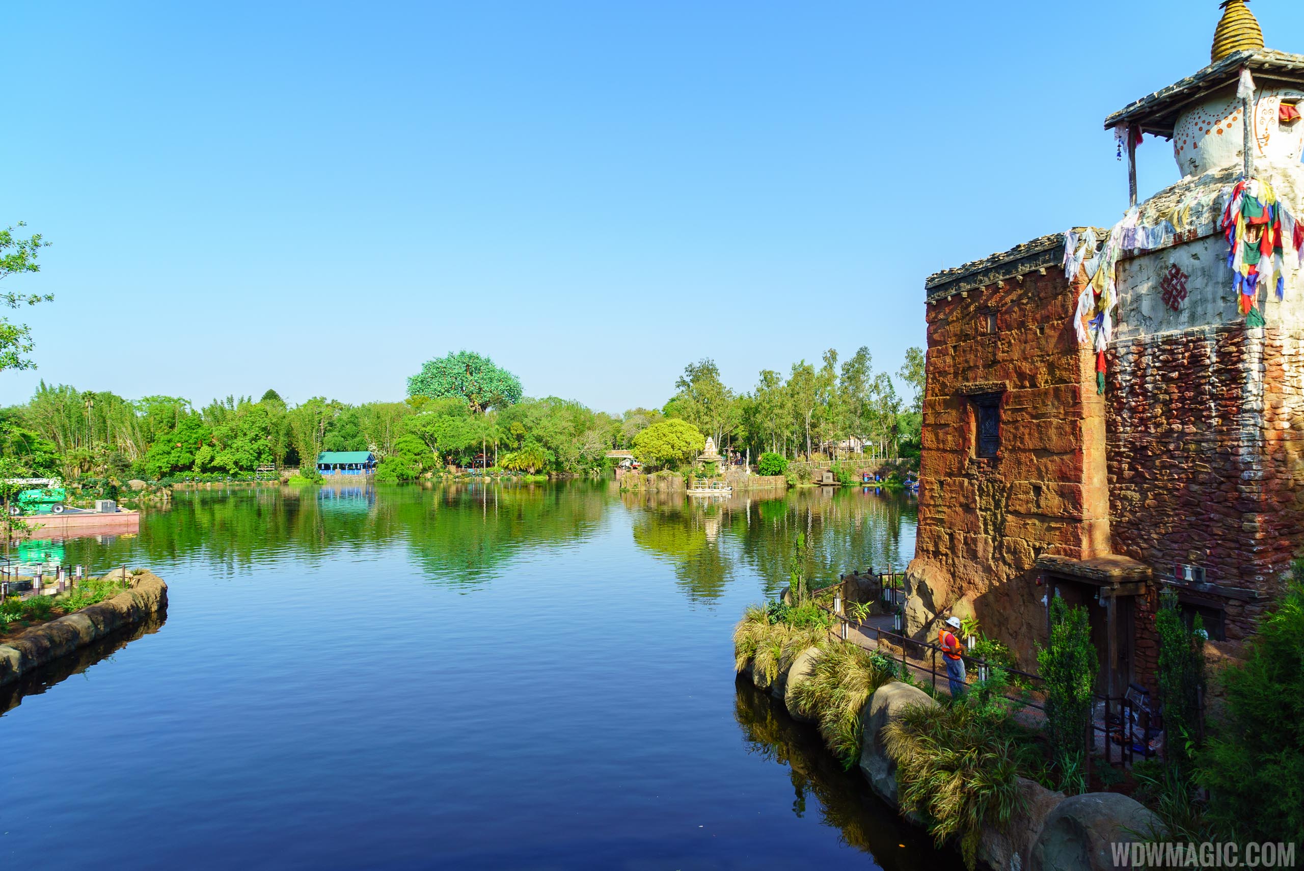
On the opposite side of the World/spectrum, the designers of Rivers of Light drew from historic Tibetan precedent:
itinerary-header.jpg

Even though most who visit have never seen the above (in any form), they can feel the authenticity at DAK's Asia:
Rivers-of-Light_Full_27495.jpg


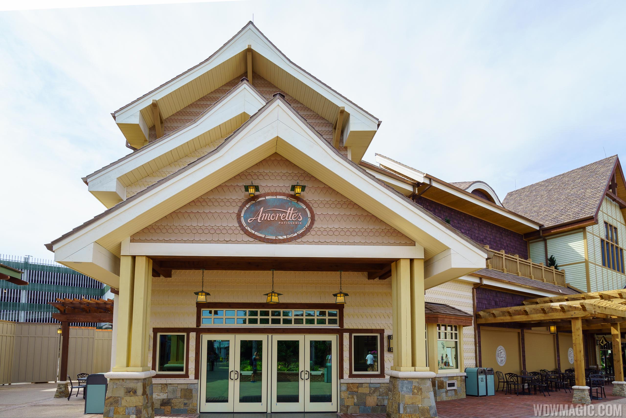
That's the difference between what is immersive place-making and what is not. It's the difference between good theme park designers and regular architects trying to get creative. No one is going to experience this triple stacked building (committing the pork-chop eave sin, among others) and think, "Ah, what a quaint, historic Floridian town":
disney-springs_Full_27691.jpg


Another example is the ogee dome in a Spanish Revival setting... it's a visual/historic contradiction. Many of the buildings/amalgams here have no accurate precedent.

***
So to answer the question posed, I don't think it can/will immerse visitors like a great theme park environment does. I wish it had, but then you'd be getting something like World Showcase, but for free.
 

Bartattack

Well-Known Member
I kept seeing people snapping pictures with very professional looking equipment and wondering if any of them were members here. I probably passed you at some point this morning/afternoon.

Were you holding up a camera with one hand and going in and round the shops? Then I think I have passed you at the Vera Bradley/Tommy bahama stores...
 

Bartattack

Well-Known Member
Overall I think the town center looks great. It's a great addition... There are some things they should improve though. There needs to be more shaded sitting room in the 'poutine' area. The few tables are not enough... And the tables next to the world of disney wall are out of place. I saw a person eating his poutine Fries at a table inside the amorette's patteserie.

I also saw lots of benches with no people on them... Probably because it was hot and there was no shade. So most of them were sitting down at the windows of the shops...

2016-05-15 13.55.26.jpg
2016-05-15 13.57.21.jpg
 

Cesar R M

Well-Known Member
Benches were removed from the Magic Kingdom hub area as people would stand on them to try and get better fireworks views. There is a risk/liability issue with someone standing up there.

A few other places the benches cause narrow walkways and it possible to walk into them if not paying attention.

But they should look to add more benches to nice tucked away corners.
They could invent "dismountable" benches. aka when fireworks time is getting close, they can disengage and remove the benches.
 

WDWBryan

Well-Known Member
Disney-Springs-D-Luxe-Burger-full-menu-May-2016.jpg


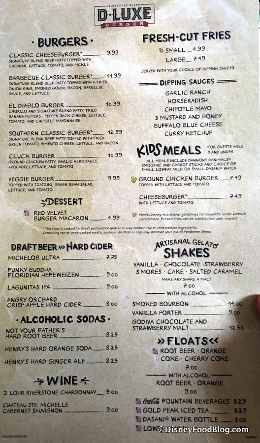
Good to see ;) Disney is able to maintain outrageous food prices even outside the parks.
Haha what a joke. I guess this the old prices for people stuck a disney philosophy. Not going to try it as a local when we have BurgerFi Burger21 Fuddruckers and Five Guys all as much cheaper options.

Hopefully Blaze Pizza won't go this route and instead charge the same prices they charge at all of their other stores
 

jmmc

Well-Known Member
I get what some people say about this not really looking like it fits the quaint Florida town, but no matter what the titles are, it looks to me like The Landing is really more of the themed looking area. To me Town Center looks more like an expensive shopping area in Italy or Spain.

In any case, I think it looks very nice.
 

Marc Davis Fan

Well-Known Member
I don't think the retail stores/signs prevent immersive place-making nearly as much as the lack of (understanding of) traditional architecture does.

A successful immersive environment will correctly-implement various architectural styles, most-often grounded in history (including imagined ones). It requires rigorous research and a guiding vision. Liberty Square, Main Street, Italy at EPCOT, Hogsmeade, etc., etc.,: all successful themed environments because they followed (and theatricized) established, recorded and understood design elements of those periods & places.

Judging just from the photos (I know, I know...) Disney Springs won't transport anyone to "a historic Florida town that has grown organically around the spring over the decades" - because a number of prominent buildings don't really work with the above theme. A few, like the glass kiosk and this thing, are downright bizarre:
disney-springs_Full_27699.jpg

Can anyone explain this roof... I'm pretty well-versed in architectural history and have never seen anything like it. I assume one of the designers, working in sketchup, extruded it and thought... "this looks kinda cool." It somehow passed muster. This seems to be representative of Modern Architecture, everywhere.

On the opposite side of the World/spectrum, the designers of Rivers of Light drew from historic Tibetan precedent:
itinerary-header.jpg

Even though most who visit have never seen the above (in any form), they can feel the authenticity at DAK's Asia:
Rivers-of-Light_Full_27495.jpg


That's the difference between what is immersive place-making and what is not. It's the difference between good theme park designers and regular architects trying to get creative. No one is going to experience this triple stacked building (committing the pork-chop eave sin, among others) and think, "Ah, what a quaint, historic Floridian town":
disney-springs_Full_27691.jpg


Another example is the ogee dome in a Spanish Revival setting... it's a visual/historic contradiction. Many of the buildings/amalgams here have no accurate precedent.

***
So to answer the question posed, I don't think it can/will immerse visitors like a great theme park environment does. I wish it had, but then you'd be getting something like World Showcase, but for free.

Thank you so much for posting this extremely thoughtful and thought-provoking analysis.

I knew something seemed weaker about the overall "feel" as compared with successfully-executed theme park lands, and I was assuming it to be the signage, etc., for retail brand stores. But you've pointed out what in hindsight seems like an obvious difference (and something I often discuss with regard to theme park lands!). Indeed, this should serve as yet another reminder of just how astonishingly impressive the aesthetically unified and accurate architecture is at theme park lands such as WS pavilions, Harambe, Hollywood Blvd., Main Street, and the like.

(That said, DS wasn't meant to be a theme park land - indeed, perhaps it was even intentionally aesthetically differentiated - so, taking it for what it is, it's still very much worth visiting, spending time walking around, etc.)
 

RandySavage

Well-Known Member
Thank you so much for posting this extremely thoughtful and thought-provoking analysis.

I knew something seemed weaker about the overall "feel" as compared with successfully-executed theme park lands, and I was assuming it to be the signage, etc., for retail brand stores. But you've pointed out what in hindsight seems like an obvious difference (and something I often discuss with regard to theme park lands!). Indeed, this should serve as yet another reminder of just how astonishingly impressive the aesthetically unified and accurate architecture is at theme park lands such as WS pavilions, Harambe, Hollywood Blvd., Main Street, and the like.

(That said, DS wasn't meant to be a theme park land - indeed, perhaps it was even intentionally aesthetically differentiated - so, taking it for what it is, it's still very much worth visiting, spending time walking around, etc.)

^You're welcome. To your point, if they had gone the route of an immersively-themed area (like a Harambe or New Orleans Square, but based on Florida over two centuries), then they would face the challenge of integrating typical tenant signage/interiors so it didn't spoil all that place-making effort (it's no fun seeing the big Cinnabon/Starbucks signs among the awesome exteriors of Port of Entry). Like The Grove in L.A. or the new Shanghai Disneytown, it's a modern lifestyle center (a nice, elaborate one, from the pics) with typical quasi-historic flourishes, but nothing to the point of transporting you to another time/place, as a great themed land strives to do. The actual natural spring area has impressed me the most out of all of it. I think Hangar Bar is very nicely done and could be dropped into an Adventureland or Lost River Delta. Looking forward to what they do with Edison, Observatory, Neverland Tunnels and Walt's Place.
 

EthanMagicBands

Active Member
From all of the promotional material and videos I have seen, Disney has always mentioned a story behind what they did with Disney Springs (like they always do with any new area), but also if I recall they also say "harkens back to" quiet often when referring to the Disney Springs town. So this is the morden day version of the old Disney Springs of yesterday.

If you look in the Guest Relations building they have a large mural or painting of Disney Springs from a supposed 1950's Expo. It shows the train tracks still in tact and the train running across it. This is clearly not true today as plants are growing on the elevated tracks now.

What this tells me is that those days are the past, and we are in Disney Springs of the present, today. So you have an old style with modern features built on top of it, like you would see in many old cities becoming modernized (like areas of Japan or China have, for example). Here it is:

2nq7cs1.jpg


I also specifically remembering Disney mention why the water tower has a new modern font logo on it, even though the water tower is old, and it had to do with it being modern day or something along those lines. In fact, behind the logo on the tower there is printing on the tower itself... watch this:

 
Last edited:

Rescue Ranger

Well-Known Member
Looks great, beautiful! Looking so forward to being there when it's all done whenever the time comes I feel is good to visit again.

BUT...with that said, I have to say it, it's not seeming "Disney-ish" enough. You just have the Characters in Flight balloon and maybe some music in the background? As fantastic as it looks, it just looks like a very very nice outdoor outlet mall. It still bothers me that the Springs logo doesn't have a hidden Mickey in it :p

Maybe in person I'll feel completely different. I wanna feel like I'm in WDW...not in an upscale Florida premium outlet.
 

Cesar R M

Well-Known Member
Here is my Walkthrough of Town Center to complement the fantastic Walkthrough that @wdwmagic posted yesterday. I thought it would be nice to post anyway because I may have focused on different things. For what it's worth, I was really impressed with everything I saw yesterday.


I really need to get a 4k monitor lol
 

jmmc

Well-Known Member
Maybe in person I'll feel completely different. I wanna feel like I'm in WDW...not in an upscale Florida premium outlet.
I wonder if that's partly on purpose, and Disney is hoping the place will attract not just tourists, but locals, too. And maybe the locals aren't always in the mood for "Disney-fied" entertainment. As hard as that is for some of us to understand. :)
 

Animaniac93-98

Well-Known Member
I wonder if that's partly on purpose, and Disney is hoping the place will attract not just tourists, but locals, too. And maybe the locals aren't always in the mood for "Disney-fied" entertainment. As hard as that is for some of us to understand. :)

This. Not everyone's into character breakfasts and thinks Art of Animation is WDW's best hotel.

They already have a Disney merchandise-focused section of the Springs (Marketplace). This is for, as you say, locals and foreign tourists. The ones who will actually drop a few hundred on a place like Sephora or Under Armour.

Besides, isn't Disney Springs already surrounded by dozens of acres of "Disney-fied" entertainment? ;)
 

Register on WDWMAGIC. This sidebar will go away, and you'll see fewer ads.

Back
Top Bottom