Sharon&Susan
Well-Known Member
The alternate universe where everybody chose Narnia.
I kind of wish it happened. It would be interesting to see the different approaches.
Be careful what you wish for...I kind of wish it happened. It would be interesting to see the different approaches.
*furiously rewrites prompt*I can’t wait for an Epcot Stanza!View attachment 528168
Thanks I hate it hereI can’t wait for an Epcot Stanza!View attachment 528168
Frankly, I’m waiting for a DCA 1.0 or even a Walt Disney Studios Park prompt. Lord help those parks...I can’t wait for an Epcot Stanza!View attachment 528168
I would LOVE a DCA 1.0 prompt.Frankly, I’m waiting for a DCA 1.0 or even a Walt Disney Studios Park prompt. Lord help those parks...
That's not Stanza IIII would LOVE a DCA 1.0 prompt.
Please let that be Stanza III
It should be a rule also to not do Imagination, not because it's a classic but because it's a bit overdone as a prompt.“It’s 1999 and sponsor HP wants something fresh and thrilling for their new EPCOT pavilion sponsorship! It’s up to you to decide which unique, classic, iconic Future World pavilion to GUT AND DISMANTLE to make way for something new!”
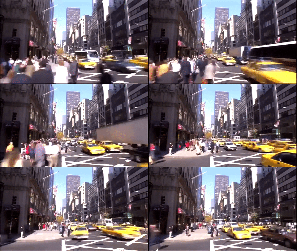


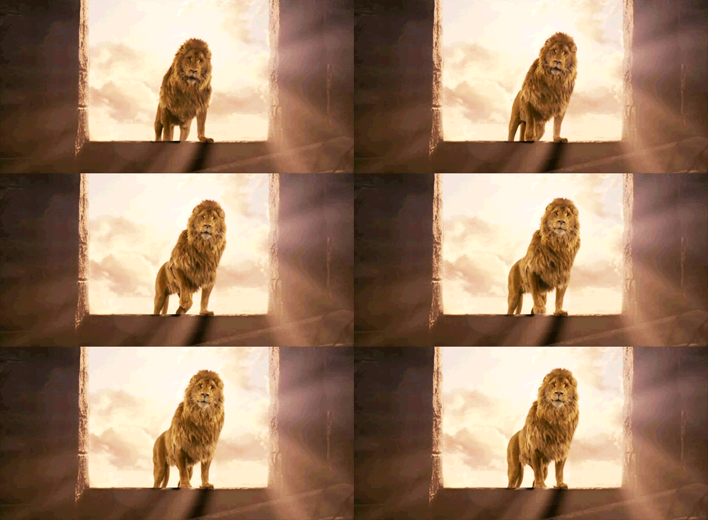

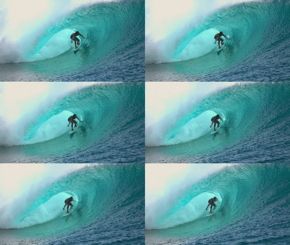
I know the original post said Future World pavilions but were there previous prompts about the World Showcase pavilions?It should be a rule also to not do Imagination, not because it's a classic but because it's a bit overdone as a prompt.
That's my two cents anyways on hypothetical sorcerers apprentice haha
How do you knowThat's not Stanza III
I make no promises about future stanzas though
Really appreciate the feedback. To answer your questions:View attachment 528178
Were these better than last week’s already-amazing projects?
…
…
…
Yes!
The skills and talents exhibited last week are on full display here. I love how creative each of the three teams got this week, and where last week was a bit more "realism-focused", this prompt is all about "thinking outside the box".
Thankfully, we did not have a repeat of the Disney Adventure (a prompt where each of the three teams named their cruise ships identical names). Instead, we got six different lands, and NONE of them Pixar (I’m shocked): Live Action Studio, The GRID, Halloween Town, World of Narnia, Toho Town, and Surf Swell Beach. Each team had a different approach, but who will win out in the end?
Given the sheer size of these projects, I’ll be breaking each team’s two lands and discuss them cumulatively, highlighting anything I think deserves special praise. But honestly, there’s so much to these projects, if I don’t mention something you’ve made don’t think of it as any slight!
View attachment 528193
Team Soul has emerged into a major powerhouse, from the innovative and unorthodox presentation styles to the consistently detailed descriptions. Both the GRID and Live Action Studio blend perfectly into Disney-MGM Studios, complimenting the pre-existing lands perfectly.
Also, can I point out the insanity that is your activity? Here’s a comparison of each team’s Stanza 2 brainstorming thread. Team Mind and Power combined are still less than yours total. Insane!
Team Power: 11 pages
Team Mind: 24 pages
Team Soul: 48 pages
LIVE ACTION STUDIO

So you have a bunch of properties, but you’re not sure how to tie them together. The solution? Create a land for the oddities of the Studios, realize they all happen to fit into the city, and ta-da! It's amazing you managed to make such a varied in properties yet consistent in setting based land work, but when I read it it all comes together.
First, to address the elephant in the room, holy moly, there’s a lot of custom art/videos in this project (this counts for both Live Action Studio and the GRID). From two upmost-quality maps to ride narrations to more real-life animatronics, there’s a lot to unpack here, so I’ll just say this: they’re all amazing, and they add so much flavor to your project.
Starting with National Treasure, an excellent fit for the 2008 setting. To be honest, I’ve kinda forgotten about this franchise, but back in 2008 it had just seen its second film and was going strong. That said... I’m not sure if I fully understand this attraction. The map is super detailed (huge kudos) but I couldn’t find a definition of what type of ride it actually was! I’m assuming based on the description, map, and reference photos it's a launch coaster. While interesting in theory, I don’t think that’s a good fit for National Treasure, a franchise that relies less on action setpieces and more on suspenseful mystery. I think an alternative ride type, like a Trackless Dark Ride or EMV, would have suited this franchise better.
By contrast, I love the slow and simple nature of An Enchanted Voyage. It feels like a Fantasyland dark ride brought to the Studios, something this rendition of the park might need more than anything. One of the teams (I think it was yours) pointed out that there was a disproportionate amount of e-tickets in the MGM-Studios Project than children's-oriented rides. Bringing something like this to the Studios will help to mitigate that problem.
About that Annie Musical… wow. The detail here is insane. To all who contributed -- congratulations, you can call yourself a playwright now. An Annie’s Musical is a great fit for the New York setting.
The Streetmoshpere was a great added touch -- loved the 2000s Pitbull music, lol. Next, the Restaurants and Shops didn’t have too much detail (well except a certain one), but they’re all serviceable for the land they fit into it. Which leads us to...
POTPOURRI PIZZA! ALL HAIL THE VIDEO!!! AHHH -
Overall, this is a very good land with many very good things. Very good!
THE GRID

Tron is such a unique concept, it's a shame we likely won’t get a land like this IRL. I love how much thought went into designing the overall aesthetic of this land, from the ceiling projections to the horizon to the costumes. It gives the effect of literally stepping in the world of Tron, difficult given the unique 1982 aesthetic.
I wonder what will happen in 2010? Will the Grid change to Tron Legacy’s more sleek style, or will it maintain the dated yet weirdly-charming 1982 style?
Something about Trials of the Grid reminds me of an interactive FutureWorld EPCOT ride, only taken to the next level. I like how you emphasized the “game” element without making it an actual game you could fail. It makes sense given the theme and makes you feel more part of the experience, rather than just sitting by watching the craziness unfold over a digital screen.
The Studio Transport System... wow. Truly amazing that you not only wrote out all that narration but were able to record it. To echo what Space said, your bf is always welcome to join Lora.
Overall, this is a very good land with many very good things. Very good!
DISNEY’S METROPOLITAN RESORT
A resort! This is one of my favorite parts of your project just by how simultaneously creative but also practical a resort here would be. First, by placing it at the back of the park you now have two entrances (at least for those), only they’re at opposite ends. It’s also an excellent tie-in with the Live Action Studio. Last, you have great views over the rest of the park (the image you showed is good given realism’s restraints, now just imagine what it’d look like with all the SAU imagery alongside the Chinese Theater and Spaceship Earth). And the custom hand-drawn art is the cherry on top. Outstanding job!
View attachment 528194
Judging on the properties and their execution, if Disney were to choose between any of the three projects, I think they’d pick yours. Both Halloween Town and Narnia were large-scale properties in 2008 (NBC is just always going to be iconic, and at the time the Narnia series had plans to be “the next big thing”). For those reasons, I think these are the exact properties Imagineers would design if given two empty land plots in the back of DHS 2008 (in this alternative universe where the rest of the park has been developed, that is).
Oh, and those land gifs are awesome!
HALLOWEEN TOWN

First up, Halloween Town! Nightmare Before Christmas is such an iconic property I’m surprised no land has been made for it already. A Haunted Mansion Holiday is fine and all, but there’s so much potential here! This land gets all the highlights of the Halloween Town shown in the movies and then some.
But first, something I noticed on your brainstorming thread I didn’t see on any others that I really appreciated: for both Halloween Town and Narnia you put great thought in the entrances of each land. First impressions matter, and entering the land the same way they show in the movies goes a long way. For Halloween Town, that means entering just how Jack traveled dimensions in the woods. For Narnia, that means entering through the Wardrobe. But concurrently you've added additional routes, not "thematic" like the others but necessary to prevent backlog. That's an excellent compromise between theming and realism.
Jack's Christmas Sleigh Run sounds like the ideal family-friendly coaster. I love how you tied the land’s setting to after the movie, explaining why Jack was still in Christmas attire, but only to the rest of Halloween Town. On the other side of the land, Oogie Boogie’s Roulette Of Fear and Lock, Shock, and Barrel’s Halloween Town Hijinx are two solid flat rides, always handy in the Studios, which lacks any if I’m not mistaken.
The Dining and Retail in Halloween Town is fantastic. I love how everything has its own unique spin, from the interactive elements of the Carabet to the Thanksgiving flair of Sally’s Potions. This really makes the land, which might not have the grandest attractions, but is filled to the brim with unique shops and dining. Last, the Christmas Shop linking to the Father Christmas Shop is Narnia is a great touch.
Overall, this is a very good land with many very good things. Very good!
WORLD OF NARNIA

Narnia! I read all seven of the books when I was little, but I never watched any of the Disney movies. It’s a shame the franchise died out before it could finish.
I really love how dramatic this land is. Keeping Narnia “hidden” from the rest of the park reminds me of how it's portrayed in the books: a parallel universe disconnected from our everyday reality. You’ve managed to condense tons of famous settings here, from the mansion to the lamppost to Cair Paravel to the White Witch's Realm. This is a feat in it itself, at no point does it feel too crowded!
A final point, watching the map creation process (for both Narnia and Halloween Town) was amazing. That map popped up in the first couple of days, but it was continually updated as the project came together. You all worked together to ensure it perfectly fit the design.
For the attractions, I have some very mixed opinions. Adding water rides is great, I’m on board for that. But… is this just one ride split into two? It seems like the Coming of Spring tells the first half (give or take) of the Lion, Witch, and the Wardrobe while the Battle for the Throne is the other half. I don’t know about that. It makes the Coming of Spring anti-climatic in its ending, especially if guests rode the Battle for the Throne first and came to the Coming of Spring later.
I think instead of stretching a book-report attraction into two, you could have instead developed a unique, atmospheric adventure set in Narnia during the events of the movie. Take this land as an opportunity to explore the world of Narnia in a way the movies, or even novels really, never could. Don't limit yourselves to what you already have, make something new.
The Dining and Retail options here are fantastic. I love all the references to events in the movies, like Mr. Tumnus, the Beavers, or the Turkish Delights. I also really appreciate the reference photos and menus, telling exactly what to expect when shopping or dining here.
I’m a bit confused by the Battle of Beruna. If I’m not mistaken, the firework show launches from the back of the park (the lagoon) in Narnia, but because there’s available seating in the perfectly aligned Hub of the park, half the crowds will disperse to watch the fireworks launch from over the mountain, while the other half will go to Narnia and watch from the lake? This should work in theory, but they’d have to be very careful to make each viewing area unique, so one area doesn’t become the “determined better spot” and everyone rushes there instead.
Adding Father Christmas for the Holiday Season is a nice last touch… but what about Aslan? Let me meet animatronic Aslan! /s
Overall, this is a very good land with many very good things. Very good!
View attachment 528195
Team Mind is living up to their namesake with their creative ideas. Both Toho Town and Surf Swell Beach are incredibly imaginative, but they also maintain a level of realism fitting with the rest of the park.
TOHO TOWN

Of all the three teams, this is the one I want most. It's a natural step for a Disney Studios Park, leaning towards Japanese films and animation. The only fear I had was how GODZILLA, Spirited Away, and Akira Kurokwasa would mesh together in one continuous land.
I’m still not sure how everything places together: the map looks convincing enough, but in practice would the transitions from big city to countryside work? I like how you split it into two levels, but then Ghbili Gardens is on the first tier, where Godzilla and the city are, while the other rural zones are on the second tier...
Then again, I am criticizing the work of someone who lives in Japan, so who am I to judge on how realistic it is?
I appreciate the realism taken towards the properties chosen for this land. They’re the most profitable and well-known IPs for a theme park set on the other side of the world, and although Japan has more than enough unique anime to fill a whole park and then some, you’ve kept it realistic for 2008 by opting for the most well-known.
Godzilla: Terror in Transit sounds like a great “e-ticket” to draw crowds to the back of the park, and I love the choice of MechaGodzilla as our antagonist. Setting the ride on a train is a really unique way to frame the story, keeping us constantly in the field of view of Godzilla but from an ordinary person’s perspective.
That said: if we’re being honest, my preference of the two is Spirited Away. It's basically a highlight reel of the movie, right from the queue which is treated less like a queue and more like part of the ride. I love how we follow the same path Chihiro makes when she first enters the Bathouse, and it hits all the right beats right up until the end. A part of me wishes we could have had the ending of the movie be included in the ride’s ending, but I suppose the slow, methodical train sequence + swamp scene ending wouldn’t have adapted very well in ride format. Eh, I'll take No-Face chaos as a worthy climax instead!
A Tale Of Trouble & Turmoil sounds like a fun stunt show… although I’m not sure about the order to commit Seppuku on stage. That sounds potentially a bit dark for a Disney show. Finally, the Ghibli Gardens walkthrough… yes, Totoro is the perfect character for a Meet & Greet!
From here, I love all the smaller references in shopping and dining to other films and anime. TBH I’m not very knowledgeable of Japanese film, but I could tell by a number of the titles and reference photos that these were from other Japanese movies. Going back to your realism point earlier, I love that could still include the finer references to fans of Japanese film in the shopping and dining, while the everyday park guest wouldn’t think twice about a shop or eatery, but would be confused if they’d didn’t know what a ride was about.
Overall, this is a very good land with many very good things. Very good!
SURF SWELL BEACH

The moment this first came up, you had my curiosity. I don’t think if I had to name 1,000 possible expansion lands to DHS before this prompt I would have named a “beach land” as one of them. But Team Mind continues to surprise. From all the landmarks, unique characters, to the “jump the shark joke”, you now hold my attention.
Also, can I just say… that name… perfection!
The Creature Feature Boats sounds so campy, I love it! You took the tropes and really ran with it. And those custom animations are jaw-dropping. They give so much life to an already vibrant attraction. The only worry I have is whether it fits into the rest of the land: I wonder if a “Jaws” parody might have been a better fit for the beach, but then that movie didn’t come out until the 70s.
Joining in the attractions, Rebel Motorbike Race is a great added thrill. I like how you tied it to the Greasers - Soc rivalry, and a map of a roller coaster is always a nice touch. The Wipeout Wheel is another solid addition to the land.
The Beach Party Palooza feels like the heart of Surf Swell Beach. It captures so much of the joyful and half-joking tone this land is known for. Corman’s Cowabunga Cafe sounds like a great way to the bring the old “Tiki Room eatery” concept to life, and Annette’s is the quintessential American diner. Finally, I loved the detail that went into the shopping, keep up the great work!
Overall, this is a very good land with many very good things. Very good!
---
Hm... I keep getting deja vu whenever I write that... I swear it's the first time I've written that...
Some of the players will be stepping out of the game at points to host and judge a few projects, so there are a few of us in the cast that know what some of the projects are.How do you know
I would LOVE an alternate reality for World Showcase, as in, redesign the entire thing. Would be so totally wicked.I know the original post said Future World pavilions but were there previous prompts about the World Showcase pavilions?
Register on WDWMAGIC. This sidebar will go away, and you'll see fewer ads.
