The Sorcerer's Apprentice Season 2: International Edition

englanddg

One Little Spark...
First off, I would like to start off by saying that I will not be talking about rooms and menus, because i don't feel it would be very valuable. Both teams did that very well.

Team Sea:
@MonorailRed & @Voxel , you guys did an overall great job. I like the statue of Kirk Douglas a lot. Also, the FantaSEA show was very cool, but I did have one issue. You said that it would be in the lobby also, but you did not say anything about it. Your website layout was very simple, and it worked. The slides were easy to navigate, and were very descriptive. I liked that you had a whole deck dedicated to the attractions. Country Bear 500 was by far my favorite, and then Avengers. I liked the idea of Philharmagic, but instead of 6 different versions, I would have liked to seen randomized versions of all of the songs. But that isn't a big deal. The Captains Saloon was a very good idea, but I think it could have worked maybe a bit better as an adults only restaurant. The bars were definitely a high point for you guys, and they were very well done. I especially loved the Adventurers Club, The grid, and the monorail bar. Rave was also a very good idea, and coming from a teenager, I would spend a ton of time there. Lastly, Davey Jones Sports Deck did not make sense to me. I just didn't know why it was themed to him, since he does not really have anything to do with sports, and would be hard to apply him to an idea like that because he is such a dark character. If it was totally enclosed, and dark, it may have been really great. Overall, you had superior bars and attractions, but some things like the sports deck suffer for me. Additionally, you lacked enough music. 3 minutes don't cover how long it took to read everything. Now I'm not sure if the rule for photos was axed, but there were for sure over 15 pictures, but the other group did that too, so no harm.

Final Grade: B

Team Land:
@Zweiland & @englanddg , excellent work on this project. It all started with your website loading page, that was so cool. The intro video was a bit laggy though, and that was a bit disappointing. I was also a fan of mystery nights, and adding an incentive for participating would be a huge success. Bandz tho...
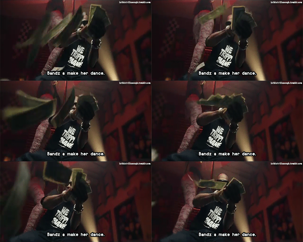
tumblr_maxlxblKyC1rwu9euo1_500.gif

Haha, I was on the edge for bands there. I like the idea of the app, but am not sure how well the bands would work in the middle of the ocean. And with giving guests iPads and iPods, I think it would be better to give them to the guests at check in and returned at check out so there aren't any allegations of them being stolen from the rooms and such. The 20K restaurant sounds amazing, probably my favorite out of all the ships. Silly Symphony was by far your best attraction, but I think you should have put all of the attractions on one floor like Team Sea. All of your attractions, including your solid DisneyQuest, are so spread out. It would be a lot simpler to have them in one area. Additionally, your villages are a cool idea, and make it almost like a different ship every where you turn. Having Splitzville on the ship is a cool idea, surprised you don't see it often on ships. One thing I have a problem with all of the radio disney publicity. It actually recently went bankrupt, and the local stations have been gradually sold off. Eventually, all of them will be gone. But, you guys killed the little details, like the characters on the side of the ship and the itineraries. Actually, the itineraries are the main reason you guys get my winning vote. Those little things that were overlooked by both me and the other team really made the difference.

Overall Grade: A
The rule of 15 pictures applies only to submitted posts, not to websites or videos presentations.

Each format carries advantages and disadvantages.

1) Direct WDW Post is clean and simple, but has image constraints to 15 (20 by the forum, but the comp says 15). In addition, the forum limits you to 5 embedded media slots (videos)

2) Video offers you a release from the image constraints, but is a lot of work to put together and is difficult for wordier stuff.

3) Websites sidestep all of those limits, but are a TON of work to put together and have them work well.
 

Matt7187

Well-Known Member
The rule of 15 pictures applies only to submitted posts, not to websites or videos presentations.

Each format carries advantages and disadvantages.

1) Direct WDW Post is clean and simple, but has image constraints to 15 (20 by the forum, but the comp says 15). In addition, the forum limits you to 5 embedded media slots (videos)

2) Video offers you a release from the image constraints, but is a lot of work to put together and is difficult for wordier stuff.

3) Websites sidestep all of those limits, but are a TON of work to put together and have them work well.
Yeah, I didn't have pictures hurt either teams grade because I thought you both went over. So it doesn't matter
 

LittleGiants16

Well-Known Member
I'll keep this brief. (We're all busy). I'm also not going to go in depth on some of the obvious things (JDM and Sam should handle that nicely)

Sea - Solidly done you two. I absolutely love your version of Deck 2. The updated Disneyquest was cool and would provide families with something to do either at night or during adverse weather. I questioned your deck eleven, as the nightlife options just kept going and going and going. But hey, I've never been on a cruise so what do I know. That being said, I did like your drink options that you made for each of the clubs. That was a nice touch. Ooooh, and the piano bars (can I get a hellz yeah?). I'm a big piano bar fan so A+ there. The pools also seemed well thought out. All in all, another solid production from two of our resident A players.

Land - How did you guys get those Cruise Radio bits going? Wow. As I was reading through your submission, I was floored by this detail. And I think that's the best way to describe your submission: detailed. The Mikey heads were a nice touch as lead-ins to further information. While Matt knocked the spread out nature of your rides, I like it. I think it's going to get people moving around the ship which gets them walking past shops and eateries and, likely, spending more money. The Itineraries were also a nice touch. There were a few things about the layout that slightly confusing, such as the placement of the fountain show, but I assume this is just because I think cruise ships are much smaller than they really are. Overall, well done guys.

But seriously, both teams, well done. You each did a ten person project with only two people. Regardless of who wins, be proud that you made it this far and of what you have accomplished.
 

englanddg

One Little Spark...
I'll keep this brief. (We're all busy). I'm also not going to go in depth on some of the obvious things (JDM and Sam should handle that nicely)

Sea - Solidly done you two. I absolutely love your version of Deck 2. The updated Disneyquest was cool and would provide families with something to do either at night or during adverse weather. I questioned your deck eleven, as the nightlife options just kept going and going and going. But hey, I've never been on a cruise so what do I know. That being said, I did like your drink options that you made for each of the clubs. That was a nice touch. Ooooh, and the piano bars (can I get a hellz yeah?). I'm a big piano bar fan so A+ there. The pools also seemed well thought out. All in all, another solid production from two of our resident A players.

Land - How did you guys get those Cruise Radio bits going? Wow. As I was reading through your submission, I was floored by this detail. And I think that's the best way to describe your submission: detailed. The Mikey heads were a nice touch as lead-ins to further information. While Matt knocked the spread out nature of your rides, I like it. I think it's going to get people moving around the ship which gets them walking past shops and eateries and, likely, spending more money. The Itineraries were also a nice touch. There were a few things about the layout that slightly confusing, such as the placement of the fountain show, but I assume this is just because I think cruise ships are much smaller than they really are. Overall, well done guys.

But seriously, both teams, well done. You each did a ten person project with only two people. Regardless of who wins, be proud that you made it this far and of what you have accomplished.
The Disney Cruise Radio was me (down to the voice). It was an off the wall thing Zwei and I came up with at some point to make our soundtrack more unique.

Glad you liked it! (it was a lot of work)
 

englanddg

One Little Spark...
You've got a voice for voiceovers my friend. I figured it was some sort of software voice sort of thing that you guys talk about which goes way over my head.
Nope. I covered this in the Discussion thread. It was an iPhone 5 and the Voice Memo app. Exported to Pinnacle Studio 15 to make the final mp4, then converted to mp3 and ogg for the site using Wondershare.

Oh, and I was a theater major in college. And have done professional theater (granted VERY long ago)...
 

Zweiland

Well-Known Member
I'll keep this brief. (We're all busy). I'm also not going to go in depth on some of the obvious things (JDM and Sam should handle that nicely)

Sea - Solidly done you two. I absolutely love your version of Deck 2. The updated Disneyquest was cool and would provide families with something to do either at night or during adverse weather. I questioned your deck eleven, as the nightlife options just kept going and going and going. But hey, I've never been on a cruise so what do I know. That being said, I did like your drink options that you made for each of the clubs. That was a nice touch. Ooooh, and the piano bars (can I get a hellz yeah?). I'm a big piano bar fan so A+ there. The pools also seemed well thought out. All in all, another solid production from two of our resident A players.

Land - How did you guys get those Cruise Radio bits going? Wow. As I was reading through your submission, I was floored by this detail. And I think that's the best way to describe your submission: detailed. The Mikey heads were a nice touch as lead-ins to further information. While Matt knocked the spread out nature of your rides, I like it. I think it's going to get people moving around the ship which gets them walking past shops and eateries and, likely, spending more money. The Itineraries were also a nice touch. There were a few things about the layout that slightly confusing, such as the placement of the fountain show, but I assume this is just because I think cruise ships are much smaller than they really are. Overall, well done guys.

But seriously, both teams, well done. You each did a ten person project with only two people. Regardless of who wins, be proud that you made it this far and of what you have accomplished.
What about the fountain show placement confused you?

Whatever it is, I can explain. It's there for a very specific reason, actually.
 

jdmdisney99

Well-Known Member
Original Poster
Challenge 11 - Critiques

land.jpg


Team Land
- Project Manager @Zweiland and @englanddg
CHALLENGE 11
TEAM LAND'S SUBMISSION


8591778_orig.png

Celebration Class


Disney-Cruise-Line-Logo.jpg


This challenge was very extensive in scope, so it was necessary to go into detail. Team Land created a website to showcase our new Disney Cruise Line ships: the Disney Celebration and the Disney Discovery, which belong to the Celebration Class. The website helps promote the new class, but also is informative and goes into detail about the specifications and offerings.

The site offers 18 custom Disney Cruise Radio announcements describing their respective decks, and a song to go along with each one.

Enjoy our submission!

CLICK HERE TO VISIT THE SITE.
  • I love the ship names.
  • Site is a beauty and the way you integrated the radio was brilliant.
  • Concept of villages is great, though has been used before...love the size as well as the foghorns
  • Integration of MDE is well advised and perfect for DCL
  • Deck 3 - Love the Discovery theme here..perfect for a ship
  • Deck 4 - Necessary continuation of the previous
  • Deck 5 - Everything is great...rooms are nice, atrium is classic, and statue choices are tasteful
  • Deck 6 - Love the cues taken from Disneyland on this level, truly bringing Disney to sea.
  • Deck 7 - Room s seem great and luxurious
  • Deck 8 - Again, nice rooms...the fish tanks seem like a nice treat as well as the other oceanic feature (BTW, like the audio clipped from official WDW opening)
  • Deck 9 to 11 - more great rooms...and a lot, which will be needed due to the demand for what would be the largest cruise ship on Earth
  • Deck 12 - ESPN Zone is a perfect combination of all things fun and competitive at Disney, and you made it work...the fountain show seems awesome
  • Deck 13 - As with other decks, taking the previous and improving...Splitsville seems like the perfect addition when expanding from smaller ships into the largest
  • Deck 14 - Great teen and family options full of thrill as well as needed tranquility
  • Deck 15 - Top of the World pool would be my home for a while if I was on this cruise...brilliant idea!
  • Deck 16 - Outlook Lounge would be extremely popular with such views.
  • The itineraries seem really expansive and adventurous, which is good for guests looking for an exciting destination
  • Overall, you really wowed with presentation, and even though some areas were weak, you took Disney cruises to the next level.


14798000900_79f4d78a27_o.png


Team Sea - Project Manager @MonorailRed and @Voxel
Challenge 11: The Final Four Disney Cruise Ships? I Think Not...
Four contestants remain. This time around you must compete to design a mode of international transportation; no, not planes, trains, or automobiles, but cruise ships! Each team is required to design the next class of Disney Cruise Line ships...take them to the next level. The class would hypothetically include two ships, but you only need to go into detail about one, because they would be exact replicas. You should bump it up a notch, knocking DCL into the international spotlight as the premiere cruising service, with the biggest, best ships. You should include write-ups for each major restaurant venue, merchandise location, or other recreation areas that at are at your discretion to include (theaters, pools, clubs, sports, etc.). Both teams should try and keep the style consistent with all current DCL ships, but I have a feeling we'll come out of this with two very different ocean liners.

SeaLogo_zps570ce8f4.png


The Disney Wish and Disney Color Playlist


The Disney Wish and the Disney Color

The Disney Wish and the Disney Color are two new cruises that join the Disney Cruise Line Fleet in 2018. These cruises are the most sophisticated in design and spectacular in entertainment on the Disney Cruise Line to date!

Though sister ships, just like any sister ships on the Disney Cruise Fleets, the Disney Wish and Disney Color both share serious similarities and design differences that really bump the cruise line up to the next level.

The Disney Wish's main theme takes inspiration from the 1920's and 1930's. The main lobby features a bronze cast statue of the original, classic form Donald Duck. They also feature a few different clubs and restaurants, similar to the Disney Dream and Disney Fantasy.

  • Love love love the music selections. Steel drums, foghorns... Really fun!
  • Interesting names, both with meanings at the core of Disney
  • Donald already has a boat; the Dream.
  • Interesting choice with Kirk Douglas. While I love the song "Whale of a Tale" I just don't think he would work alongside his cartoon counterparts.
  • FantaSEA seems very innovative and new...awesome!
  • Very block-y site this week...could have been more user-friendly.
  • Not a fan of the slide sharing program. Though I know it was necessary.
  • Love the way the deck plans are put together.
  • Deck 1 - The necessities were very well accommodated.
  • Some slides didn't match other. Again, not pretty with the site.
  • Deck 2 - Wonderful idea of bringing DisneyQuest to the sea. Not all the way to S.S. Disney, but more than a regular cruise! Awesome attractions there (esp. love PhilharMagic)
  • Deck 3 - Everything seems fun, but very familiar.
  • Deck 4 - Perfect place for kids and families but, again, familiar.
  • Deck 5 - Love the unique, adult's attention you gave this deck.
  • Deck 6 to 10, 13 - Love the rooms! Staying in a Jules Verne suite would be epic.
  • Deck 11 - Wonderful vibe to this area...+1 for Adventurer's Club
  • Deck 12 - The pools seem really fun!
  • Deck 14 - The sports deck looks perfect, as I know many who would definitely like the thrill of playing at sea.
  • Deck 15 - Love that you brought this over and I also enjoyed the special events!
  • Overall, great job, though it was familiar and the presentation was less than spectacular.
 

Voxel

President of Progress City
Challenge 11 - Critiques

land.jpg


Team Land
- Project Manager @Zweiland and @englanddg

  • Love love love the music selections. Steel drums, foghorns... Really fun!
  • Interesting names, both with meanings at the core of Disney
  • Donald already has a boat; the Dream.
  • Interesting choice with Kirk Douglas. While I love the song "Whale of a Tale" I just don't think he would work alongside his cartoon counterparts.
  • FantaSEA seems very innovative and new...awesome!
  • Very block-y site this week...could have been more user-friendly.
  • Not a fan of the slide sharing program. Though I know it was necessary.
  • Love the way the deck plans are put together.
  • Deck 1 - The necessities were very well accommodated.
  • Some slides didn't match other. Again, not pretty with the site.
  • Deck 2 - Wonderful idea of bringing DisneyQuest to the sea. Not all the way to S.S. Disney, but more than a regular cruise! Awesome attractions there (esp. love PhilharMagic)
  • Deck 3 - Everything seems fun, but very familiar.
  • Deck 4 - Perfect place for kids and families but, again, familiar.
  • Deck 5 - Love the unique, adult's attention you gave this deck.
  • Deck 6 to 10, 13 - Love the rooms! Staying in a Jules Verne suite would be epic.
  • Deck 11 - Wonderful vibe to this area...+1 for Adventurer's Club
  • Deck 12 - The pools seem really fun!
  • Deck 14 - The sports deck looks perfect, as I know many who would definitely like the thrill of playing at sea.
  • Deck 15 - Love that you brought this over and I also enjoyed the special events!
  • Overall, great job, though it was familiar and the presentation was less than spectacular.


14798000900_79f4d78a27_o.png


Team Sea - Project Manager @MonorailRed and @Voxel

  • I love the ship names.
  • Site is a beauty and the way you integrated the radio was brilliant.
  • Concept of villages is great, though has been used before...love the size as well as the foghorns
  • Integration of MDE is well advised and perfect for DCL
  • Deck 3 - Love the Discovery theme here..perfect for a ship
  • Deck 4 - Necessary continuation of the previous
  • Deck 5 - Everything is great...rooms are nice, atrium is classic, and statue choices are tasteful
  • Deck 6 - Love the cues taken from Disneyland on this level, truly bringing Disney to sea.
  • Deck 7 - Room s seem great and luxurious
  • Deck 8 - Again, nice rooms...the fish tanks seem like a nice treat as well as the other oceanic feature (BTW, like the audio clipped from official WDW opening)
  • Deck 9 to 11 - more great rooms...and a lot, which will be needed due to the demand for what would be the largest cruise ship on Earth
  • Deck 12 - ESPN Zone is a perfect combination of all things fun and competitive at Disney, and you made it work...the fountain show seems awesome
  • Deck 13 - As with other decks, taking the previous and improving...Splitsville seems like the perfect addition when expanding from smaller ships into the largest
  • Deck 14 - Great teen and family options full of thrill as well as needed tranquility
  • Deck 15 - Top of the World pool would be my home for a while if I was on this cruise...brilliant idea!
  • Deck 16 - Outlook Lounge would be extremely popular with such views.
  • The itineraries seem really expansive and adventurous, which is good for guests looking for an exciting destination
  • Overall, you really wowed with presentation, and even though some areas were weak, you took Disney cruises to the next level.
I think you mixed the reviews..
 

Sam Magic

Well-Known Member
Sam's Critiques:

Land : @englanddg @Zweiland

Detail. If I had to pick one word to describe this teams proposals and some before I would choose the word detail. This team focused on the details that are so essential to imagineering and for that I tip my hat. Whether it was ironing out a very plausible scenario for Doctor Who to make it into the parks or focusing on the various cultures of Scandinavia this team made sure every hair was in its place. These past three weeks (?) showed your ability to create something from the ground up and revolutionize the DCL company.

But let's board the ship!

From the beginning I loved how the Celebration line truly changed the way Disney ships are experienced while maintaining that Disney feel. I loved the different themed areas in the ship and I feel that they truly made this ship unique. The wifi system was something that I think is needed on the Disney Ships, it actually made me mad that this is not what the Disney bands at the park are like.

Now...I'm going to admit that when I saw Blue Bayou I fangirled, I fangirled so hard that I spilled my water on my carpet. Blue Bayou is actually a water park a few minutes down I-10 here in Baton Rouge and while it is not the best place ever, your Blue Bayou was great. However, since you did do New Orleans and my home state I will take a minute to clear a few things up about Cajun/Creole/NOLA culture which are always grouped together. In reality all three are very separate. NOLA/Creole is close to the same culture culinary wise and they have their own spin on things separate from the rest of the state. Cajun culture is its own thing entirely and they have a very different spin on really everything. Cajun's speak their own version of French, Mardi-Gras, values, etc. So if anyone does do a Louisiana themed area keep in mind that the state has VERY different cultures within the greater Louisiana culture. The only city that does mix them is Baton Rouge and that is due to it's geographical position as being in between New Orleans to the south and Lafayette the Cajun Culture Capitol to the west. Aside from my little rant it was still amazing and the presence of Club 33 and Main Street USA. They all added a very unique and fun feel to the place (can I go there like right now!) The Aquariums, theaters, mini golf, Disney Quest, Night Clubs etc. were all fantastic parts of this ship and I loved them all.

Your site was the best site I have ever seen come from this contest. I had a few problems with the video, but that was probably my wifi. Everything else was great. My favorite things were the individual 'radio broadcasts'. The were informative and had some great music on them that was personalized to each deck. Graphically I think it could have looked cleaner (site wise), but your stellar pictures and maps made up for it.

Overall this was a win you guys worked hard for and a project that truly differed your boat from the others in the Disney line up.
 
Last edited:

Register on WDWMAGIC. This sidebar will go away, and you'll see fewer ads.

Back
Top Bottom