The House Cup: An Imagineering Competition

mickeyfan5534

Well-Known Member
hufflepuff.png

Team Hufflepuff proudly presents a project that is sure to impress, astound and amaze. Team Hufflepuff presents, New Fantasyland!
http://newfantasyland.weebly.com/
 

Voxel

President of Progress City
I'm hoping that I don't forget one, but here it goes..
@Voxel's voxel-tastic reviews for Fantastic Voxels... I mean Vehicles and where to find them.
Sadly I must say there isn't enough Voxels in these submissions.

Official mini-challenge entry:

For the potentially newly renamed "Disney Cars Speedway," a natural to straddle both Tomorrowland and Fantasyland, the decidedly non-futuristic gas-powered vehicles will be replaced with electric Cars. This would fit better with Disney's overall themes of conservation and innovation, and eliminate the need to pay Speedway cast members an extra 20 cents per hour for working in a hazardous environment. Each vehicle will be designed to represent a character from the popular Disney/Pixar Cars franchise that participated in the racing scenes. The interior will have a screen with interactive capabilities, such as welcoming guests who wear MagicBands by name, and recognizing other character cars as they pass in nearby lanes and communicating with them via pre-recorded messages by the original stars. This would include a new loading/pit-stop area featuring Mater and other non-racing friends offering words of encouragement to your particular character vehicle and "plugging in" your vehicle to drive the point home that it is powered by electricity.

View attachment 138781

Iger is secret petitioning your promotion through the ranks, not only have you implement and idea that utilizes his money hungry Magic bands you have also found a way to save money in the monthly budget with decreasing gas cost and no more hazard pay. Congrats. :D
Over-all I love this idea, though honestly I love the smell of the motorway fumes I know alot of people disagree. I believe you are on the right track with adding interactive capabilities to the car.

Fantastic Vehicles and Where to Find Them Submission - For Gryffindor!:D


Monsters Inc: Mike and Sulley to the Rescue is a dark ride at Disney California Adventure Park that over the years has not lived up to some other classic Disney dark rides, and therefore in 2022, will receive a full makeover and the long anticipated arrival of the "door coaster" vehicles.

To facilitate this change, the interior has been gutted and replaced with Disney's first ever inverted family coaster. As seen in the blueprint above, the ride vehicle itself hangs below the track and seats 2 riders per door, equipped with on-board audio of Mike and Sulley guiding you through the door factory to find Boo's door. The ride vehicles also have "swinging" capabilities, where your doors can swing out at a 23 degree angle, creating a more thrilling adventure on banked drops and turns.

Overall, the door coaster ride vehicles "plus" the attraction from a generic dark ride experience to something that excites visitors, adds a family coaster to DCA, and also could lead to a potential Monstropolis miniland down the line as DCA gears more towards Pixar and Marvel as staples of the park.

You won't let go of the Doors coaster will you.. It's okay because I think this would work, my only fear is you have 2 riders per door (while brilliant) means you are going to need ALOT of doors. Think about how many speedway cars there are. Other than that I love it :D Keep of the decent work :p

Fantastic Vehicle's and Where to Find Them Official Submission:


The attraction vehicle I will be replacing is Test Track in Epcot. Instead of the regular seating they have now, I feel like we could make this ride an actual race like the radiator spring racers, so what's my idea? Instead of having one car, we have five Chevrolet cars, and these five all seat up to five people; they can be single seated(like space mountain in the magic kingdom). This lets the wait time be shorter, still have the main idea of the attraction itself, while still adding a competition effect to the attraction, by doing this, we can create five different tracks, and depending on the speed of the car the "team"(referring to five people in one car) choses before riding what car they would like(either 1,2,3,4, or 5) not knowing how fast the speed is or who is going to win at the end. Overall, this changes the seating, vehicle style, and effect the ride has on the guest, while not just riding at 60 miles per hour(or less here and there, depending on what the team would chose), but also having the ability to be competitive.


So they are racing on different track? While this could be fun in theory the amount of overhaul that would need to be done is astronomical, Iger is not happy with this proposal and will see you go the way of Staggs. :p Throwing aside the entire need to replace all of test track I think this is a great idea and would be an awesome replace in the speedway space or changing the design and using as an Endor race..

RMichael21 Presents...
In association with the Hufflepuff House...

The Great Movie Ride


View attachment 138833

In partnership with Turner Classic Movies, The Great Movie Ride will receive a complete re-imagining in 2018 as part of the top to bottom overhaul of Disney's Hollywood Studios, which will in introduce brand new scenes, effects and animatronics to the ride.View attachment 138838
Due to the ride possessing quite boring and plain vehicles, the cars will receive a complete redo, to evoke the style of classic movie premieres, (almost stuck in the old-fashioned mindset that when one goes out to the movies one gets dressed up for a night at the cinema). The vehicles will be riddled with many hidden details such as film reels worked into the design, plush red velvet seats and an LED piece on the back of the vehicles that changes color: personifying the mood/tone displayed in any particular scene.

In addition, the attraction will be converted into a trackless ride, so groups of four vehicles at a time will experience the attraction together, but can spin, turn, intertwine and interact, not only improving the ride experience and increasing kinetic energy between riders and separate vehicles, but controlling the direction that the rider is looking at. Finally, the new fleet of vehicles will feature double the cars and each car can seat 4 rows of 4 guests, meaning its capacity is retained while still offering a unique and magical time at the movies.​

Brilliant design!!!! I love it, esp the trackless aspect. Hypothetically almost no work needs to be done due to the original large size of the first gen vehicles. If small enough they could move around each other and due interesting things during Alien scenes. I like it, keep up the good work.

Fantastic Vehicles and Where To Find Them:
@IAmNotAHufflepuff's Submission:

jii_oldlogo.gif


With Journey Into Imagination set to have a massive makeover (restoring the Dreamfinder and Figment theme) in 2020, Imagineering has decided to design new, more imaginative ride vehicles for the restored attraction. And tell me, what's more imaginative than flying? ;)


e65cbab4ec19f43819a3bdb77239176f.jpg
\
Picture this, but changed to become a ride vehicle.

The Omnimover cars have been completely swapped out with "Dreamcatchers", looking straight from the original attraction , held up by an unseen mini-KUKA like arm. The new arm allows the vehicles to make gentle movements, like swaying back and forth, rising up and down, and maybe even spinning around at one point.

Hopefully, with the revolutionary ride vehicle and the resorted presence of the original attraction's charm, the new Journey into Imagination is sure to be a success! :D

Hmm, this could work.. The design would fit the original dreamfinder something I love. I think this vehicle design would be brilliant, though I'm not sure how I feel about a KUKA arm though would give a flying feel. Overall 10/11.

View attachment 138880

Walk-Tronixs will be a new ride system using the most advanced AudioAnimatronics ever used in a new way ever seen before.

Imagine riding in the cart of an AA pack mule. How would this pack mule move it's feet? Under the ground, diagram above is placed in a track. The big orange wheels turns on the track and also turns the red one. The red one is connected to the grey rod, which in turn moves in a circular motion, simulating the movement of legs. Attach a cart to the back with seats, and you've got an attraction.

Ideally, this ride was made for Dinosaurs, but it is a very flexible design. So, the vehicle will be located in a new second route on the Jungle Cruise, where guests ride in a cart behind an elephant AA pulling it.

Hope you enjoyed!

I'm having a hard time understanding what the design your trying to describe. I think you trying to use something like this:

If this is the case then yes I could see this being used as an illusion to move an animal, I think it's very unique

My new ride vehicle will give some Disney love to a classic attraction: Prince Charming's Regal Carrousel. With so many classic Disney horses to pick from why not invite children and children at heart to hop aboard some colorful characters they know well and dear rather than tired horses that can be found in any theme park or mall across America? Ride vehicles will be sculpted to look like a classic horse characters and can even be fitted with audio clips to add some more fun. This ride vehicle change will make this original attraction even more exciting while still retaining its classic charm. Headless horseman, anyone?

horses-disney-couples-19022988-400-550.jpg


images

I'm torn on this one, Walt loved the Carousels as they were. They represented an innocents of life and the part of childhood that every American experience at their local malls and parks. Pushing that part of the design aside, this is a great idea and I can see kids freaking out to ride many of these animals.
 

MonorailRed

Applebees
Fantastic Vehicles and Where to Find Them Reviews
cat-sad-601x400.jpg


@Tony the Tigger

First of all, I want to say that I really enjoyed that you decided to pick an attraction that’s ride vehicle is crucial to the attraction.

· I think the cartoon-iness of the Cars vehicles would be nice as a transition in Fantasyland. Especially even if viewed a bit in Storybook Circus, I could really see the “American circus” and the “American Racetrack” going hand in hand with each other.

· My only concern while it fits, with Storybook Circus and Fantasyland, it really doesn’t fit well with Tomorrowland. There’s something about the franchise of Cars in the area of Cosmic Rays, Space Mountain, PeopleMover, and Star Traders that doesn’t mesh well.

· My advice for a future challenge would be to try and fit it into all of the surrounding area. Maybe create a backstory behind it to make it work with the land!


@spacemt354

First of all, I think this one little change to the attraction like the ride vehicle really brings this ride to another level! So, awesome job making a ride better by a little change.


· I like how you had the vehicles suspended and the onboard audio. It really brings a new dimension to the ride that even California Locals (Most of your audience) hasn’t experienced before.

· My big concern with this is the realism of putting in this track with the audio-animetronics and the lackluster show building’s overall design features.

· My advice for a future challenge would be to keep in mind the space (Pun Intended) of show scenes and the building and if those scenes would work just as well or better from a different angle.


@disneydf

First off, I want to say awesome out-of-the-box idea for re-imagining an attraction vehicle!


· The seating for Test Track has always been the same, but I think this vehicle could really shake it up! I feel like if the vehicles are single seated, the twists, turns, launch, and stops on test track could feel more intense overall.


· My two concerns with this is the design of the vehicle and the recent update. Sounds a little odd for a ride vehicle for a car testing facility and the recent update in the attraction also makes it a little less realistic for a giant change as much as what you are proposing.

· My advice for a future challenge is to take in the timespan of an attraction’s recent history and feasibility for projects.


@RMichael21

First off, if any ride at DHS deserves some love based on attraction guest numbers and recent updates within the attraction, I believe that GMR is currently that! So excellent choice!


· I really enjoyed how got rid of the classic Universe of Energy slab of a ride vehicle, and turned it into something really special for not only GMR, but DHS. The style fits perfectly with the attraction.

· Red velvet seats in a ride vehicle is a little out of the box, and a little unnecessary. I also feel like LED and an old-fashioned feel clash.

· My advice for future challenges would be to keep in mind the possibility of unnecessary updates and designs, and justifying them within the post.

@IAmAHufflepuff

First of all, I really like that starting out, you explained the context of the vehicle change. Supporting that the ride is getting a major overhaul definitely brings this in as a justification to your vehicle presentation.

· Other little things I enjoyed were your font style choice, adding a Kuka arm like vehicle to the original Figgy, how you named them “Dreamcatchers”, and it really adds a dimension to the story.

· One thing I really pick out is the idea of “Keep Moving Forward” with proposals and I wish instead of going with the old school Imagination as an excuse for the ride vehicle, you chose to make the vehicle a compliment to a current attraction.

· My advice for future challenges would be to make something shine in an inventive, out-of-the-box “pulsing”.


@DSquared

First of all, I really think it’s interesting that you had a totally new ride vehicle based on past Audio-animatronic achievements!

· I really like how it’s flexible, even though it’s made for Dinosaur, this design can be used other attractions.

· However, I think you could have described it better because I had to read it multiple times to understand the vehicle design.

· My advice for the future would be to go more in depth when designing something from scratch.


@Fox&Hound

First of all, I find it cool how original this idea is! I haven’t heard of doing this before!

· I really enjoyed that you included well-known characters to an attraction to boost ride attendance! Kids will love it!

· I don’t know about changing up an opening day attraction’s vehicle’s this much. There are so many prominent horse characters and too many cooks can ruin the kitchen.

· My advice for the future would be to keep in mind how many characters your putting into your concept.
 

Daveeeeed

Well-Known Member
The Ravenclaw House Proudly Presents: Your Dinner (Just Kidding) The Great Fantasyland Expansion!

Fantasyland at Walt Disney World is a stunning achievement in theme parks and the staple of the entire resort. The land was recently expanded upon in one of the park's largest expansions in history. The end result was New Fantasyland. There have been two phases to this redevelopment and expansion, but let's take a look at what the future should hold in a phase three. Read on to leave the world of normality, the dimension you are currently in. Click the links throughout to explore a whole new world (;)) of magic and wonder. Proudly presented by the Ravenclaw House, here is The Great Fantasyland Expansion!

*******************************************************************************************************
Fantasyland will be split up into five sections:
  • The Kingdom (Old Fantasyland, but all facades will look more like Disneyland's)
  • The Forest (New Fantasyland)
  • Storybook Circus
  • Wonderland (indoor area themed to Alice In Wonderland)
  • Volcanicia (Jules Verne themed area)
*******************************************************************************************************

The Kingdom

The Enchantment Theater

This theater would open up with the brand new attraction replacing barnstormer. It would be themed to a circus tent just like the the rest of the land. Inside would be a few sections of seating just like the festival of the lion king. The seating is themed to old circus benches. .
The shows within the theater are temporary or just for special events. There would be a show opening with the theater that would be themed to the upcoming Moana Disney animation feature.

*******************************************************************************************************
Wonderland
luna_by_tcool123-d9zuh8q.png

*The exterior entrances to Wonderland will look like a Crowded English townhome style street in the time period of Alice In Wonderland. Wonderland will be completly indoors similar to Stage 1 at Walt Disney Studios Park Paris.

Down the rabbit hole

Queue
The queue is through the forests of wonderland but when needed it can be extended to an out door area.

Ride Vehicle
The ride vehicles would be themed to the Chesire cat a lot like the classic Disneyland's versions vehicles are themed to the caterpillar.


Scene 1 - Main Lift
Guests leave the station, and turn a corner into a cave. As they go up they are falling down the rabbit hole. Guests enter the tugly woods in pursuit of the White Rabbit.

Scene 2 - The Tuggley Woods
As guests weave, dip, and spin through the tugley woods they come across various creatures. The chesire cat appears sending guests to the Queen's

Scene 3 - Interrupting the Croquet
Guests interrupt the Queen of Hearts croquet game. There taken to the gullitone, and escape The vehicles enter an outside portion through the maze until they get back into the show building.

Scene 4 - Unbirthday
Guests experience an Unbirthday party with the Hatter & Friends. At the end a birthday cake explodes, and the guests exit back into the station.


Teacups
Will be indoors and will not have a roof on it, so it will be open.

Walrus and Carpenter's
is a brand new quick service location in the new wonderland sub area. Themed around the 2 characters from the animated classic. It serves primarily sea food but specialized in oysters, mussels and clams.

The Cheshire grotto

The Cheshire grotto is a sit down restaurant themed to the forests of wonderland. Around the area are signs pointing in random directions. Also around the area is weird wonderland creatures. You can hear singing flowers in the distance as you eat your meal. It would serve English food.

*******************************************************************************************************

Volcanicia
Les_Mystères_du_Nautilus_2009.jpg
In the center of Volcanicia is the nautilus. It would be a lot like it's sibling in Paris and Tokyo. Nearby is a small circular building inside the building is the entrance to both the Nautilus(a walk through attraction) and the Captain's Quarters (a restaurant) To access both of the you most either go disown a stair case or take an elevator. Once one floor below the rest of the park the entrance to both lay in front of you.


The Nautilus

You would start out by going down a long corridor. At the end of the corridor are some of the crews cabins open for us to go in. Each cabin would have a bunk for 2 and a small sink. Leaving the room we enter the nautilus''s bridge. Complete with plenty of switches and levers. The younger guests can go up stairs to the captains wheels and lead the nautilus on a journey 20,000 leagues under the sea. Out side the port holes in this area are some animatronic fish making us believe we are below the water.

We then walk down a different hallway through a closed door we can hear organ music. Could it perhaps be captain Nemo playing? At the end of the hallway we reach the control center. The next room we enter is the boiler room. The second to lest room we reach is the diving room an open chamber of water on the ground in front of us with the path splitting to either side. Every once in a while you can see a diver swimming in the water. The last room the treasury shows most of the treasures that the crew has found on their journeys. There is also a large port hole that opens to reveal the giant squid attacking the sub. The electrical shocks scare it off and we precede to the exit.

The Captain's Quarters
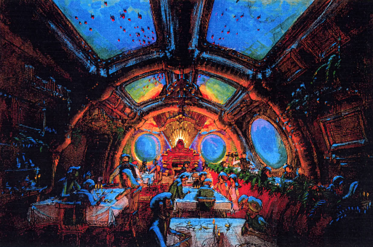
tumblr_mviegqAbIl1qk6dn0o1_1280.jpg


We enter down a hallway just like the walk through. We the reach a massive oval dining room. On the walls are closed port holes. At the opposite end of the room is an organ. to be specific it is Captain Nemo's organ. Every half hour a cast member dressed as captain Nemo will come out and play the organ.
Most of the food here is sea food. It would become a signature dining experience use like BE Our Guest.

*******************************************************************************************************
Volcanicia Attractions:

Around the World in 80 Days

2gy3ipi.jpg


Around the World in 80 Days will be a new C-Ticket ride in the style of Peter Pan's Flight. The attraction will be very similar to the book of the same name, and will see guests board hot air balloon themed ride vehicles that fit 4. The queue will see guests walking through Fogg's home, until they reach a dinning hall. Here will be an AA preshow showing Phileas making his famous bet against the Ministry of Science. From here the guests board the ride vehicles. The drawing above shows one of the more memorable scenes in the ride, ascending over the Eifel Tower. This will be one of 7 unique scenes. What is unique is that there is a fantastical tone felt throughout with each scene using more unconventional neon colors, and each scene 'popping' out of the storybook. The 7 scenes are listed below.

Scene 1: Leaving England with the police chasing behind
Scene 2: Meeting Passepartout and getting away from police by flying
Scene 3: Flying over a railroad and past the Taj Mahal and meeting girl
Scene 4: Returning the stolen jewels to China past the Great Wall; Fogg leaving
Scene 5: Struggling Fogg finds Passepartout and girl in San Fran past the bridge
Scene 6: IMAX screen showing them leaving New York and flying across the Atlantic
Scene 7: Arriving at the Ministry of Science in England and having the cheating Minister arrested


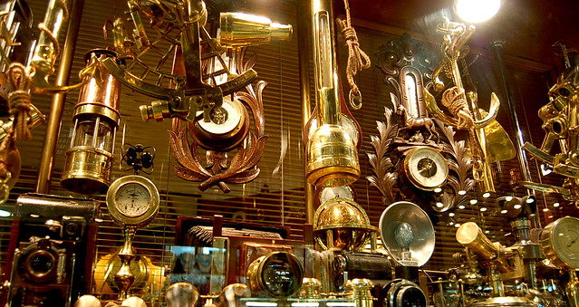
Fogg's Laboratory will be a new shop at the end of the Around the World in 80 Days C-Ticket attraction. The shop will be small, and will be inspired by the steampunk aspects present in most adaptations of the scientist's lab throughout media. Here, guests may purchase the usual memorabilia and merchandise from shirts, to hats, to autograph books, and special stuffed animals, shirts, and decorative postcards themed around the attraction.

2236788450_2416e10faa_z.jpg


https://www.youtube.com/channel/UCL_kYT53CsT1DBywYsL2yrg


Journey To The Center of The Earth E-ticket ATTRACTION:
The building is the exact same as the Tower of Terror in Hollywood Studios.

Queue
It begins outside in a run-down walkway to the mine to the center of the earth. Once you enter the building (The lobby in TOT) you are in a maintenance area that you must pass through to enter the mine. You see a couple of Jules Verne's small contraptions and prototypes of telescopes etc. The walls in this room have a very metallic copper look.
The Pre-show is a non-moving elevator similiar to Escape From Gringotts at Universal Orlando, to simulate that you go to the entrance which is deep in the Earth . The Boiler Room/loading area in The Tower of Terror is a cave/cavern's entrance in this JTTCOTE.

Ride Vehicle: Exactly like the tower of terror except it is themed to be a manned drill that will take you to the center of the Earth. As you go from floor to floor down you bob up and down to make you feel like you are drilling down. There is also a narration of the Mine Operator guiding you through.


Scene 1 - Departure
Guests depart from the boarding area and follow the same route as tot to the next scene.

Scene 2 - The caverns
This is where the ghosts are in the tower of terror; instead, here you have a cave with bioluminescent creatures. Rocks are falling down so the Pepper's Ghost Effect works
by not letting you see further into into the cave. It also shows rocks falling down.
Scene 3 - Monster (The 5th dimension is on TOT.)
The Mine operator panics and the vehicle slightly bounces up and down as it heads up. to get to the correct spot to burrow into the center of the earth. In here you encounter the Monster at the center of the Earth.
Scene 4 - Drop Shaft
Drop Once the vehicle arrives in the drop shaft you always go up first and then drop, the mine operator says briefly that this is it, and that you will go to the center of the earth.
Scene 5 - you see lava from the volcano which then steam goes everywhere and you soar up as you hear a loud eruption. you drop at least once more after that.
Scene 6 - You disembark into a gift shop themed to Jules Verne's contraptions hanging from the ceiling.

Ride Music composed by me, (was soecifically designed for this ttraction):https://drive.google.com/file/d/0B1vAihgS5Ax-UjJkek4wcWoxSE0/view?usp=sharing

Exterior concept art: https://www.dropbox.com/s/hjibhubaf3o2i8v/2016-04-29_23.25.40.png?dl=0

trk_mgm_tower.jpg

(Just to show you the layout)
Storybook Circus
New Attraction

The Big Race Starring Mickey and Friends

th


The Big Race Starring Mickey and Friends will be a new dark ride themed to the world of Mickey and Friends, who must race across the land to get Minnie back from Pete. The ride's vehicular them will also be a spiritual successor to Autopia, which is being demolished in this project.

The queue of the attraction will reuse some settings from the old Mickey's Toontown, having the queue go through Mickey's house into his backyard. Then, you head into a garage behind his house. Inside are models of the cars seen in the attraction, and a few TV monitors. On the monitors are a short pre-show film showing Minnie getting taken, and Mickey, Donald, Goofy, and Pluto getting into cars to go chase him and get Minnie back. After this, guests leave the garage and board their own cars (fitting up to 6) to chase down Pete.

What makes this attraction special is that there will be no 'scenes' and going through doors, everything will flow freely as the 4 friends ride through the wacky Toontown setting to get Minnie back. For reference of how 'wacky' this attraction will get, think the "On The Open Road" segment of A Goofy Movie, but more fast paced.


Also, throughout the ride, events can be triggered that change the story of the ride by clicking buttons when instructed to by Mickey, who is on a monitor on the car. This includes Darkwing Duck coming in to take down some of Pete's goons, Huey, Dewey, and Louie throwing pies at Pete to block his view, Roger Rabbit and his cab Benny cutting Pete off, and much more.
 
Last edited:

MonorailRed

Applebees
Que-dditch Reviews
453768-cats-cute.jpg


@spacemt354

First of all, I think that the Soarin’ queue was in need of a better interactive queue, so gold star for doing that! :D

· I enjoyed how you tied your queue into the Soarin’ Over the World update and updated the scenery of the queue overall.

· I feel like you could have done something more unique then update the queue that was already there.

· My advice for a future challenge would be to add something unique to an attraction. Something no one has seen before! :cool:


@Sam4D23

First of all, I really like how you made Space Mountain’s queue more updated and special! :)

· I really liked how you updated the space windows and integrated MyMagic+

· I’m feel that the redeemable points to get food and souvenirs would make TDO claw their eyes out. :eek::hilarious:

· My advice would be to have a “high score” instead of transferring it into other sectors of the resort next time.


@Fox&Hound

First of all, really enjoyed how you addressed the Frozen attraction and it’s probably extreme wait times! :D

· I really enjoyed that you paid tribute to the movie with “Do you wanna build a snowman” and also paid tribute to the pavilion itself by having Norway facts in the queue.

· (Serious nitpick alert :rolleyes:) One thing I didn’t enjoy was the puzzle games in the queue. It felt a little candy crush to me and less about the attraction.

· My advice for a future challenge would be to keep in mind the theme of the attraction and theme the queue to tie in hand in hand with the actual attraction.


@Tony the Tigger

First of all, I wanna say it’s great that you fixed the tacky queue for Spaceship Earth, one of my favorite attractions! This being indoors is a nice touch, it makes people want to ride it in colder weather conditions at Epcot. :)

· I like how you made the quiz in the queue as well, it really makes the queue be part of the journey in the attraction.

· My only concern is that the queue itself clashes with the ride theme. It doesn’t really make sense to go through the time travel scenes of the ride in the queue, and then go in the time travel vehicles to go back to the future. o_O

· My advice for future challenges would be to see how the queue transitions with the attraction. Think of the queue as a prequel to the story ahead.


@disneydf

First, I really want to address how great it is that you not only updated a queue of a classic attraction, but also addressed when Pirates line is long, it can seem like forever to get to the ride.

· I really enjoyed your “pillage, plunder, rifle, and loot”-ing jewels queue. It’s very mine train-y but also fits into the ride and necessity level of interactive queue for Pirates. :D:eek:

· One thing I didn’t enjoy was the Jack Sparrow Audio-Animatronic. I feel like it clashed with the “going back in time to where pirates existed” element of the attraction.

· My advice for future challenges would be to see how the queue transitions with the attraction. Think of the queue as a prequel to the story ahead.


@DlpPhantom

First of all, thank you for addressing the need for an interactive queue if Imagination becomes popular again, I think it’s something we never talk about, but the queue itself is quite boring. :bookworm:

· I liked the fact that you paid tribute to the original attraction, while making it new with the “bringing it to life” factor. :D

· Something I didn’t like was the fact you didn’t describe what the update to the attraction was going to be. I feel like you meant going back to the original version, but I wasn’t sure and had to read it a few times.

· For future challenges, remember to keep in mind to explain the context of how your project fits and describe in depth why it’s changing.
 

MonorailRed

Applebees
Year One Reviews

First, I want to say All the Houses were really interesting to look at in the blue sky/design process. So good job on that for all houses! Really great first projects everyone!


Slytherin

Starting out, sadly the video in the beginning of the thread wasn’t working, so I had to move on from whatever it was. I’m assuming it was music for reading along with the project, but that might not be correct. Really enjoy how you opened the project text wise though! Sold me to read more! I also like how you made the description of your changes clockwise traveling throughout the land! Small thing, but I thought it was cool!

I think it’s great that you mimicked DLR’s Fantasyland refub in the sense of aesthetics. The tents may be classic, but it can be better. Loved the stain glass windows, by the way! So good job there!

Philharmagic – Glad you included music from the attraction here! Made it more immersive to read!

I feel like the Fantasyland Opera House fits extremely well for the Fantasyland up update you did, and I love the backstory! The posters coming to life similar to the Main Street Mickey Mouse meet and greet was a nice touch! The switch from metal to wood barriers, crown molding, ceiling tiles, nods to Disney musicians, and the lobby’s pillars and marble were nice little touches I really enjoyed! The picture really helped me see what you we’re trying to do to the lobby as well, which was nice.

As for the show, regal opera house style and the opera boxes were great makeover decisions! The 4k 3D projection updates were a nice way of brining this into the 21st century. I like your additional music to the Philharmagic set list and the transitions were wonderful. I’m a little torn that you got rid of Lion King and Mermaid, though. Then again, you made this completely original then any other show or ride you can find a WDW and that’s a great thing! Nice that you addressed a CM outfit change, though I’m not sure if it was necessary. Opera style glasses helped immerse guests into the story in my opinion!

It’s a Small World – First, I love that you chose to give this ride some TLC, it needs it and I think it’s fitting for a “Final Phase” project. I honestly wish you did more inside the attraction itself, though.

I don’t know how I feel about getting rid of the tent and roof, considering Florida weather. I’d hate for small world to flood or that old structure to be molded over or something due to it’s age and harsh storms in Florida. Small world is one of those “Oh, I’ll ride this while waiting for the rain to stop” rides, and I think taking the ceiling out was a bad move.

Peter Pan’s Flight – Nice exterior change, glad you re-tracked this, and updated scenes. Great move here!

Under the Sea: Journey of the Little Mermaid – Though unrealistic because it’s been updated from various mistakes, I’m really happy you decided fixed this up. It could be so much better and I think you did just that. I like the screen you added, but I’m a little concerned about extending the show building to add that scene, because I think it’d terrify kids, and that’s the rides large audience.

Mickey and the Beanstalk – I just want to say I really loved this ride concept! I’ve never heard of putting a drop tower in Fantasyland, but I feel like this fits well and it’s very inventive! The bullet points described the ride great! Wish I had more with this because I enjoyed it so much, art, pictures, more detailed descriptions, anything really. Such a cool project!

Princess Fairytale Hall – Good move and design, here. Although I don’t know if I like all the princesses clumped together in the expansion, long wait times are never good. Would’ve liked to see you play with different characters more.

Wonderland – Thank you for fixing this part of Fantasyland! It needs to be a stronger transition area! Nice area, loved the Labyrinth! Although I don’t enjoy that you go rid of the major centerpiece in the Teacups, I personally think it adds to the experience.

Sword in the Stone – AMAZING artwork, ride, and descriptions. That’s all I have to say. This is one of my favorite attractions from Year 1 in general.

Overall, some rough spots here and there in your project. Wish I had a more detailed map to see more of what you we’re aiming for. I also wish you worked on fixing more attractions in Fantasyland, such as Pooh. I feel for a “Final Phase” Fantasyland needs a little more added pixie dust for me to be totally content with this as the “last phase.” Some things you could do to work on this is to use your time more wisely, and ask yourselves “Is there anything else I could make better?” and go from there.

But seriously, spectacular work Slytherin! I’m impressed with this project, awesome work!


Gryffindor

First of all, your music/art intro was wonderful. Really immersed me in the presentation! I want to say how much I enjoyed all the artwork here…. Great work on that!

The site is loud, but brilliant. The castle melody is one of my favorite loops at WDW. Really loving this interactive website!

Mickey’s Philharmagic – I really love the choice of randomizing scenes in this attraction, it makes it re-rideable and I think that’s what Philharmagic is suffering from now. Wish you updated the queue, but eh, it’ll work.

Like that you kept some original scenes, but randomized where you did. Good editions film wise, I think they appeals to many Disney era audiences and makes everyone want to watch it!

Peter Pan’s Flight – This is in need of a refurb inside the ride, and I’m glad you did that! Love the exterior change design! Nice maintenance, vehicle, track change, added effects, and starfield additions! Overall, great update! Good Job!

Wonderland Forest – Custom Artwork and the slideshow is amazing! Great transition idea and teacups move. Nice QS alternative to Village Haus and D-Zone.

Amazing queue! I can’t say that enough. Well written, immersive, it would be one of the best queues at MK besides Mansion. Loved that! I also enjoyed how you made the ride a water ride, almost as a family transition to Splash Mountain like the Mine Train is for Big Thunder. Loved the glass tunnel and the attraction all around. Definitely, one of my Year 1 favorites! Great job!

Meet and Greet – Loved that you made it so you can meet the dwarfs this way!

It’s a Small World – Amazing changes in the clock tower, great art to show that! Really enjoyed that you made it work with the railroad! That area in the railroad is an eyesore and I’m glad you fixed it. Little things add up. I feel like the move according to the map is nice as well, being close to the colors of Storybook Circus, it should transition very well. I wish you said if the queue was indoor or outdoor, it really makes a difference in Florida.

Winnie the Pooh and the Honey Tree – Great Blueprint and queue design! Nice additions added like “Up, down, touch the ground” Wonderful update overall! One of my Year 1 favorites!

Mary Poppins – This attraction was practically perfect in every way. The art, the scenes, everything. Great job! One of my Year 1 favorites!

Overall, stunning, immersive, presentation Gryffindor! There were some spelling/grammar errors and some blasting music, but that’s really all I have to say as a negative. Wonderful Work!

Hufflepuff

Good presentation opening! Wish it was more about the project and less about the team introduction though. I didn’t feel immersed in the intro. Although I must say, the Website opening is cool! Nice overview as well!

Princess Fairytale Hall – I like how you added the enchanted artifacts. I think the coolest effect in the hall is that slipper and it’s great that you added to that! I don’t know how I feel about adding Elena to the lineup. I feel like she might work better at DHS’s Disney Jr. Meet and Greet area. Other character meet and greets were nice as well.

Roaming characters – Love this addition because of the Flynn Rider testing!

Mickey’s Philharmagic – Enjoyed the idea of mixing more new and old movies, though I don’t know about our choices of adding “Strangers Like Me”. It seemed out of place with the rest of the Fantasyland style music scenes you choose. I was also a little confused with the new façade, since it’s still castle themed I didn’t really see the purpose (Unless your getting rid of the tents?). Wish you updated the queue as well. The other music choices were good though!

Peter Pan Updates – Good basic fixes. Wish there was more information on this.

When Will My Life Begin: Rapunzel's Magical Adventure – I like how you added a contemporary princess to the Fantasyland land’s lineup. LOVE the artwork for the area! – Helps me picture what your thinking for this. Good queue and pre-show. Love the vehicle - Think it was really inventive for a dark ride! Overall, great ride experience as well! One of my Year 1 favorites!

Snuggly Duckling – Good replacement for Pinocchio’s!

Pinocchio Daring Adventure – Really enjoyed this version of the Disneyland attraction! I felt like it was unique and I really wanted to ride it after reading it! Perfect fit for the expansion. Ride vehicles were nice as well. One of my Year 1 favorites!

Good job an justification of keeping the Enchanted Forest as is!

Dark Forest – I really like how you made this indoor to combat the fireworks issue, though I feel the Belle entrance is a little narrow, I totally agree with the Storybook Circus enterance. Great for Florida weather as well!

Tale as Old as Time: Belle's Storybook Journey – Love the bluerprint! But it seems that the attraction may be too long when adding the music from the musical. Plus, even though I love the musical, it just doesn’t fit with the cartooniness of the rest of the dark rides. Plus, I feel “Me”, “Home”, “Home Reprise”, “A Change In Me”, and even the library scenes were unnecessary. An attraction is more of the sparknotes version of a story, remember that for later! J

Once Upon a Dream: Aurora's Thrilling Tale – I loved this attraction! Very well put together, nice blueprint, queue and preshow are great – Good Stuff! Great attraction as well!

Storybook Circus – I feel like you could have tackled this more, but I’m cool with you leaving it be considering how much your adding.

Wonderland – Loved the map! Theme is wonderful. A little weary getting rid of Tomorrowland territory for more of a giant Fantasyland. Alice's Curious Journey: An Adventure Through Wonderland was a nice ride through attraction!

Fantasia Gardens – Though I enjoy a garden transition to Tomorrowland, I’m still weary of taking space from Tomorrowland territory when Fantasyland’s so large. Loved the world peace café and the swings! Nice Small world exterior change!

Overall, a wonderful, giant, naturalistic, expansion Hufflepuffs! There were some things that didn’t resonate as much as others, but you let the last expansion in Fantasyland go out with a bang!


Ravenclaw

Good intro Ravenclaw! Love that you included a table of contents type area in the beginning. Wish it were in the order that you presented things, but eh, you guys we’re on a time crunch so I’ll let it go.

Wonderland – Really like theming of this area! The English street is a nice fit. Down the rabbit hole sounded like a fun attraction! Wish I had more detail or pictures, but I could still see what you we’re going for. Enclosing Teacups was a nice addition! Walrus and Carpenter's seemed a bit of a confusing addition considering Harbor House selling seafood in the park already, but I like how you tried to theme it to the movie!

The Kingdom - The Enchantment Theater really reminded me of the theater at DLR’s Fantasyland. It adds more capacity to the land without making a darkride… Good thought! The Cheshire grotto added a table service and I find that really important for MK in the sense of the crazy BoG reservations. Hopefully that restaurant balances it out more.

Volcanicia – This seemed a bit more of a tomorrowland expansion then a Fantasyland one. Though I can see how the old 20k in Fantasyland could see where you we’re going with this. The Nautilus and The Captain's Quarters were great additions as well.

Around the World in 30 Days seems like a Fantasyland attraction, actually! I could see it kind of working! The orange Effiel tower was a bit confusing in the artwork. Love that you made it Peter Pan’s flight style! Overall, it sounded like a great ride!

Journey To The Center of The Earth seems more of a fusion between tomarrowland and Fantasyland, but I do like that you put it in WDW! The music was fantastic! AMAZING job on that! Great attraction, good job!

Storybook Circus – I like how you totally made a car themed ride to take up the love of Autopia! This looked like a very fun ride, however I’m not sure that it fits in with the “traveling circus” theme enough to go in this area.

The Forest – I feel like I didn’t see this part

Overall, there were a few glitches here and there, especially posting after due date, but I feel like you all put something special together. So great job! For future challenges, I’d advise to get everything together a few days earlier so your ready the night of!
 

Voxel

President of Progress City
Voxel's Voxel-tastic review of Year One's end of year project:

Slytherin
  • Like @MonorailRed I am sadden to see that your initial video doesn't work, I'm not sure if it was key to the entire project or just background music to get us in the imagination mood. Either way it has to be skipped.
  • Not sure how I feel about calling original fantasyland as paling are you talking about the rides themselves or the exterior.
  • I do love your questionaire, is something Disney would do when trying to get attention towards a product
  • I completely agree that Fantasyland could use some heavily updating in terms of exterior, gold in my books. :D
  • Thank you for retheming the exterior to the Magic Kingdom Music Hall, it has a grad feeling to it and as a big theatre nerd it just sounds better.
  • You sold me at the tribute to the Sherman brothers. I be happy
  • Overall Review for Philharmagic: It's truly brilliant the amount of detail that you placed into this area. I hope that the rest of the project as this level of detail it's memorizing and I can't say enough about it.
  • I am struggling to read you It's a small world text, be careful with bright colors. :D
  • I'm not sold on your fix for It's a small world, there is a reason loading areas are covered in Disney World when they aren't in Disneyland. Florida is known for afternoon showers sometimes for weeks on end.
  • I wish you had gone into more detail about the retracking of Peter Pan, are you using the new system being implemented in Shanghai?
  • I'm not sure that I am sold on the Beanstalk attraction, one of the beauties of a "Magic Kingdom" park is that nothing is taller than the castle, I fear that this attraction would be noticable the moment guest step into the park and might distract people away from the castle.
  • I liked the various Alice details that were added :D
  • I love the sword and the stone ride, it's been a long time since I have seen that used in a Disney attraction. Why I'm not sure if it's popular enough for a beautiful ride of that size it was still great to see. I loved it.
Overall I think you guys implemented a great amount of detail, something that I really like. That being said there were a few questionable moves two biggies is Florida Weather and secondary keep in mind sight lines. Don't wanna ruin views with possible attractions.


Gryffindor


    • I love the little poem starting of the the post.
    • I HATE WEBSITES WITH BACKGROUND MUSIC IT'S MY NUMBER ONE WEB DEVELOPMENT PET PEEVE. Usually because I'm blaring music from a youtube tab trying to do work and it's a massive distraction and something I have to actively think about to fix.
    • I'm glad that you used a map to navigate even though it doesn't exactly the true layout.
    • There is not alot to say here. I love the hand drawn photos they added a great touch but I would have loved more images. While you can read text sometimes words help convey the meaning.
    • The website design is clean and easy to use so I greatly appreciate it.
    • I love Mary Poppins and felt like it was a greatly needed attraction thus great job there.
    • Now to the honest part I don't wanna talk about. I didn't feel like you tried to push the boundaries of Fantasyland, while everything you did was great and needed it felt like like a traditional fantasyland both for good and bad.

Hufflepuff

  • I love the website, but the init Themed Areas button does not work.
  • Also great use of the New Fantasyland logo
  • Great touch of adding all your team members to the list. Such a Hufflepuff move.
  • I love roaming character!!! I wonder if modern Disney is safe for this to occur but I don't care, I love roaming Characters, I would pay extra for that!
  • I think it's a brilliant idea to re-theme the Hall with objects from the stories.
  • I'm not sure where you are adding the Rapunzel ride of the Pinocio ride, I love the ideas though. They would be great additions
  • Similar statements about the Enchanted woods, I'm not sure where you are putting everything. I love these attractions but land and practicality is becoming a concern for me.
  • This new map is helping me understand things better, I wish it was labled a little better and I wish maps were included for all of the lands. I am sure the bank of Iger is unhappy with moving it's a small word, though I understand the design decision.
  • Alice is a great ride from Disneyland and I am happy to see it come to Disney World.
  • I had trouble understanding where rides were going to be located though all the riders you created were brilliant.
  • The website was easy to view once I figured it out, but next time it might be useful for you to take full advantage of the website aspect and use more photos and more pages to allow users easier navigation.
  • Great job Hufflepuff, this is a possible my favorite submission for this project.


Ravenclaw

  • The first thing I notice is the lack of formatting, I noticed that there was a bit of chaos going on at the end there. Next time it looks like there might be an issue try to as for an extension early in the day so we can extend the deadline for all teams:
  • I'm not sure why your replacing an attraction that handles people everyday with a tent that will be a temporary or special events, it may increase the number of people going to other attractions
  • I wish there was a short description before attractions for going into detail, that being said I love the Wonderland area and would be a great addition to any Disney Park.
  • I love the detail that goes into Volcanicia, but I'm not sure how I feel about it fitting into the Magic Kingdom. I know there were Vernes rides/attractions through out the history of Disneyland and the Magic Kingdom but after seing the land in Disney Sea it might be an area best save for that. That being said Everything here is perfect! just no right for the Magic Kingdom
  • Journey to the Center of the Earth, I am going to say the same thing about Gryffindor, keep in mind sight lines, you can't miss Tower of Terror but imagine walking down Main Street USE and you get a wonderful glance of the castle but atlas whats this 14 story tower in my shot.. (Does that make sense what I am saying) Other than that though I love this attraction!
  • I am glad that you are keeping a tribute to Autopia/Speedway in this attraction I love it!
 
Last edited:

IAmNotAHufflepuff

Well-Known Member
Voxel's Voxel-tastic review of Year One's end of year project:

Slytherin
  • Like @MonorailRed I am sadden to see that your initial video doesn't work, I'm not sure if it was key to the entire project or just background music to get us in the imagination mood. Either way it has to be skipped.
  • Not sure how I feel about calling original fantasyland as paling are you talking about the rides themselves or the exterior.
  • I do love your questionaire, is something Disney would do when trying to get attention towards a product
  • I completely agree that Fantasyland could use some heavily updating in terms of exterior, gold in my books. :D
  • Thank you for retheming the exterior to the Magic Kingdom Music Hall, it has a grad feeling to it and as a big theatre nerd it just sounds better.
  • You sold me at the tribute to the Sherman brothers. I be happy
  • Overall Review for Philharmagic: It's truly brilliant the amount of detail that you placed into this area. I hope that the rest of the project as this level of detail it's memorizing and I can't say enough about it.
  • I am struggling to read you It's a small world text, be careful with bright colors. :D
  • I'm not sold on your fix for It's a small world, there is a reason loading areas are covered in Disney World when they aren't in Disneyland. Florida is known for afternoon showers sometimes for weeks on end.
  • I wish you had gone into more detail about the retracking of Peter Pan, are you using the new system being implemented in Shanghai?
  • I'm not sure that I am sold on the Beanstalk attraction, one of the beauties of a "Magic Kingdom" park is that nothing is taller than the castle, I fear that this attraction would be noticable the moment guest step into the park and might distract people away from the castle.
  • I liked the various Alice details that were added :D
  • I love the sword and the stone ride, it's been a long time since I have seen that used in a Disney attraction. Why I'm not sure if it's popular enough for a beautiful ride of that size it was still great to see. I loved it.
Overall I think you guys implemented a great amount of detail, something that I really like. That being said there were a few questionable moves two biggies is Florida Weather and secondary keep in mind sight lines. Don't wanna ruin views with possible attractions.
Year One Reviews

First, I want to say All the Houses were really interesting to look at in the blue sky/design process. So good job on that for all houses! Really great first projects everyone!


Slytherin

Starting out, sadly the video in the beginning of the thread wasn’t working, so I had to move on from whatever it was. I’m assuming it was music for reading along with the project, but that might not be correct. Really enjoy how you opened the project text wise though! Sold me to read more! I also like how you made the description of your changes clockwise traveling throughout the land! Small thing, but I thought it was cool!

I think it’s great that you mimicked DLR’s Fantasyland refub in the sense of aesthetics. The tents may be classic, but it can be better. Loved the stain glass windows, by the way! So good job there!

Philharmagic – Glad you included music from the attraction here! Made it more immersive to read!

I feel like the Fantasyland Opera House fits extremely well for the Fantasyland up update you did, and I love the backstory! The posters coming to life similar to the Main Street Mickey Mouse meet and greet was a nice touch! The switch from metal to wood barriers, crown molding, ceiling tiles, nods to Disney musicians, and the lobby’s pillars and marble were nice little touches I really enjoyed! The picture really helped me see what you we’re trying to do to the lobby as well, which was nice.

As for the show, regal opera house style and the opera boxes were great makeover decisions! The 4k 3D projection updates were a nice way of brining this into the 21st century. I like your additional music to the Philharmagic set list and the transitions were wonderful. I’m a little torn that you got rid of Lion King and Mermaid, though. Then again, you made this completely original then any other show or ride you can find a WDW and that’s a great thing! Nice that you addressed a CM outfit change, though I’m not sure if it was necessary. Opera style glasses helped immerse guests into the story in my opinion!

It’s a Small World – First, I love that you chose to give this ride some TLC, it needs it and I think it’s fitting for a “Final Phase” project. I honestly wish you did more inside the attraction itself, though.

I don’t know how I feel about getting rid of the tent and roof, considering Florida weather. I’d hate for small world to flood or that old structure to be molded over or something due to it’s age and harsh storms in Florida. Small world is one of those “Oh, I’ll ride this while waiting for the rain to stop” rides, and I think taking the ceiling out was a bad move.

Peter Pan’s Flight – Nice exterior change, glad you re-tracked this, and updated scenes. Great move here!

Under the Sea: Journey of the Little Mermaid – Though unrealistic because it’s been updated from various mistakes, I’m really happy you decided fixed this up. It could be so much better and I think you did just that. I like the screen you added, but I’m a little concerned about extending the show building to add that scene, because I think it’d terrify kids, and that’s the rides large audience.

Mickey and the Beanstalk – I just want to say I really loved this ride concept! I’ve never heard of putting a drop tower in Fantasyland, but I feel like this fits well and it’s very inventive! The bullet points described the ride great! Wish I had more with this because I enjoyed it so much, art, pictures, more detailed descriptions, anything really. Such a cool project!

Princess Fairytale Hall – Good move and design, here. Although I don’t know if I like all the princesses clumped together in the expansion, long wait times are never good. Would’ve liked to see you play with different characters more.

Wonderland – Thank you for fixing this part of Fantasyland! It needs to be a stronger transition area! Nice area, loved the Labyrinth! Although I don’t enjoy that you go rid of the major centerpiece in the Teacups, I personally think it adds to the experience.

Sword in the Stone – AMAZING artwork, ride, and descriptions. That’s all I have to say. This is one of my favorite attractions from Year 1 in general.

Overall, some rough spots here and there in your project. Wish I had a more detailed map to see more of what you we’re aiming for. I also wish you worked on fixing more attractions in Fantasyland, such as Pooh. I feel for a “Final Phase” Fantasyland needs a little more added pixie dust for me to be totally content with this as the “last phase.” Some things you could do to work on this is to use your time more wisely, and ask yourselves “Is there anything else I could make better?” and go from there.

But seriously, spectacular work Slytherin! I’m impressed with this project, awesome work!


Gryffindor

First of all, your music/art intro was wonderful. Really immersed me in the presentation! I want to say how much I enjoyed all the artwork here…. Great work on that!

The site is loud, but brilliant. The castle melody is one of my favorite loops at WDW. Really loving this interactive website!

Mickey’s Philharmagic – I really love the choice of randomizing scenes in this attraction, it makes it re-rideable and I think that’s what Philharmagic is suffering from now. Wish you updated the queue, but eh, it’ll work.

Like that you kept some original scenes, but randomized where you did. Good editions film wise, I think they appeals to many Disney era audiences and makes everyone want to watch it!

Peter Pan’s Flight – This is in need of a refurb inside the ride, and I’m glad you did that! Love the exterior change design! Nice maintenance, vehicle, track change, added effects, and starfield additions! Overall, great update! Good Job!

Wonderland Forest – Custom Artwork and the slideshow is amazing! Great transition idea and teacups move. Nice QS alternative to Village Haus and D-Zone.

Amazing queue! I can’t say that enough. Well written, immersive, it would be one of the best queues at MK besides Mansion. Loved that! I also enjoyed how you made the ride a water ride, almost as a family transition to Splash Mountain like the Mine Train is for Big Thunder. Loved the glass tunnel and the attraction all around. Definitely, one of my Year 1 favorites! Great job!

Meet and Greet – Loved that you made it so you can meet the dwarfs this way!

It’s a Small World – Amazing changes in the clock tower, great art to show that! Really enjoyed that you made it work with the railroad! That area in the railroad is an eyesore and I’m glad you fixed it. Little things add up. I feel like the move according to the map is nice as well, being close to the colors of Storybook Circus, it should transition very well. I wish you said if the queue was indoor or outdoor, it really makes a difference in Florida.

Winnie the Pooh and the Honey Tree – Great Blueprint and queue design! Nice additions added like “Up, down, touch the ground” Wonderful update overall! One of my Year 1 favorites!

Mary Poppins – This attraction was practically perfect in every way. The art, the scenes, everything. Great job! One of my Year 1 favorites!

Overall, stunning, immersive, presentation Gryffindor! There were some spelling/grammar errors and some blasting music, but that’s really all I have to say as a negative. Wonderful Work!

Hufflepuff

Good presentation opening! Wish it was more about the project and less about the team introduction though. I didn’t feel immersed in the intro. Although I must say, the Website opening is cool! Nice overview as well!

Princess Fairytale Hall – I like how you added the enchanted artifacts. I think the coolest effect in the hall is that slipper and it’s great that you added to that! I don’t know how I feel about adding Elena to the lineup. I feel like she might work better at DHS’s Disney Jr. Meet and Greet area. Other character meet and greets were nice as well.

Roaming characters – Love this addition because of the Flynn Rider testing!

Mickey’s Philharmagic – Enjoyed the idea of mixing more new and old movies, though I don’t know about our choices of adding “Strangers Like Me”. It seemed out of place with the rest of the Fantasyland style music scenes you choose. I was also a little confused with the new façade, since it’s still castle themed I didn’t really see the purpose (Unless your getting rid of the tents?). Wish you updated the queue as well. The other music choices were good though!

Peter Pan Updates – Good basic fixes. Wish there was more information on this.

When Will My Life Begin: Rapunzel's Magical Adventure – I like how you added a contemporary princess to the Fantasyland land’s lineup. LOVE the artwork for the area! – Helps me picture what your thinking for this. Good queue and pre-show. Love the vehicle - Think it was really inventive for a dark ride! Overall, great ride experience as well! One of my Year 1 favorites!

Snuggly Duckling – Good replacement for Pinocchio’s!

Pinocchio Daring Adventure – Really enjoyed this version of the Disneyland attraction! I felt like it was unique and I really wanted to ride it after reading it! Perfect fit for the expansion. Ride vehicles were nice as well. One of my Year 1 favorites!

Good job an justification of keeping the Enchanted Forest as is!

Dark Forest – I really like how you made this indoor to combat the fireworks issue, though I feel the Belle entrance is a little narrow, I totally agree with the Storybook Circus enterance. Great for Florida weather as well!

Tale as Old as Time: Belle's Storybook Journey – Love the bluerprint! But it seems that the attraction may be too long when adding the music from the musical. Plus, even though I love the musical, it just doesn’t fit with the cartooniness of the rest of the dark rides. Plus, I feel “Me”, “Home”, “Home Reprise”, “A Change In Me”, and even the library scenes were unnecessary. An attraction is more of the sparknotes version of a story, remember that for later! J

Once Upon a Dream: Aurora's Thrilling Tale – I loved this attraction! Very well put together, nice blueprint, queue and preshow are great – Good Stuff! Great attraction as well!

Storybook Circus – I feel like you could have tackled this more, but I’m cool with you leaving it be considering how much your adding.

Wonderland – Loved the map! Theme is wonderful. A little weary getting rid of Tomorrowland territory for more of a giant Fantasyland. Alice's Curious Journey: An Adventure Through Wonderland was a nice ride through attraction!

Fantasia Gardens – Though I enjoy a garden transition to Tomorrowland, I’m still weary of taking space from Tomorrowland territory when Fantasyland’s so large. Loved the world peace café and the swings! Nice Small world exterior change!

Overall, a wonderful, giant, naturalistic, expansion Hufflepuffs! There were some things that didn’t resonate as much as others, but you let the last expansion in Fantasyland go out with a bang!


Ravenclaw

Good intro Ravenclaw! Love that you included a table of contents type area in the beginning. Wish it were in the order that you presented things, but eh, you guys we’re on a time crunch so I’ll let it go.

Wonderland – Really like theming of this area! The English street is a nice fit. Down the rabbit hole sounded like a fun attraction! Wish I had more detail or pictures, but I could still see what you we’re going for. Enclosing Teacups was a nice addition! Walrus and Carpenter's seemed a bit of a confusing addition considering Harbor House selling seafood in the park already, but I like how you tried to theme it to the movie!

The Kingdom - The Enchantment Theater really reminded me of the theater at DLR’s Fantasyland. It adds more capacity to the land without making a darkride… Good thought! The Cheshire grotto added a table service and I find that really important for MK in the sense of the crazy BoG reservations. Hopefully that restaurant balances it out more.

Volcanicia – This seemed a bit more of a tomorrowland expansion then a Fantasyland one. Though I can see how the old 20k in Fantasyland could see where you we’re going with this. The Nautilus and The Captain's Quarters were great additions as well.

Around the World in 30 Days seems like a Fantasyland attraction, actually! I could see it kind of working! The orange Effiel tower was a bit confusing in the artwork. Love that you made it Peter Pan’s flight style! Overall, it sounded like a great ride!

Journey To The Center of The Earth seems more of a fusion between tomarrowland and Fantasyland, but I do like that you put it in WDW! The music was fantastic! AMAZING job on that! Great attraction, good job!

Storybook Circus – I like how you totally made a car themed ride to take up the love of Autopia! This looked like a very fun ride, however I’m not sure that it fits in with the “traveling circus” theme enough to go in this area.

The Forest – I feel like I didn’t see this part

Overall, there were a few glitches here and there, especially posting after due date, but I feel like you all put something special together. So great job! For future challenges, I’d advise to get everything together a few days earlier so your ready the night of!

The introducing video was just background music. Nothing to be worried about. :rolleyes:

Besides, I had kept most of the proposal on a Word Document the last week.. When I tried to paste it back, all the pictures and formatting were long gone. You can imagine some things may have got displaced here and there. :p
 

MonorailRed

Applebees
Results from Year One
tumblr_luc12sfvlm1qhjhoao1_500.gif


Year One Main Challenge Rankings
1. Hufflepuff
2. Slytherin
3. Gryffindor
4. Ravenclaw


Mini-Challenge Rankings

Challenge 1

1. @RMichael21
2. @IAmNotAHufflepuff
3. @spacemt354
Extra points for the rest of the contestants.

Challenge 2

1. disneydf
2. Fox&Hound
3. Tony the Tigger

Extra points for the rest of the contestants.


House Cup Points
huffbannercopy_by_hetaloid-d8q8kiy.png

Hufflepuff - 165
Gryffindor - 137
Slytherin - 137
Ravenclaw - 79

dumbledore_3244649b.jpg

But wait...

The "Prefect Award" this challenge goes to @David2319
for best composed score in a challenge. Fantastic work!


This award is 25 points.

Which changes the standings to...


Current House Cup Points
Hufflepuff - 165
Gryffindor - 137
Slytherin - 137
Ravenclaw - 104
 

Jack Pumpkinhead

Well-Known Member
Results from Year One
tumblr_luc12sfvlm1qhjhoao1_500.gif


Year One Main Challenge Rankings
1. Hufflepuff
2. Slytherin
3. Gryffindor
4. Ravenclaw


Mini-Challenge Rankings

Challenge 1

1. @RMichael21
2. @IAmNotAHufflepuff
3. @spacemt354
Extra points for the rest of the contestants.

Challenge 2
1. disneydf
2. Fox&Hound
3. Tony the Tigger
Extra points for the rest of the contestants.


House Cup Points
huffbannercopy_by_hetaloid-d8q8kiy.png

Hufflepuff - 165
Gryffindor - 137
Slytherin - 137
Ravenclaw - 79

dumbledore_3244649b.jpg

But wait...


The "Prefect Award" this challenge goes to @David2319
for best composed score in a challenge. Fantastic work!


This award is 25 points.

Which changes the standings to...


Current House Cup Points
Hufflepuff - 165
Gryffindor - 137
Slytherin - 137
Ravenclaw - 104
55565717.jpg
 

MonorailRed

Applebees
As winners of the Final Fantasyland Challenge, Hufflepuff's your on the clock to choose the Next challenge!

hufflepuff+rave.gif


2 - 14 votes - Design a new Future World Pavilion ---- from @David2319
3 - 13 votes - Re-design Disney Quest at Disney Springs ---- from @IAmNotAHufflepuff
4 - 13 votes - Design a new Animal Kingdom continent ---- from @David2319
5 - 12 votes - Design an E-ticket attraction based on a Disney/Pixar film not used for an attraction before ---- from @BNImagineer
6 - 11 votes - Re-design Disneyland Paris' Discoveryland ---- from @David2319
7 - 11 votes - Imagine Swan and Dolphin never existed, and design a deluxe resort in that location ---- from @spacemt354

The next challenge is until Saturday May 14th at Midnight, so plan accordingly!
 

spacemt354

Chili's
Original Poster
As winners of the Final Fantasyland Challenge, Hufflepuff's your on the clock to choose the Next challenge!

hufflepuff+rave.gif


2 - 14 votes - Design a new Future World Pavilion ---- from @David2319
3 - 13 votes - Re-design Disney Quest at Disney Springs ---- from @IAmNotAHufflepuff
4 - 13 votes - Design a new Animal Kingdom continent ---- from @David2319
5 - 12 votes - Design an E-ticket attraction based on a Disney/Pixar film not used for an attraction before ---- from @BNImagineer
6 - 11 votes - Re-design Disneyland Paris' Discoveryland ---- from @David2319
7 - 11 votes - Imagine Swan and Dolphin never existed, and design a deluxe resort in that location ---- from @spacemt354

The next challenge is until Saturday May 14th at Midnight, so plan accordingly!
More clock gifs...
tumblr_mqhwvm0oHt1s2wio8o7_400.gif
 

Register on WDWMAGIC. This sidebar will go away, and you'll see fewer ads.

Back
Top Bottom