News Swan and Dolphin Tower Expansion - The Walt Disney World Swan Reserve

MisterPenguin

President of Animal Kingdom
Premium Member
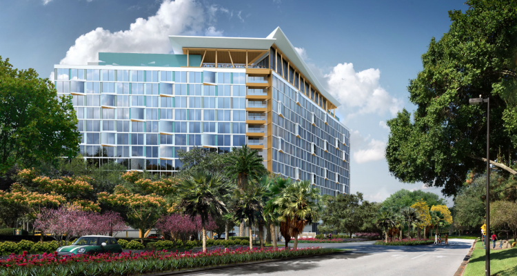
Interesting that the signage appears to say Walt Disney World Swan. Obviously that may just be concept art filler. But, it does make me wonder if we'll see the X at the Walt Disney World Swan or Walt Disney World X as the naming convention.

No, it just is appropriately named "WAN".
 

tonymu

Premium Member
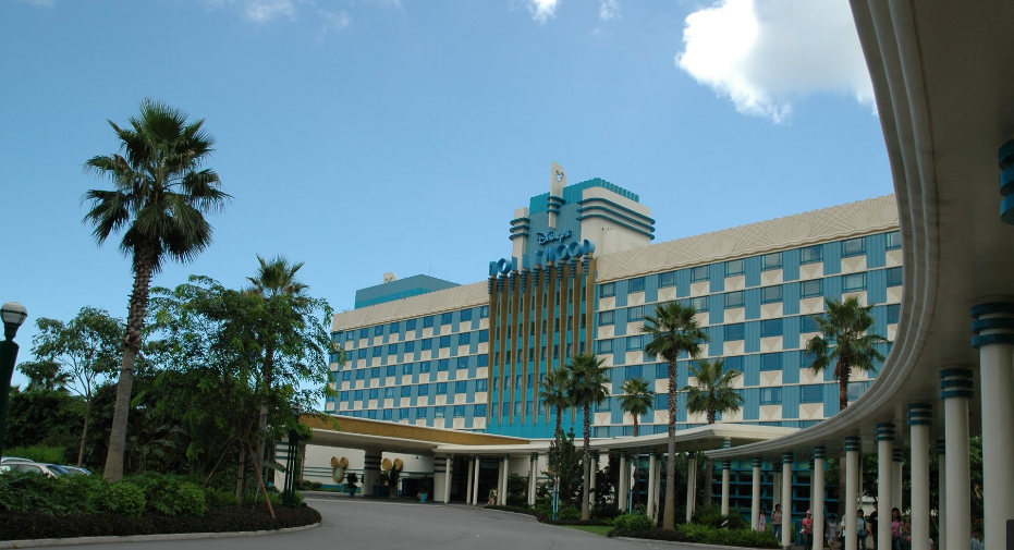
Why could they not design the third tower to fit in with the existing architecture making it look like a cohesive resort!? There are plenty of design elements in the existing Graves buildings that could have been lifted to at least give a nod to what is already built instead of building a big glass box that seems to have no connection whatsoever.
What are you talking about! They did! Look at that splash of Swolphin orange in the middle, top and under the balconies! It ties it all three structures together! ;):hungover::facepalm::cry:
 

Missing20K

Well-Known Member
I guess Tishman never gave up on building that standard convention hotel, and no one in management at Disney gives a crap. Wether you appreciate the Swan and Dolphin, you always think of WDW when you see them. Unlike this new box. Ugh.

The art was once valid it seems, but is old. It has been superceded by something a little more fitting. Not a Swolphin clone but something a bit better than the office block. Location and size is around the same.

Not sure. I thought they gave up too until I saw this artwork. @marni1971??
 

Bocabear

Well-Known Member
I like the new tower design much better than the existing ones. That being said I'm not architecture critic, but I don't see how the new tower ties at all into the existing ones? Glass and steel boxes versus concrete and circles.....
EXACTLY! You have a uniquely designed world class resort campus and you need to add a third tower....Seems like they would at least try to integrate into the existing style of the resort to make a cohesive property rather than a completely different plain glass box with a little embellishment. There are so many ways they could incorporate the new building into the fabric of the resort without even changing the basic box...Modify the top structure to more resemble the post-modernist Graves architecture, Use the exagerrated awning stripe motif used all over the resort...Waves, Palm leaves... a wealth of design inspirations right in front of them.
 

wdisney9000

Truindenashendubapreser
Premium Member
As a child, it was always such an inspiring sight to pass by the Swan and Dolphin when we arrived on property. Same for all of the themed resorts on property. Even as an adult, they have a, "you are at Disney!" emotional appeal. From the original monorail resorts to the later additions built in the Eisner years which all make pulling up to the resort an experience in itself, let alone walking in an being immersed in the theme, such as African savannas , turn of the century National Park lodges, Marthas Vineyard, The Caribbean, Louisiana, Polynesian, etc, etc.

Now we get The Riveria and this glass box resort which look like they will have the appeal of pulling up to an insurance company seminar at an airport hotel.
 

Bocabear

Well-Known Member
An Art Deco hotel would fit DHS....
Screenshot_23.png
 
Last edited:

Jambo Joe

Well-Known Member
Well this one is officially a head scratcher for me. I had hoped that they were revising this design but it appears not. Maybe it will be more interesting than it appears in the illustration but it certainly doesn’t seem to be at all engaged with the two existing towers. It’s also on the other side of a wide road and has no connection or view of Crescent Lake. Just seems like an isolated office building in any American suburb.
 

lazyboy97o

Well-Known Member
I really don’t think imitating Graves’ work would have been the appropriate way to expand the hotel complex. The Swan and Dolphin were conceived of together as whole and was organization in such a manner. Graves’ works is most recognizable for its aesthetic in elevation but it was also carefully crafted in plan. The Swan and Dolphin are a ver. An imitation off to the side would have looked just like that, a misplaced imitation trying desperately to fit in without really understanding how.
 

Lensman

Well-Known Member
Doing some research for work and this popped up. Apologies if it's already been posted but I had never seen this particular piece of concept art. From Tishman EDIT: (not from their website, apologies.)

sd_new_hotel.png
I join those above in their lack of enthusiasm for this design. The one nice feature is that I see that some of the rooms will have "wing" floor to ceiling windows where you get views in two directions. Here's an example of how that's used in a different building:
Screen Shot 2018-09-21 at 9.46.58 PM.png


Unfortunately, I don't think the view from the new hotel will be as nice.
 

build_it

Well-Known Member
I really don’t think imitating Graves’ work would have been the appropriate way to expand the hotel complex. The Swan and Dolphin were conceived of together as whole and was organization in such a manner. Graves’ works is most recognizable for its aesthetic in elevation but it was also carefully crafted in plan. The Swan and Dolphin are a ver. An imitation off to the side would have looked just like that, a misplaced imitation trying desperately to fit in without really understanding how.
I'm not suggesting an imitation - I'm talking essence of design. They could do something that's very current, but still pulls a lot of essence from the original works. Graves did that a lot himself with the additions he did to existing buildings. Easy things that could pull these together - some round windows - some color choices - some covered walkways - some overriding large scale geometrics or patterns. And his design group is still around, they could have easily hired them as a consultant (even if they had their own architects) to provide some design suggestions of how to add a third building that would work in harmony with the existing campus of buildings.
 

Lensman

Well-Known Member
I'm not suggesting an imitation - I'm talking essence of design. They could do something that's very current, but still pulls a lot of essence from the original works. Graves did that a lot himself with the additions he did to existing buildings. Easy things that could pull these together - some round windows - some color choices - some covered walkways - some overriding large scale geometrics or patterns. And his design group is still around, they could have easily hired them as a consultant (even if they had their own architects) to provide some design suggestions of how to add a third building that would work in harmony with the existing campus of buildings.
I wonder if someone decided to specify floor-to-ceiling windows, thus limiting the architectural options? Not saying that you can't do something interesting with floor to ceiling windows, just that it precludes a bunch of subclasses of post-modern. Economics also probably dictated the L shaped rectangular design on the limited footprint they had to work with, so we couldn't have any interesting shapes like the Swan or the Dolphin. It's unfortunate.
 

Register on WDWMAGIC. This sidebar will go away, and you'll see fewer ads.

Back
Top Bottom