-
Welcome to the WDWMAGIC.COM Forums!
Please take a look around, and feel free to sign up and join the community.
You are using an out of date browser. It may not display this or other websites correctly.
You should upgrade or use an alternative browser.
You should upgrade or use an alternative browser.
EPCOT Space 220 Restaurant dining experience at Epcot's Future World
- Thread starter wdwmagic
- Start date
No Name
Well-Known Member
This looks really great. Probably the best restaurant preshow I’ve seen. Maybe the only one I’ve seen. My only tiny complaint is that, in the elevator video, they didn’t have to be so transparent about the actual aerial view of the park, including showing that dang Guardians building. But nonetheless, this is truly something stellar that feels right at home at Epcot.
I hate to say it but I still see Star Trek TNG Enterprises Ten Forward lounge LOL. I think I might go up for a drink but I dont see it being all that. Maybe its just the fact that its new. The menu wasnt that exciting to me. I enjoy experience dining and done several of them, but maybe in person it looks better.
James Alucobond
Well-Known Member
I think it's actually kind of interesting how much of backstage they're willing to show. I don't have a problem with it, but it would be cool to see some sort of imaginary idealized version of backstage.My only tiny complaint is that, in the elevator video, they didn’t have to be so transparent about the actual aerial view of the park, including showing that dang Guardians building.
sedati
Well-Known Member
I know it's not as mind-blowing as beige paint or fonts on a trashcan or whatever it is that really inspires the EPCOT fans, but I'm excited.I think I might go up for a drink but I dont see it being all that.
Figments Friend
Well-Known Member
Looks cool.
Looking forward to honest reviews of the food ( paid off 'vloggers / bloggers' don't count ).
Tried for a reservations earlier today after the chaos passed this morning online but nothing coming up during my dates.
Will look again however next week.
Bonus consolation prize was scoring a unexpected reservation for San Angel Inn.
Totally unexpected.
In the 30+ years I have been going to Epcot, not once have I been able to dine here.
Mostly because of the limited menu choices for moi, and then in later years difficulty in getting a reservation.
So no disapointment here.
Space 220 looks to be a nice addition.
Will get to check it out eventually.

-
Looking forward to honest reviews of the food ( paid off 'vloggers / bloggers' don't count ).
Tried for a reservations earlier today after the chaos passed this morning online but nothing coming up during my dates.
Will look again however next week.
Bonus consolation prize was scoring a unexpected reservation for San Angel Inn.
Totally unexpected.
In the 30+ years I have been going to Epcot, not once have I been able to dine here.
Mostly because of the limited menu choices for moi, and then in later years difficulty in getting a reservation.
So no disapointment here.
Space 220 looks to be a nice addition.
Will get to check it out eventually.
-
MrPromey
Well-Known Member
I wonder if this is like what going to the starcruiser will be.Wonder if they would look into an upgrade later that would show close to real time cloud coverage. i.e hurricanes off the coast type deal.
Satans Hockey
Active Member
This looks fun, definitely on my list of things to do whenever we get back down there.
Not at all classy but I'd be amused by some sort of man vs food challenge, like the Mission Space Orange challenge where if you eat your entire meal and don't barf on Mission Space Orange you get a free meal or a free express pass for a ride lol
Not at all classy but I'd be amused by some sort of man vs food challenge, like the Mission Space Orange challenge where if you eat your entire meal and don't barf on Mission Space Orange you get a free meal or a free express pass for a ride lol
UNCgolf
Well-Known Member
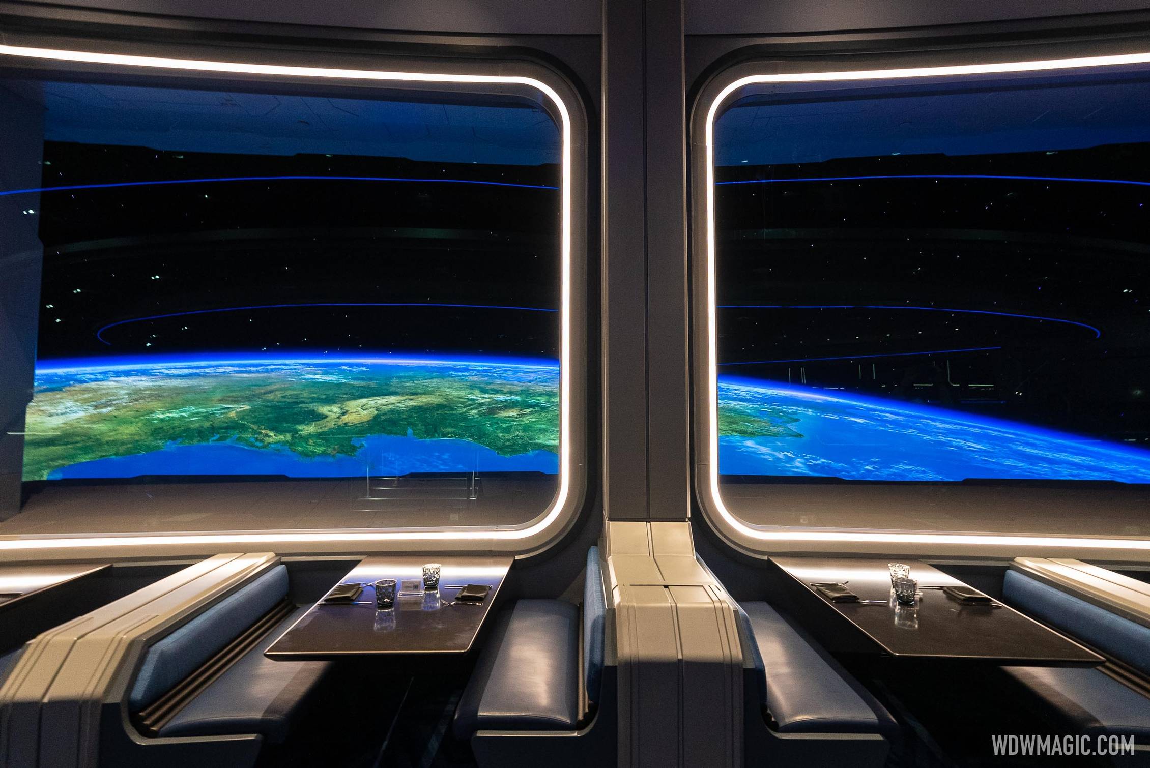
The CGI on the windows doesn't look as impressive as I'd hoped. I'm sure it looks different (and likely better) in person, but in the photos/videos I've seen it just doesn't look very realistic.
I'm not passing judgment until I see it in person (if I ever do), but I'm curious to hear how it looks from people who have been.
I'm not passing judgment until I see it in person (if I ever do), but I'm curious to hear how it looks from people who have been.
rkleinlein
Well-Known Member
Dinner is $320 plus tax for a family of four. Does anybody else think that's a bit steep?
Disstevefan1
Well-Known Member
I have just saw the YouTube videos. This looks GREAT! To me this is very EPCOT! I really want to experience this at least once. I honestly don't care what food is there, probably the same old stuff with space names.
Chi84
Premium Member
Apparently not, given the number of people who are trying to get reservations and being shut out.Dinner is $320 plus tax for a family of four. Does anybody else think that's a bit steep?
UNCgolf
Well-Known Member
This may be a minor detail to some, but for me the absence of the dim-glowing blue lighting in the dining room is very disappointing. It's one of the things that really screamed futuristic/space, and without it I think the atmosphere is really lacking.
That may be part of the reason the windows don't seem to work as well as they should for me. Of course I haven't seen it in person and it could be very different, but the lighting could definitely have an effect.
Lil Copter Cap
Well-Known Member
Having just dined at California Grill last night with four adults totaling $350....I would say $320 is steep for a CGI-based environment.Dinner is $320 plus tax for a family of four. Does anybody else think that's a bit steep?
BUT I find dinner at California Grill, an OG '71 location, with great views and fireworks to be worth the money. I'll give Space 220 a try, but I really can't see myself going more than once...(which may even be by design).
I suspect the lighting was modified due to reflection in the window. With the thin blue strip that was in the final version, it does reflect in the window. Not enough to be an issue, but I suspect the wide blue strip was too reflective.
You can see the reflection in this image.

You can see the reflection in this image.

brihow
Well-Known Member
I get that - what I was suggesting that if anything the lighting should be dimmer and just more blue. That would make reflections even less of an issue than they currently are.I suspect the lighting was modified due to reflection in the window. With the thin blue strip that was in the final version, it does reflect in the window. Not enough to be an issue, but I suspect the wide blue strip was too reflective.
Register on WDWMAGIC. This sidebar will go away, and you'll see fewer ads.
