-
Welcome to the WDWMAGIC.COM Forums!
Please take a look around, and feel free to sign up and join the community.
You are using an out of date browser. It may not display this or other websites correctly.
You should upgrade or use an alternative browser.
You should upgrade or use an alternative browser.
So, You Want to be an Imagineer Season 19 - Madcap Circus [CONCLUDED]
- Thread starter JokersWild
- Start date
AceAstro
Well-Known Member
The comic sans usage is an incredible choice.
@Pi on my Cake would be proud
TheOriginalTiki
Well-Known Member
Happening TONIGHT at 1AM Eastern/10PM Pacific. Written reviews and the first merge project will follow.
Everyone did something really cool and unique and interesting this round. We got different ride systems, presentation styles, and overall just another very strong round from everybody. Great job, everyone!!
Mickeynerd17
Well-Known Member
Happening TONIGHT at 1AM Eastern/10PM Pacific. Written reviews and the first merge project will follow.
*Fear Intensifies*
TheOriginalTiki
Well-Known Member
Marriage update incoming...it's not good
Season 19, Act Eight: The Delightfully Different Dark Ride Suite
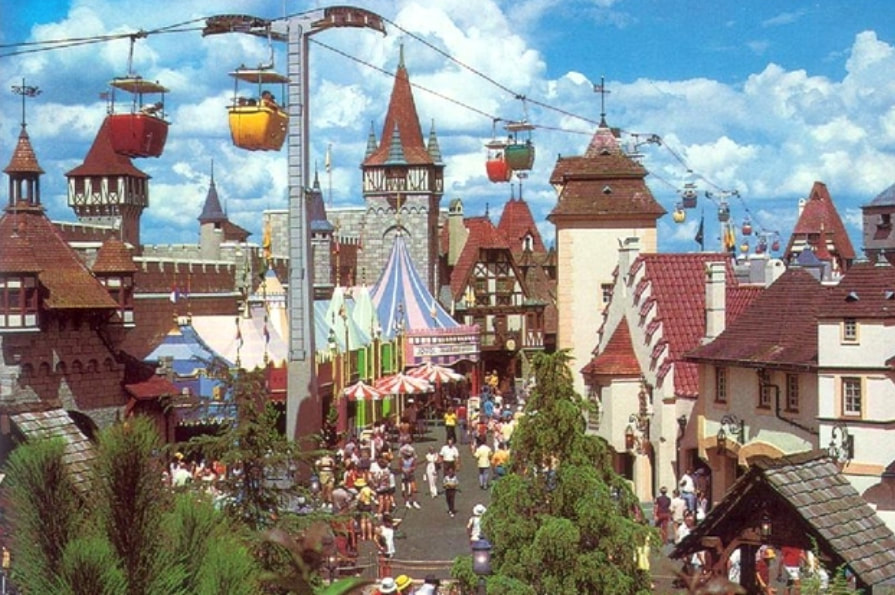
In celebration of Walt Disney World's 50th Anniversary, let's go back to 1971. Attempting to recapture the magic of the original Disneyland, WDI updated three Fantasyland classics based on three classic themes:
Snow White's Scary Adventures - the scary ride
Peter Pan's Flight - the beautiful ride
Mr. Toad's Wild Ride - the wacky/ thrilling ride
Your challenge is to raze these classic attractions and create three new dark rides for 1971 Fantasyland using each of the three themes: scary, beautiful, and wacky. Your attractions can be based upon any Disney IP from and before 1971 with the exception of the IPs that WDI had intended to use in Magic Kingdom during development:
The Legend of Sleepy Hollow
Mary Poppins
Sleeping Beauty
Snow White
Peter Pan
Mr. Toad
This project is due Saturday, July 17th at 11:59pm EST/ 8:59pm PST.
monkey92514
Well-Known Member
Thanks for having me, it was good to do this again 
I'm gonna jokingly blame my elimination on Greg. (seriously, I can't be the only person in this world who disliked him, right?)
I'm gonna jokingly blame my elimination on Greg. (seriously, I can't be the only person in this world who disliked him, right?)
Chaos Cat
Well-Known Member
Yeah, screw Greg!Thanks for having me, it was good to do this again
I'm gonna jokingly blame my elimination on Greg. (seriously, I can't be the only person in this world who disliked him, right?)
...who's Greg?
TheOriginalTiki
Well-Known Member
Avatar teaser for project nine now up.
AceAstro
Well-Known Member
I wonder how this looks...Season 19, Act Eight: The Delightfully Different Dark Ride Suite

In celebration of Walt Disney World's 50th Anniversary, let's go back to 1971. Attempting to recapture the magic of the original Disneyland, WDI updated three Fantasyland classics based on three classic themes:
Snow White's Scary Adventures - the scary ride
Peter Pan's Flight - the beautiful ride
Mr. Toad's Wild Ride - the wacky/ thrilling ride
Your challenge is to raze these classic attractions and create three new dark rides for 1971 Fantasyland using each of the three themes: scary, beautiful, and wacky. Your attractions can be based upon any Disney IP from and before 1971 with the exception of the IPs that WDI had intended to use in Magic Kingdom during development:
The Legend of Sleepy Hollow
Mary Poppins
Sleeping Beauty
Snow White
Peter Pan
Mr. Toad
This project is due Saturday, July 17th at 11:59pm EST/ 8:59pm PST.
monkey92514
Well-Known Member
From "Over the Garden Wall" haha...who's Greg?
Roster updated. Don't forget to submit a new team logo if anyone would like to try their hand.
TheOriginalTiki
Well-Known Member
From "Over the Garden Wall" haha
Can ya add this to the brainstorming thread.
tcool123
Well-Known Member
Oooooo I can't wait to see what y'all turn out! This was honestly my favorite challenge from SYWTBAI Purists vs Traditionalists! (If only I actually finished what I summittedSeason 19, Act Eight: The Delightfully Different Dark Ride Suite

In celebration of Walt Disney World's 50th Anniversary, let's go back to 1971. Attempting to recapture the magic of the original Disneyland, WDI updated three Fantasyland classics based on three classic themes:
Snow White's Scary Adventures - the scary ride
Peter Pan's Flight - the beautiful ride
Mr. Toad's Wild Ride - the wacky/ thrilling ride
Your challenge is to raze these classic attractions and create three new dark rides for 1971 Fantasyland using each of the three themes: scary, beautiful, and wacky. Your attractions can be based upon any Disney IP from and before 1971 with the exception of the IPs that WDI had intended to use in Magic Kingdom during development:
The Legend of Sleepy Hollow
Mary Poppins
Sleeping Beauty
Snow White
Peter Pan
Mr. Toad
This project is due Saturday, July 17th at 11:59pm EST/ 8:59pm PST.
Will definitely watch the brainstorming thread for this challenge just to see what y'all come with it
Last edited:
TheOriginalTiki
Well-Known Member
Hey guys, just some general housekeeping mostly in regards to the powers that are still out there. I said on the podcast last night that the last time the people holding onto the Diamond and Golden PoMVPs can use them is Project Ten. After doing some math @JokersWild and I decided to slot in an additional lightning round as opposed to a post-merge double elimination, bumping the final time you can use these powers to Project 11. In addition, @ThemeParkPriest has received the Nomination Swapper via Walt's Vault which gives him the power to swap out one nomination BESIDES himself. Project 11 will also be the last time this power can be used. Alright we good? We good!
spacemt354
Chili's
Project 7 Reviews
Just to briefly comment I've only seen Over the Garden Wall, and a few episodes of Adventure Time. So other than OTGW I'll assume everything follows through with what the show is about and focus more on the overall vibe of the attraction itself.
This was a pretty creative attraction! The ride review style to the presentation makes it stand out for sure, but I don't think it would have been my choice for how to present this project. Instead I probably would have liked to see a bit more of a formal imagineering presentation, because naturally a review done by the team is going to say the project is amazing, but if you wanted to go with the review format, it would have been cool to have a testimonial attached with the full presentation from an outside member of the forum or friend giving a review of the attraction. Nonetheless, you were at least consistent with the first person perspective throughout the presentation and I could still follow along with what was happening throughout the attraction, but one of the downsides to a first-person review is some of the technical aspects like the Ride System, Ride Stats, and other elements aren't able to be written, and the attraction map feels out of place as how would a reviewer(s) acquire that interior design info of the building?
But let's get back to the positives I especially love how colorful this entire attraction is. You captured the spirit and energy of Adventure Time and the Land of Ooo very well and the transitions of scenes and characters was expertly accomplished. I recall seeing the AT attraction you were observing the ride-through of in the brainstorming and you definitely took the issues with it and fixed them ten-fold with this attraction. Also I think your location was well chosen and you all did well respecting the source material in that regard. In addition everyone on this team truly held their own weight and contributed to the project which was great to see!
Overall, this team I feel has improved each week not only as a team but individually as well trying to branch out, and I hope you take that energy with you going forward not only in the game but also in other endeavors as well!
Creativity - 10/10
Realism - 9/10
Detail - 8/10
Presentation - 8/10
Teamwork - 10/10
--------------------------
Total: 45/50
Off the bat I loved the concept of an autumn park, yet I wasn't a huge fan of the placement in Salem, MA. Having been there a few times myself, while it's possible to have a theme park there, it absolutely wouldn't be in Salem, as there's no room, so more than likely it would be in another town. Which at that point, it could have been in Anywhere, USA. Or perhaps a boutique park expansion at Six Flags New England? I do appreciate the inventiveness and alternate timeline stuff, but even then I wasn't sure on the Salem choice despite the obvious Halloween/Witch Trials/Hauntings associations.
I love the book format as well as the music as I'm listening to the playlist as typing this. While it is definitely a melancholy show I wouldn't expect from CN, it has a very distinct style all it's own that makes it ripe for a theme park attraction such as this. I also love the custom artwork attempts for the ride vehicle among others throughout the project! Especially the Woodsman too. Overall the attraction is super detailed and well written. I felt very comfortable transitioning from one scene to the next and the visuals felt like they capture the miniseries well. And once again I think the presentation itself and the accompanying music sets it over the top. (or should I say over the garden wall?). One last thing to add, everyone did a great job contributing to the project as well. Naturally some did more than others when it came to the actual write-up but overall everyone did their part in researching the show and trying their best to come up with the best possible attraction in my opinion.
Creativity - 10/10
Realism - 8/10
Detail - 10/10
Presentation - 9/10
Teamwork - 10/10
---------------------
Total: 47/50
 An interactive presentation! Holy Toledo! I think I've clicked through it a few times now. Getting to the location itself I think USH is a good place for this as something more experimental would be good to be placed there first before possibly being duplicated to the other parks. Overall I like how you introduced the characters especially for folks who have never seen the show. I also really like how the attraction is set up with the switching tracks and different formats. While the concept seemed fairly basic on ride, you did a wonderful job of having the user/reader feel like they are demoing the attraction. Stuff like that to me gives a sense of realism by allowing you to feel how the attraction will actually be like rather than passively reading it. Incredible artwork here as well by @Brer Panther - who has really become a powerhouse artist on these forums! It's something that especially in these team games makes the team elevate that much higher when there's wonderful artwork involved. The artwork from @Tegan pilots a chicken as always was also very good, especially the interactive map!
The only nitpicks I might have with this would be a lot of the presentation was set on the interactivity and the ride itself, I would have liked a little bit more buildup to the attraction, meaning like it just kinda jumped right into the ride, would there have been anything in a queue to help? Is Kelsie in the queue? Those intro elements are really the only things I would say that are 'missing' other than that this project is truly one for the record books.
Creativity - 10/10
Realism - 9/10
Detail - 9/10
Presentation - 10/10
Teamwork - 10/10
----------------------
Total: 48/50
Just to briefly comment I've only seen Over the Garden Wall, and a few episodes of Adventure Time. So other than OTGW I'll assume everything follows through with what the show is about and focus more on the overall vibe of the attraction itself.
Team Ringling - Adventure Time
This was a pretty creative attraction! The ride review style to the presentation makes it stand out for sure, but I don't think it would have been my choice for how to present this project. Instead I probably would have liked to see a bit more of a formal imagineering presentation, because naturally a review done by the team is going to say the project is amazing, but if you wanted to go with the review format, it would have been cool to have a testimonial attached with the full presentation from an outside member of the forum or friend giving a review of the attraction. Nonetheless, you were at least consistent with the first person perspective throughout the presentation and I could still follow along with what was happening throughout the attraction, but one of the downsides to a first-person review is some of the technical aspects like the Ride System, Ride Stats, and other elements aren't able to be written, and the attraction map feels out of place as how would a reviewer(s) acquire that interior design info of the building?
But let's get back to the positives I especially love how colorful this entire attraction is. You captured the spirit and energy of Adventure Time and the Land of Ooo very well and the transitions of scenes and characters was expertly accomplished. I recall seeing the AT attraction you were observing the ride-through of in the brainstorming and you definitely took the issues with it and fixed them ten-fold with this attraction. Also I think your location was well chosen and you all did well respecting the source material in that regard. In addition everyone on this team truly held their own weight and contributed to the project which was great to see!
Overall, this team I feel has improved each week not only as a team but individually as well trying to branch out, and I hope you take that energy with you going forward not only in the game but also in other endeavors as well!
Creativity - 10/10
Realism - 9/10
Detail - 8/10
Presentation - 8/10
Teamwork - 10/10
--------------------------
Total: 45/50
Team Bailey - Over the Garden Wall
Off the bat I loved the concept of an autumn park, yet I wasn't a huge fan of the placement in Salem, MA. Having been there a few times myself, while it's possible to have a theme park there, it absolutely wouldn't be in Salem, as there's no room, so more than likely it would be in another town. Which at that point, it could have been in Anywhere, USA. Or perhaps a boutique park expansion at Six Flags New England? I do appreciate the inventiveness and alternate timeline stuff, but even then I wasn't sure on the Salem choice despite the obvious Halloween/Witch Trials/Hauntings associations.
I love the book format as well as the music as I'm listening to the playlist as typing this. While it is definitely a melancholy show I wouldn't expect from CN, it has a very distinct style all it's own that makes it ripe for a theme park attraction such as this. I also love the custom artwork attempts for the ride vehicle among others throughout the project! Especially the Woodsman too. Overall the attraction is super detailed and well written. I felt very comfortable transitioning from one scene to the next and the visuals felt like they capture the miniseries well. And once again I think the presentation itself and the accompanying music sets it over the top. (or should I say over the garden wall?). One last thing to add, everyone did a great job contributing to the project as well. Naturally some did more than others when it came to the actual write-up but overall everyone did their part in researching the show and trying their best to come up with the best possible attraction in my opinion.
Creativity - 10/10
Realism - 8/10
Detail - 10/10
Presentation - 9/10
Teamwork - 10/10
---------------------
Total: 47/50
Team Barnum - Infinity Train
The only nitpicks I might have with this would be a lot of the presentation was set on the interactivity and the ride itself, I would have liked a little bit more buildup to the attraction, meaning like it just kinda jumped right into the ride, would there have been anything in a queue to help? Is Kelsie in the queue? Those intro elements are really the only things I would say that are 'missing' other than that this project is truly one for the record books.
Creativity - 10/10
Realism - 9/10
Detail - 9/10
Presentation - 10/10
Teamwork - 10/10
----------------------
Total: 48/50
Disney Warrior
Well-Known Member
I’m gonna wait until the Fantasyland round is finished to do guest reviews (since it is a more familiar topic). Don’t bet on me doing it, as It Can Always be Worse will be happening, and that may take up some of my time
Pi on my Cake
Well-Known Member
- In the Parks
- Yes
Comic Sans AND Infinity Train! Thank you for making a project specifically catered to my interests lol
I'm in Maryland visiting family (first vacation since the pandemic! Mostly just chilling in houses with family, but at least it is different houses lol), but tonight after the older fam heads to bed I gotta check it out!
Brer Panther
Well-Known Member
Was I eliminated?
Register on WDWMAGIC. This sidebar will go away, and you'll see fewer ads.
