So, You Want to be an Imagineer Season 19 - Madcap Circus [CONCLUDED]

spacemt354

Chili's
Space's Guest Reviews:

Team Barnum - Super Pets Plaza

The first few days of this team's PM reminded me of Team Reality and it's hilarious how your logo reflects that. The team was off to the races with ideas lead by Tegan beautifully. Every way able to contribute to the concept design and come to a consensus relatively early in this timeframe. That may have hurt or helped you depending on perspective because I was taking the 'wait and see' approach when thinking about how this would fit into the park. But I must say you all did this wonderfully. The incorporation of Super Pets into a rotating theater type show was a super unique way of tackling this project. And while the presentation itself was solid, for some reason the colors chosen here really jumped out of the screen while reading and I just wanted to echo how much I enjoyed that color choice. Also the character animation images were so well done!

Overall, while this is more of a broad stroked review from the surface level, I think this was a very strong showing for many folks of which this is their first time playing in SYWTBAI. Especially to be lead by Tegan as well, it's a juggling act of styles that you have to balance but I think this team is going to be a contender going forward!

Creativity - 9/10
Realism - 8.5/10
Detail - 9/10
Presentation - 9/10
Teamwork - 10/10
-----------------------------------
Total: 45.5/50 =
+5
= 50.5/50 = 101%

Team Bailey - Pacific Point

As soon as this one was an animal based project it was no doubt PerGron would have an advantage in both the knowledge and experience field having ridden zoologic projects all the way to victory in 1986 last season. That said as a team based comp anything is possible but it did help despite some of the team delays that the project stayed on focus and produced one of the most detailed magazine presentations I've seen.

I can't really comment on the authenticity of all the advertisement animal contents scattered throughout the magazine, and while they may have been a bit too distracting for my taste from the project itself, it definitely added to the realism effect and deserves recognition for feeling so real...as if I'm actually reading an online magazine. It's insane!

As for the project itself, SeaWorld would probably have been my pick for this as well, albeit the 2nd tier which may or may not come back to haunt the team considering the other teams went with a riskier Tier. Nevertheless, I loved the restaurants and menus great job to both Sharon and Shannon - you really did amazing with those. Overall there was a lot to this project that perhaps I can come back to in more depth if you'd like later in the week, but for now my general impression is this is a lot to digest, but when you take the time and read the individual pieces, it very much feels like even one or two of these could have been submitted as the project and it would have been sufficient. That's a tribute to how much people are invested in the project however, but just try to b cognizant of what you're trying to highlight vs what is secondary, because reading this everything felt like it was at the same level of importance when drowns out potentially more important items from the reader.

Creativity - 9/10
Realism - 10/10
Detail - 10/10
Presentation - 10/10
Teamwork - 8/10
-----------------------------------
Total: 47/50
+3
= 50/50 = 100%

Team Ringling - Looney Tunes Discovery Trail

Off the bat something as simple as converting a powerpoint into a youtube video makes the project stand out on its own. I love unique presentations and formats and that conversion really isn't too taxing but it allows you to put music behind to envelop the reader in the ambiance of what you're trying to create - in this case Looney Tunes!

While the LT IP in and of itself is pretty standard for Six Flags related park projects, the execution of it is what counts. And I think everything about this is pretty realistic, I have a hard time deciphering what wouldn't be possible from this presentation, albeit with the budget supplied. Each component in this flowed naturally and it came from a brainstorming from the top down from Outbound that was organized, efficient, and ran like clockwork throughout the brainstorming phase and into the production phase. The custom art and Minecraft was also such a delightful touch. Overall the exhibits on the trail, again while a bit predictable being Looney Tunes, incorporated the IP in a way that made it feel special and unique among the other Looney Tunes areas in Six Flags parks.

Creativity - 8/10
Realism - 10/10
Detail - 9/10
Presentation - 10/10
Teamwork - 9/10
-----------------------------------
Total: 46/50
+5
= 51/50 = 102%
 

TheOriginalTiki

Well-Known Member
I'd like to give everyone a big thanks to a very successful first project. Going with animals was a bit niche as a jumping off point. We did it for the primary reason of the "Animal March" theme, but I would be lying if I said Lost Kingdoms from 1986 wasn't also an inspiration to see what ya'll could come up with next. Generally speaking I loved all three of the projects to come out of this, with each scoring above 45/50 when factoring in bonus points. One really cool thing to highlight is that I gave each team one 10/10, each in a different category.

Team Barnum blew me away with how great they worked as a unit with @Tegan pilots a chicken being a genuinely wonderful team leader. Those hand-written notes were straight up motivational even for me haha ;) :) @PerGron blew it out of the park for his team on the realism side of things. I mean, it's PerGron and animals, what more really needs to be said. Meanwhile @Outbound and company continue the #GameChanger mentality when it came to presentation with a genuinely fun video that was very easy to digest and kept in tone with the Looney Tunes source material. VERY interesting to see each of the three teams excel in entirely different ways. Only time will tell which team will have the edge but as of right now it's a super close race in my book.

Let's start with Team Barnum (I promise I'll update this post with logos soon. Just want to crack out feedback before I fall asleep)

So yea, as mentioned the teamwork this round was incredible. Big shoutout to @monkey92514 for a super strong first round after a modest Project Zero. The chemistry between Tegan and Monkey is just as great as I thought it'd be and I'm really happy I put them on the same team. Beyond those two everyone made sure to contribute their own piece and shine in their own way, and that's exactly what gives a team a 10/10 score in the team work department. As for the project, I was nervous about the Carousel theater. I really was. I thought it was something sort of outside the bounds of what the park would do. As soon as I started reading and realized how you implemented the elaborate yet practical pet habitats that would be super entertaining and educational at the same time, with the mix of great character tie ins, the whole concept became a chef's kiss. Not the most realistic ride system in the world for the park, but an attraction that overall speaks to the park's vibe. The attached exhibit was icing on the cake.

Then the project kept going...and this is sort of where I started to have a problem. Location is key here. I'm curious if @monkey92514 saw one of my Discovery Kingdom vlogs when he cited Monsoon Falls as a footprint, as I've cited that location as prime real estate for a front of the park coaster multiple times on the channel. Here's the thing though...it IS prime real estate for a coaster. I really think the Sea Lion stadium would have been a far better move as a location goes. You could have expanded things more naturally into the Discovery Cove section of the park and there would have been an overall bigger footprint to work with. The Monsoon Falls footprint as it stands is not very big. It'd be able to fit the carousel theater and attached exhibit fine, but honestly not much else if you're keeping the sea lion stadium as is.

@monkey92514 and @NateD1226 had some KILLER writing on the attached show, but I just don't see the space in my head for it let alone the shopping and dining. This is the risk ya'll took with Discovery Kingdom. Ya knew I was gonna be picky when it came to realism haha. ;) One note of realism I should add though is that I had to laugh when it was briefly suggested to move Flash. Let me paint a picture here. Flash goes RIGHT over the main entrance to the park. It's been a fixture of the park's main entrance for almost two decades. The ride has a ton of mechanical problems and I see it getting removed sooner rather than later (I was honestly surprised that wasn't where the inevitable S&S freespin ended up), the idea of physically moving it to another area of the park was just amusing to me. It'd be like moving Gatekeeper into a random plot of Cedar Point parking lot. Good call not going that route. :hilarious::hilarious:

Creativity 9/10
Detail 8/10
Realism 7/10
Presentation 8/10
Team Work 10/10
+5 bonus points
Total: 47/50

Team Bailey is up next and...this was a lot to take in. Mostly in the best kind of ways. I'll start with the downsides first and get them out of the way, because overall while I'd rank this as the Bronze out of the three it's still a shiny, really nice looking Bronze that ya'll should be proud of. I think my biggest issue with this team just in general was in the group work department. Don't get me wrong, everyone did get stuff to do for the most part, but I felt a distinct sense of "this is PerGron's baby, so were just going to let him do what he wants". I want to make it clear, that's not inherently bad. It was an obvious call to make PerGron team leader on this and I really don't think he did anything bad at all when it came to his leadership.

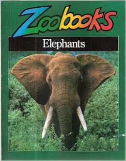
On the contrary he handled the situation with @1HAPPYGHOSTHOST being way over their head as a first timer to the game with professionalism and class. It's just the fact that I didn't feel any sort of distinct voice outside of PerGron's that your team score is a little low. He clearly had the lion's share of the work more so than the other project leaders from what I could tell. Another nitpick that I have to address is text size. Yes, this comes down to a "Tiki is a Boomer" thing haha. But honestly I would have loved to have given presentation a 10 here but the text was just small enough that I either had to get really close to my computer to read, or zoom in and scroll around to read. Neither of those were ideal options. World's smallest violin, I know. The magazine format was overall great, but come on man, it's all about the ZOOBOOKS. This is probably too much of a free hint but I'd love to see what @PerGron could do with that as a format.

51nkEpbfFBL._SX258_BO1,204,203,200_.jpg


Positives. there's a lot here. TONS of detail, and the realism is absolutely freaking on point. At this stage I'm just taking PerGron's word when it comes to the conservation stuff as I think it's safe to say he knows better than all of us. With that in mind the amount of care and effort put into tiny details of the project to make it environmentally friendly was honestly a "Game Changer" of its own right when it comes to perfecting the realism score. For my money I don't think any project in the history of the game has earned a 10/10 for realism as much as this one. Creatively I'm not gonna lie...it's just a tad bit on the dry side. With that in mind it's dry in a very realistic SeaWorld eductainment type of way. One of the big observations with the gameplay of SYWTBAI's rubric is the general rule of thumb that the less you score for creativity the more you score for realism and vice versa. This project is a testament to that to some extent, but the creativity was definitely still there. My favorite touch was the sea-through ( ;) ) walkways that were both practical and great from a kinetic visuals point of view. Very strong naturalistic little details compliment everything really well, and give the whole thing a strong sense of place that makes me excited for PerGron's future career as SeaWorld's creative director. ;)

Creativity: 8/10
Detail: 9/10
Realism: 10/10
Presentation: 8.5/10
Group Work: 7.5/10
+3 Bonus Points
Total: 47/50

Lastly we have Team Ringling. This was a really interesting case. BY FAR the most activity in the clubhouse threads, by far the least activity in the overall brainstorming. With all that said you all didn't really need that much in the way of brainstorming because the idea came together really naturally and everyone on the team did a solid job pulling their parts together. Presentation wise, while I wouldn't call this a mindblower on the same level of Stereotypical Aussie Minecraft Youtuber, it was still enough to pull in a solid 10/10. You know what I love about it as a judge who's very much in the "Trying to be Mr. Adult Man" phase of his life? Brevity. I will always appreciate detail that that's definitely the lowest scoring component here, but I think the super easy to digest video format more than makes up for it and swings the scales back in your direction as my favorite of the three projects.

Of course choosing my home park didn't hurt. An interesting conundrum that comes up comparing the two Discovery Kingdom projects is that on a whole I think Team Barnum's had more creative flair, but Team Ripley's was a much more realistic and modest proposal in a really good way. All in all I appreciate the fact that this was the only team to not color outside the lines when it came to what was actually asked of with this project. Don't get me wrong, I appreciate all the extra side stuff from the other teams and totally get why you would want that to make sure everyone in a group setting stands out. With all that said, there's something really refreshing about a strictly meat and potatoes type of project that sticks to the basic as far as the actual content of the prompt is concerned. One thing I really want to spotlight here is location. Ya'll...I don't even think you REALIZE how good of a location this is for the park. Honestly, it fits in super well and I'm really happy with it. Let me just list some bullet points for why it's a great choice.

-The WHOLE back area of the park hugging the ski stadium is pretty much a dead zone. You picked wisely as far as utilizing space people either wouldn't miss or just isn't being used.

-Kinetic as hell tie in with the nearby Looney Tunes Seaport

-Brings land mammal exhibits to this side of the park. A major plus considering all the other ones are segregated to a sad back corner that will hopefully get some new life once the new wild mouse eventually opens back there.

So let's go through those three bullet points. Great use of dead space as I said. The walrus encounter is on its last legs and it wouldn't surprise me at all to see the park move the remaining walruses they do have to an aquarium or something. With that out of the way, you legitimately do have a ton of space to work with that would be really well utilized. The whole "Trail" element is honestly really on brand for how the park used to do their animal trails. This is a detail I doubt was intentional from anyone but as someone who grew up with the park in its pre-rides "Africa USA" days the overall pacing and vibe felt like a total throwback. The use of the Looney Tunes IP was fantastic and there were just enough creative touches for it to feel engaging without being invasive.

Lastly, as I mentioned...I really do think it's important that if the park wants to continue using animals as a selling point that they diversify their experiences. The new reptile house and themed queue for Sidewinder Safari promises to be a great step in the right direction, but something as simple as one land mammal exhibit away from the Sidewinder corner of the park would go a long way to making the overall roster feel more whole the and the park layout more diverse. With excellent pacing in the presentation and a ton of solid ideas, this team really brought it home for me in spite of how quiet they were on the brainstorming front.

Creativity: 9/10
Detail: 8/10
Realism: 9/10
Presentation: 10/10
Group Work: 8/10
+5 Bonus Points
Total: 49/50​
 
Last edited:

TheOriginalTiki

Well-Known Member
I like how an M&M Stairs joke of all things buried my feedback haha. Reposting so it's easy to find at the top of the page.

I'd like to give everyone a big thanks to a very successful first project. Going with animals was a bit niche as a jumping off point. We did it for the primary reason of the "Animal March" theme, but I would be lying if I said Lost Kingdoms from 1986 wasn't also an inspiration to see what ya'll could come up with next. Generally speaking I loved all three of the projects to come out of this, with each scoring above 45/50 when factoring in bonus points. One really cool thing to highlight is that I gave each team one 10/10, each in a different category.

Team Barnum blew me away with how great they worked as a unit with @Tegan pilots a chicken being a genuinely wonderful team leader. Those hand-written notes were straight up motivational even for me haha ;) :) @PerGron blew it out of the park for his team on the realism side of things. I mean, it's PerGron and animals, what more really needs to be said. Meanwhile @Outbound and company continue the #GameChanger mentality when it came to presentation with a genuinely fun video that was very easy to digest and kept in tone with the Looney Tunes source material. VERY interesting to see each of the three teams excel in entirely different ways. Only time will tell which team will have the edge but as of right now it's a super close race in my book.

Let's start with Team Barnum (I promise I'll update this post with logos soon. Just want to crack out feedback before I fall asleep)

So yea, as mentioned the teamwork this round was incredible. Big shoutout to @monkey92514 for a super strong first round after a modest Project Zero. The chemistry between Tegan and Monkey is just as great as I thought it'd be and I'm really happy I put them on the same team. Beyond those two everyone made sure to contribute their own piece and shine in their own way, and that's exactly what gives a team a 10/10 score in the team work department. As for the project, I was nervous about the Carousel theater. I really was. I thought it was something sort of outside the bounds of what the park would do. As soon as I started reading and realized how you implemented the elaborate yet practical pet habitats that would be super entertaining and educational at the same time, with the mix of great character tie ins, the whole concept became a chef's kiss. Not the most realistic ride system in the world for the park, but an attraction that overall speaks to the park's vibe. The attached exhibit was icing on the cake.

Then the project kept going...and this is sort of where I started to have a problem. Location is key here. I'm curious if @monkey92514 saw one of my Discovery Kingdom vlogs when he cited Monsoon Falls as a footprint, as I've cited that location as prime real estate for a front of the park coaster multiple times on the channel. Here's the thing though...it IS prime real estate for a coaster. I really think the Sea Lion stadium would have been a far better move as a location goes. You could have expanded things more naturally into the Discovery Cove section of the park and there would have been an overall bigger footprint to work with. The Monsoon Falls footprint as it stands is not very big. It'd be able to fit the carousel theater and attached exhibit fine, but honestly not much else if you're keeping the sea lion stadium as is.

@monkey92514 and @NateD1226 had some KILLER writing on the attached show, but I just don't see the space in my head for it let alone the shopping and dining. This is the risk ya'll took with Discovery Kingdom. Ya knew I was gonna be picky when it came to realism haha. ;) One note of realism I should add though is that I had to laugh when it was briefly suggested to move Flash. Let me paint a picture here. Flash goes RIGHT over the main entrance to the park. It's been a fixture of the park's main entrance for almost two decades. The ride has a ton of mechanical problems and I see it getting removed sooner rather than later (I was honestly surprised that wasn't where the inevitable S&S freespin ended up), the idea of physically moving it to another area of the park was just amusing to me. It'd be like moving Gatekeeper into a random plot of Cedar Point parking lot. Good call not going that route. :hilarious::hilarious:

Creativity 9/10
Detail 8/10
Realism 7/10
Presentation 8/10
Team Work 10/10
+5 bonus points
Total: 47/50

Team Bailey is up next and...this was a lot to take in. Mostly in the best kind of ways. I'll start with the downsides first and get them out of the way, because overall while I'd rank this as the Bronze out of the three it's still a shiny, really nice looking Bronze that ya'll should be proud of. I think my biggest issue with this team just in general was in the group work department. Don't get me wrong, everyone did get stuff to do for the most part, but I felt a distinct sense of "this is PerGron's baby, so were just going to let him do what he wants". I want to make it clear, that's not inherently bad. It was an obvious call to make PerGron team leader on this and I really don't think he did anything bad at all when it came to his leadership.

On the contrary he handled the situation with @1HAPPYGHOSTHOST being way over their head as a first timer to the game with professionalism and class. It's just the fact that I didn't feel any sort of distinct voice outside of PerGron's that your team score is a little low. He clearly had the lion's share of the work more so than the other project leaders from what I could tell. Another nitpick that I have to address is text size. Yes, this comes down to a "Tiki is a Boomer" thing haha. But honestly I would have loved to have given presentation a 10 here but the text was just small enough that I either had to get really close to my computer to read, or zoom in and scroll around to read. Neither of those were ideal options. World's smallest violin, I know. The magazine format was overall great, but come on man, it's all about the ZOOBOOKS. This is probably too much of a free hint but I'd love to see what @PerGron could do with that as a format.

51nkEpbfFBL._SX258_BO1,204,203,200_.jpg


Positives. there's a lot here. TONS of detail, and the realism is absolutely freaking on point. At this stage I'm just taking PerGron's word when it comes to the conservation stuff as I think it's safe to say he knows better than all of us. With that in mind the amount of care and effort put into tiny details of the project to make it environmentally friendly was honestly a "Game Changer" of its own right when it comes to perfecting the realism score. For my money I don't think any project in the history of the game has earned a 10/10 for realism as much as this one. Creatively I'm not gonna lie...it's just a tad bit on the dry side. With that in mind it's dry in a very realistic SeaWorld eductainment type of way. One of the big observations with the gameplay of SYWTBAI's rubric is the general rule of thumb that the less you score for creativity the more you score for realism and vice versa. This project is a testament to that to some extent, but the creativity was definitely still there. My favorite touch was the sea-through ( ;) ) walkways that were both practical and great from a kinetic visuals point of view. Very strong naturalistic little details compliment everything really well, and give the whole thing a strong sense of place that makes me excited for PerGron's future career as SeaWorld's creative director. ;)

Creativity: 8/10
Detail: 9/10
Realism: 10/10
Presentation: 8.5/10
Group Work: 7.5/10
+3 Bonus Points
Total: 47/50

Lastly we have Team Ringling. This was a really interesting case. BY FAR the most activity in the clubhouse threads, by far the least activity in the overall brainstorming. With all that said you all didn't really need that much in the way of brainstorming because the idea came together really naturally and everyone on the team did a solid job pulling their parts together. Presentation wise, while I wouldn't call this a mindblower on the same level of Stereotypical Aussie Minecraft Youtuber, it was still enough to pull in a solid 10/10. You know what I love about it as a judge who's very much in the "Trying to be Mr. Adult Man" phase of his life? Brevity. I will always appreciate detail that that's definitely the lowest scoring component here, but I think the super easy to digest video format more than makes up for it and swings the scales back in your direction as my favorite of the three projects.

Of course choosing my home park didn't hurt. An interesting conundrum that comes up comparing the two Discovery Kingdom projects is that on a whole I think Team Barnum's had more creative flair, but Team Ripley's was a much more realistic and modest proposal in a really good way. All in all I appreciate the fact that this was the only team to not color outside the lines when it came to what was actually asked of with this project. Don't get me wrong, I appreciate all the extra side stuff from the other teams and totally get why you would want that to make sure everyone in a group setting stands out. With all that said, there's something really refreshing about a strictly meat and potatoes type of project that sticks to the basic as far as the actual content of the prompt is concerned. One thing I really want to spotlight here is location. Ya'll...I don't even think you REALIZE how good of a location this is for the park. Honestly, it fits in super well and I'm really happy with it. Let me just list some bullet points for why it's a great choice.

-The WHOLE back area of the park hugging the ski stadium is pretty much a dead zone. You picked wisely as far as utilizing space people either wouldn't miss or just isn't being used.

-Kinetic as hell tie in with the nearby Looney Tunes Seaport

-Brings land mammal exhibits to this side of the park. A major plus considering all the other ones are segregated to a sad back corner that will hopefully get some new life once the new wild mouse eventually opens back there.

So let's go through those three bullet points. Great use of dead space as I said. The walrus encounter is on its last legs and it wouldn't surprise me at all to see the park move the remaining walruses they do have to an aquarium or something. With that out of the way, you legitimately do have a ton of space to work with that would be really well utilized. The whole "Trail" element is honestly really on brand for how the park used to do their animal trails. This is a detail I doubt was intentional from anyone but as someone who grew up with the park in its pre-rides "Africa USA" days the overall pacing and vibe felt like a total throwback. The use of the Looney Tunes IP was fantastic and there were just enough creative touches for it to feel engaging without being invasive.

Lastly, as I mentioned...I really do think it's important that if the park wants to continue using animals as a selling point that they diversify their experiences. The new reptile house and themed queue for Sidewinder Safari promises to be a great step in the right direction, but something as simple as one land mammal exhibit away from the Sidewinder corner of the park would go a long way to making the overall roster feel more whole the and the park layout more diverse. With excellent pacing in the presentation and a ton of solid ideas, this team really brought it home for me in spite of how quiet they were on the brainstorming front.

Creativity: 9/10
Detail: 8/10
Realism: 9/10
Presentation: 10/10
Group Work: 8/10
+5 Bonus Points
Total: 49/50​
 

JokersWild

Well-Known Member
Original Poster
First off, thanks everyone for working hard and getting your projects in on time. Sometimes the first round can be a bit hectic, but you all really hit the ground running and turned in some pretty great projects. Anyway, onto the reviews!

Team Bailey.png

Pacific Point
I think that SeaWorld was a very natural pick for your team, especially with @PerGron's experience working in zoos. While Discovery Kingdom would have been more of a challenge, I think that the choice of SeaWorld allowed you to focus more on the science of the animals presented rather than wading through some of the Six Flags shenanigans that the other teams focused on.

I love the attempted focus on realism, but you lost me a few times. While I'm glad that you focused on expanding the Orca habitat (something that really does need to be done) I'm not sure "saltifying" (is that even a real term?) the lake was the most realistic way to do it. I'm really glad that you did something with it as it's a super weird, very dead area of that park, but it might have been more realistic to fill it in and build larger tanks on top of/ in it. Please correct me if there's a precedent for this - I've never built an Orca habitat before. Aside from that, your project was almost too realistic at points, though I'm obviously not going to hold that against you in the scoring. While I appreciate half a page dedicated to the salinity of the Orca habitat, I'm not sure that it was necessary.

I'm really glad that you focused on doing something with Wild Arctic as well. While I really like the exhibits, the ride is in terrible shape and the entire pavilion doesn't look like it's been touched in at least 15 years. Same with the changes to Shamu Stadium. I really like how you've addressed all of the problem areas with the park and really tried to not only fix them, but also give them a bit of thematic consistency and relevance.

All of your experiences are really solid. Journey of the Orca gives the Orca habitat a much better sense of purpose than they ever had and finally makes the park's headlining attraction a...headlining attraction. I've never understood why SeaWorld doesn't do much with the Orcas outside of the shows and up-charge experiences. I love that you've given people a reason to see the habitats.

Dining looks great. I don't have a ton to say about it, but I didn't want to not mention it.

I will mention this because Tiki did. Initially, I didn't agree with Tiki's critique on your teamwork. You all were very present and very active in brainstorming. Then I realized that @PerGron wrote more than half the project. Out of what's credited, PerGron is credited for 6 of the 10 portions of your project. I'm not sure if it's because you ended up being down a few people, or if you were just leaving PerGron to his own devices, but I would like to see these projects spread a bit more evenly in the future. I'm absolutely not calling anyone out, and I don't agree with the idea that you guys were just going along with PerGron the whole time, as everyone was active and engaged during brainstorming, but the project credits do speak for themselves to some degree.

All in all, I really enjoyed this project. You guys addressed A LOT of the issues SeaWorld currently faces in an incredibly realistic and very creative way. Something like this would absolutely set SeaWorld back on track to being one of the top zoos/ marine parks/ whatever in the country. Great job!

Creativity: 10/10
Realism: 9/10
Detail: 8/10
Presentation: 9/10
Teamwork: 8/10
Second Ring Bonus: +3
Total: 47/50

----------------------------------------

Team Ringling.png

Looney Tunes Discovery Trail
If I could use only one word to describe your project, it'd be quaint. And I mean it in the best way. It's a nice quaint walkthrough that really reminds me of exhibits at my home Six Flags, Six Flags Great Escape. There isn't really a ton to say about this because there isn't really a ton presented, but I liked it as a whole. This reminds me more of something that the park would have done when it first became a Six Flags park rather than something new to add, but it's still a really nice concept. The only real complaint I have about realism is that a Six Flags park would never house a Tasmanian Devil. Literally two minutes of research told me that there are only six zoos in the US that are even allowed to display Tasmanian Devils because of their endangered status. I know that it makes sense for a Looney Tunes exhibit, but there are more realistic choices you could have gone with, like Pepe Le Pew, who I know you discussed.

The picnic area and meet n greets were also really nice. I don't have a ton to say about them, but they were a great, very realistic, way to round out your area.

The video was a really great way to present your project. The music really drove home the mood you were going for. This is the smallest of nitpicks, but each slide change was consistently one beat off of being synced to the music. It's a total non-issue, but to me at least it would have helped improve your presentation even just a little bit. If you are to do a presentation like this again, I'd suggest presenting the google slide document along with it. It just helps for easier reading and reviewing.

All in all, great job. This was definitely the smallest of the three, and your activity was really worrying me, but you guys still came together and put out a pretty great project.

Creativity: 8/10
Realism: 8/10
Detail: 7.5/10
Presentation: 8.5/10
Teamwork: 8/10
Center Ring Bonus: +5
Total: 45/50

----------------------------------------

Team Barnum.png

DC Super Pets Plaza
Great choice of IP. Discovery Kingdom already has a weirdly large DC presence, so I think that picking DC was a great choice. An even better choice was picking the oft-overlooked DC family - The Super Pets. I think the Krypto The Superdog cartoon was the only really mainstream attention that the DC pets ever got, but this is a great way to bring attention back to them. And with a Krypto movie apparently being made for some reason I SMELL SYNERGY.

Onto the attraction, I like it in concept. It's an interesting idea and a cool way to showcase a bunch of animals in a short amount of time without it being a stereotypical stunt show, but it feels a bit sterile for an attraction that's supposed to drive pet adoptions. We have all of these live animals, and guests are just hanging out in a revolving theater like it's Jurassic Park. Like I said, I love the concept, and I really love the weird character pulls you have, but I think that this would have been better served as a walkthrough. It'd be more realistic for a Six Flags park, and it'd put guests into (at least slightly) more contact with the animals.

I love the partnership with the Humane Society. It makes a ton of sense, and I could totally see it being a part of an attraction like this.

And then I got a few pages further and found the aforementioned stereotypical stunt show that I just praised you for avoiding. I REALLY don't mean to be this negative. I think that every part of this project works well separately, but it gets super redundant super fast. I think your project would have been better suited if it focused on different animals. Have the Carousel Theater focus on the weirder animals like Bat-Cow, or Aquaman's fish. Get fun with it before talking about the importance of domesticated animals and transition into the adoption center post show. Then the animal show to drive home the super qualities of pet adoption. I think the redundancies in your attractions is the biggest flaw of these really great projects that work fantastically separately.

Dining is great. I love the call-backs to even more obscure animal characters, and the food sounds delicious. Your shop is pretty standard Six Flags fair, which is totally fine.

Team Barnum absolutely had the best teamwork of the three teams. Everyone worked amazingly together during brainstorming and you can really tell that every aspect of this project was a collaborative effort. This is the type of teamwork all the teams should be striving for. Great job!

Again, I don't mean to be negative. I really did enjoy the project, I just think this would have been even better if you guys tried differentiate each of your experiences. Nevertheless, great job!

Creativity: 7/10
Realism: 8/10
Detail: 8.5/10
Presentation: 8/10
Teamwork: 10/10
Center Ring Bonus: +5
Total: 46.5/50
 
Last edited:

JokersWild

Well-Known Member
Original Poster
THE RESULTS
To preface this, we are normally going to do results based on mine and Tiki's scores only for since I'm sure there'll be a bunch of reviewers coming in and out as the season progresses and we didn't want to make any of the volunteers feel obligated to review every project. HOWEVER, Tiki and I ended up having a tie, so we decided to use Space's scores to break it...and we still had a tie. But it was a tie that didn't effect the winner, so it's ok. This probably won't continue in future rounds, but we may use him to break ties if we need to. Anyway, without further ado:

This was a frighteningly close round, as you'll soon see. But that just speaks to the quality of the projects.

Team Bailey - 144/150
While I might not personally agree with it, I think the issue was the teamwork. Other than that you guys had a really fantastic project that came so close to winning.

Team Barnum - 144/150
Another really fantastic project hampered slightly by realism and redundancy

Team Ringling - 145/150
A really great first showing. Simplicity was the thesis of your project, and it really seemed to have paid off.
PoMVP goes to @ThemeParkPriest, meaning you are safe from elimination during Project 2. Congratulations!

As said earlier, we unfortunately had to say goodbye to @1HAPPYGHOSTHOST.​
 

PerGron

Well-Known Member
While I'm glad that you focused on expanding the Orca habitat (something that really does need to be done) I'm not sure "saltifying" (is that even a real term?) the lake was the most realistic way to do it. I'm really glad that you did something with it as it's a super weird, very dead area of that park, but it might have been more realistic to fill it in and build larger tanks on top of/ in it. Please correct me if there's a precedent for this - I've never built an Orca habitat before.
So to answer a few questions

Saltifying isn’t a real term, there isn’t really a term for what I was trying to explain, but it is a thing that happens. Basically what was being described is the same thing that happens in the tanks, just at a macro scale.

Water runs through a series of filters that change the chemical component and salt content to have increased levels of salt in it to make it livable for animals. It was developed by Shedd Aquarium in Chicago due to having no access to real seawater and it being way too expensive to import constantly.

The machine described is just a scaled up version of what they have, which is pretty much what SeaWorld already uses for their orcas. There would have to be tests on how to do it for such a large body of water, but it is completely doable if they put the time and money into it (which I absolutely wish they would).

Shedd has pretty much one machine for their whole aquarium, which is probably around the amount of water held in this lake (if not more, that place is huge) so I am confident they could do it to the lake too!
 

montydysquith-navarro

Well-Known Member
In the Parks
No
I just want to clarify so we're all on the same page:

A CENTER RING PROJECT CANNOT BE ATTACHED TO AN IP
Thanks.
Lmao this is the equivalent of your teacher looking at your exam paper and repeating a test instruction loudly to the class, while you sit there shaking in your shoes thinking what did you do wrong...

I guess that's perfect for Joker given his actual job!
 

Orange Cat

Well-Known Member
THE RESULTS
To preface this, we are normally going to do results based on mine and Tiki's scores only for since I'm sure there'll be a bunch of reviewers coming in and out as the season progresses and we didn't want to make any of the volunteers feel obligated to review every project. HOWEVER, Tiki and I ended up having a tie, so we decided to use Space's scores to break it...and we still had a tie. But it was a tie that didn't effect the winner, so it's ok. This probably won't continue in future rounds, but we may use him to break ties if we need to. Anyway, without further ado:

This was a frighteningly close round, as you'll soon see. But that just speaks to the quality of the projects.

Team Bailey - 144/150
While I might not personally agree with it, I think the issue was the teamwork. Other than that you guys had a really fantastic project that came so close to winning.

Team Barnum - 144/150
Another really fantastic project hampered slightly by realism and redundancy

Team Ringling - 145/150
A really great first showing. Simplicity was the thesis of your project, and it really seemed to have paid off.
PoMVP goes to @ThemeParkPriest, meaning you are safe from elimination during Project 2. Congratulations!

As said earlier, we unfortunately had to say goodbye to @1HAPPYGHOSTHOST.​
Losing by one point is so me that I’m enjoying this more than I would’ve if we won
 

Tegan pilots a chicken

Sharpie Queen 💜
Premium Member
Thank you @JokersWild @spacemt354 and @TheOriginalTiki for your reviews and feedback! And WOW!! Just like SA7, we started with a tie! Clearly this is gonna be another highly competitive game. Looking forward to whatever may come!

A lot was said in the feedback of our team dynamic and I could not agree more. Our entire crew contributed and those are always my favorite projects! I just wanted to give special recognition to @NateD1226 for his work on our actual presentation. He and I are both credited on it, but he truly did most of the work on it and I just wanted him to get the recognition he deserves!
 

Register on WDWMAGIC. This sidebar will go away, and you'll see fewer ads.

Back
Top Bottom