mickEblu
Well-Known Member
oh i wasn't basing that in fact or anything, it just looks better in B&W photos than in color ones
Oh gotcha. I was just genuinely curious because I wish I grew up in that era.
oh i wasn't basing that in fact or anything, it just looks better in B&W photos than in color ones
At the park today. It looks... alright. I actually don’t mind the new brick colors and the pink of the castle. The blue, however, is too bold, in my opinion. Not at all a fan of the sparkles on the front. They really stand out. Also, the new roofs have absolutely no texture to them. They look like flat pieces of plastic, rather than real shingled roofs, which is especially noticeable in the afternoon when the sun reflects off the castle roof. Coupled with the new coloring, it makes the castle look more like a toy than it should.
Now that I’ve seen it in person, my final verdict is that while it’s not horrible, it’s not great either. I definitely don’t hate it but I don’t love it either.
View attachment 375572
Here’s what I mean with the roofs. This is pretty accurate to how it looks in person.
Agreed - the new color scheme is fine. I love it. The sparkles are questionable. But not horribleI enjoy Disneyland history as much as the next guy, but you don't think the castle looks a bit...drab wih that color scheme? It honestly is kind of depressing, especially compared to the present look.

THAT is how you know SW:GE is too much for Disneyland.Wow am I reading this right? Kim felt like they needed to make the castle brighter to compensate for the falcons pending popularity?it went in the wrong park
>>During a year in which the Millennium Falcon will most likely become Disneyland’s most photographed attraction, Irvine set out to make the castle bolder and more colorful, as if to say, “Don’t forget your roots.” While Galaxy’s Edge will emphasize realism, with every staffer adopting a role in the land to give it a lived-in feel, Irvine describes her castle refresh as if she were putting a punctuation mark on Disneyland’s mission statement — to enter the worlds of yesterday, tomorrow and fantasy.

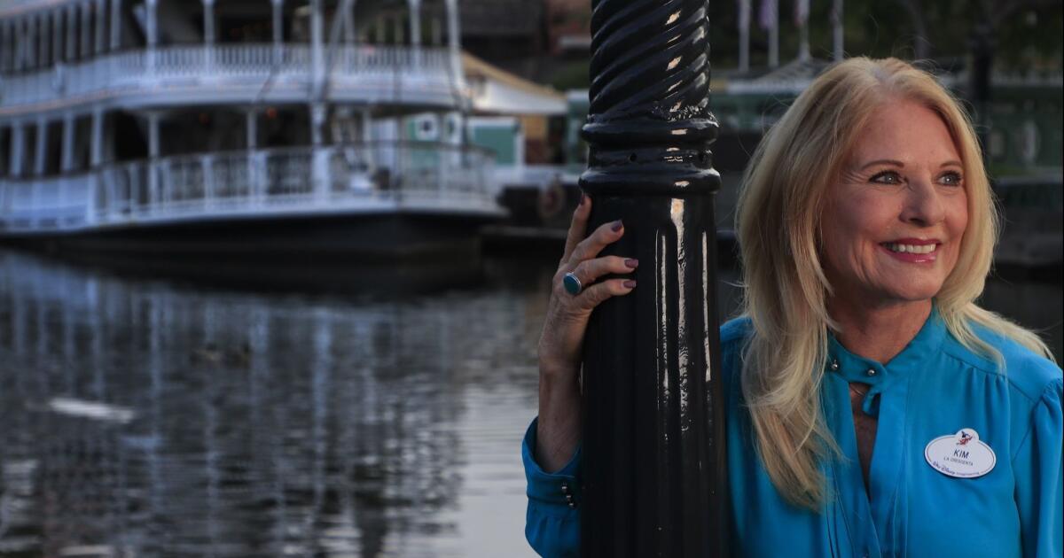
A brighter Sleeping Beauty's Castle is just one way Kim Irvine keeps the magic in Disneyland
Here’s how deep Kim Irvine’s connections are to Disneyland: About three years before she started working for Walt Disney Imagineering, the creative arm of the company responsible for theme park experiences, the then-15-year-old simply wanted her mother to stop embarrassing her.www.google.com
Wow am I reading this right? Kim felt like they needed to make the castle brighter to compensate for the falcons pending
I don’t think Kim should be making decisions any more. Caring about DL and being competent at one’s job are separate things. Her track record is embarrassing.
I don’t think Kim should be making decisions any more. Caring about DL and being competent at one’s job are separate things. Her track record is embarrassing.
After decades in Imagineering, Kim is introduced not by her resume, but instead by her lineage. "Her parents were WED designers blah blah"
Let's compare this to Tony Baxter, who is instead introduced by his long list of incredibly done lands and attractions.
Bah, the family angle makes for a nice newspaper story. They’d do the same for any other imagineer if there were a family connection to talk about.
I think the new castle looks great. And this split photo is a great example of the changes:
The walls look so much better! The new blue is a great contrast to those colors- better than the old in my opinion. I would have liked if they had kept the old trim on the roofs, but otherwise I think it looks fantastic. Can't wait to see it again in October.
To this point, probably the biggest positive of the new castle is the removal of the remnants from the 60th castle.Worth noting, that split photo uses the older castle in a modified form- it was taken when they had the 60th roofs on, after the 60th ended. All that extra silver lining and toppers isn't how the castle was supposed to look at any point in time.
Register on WDWMAGIC. This sidebar will go away, and you'll see fewer ads.
