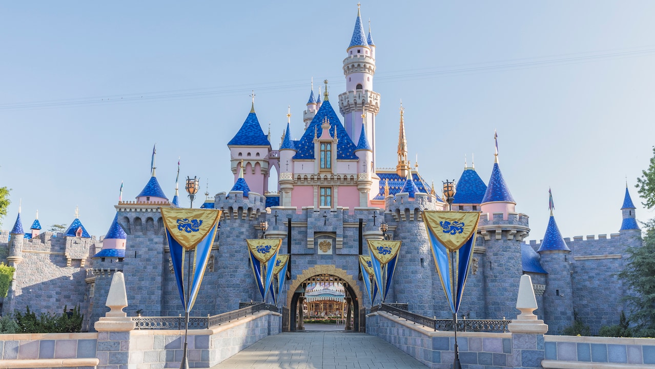
For comparison, here's a high quality kodachrome photo of the castle in 1957... probably the best photo I've seen since many pictures taken in the '50s are poor quality, faded, or inaccurate.
Not sure where Kim's getting the idea that her new colors are either based, or the same as the original in her LA Times article.
What was once tasteful, mature, and iconic in it's design is now overly garish and frankly artificial in it's appearance. I definitely think the current paint job is better than the 2005 one. If they had scaled back some of the gold accents they added, as well as those god awful stars they painted onto the center roof- I think I'd be just fine with this update. If I had to guess, the roofs look fake now since they were likely designed to withstand the abuse Disney's frequent and unnecessary overlays inflict on the structure. I don't hate this new paint job... but it's definitely indicative of WDI's continued loss of generational knowledge and class.
Frankly, I've never been a fan of Kim who seems to have some disdain for Disneyland's fandom, and who's projects tend to leave things worse off than what was there before. I cringe whenever she touts her lineage in an attempt to give her credibility... since it's clear her decades long resume hasn't. Compared to Mr. Baxter who has actually been vocally critical of many of Disney's decisions and seemed far less willing to bend to 2000's era Disneyland management, and was subsequently removed from WDI when he should be running the place.
I actually think Tony said it best (I'm paraphrasing here, this comment comes from an interview he did)- when you visit the Louvre and see the Mona Lisa, it's a rather small painting- but emotionally it's bigger. Sleeping Beauty's Castle is the same way- and Disney would be better served to just let it be what it is. Scale back the seasonal overlays, you wouldn't put jewelry and glitter on the Mona Lisa. The Castle isn't big enough to handle the added Christmas and promotional fluff it's forced to endure every year.
And now with the new "permanent" style, the castle is in a permanent overlay. The Castle shouldn't remain exactly the same over 60+ years, but it's essential that each update goes back to what the original designers wanted and either improve upon, or retain what was there before instead of Kim's twisted idea of what it ought to have been.
But seriously, get rid of those gosh darn sparkles on that center roof. Looks like dirt, or rust, or something.

