-
The new WDWMAGIC iOS app is here!
Stay up to date with the latest Disney news, photos, and discussions right from your iPhone. The app is free to download and gives you quick access to news articles, forums, photo galleries, park hours, weather and Lightning Lane pricing. Learn More -
Welcome to the WDWMAGIC.COM Forums!
Please take a look around, and feel free to sign up and join the community.
You are using an out of date browser. It may not display this or other websites correctly.
You should upgrade or use an alternative browser.
You should upgrade or use an alternative browser.
News Sleeping Beauty's Castle to be refurbished
- Thread starter Model3 McQueen
- Start date
britain
Well-Known Member
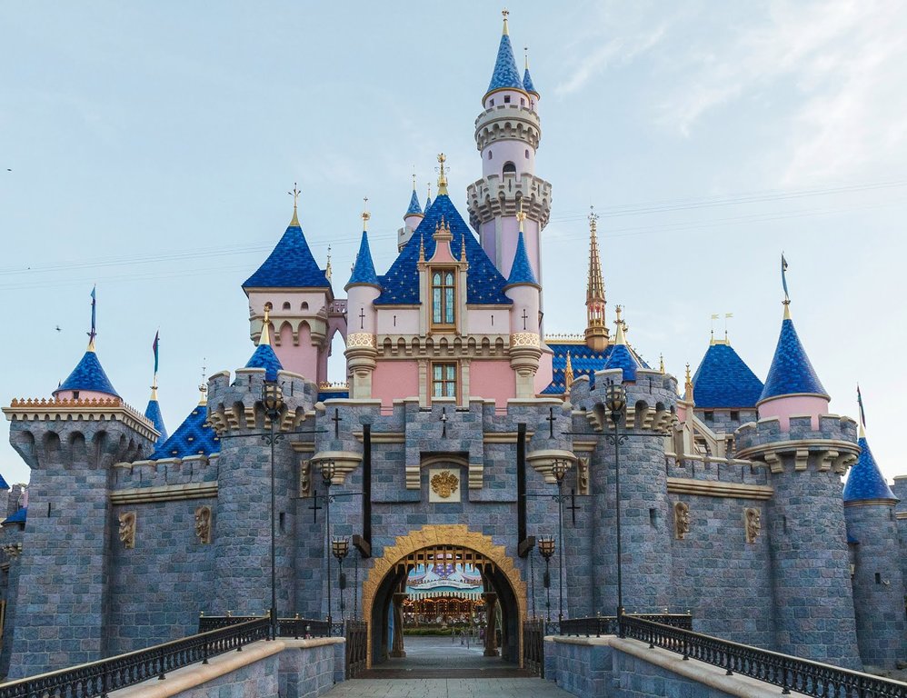
It’s supposed to simulate atmospheric perspective - meaning color gets paler the further away an object gets from you (as seen in the background of the Mona Lisa, the mountains between peaks of Carsland, and the ‘distant’ spires of Galaxy’s Edge).I love the final result, however I don't get why the tallest turret roof is a lighter color than the rest.
I’ll have to see it in person, but I think Sleeping Beauty Castle’s central tower is just too close for the illusion to really work.
Last edited:
VJ
Well-Known Member
Personally, I feel like this article is better than the one above (sorry @Disney Analyst  )
)
https://www.ocregister.com/2019/05/...ust-in-time-for-star-wars-galaxys-edge-debut/
https://www.ocregister.com/2019/05/...ust-in-time-for-star-wars-galaxys-edge-debut/
lazyboy97o
Well-Known Member
And to think they asked Tom Morris to leave...I actually think it's quite the opposite. HKDL's castle looks like it was designed by skilled artists, while DL's colors look like a cheap knock-off.
The color scheme HKDL castle is restrained and dignified; it has hints of fantasy, while remaining grounded in reality. DL's new color scheme takes bits and pieces of how people imagine a Disney castle might look, and turns them up to a cartoonish level. Instead of being alluring and implying there's more than initially meets the eye, the new design stands there and shouts "LOOK AT ME! I'M A FAIRY TALE CASTLE, Y'ALL!"
Everything is bright, bold, and in your face; there's very little subtlety to the design. I understand what they're attempting with lighter colors toward the tops (the technique works incredibly well in Carsland, Pandora, and seemingly Galaxy's Edge), but it just doesn't work with blocks of color rather than a gradual fade. The contrast between the various roofs, walls, stone, and trim is just all too much, making it look like a mass-produced toy made with limited material options, rather than a real world structure made from actual building materials. Sure, some of it will fade over time, but at its heart it will remain the same; even after 9 years of sun exposure, the 50th color scheme was still far more pink that the castle had been in prior incarnations.
In a way, it reminds me of a beautiful woman who is aging, and instead of gracefully accepting it, she cakes on the makeup with increasingly harsh lines and bright colors. Instead of being beautiful and refined, she looks increasingly like a circus clown.
Until the last few years, Disney parks have always been grounded far more in reality than in fantasy. Sure, it's always been a romanticized version of the past, but that's what allows the fantasy elements to be folded in so seamlessly while still appealing to and connecting with general audiences. I fear that the recent shift toward ever-increasing emphasis on fantasy and cartoonish elements will be the most difficult part to undo of Iger's legacy of giving people what they think that want, rather than blowing them away with something they never expected. Yes, HKDL was designed and built on a budget, but it was also done during that previous era when even the fantastical designs were very much rooted in reality, giving them a timeless appeal and endless number of ways to connect with the audience.
Of course, HKDL's castle is currently being made over in an even more egregious manner due to some political posturing and castle envy, so any beauty and charm it once had will be gone forever. While DL's paint scheme is heavy-handed, at least it can be easily undone in the future with another coat of paint.
But then it wouldn’t pop for instagram!I actually think it's quite the opposite. HKDL's castle looks like it was designed by skilled artists, while DL's colors look like a cheap knock-off.
The color scheme HKDL castle is restrained and dignified; it has hints of fantasy, while remaining grounded in reality. DL's new color scheme takes bits and pieces of how people imagine a Disney castle might look, and turns them up to a cartoonish level. Instead of being alluring and implying there's more than initially meets the eye, the new design stands there and shouts "LOOK AT ME! I'M A FAIRY TALE CASTLE, Y'ALL!"
Everything is bright, bold, and in your face; there's very little subtlety to the design. I understand what they're attempting with lighter colors toward the tops (the technique works incredibly well in Carsland, Pandora, and seemingly Galaxy's Edge), but it just doesn't work with blocks of color rather than a gradual fade. The contrast between the various roofs, walls, stone, and trim is just all too much, making it look like a mass-produced toy made with limited material options, rather than a real world structure made from actual building materials. Sure, some of it will fade over time, but at its heart it will remain the same; even after 9 years of sun exposure, the 50th color scheme was still far more pink that the castle had been in prior incarnations.
In a way, it reminds me of a beautiful woman who is aging, and instead of gracefully accepting it, she cakes on the makeup with increasingly harsh lines and bright colors. Instead of being beautiful and refined, she looks increasingly like a circus clown.
Until the last few years, Disney parks have always been grounded far more in reality than in fantasy. Sure, it's always been a romanticized version of the past, but that's what allows the fantasy elements to be folded in so seamlessly while still appealing to and connecting with general audiences. I fear that the recent shift toward ever-increasing emphasis on fantasy and cartoonish elements will be the most difficult part to undo of Iger's legacy of giving people what they think that want, rather than blowing them away with something they never expected. Yes, HKDL was designed and built on a budget, but it was also done during that previous era when even the fantastical designs were very much rooted in reality, giving them a timeless appeal and endless number of ways to connect with the audience.
Of course, HKDL's castle is currently being made over in an even more egregious manner due to some political posturing and castle envy, so any beauty and charm it once had will be gone forever. While DL's paint scheme is heavy-handed, at least it can be easily undone in the future with another coat of paint.
Disney Analyst
Well-Known Member
Personally, I feel like this article is better than the one above (sorry @Disney Analyst)
https://www.ocregister.com/2019/05/...ust-in-time-for-star-wars-galaxys-edge-debut/
I don’t disagree
Animaniac93-98
Well-Known Member
Disney Analyst
Well-Known Member
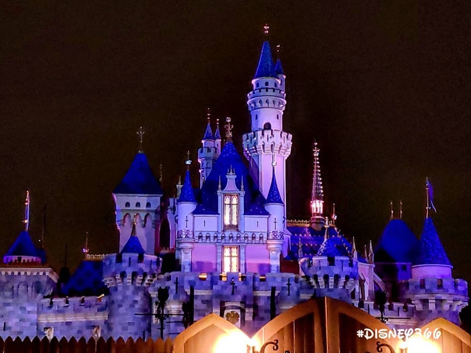
From Disney366

Practical Pig
Well-Known Member
Thanks for the night lighting! She's gorgeous here, and the roofs look great to this camera's eye at least. Better than in the daylight photos. The shades of cobalt blue, as seen here at least, are working very well.
yensidtlaw1969
Well-Known Member
Looking at pictures, the new paint does feel a bit like a step backwards to me -- it feels much flatter than previous versions, and the colors all seem a little too cool-toned and a little unrelated to each other. For a project that professed interest in making the castle feel taller without making it taller (and I do not think they should make it taller!), they somehow made it feel more toy-like than ever. Very plastic, lacking depth, and those sparkles on the central roof really just feel like a joke. The "forced perspective" through paint on the tallest tower is a bust -- the paint simply makes the whole tower look uniformly lighter in color than the others instead of appearing to fade as it goes up to suggest greater height. The whole color scheme lacks unity.
I popped into photoshop and whipped up a quick, imperfect rendering that brings the colors a little more into the world of what I wish had happened - a slightly more restrained update to the castle's color scheme that retains some of the warmth while pushing the depth of the castle's features forward and suggesting height with a little more subtlety. It's not earth-shatteringly different, but think of it as how I would have gone about resolving this version of the paint job instead of a proposal for a totally different one:
Actual photo:

Photo Edit:

EDITED To Add: Trying to get these to pop up in a scrollable Gallery View isn't working - the best way to see the differences is to open each image in a new tab and then flip back and forth between the two. Doing that makes the adjustments much clearer to see.
I popped into photoshop and whipped up a quick, imperfect rendering that brings the colors a little more into the world of what I wish had happened - a slightly more restrained update to the castle's color scheme that retains some of the warmth while pushing the depth of the castle's features forward and suggesting height with a little more subtlety. It's not earth-shatteringly different, but think of it as how I would have gone about resolving this version of the paint job instead of a proposal for a totally different one:
Actual photo:
Photo Edit:
EDITED To Add: Trying to get these to pop up in a scrollable Gallery View isn't working - the best way to see the differences is to open each image in a new tab and then flip back and forth between the two. Doing that makes the adjustments much clearer to see.
britain
Well-Known Member
Looking at pictures, the new paint does feel a bit like a step backwards to me -- it feels much flatter than previous versions, and the colors all seem a little too cool-toned and a little unrelated to each other. For a project that professed interest in making the castle feel taller without making it taller (and I do not think they should make it taller!), they somehow made it feel more toy-like than ever. Very plastic, lacking depth, and those sparkles on the central roof really just feel like a joke. The "forced perspective" through paint on the tallest tower is a bust -- the paint simply makes the whole tower look uniformly lighter in color than the others instead of appearing to fade as it goes up to suggest greater height. The whole color scheme lacks unity.
I popped into photoshop and whipped up a quick, imperfect rendering that brings the colors a little more into the world of what I wish had happened - a slightly more restrained update to the castle's color scheme that retains some of the warmth while pushing the depth of the castle's features forward and suggesting height with a little more subtlety. It's not earth-shatteringly different, but think of it as how I would have gone about resolving this version of the paint job instead of a proposal for a totally different one:
Actual photo:
View attachment 373666
Photo Edit:
View attachment 373667
EDITED To Add: Trying to get these to pop up in a scrollable Gallery View isn't working - the best way to see the differences is to open each image in a new tab and then flip back and forth between the two. Doing that makes the adjustments much clearer to see.
Very good, but the gold trim in the original is growing on me.
Practical Pig
Well-Known Member
Looking at pictures, the new paint does feel a bit like a step backwards to me -- it feels much flatter than previous versions, and the colors all seem a little too cool-toned and a little unrelated to each other. For a project that professed interest in making the castle feel taller without making it taller (and I do not think they should make it taller!), they somehow made it feel more toy-like than ever. Very plastic, lacking depth, and those sparkles on the central roof really just feel like a joke. The "forced perspective" through paint on the tallest tower is a bust -- the paint simply makes the whole tower look uniformly lighter in color than the others instead of appearing to fade as it goes up to suggest greater height. The whole color scheme lacks unity.
I popped into photoshop and whipped up a quick, imperfect rendering that brings the colors a little more into the world of what I wish had happened - a slightly more restrained update to the castle's color scheme that retains some of the warmth while pushing the depth of the castle's features forward and suggesting height with a little more subtlety. It's not earth-shatteringly different, but think of it as how I would have gone about resolving this version of the paint job instead of a proposal for a totally different one:
Actual photo:
View attachment 373666
Photo Edit:
View attachment 373667
EDITED To Add: Trying to get these to pop up in a scrollable Gallery View isn't working - the best way to see the differences is to open each image in a new tab and then flip back and forth between the two. Doing that makes the adjustments much clearer to see.
I like your photo edits. The slightly lighter roofs probably mimic what they will look like after a couple of years in the CA sun. Boosting the warmer tones in the stonework is appealing to me, and balances the more saturated blues of the roof.
D
Deleted member 107043
Looks dreamy. Love.
VJ
Well-Known Member
LOOK AT HOW PRETTY IT IS I LOVE IT
NateD1226
Well-Known Member
This looks super animated! I love it so much!!!
Disney Analyst
Well-Known Member
Does anyone know, did the Notre Dame spire always have an internal light?
VJ
Well-Known Member
i noticed that too; i don't particularly remember one before?Does anyone know, did the Notre Dame spire always have an internal light?
Disneysea05
Well-Known Member
- In the Parks
- Yes
Does anyone know, did the Notre Dame spire always have an internal light?
I only ever notice it when it’s used during Halloween Screams, when Zero flies around the castle.
Register on WDWMAGIC. This sidebar will go away, and you'll see fewer ads.
