News Revamped Dining Room Unveiled at EPCOT's San Angel Inn Restaurante

wdwmagic

Administrator
Moderator
Premium Member
Original Poster

San-Angel-Inn-Restaurant_Full_56382.jpg
 

JIMINYCR

Well-Known Member
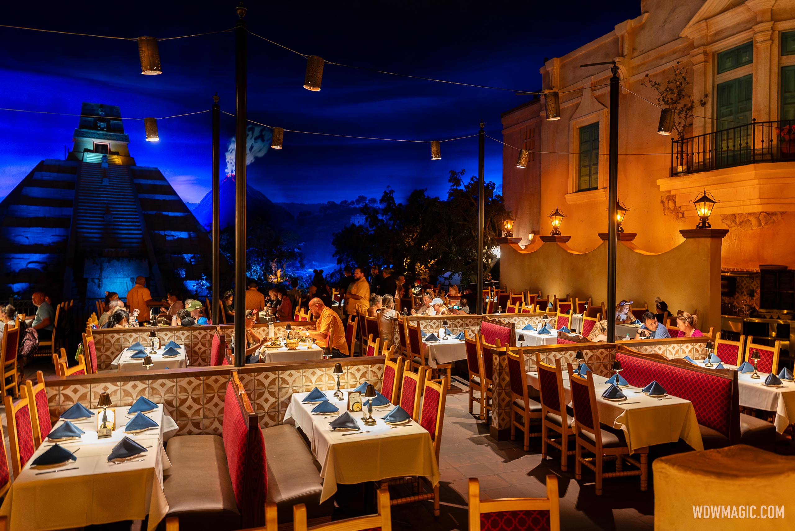
Better lighting is a godsend. I know the darker ambiance was to connect with the volcano theming but it was hard to read the menu. I started bringing a mini flashlight with me when we dined there. Previously it was very cramped and hard to move in and out of your seating. It’s a welcome update to the dining area.
 

HauntedPirate

Park nostalgist
Premium Member
This looks like a fairly well-done improvement to the restaurant. We never ate there but the (many) times we were inside the pavilion it was so dark we never understood how people could read the menus or eat.

The cynic in me (Damn you, Bob) says, "Fewer tables means they can reduce staff", though. :(
 

mysto

Well-Known Member
Looks like they wen't from not enough light to too much. Another cafeteria. Hopefully the overheads are dimmable and they just turned them up for the photo. The little lamps on the table should be enough.

The seating looks great!
 

aladdin2007

Well-Known Member
Seating looks like a big improvement. It previously seemed like everyone was on top of each other.

I agree the lighting now seems too bright (after previously being too dark), but that could partially be due to the camera.
agree on both,,,,are the tables still along the water? Im not a fan of all the poles in the middle making the view somewhat cluttered and the bright lights ruining the mood of the cozy atmosphere. could always just use your phone light to read the menu.
 

BrianLo

Well-Known Member
They also added a new wall so that the busing is tucked away. I sat right against the building behind the order entry server kiosk and it was less than ideal. Glad to see that no longer exists.
 

neo999955

Well-Known Member
In the Parks
No
This looks wonderful, although I hope they update the menu as well. I've found La Hacienda de San Angel to be better food, but perhaps we just had a bad experience the first time we were at San Angel Inn.
 

DCLcruiser

Well-Known Member
This looks like a fairly well-done improvement to the restaurant. We never ate there but the (many) times we were inside the pavilion it was so dark we never understood how people could read the menus or eat.

The cynic in me (Damn you, Bob) says, "Fewer tables means they can reduce staff", though. :(
Highly recommended spot. Get a margarita and enjoy a nice evening watching the boats float by. My (now) wife, and I went for a nice romantic dinner there early on in our relationship. Worked like a charm haha.
 

Figments Friend

Well-Known Member
Really like this restaurant.
Love the ambiance and the food.

Although the seating looks to be quite a improvement, I can see two issues that mess with the visual aspect of this restaurant…

The poles supporting the string lighting are now blocking the view of the volcano background somewhat.
The view is now ‘cluttered’ which I am not overly thrilled to see.
There is a clear reason why the original designers did not use poles.

The other quibble is the dividers between the new table arrangements.
This takes away from the feeling of dining ‘waterside‘ and has a feel of just about any other restaurant with booths.
From a design standpoint, I think it would have been better to not include the dividers.

Seems this experience has been compromised, at least visually, which is a big part of why some want to dine here.
But the spreading out of the seating is a plus and needed.

-
 

Register on WDWMAGIC. This sidebar will go away, and you'll see fewer ads.

Back
Top Bottom