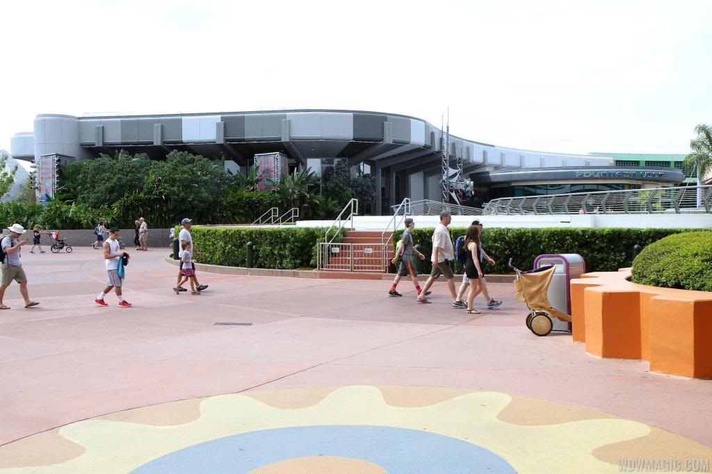
Repainting of Epcot Central Plaza?

Soarin' Over Pgh

Well-Known Member
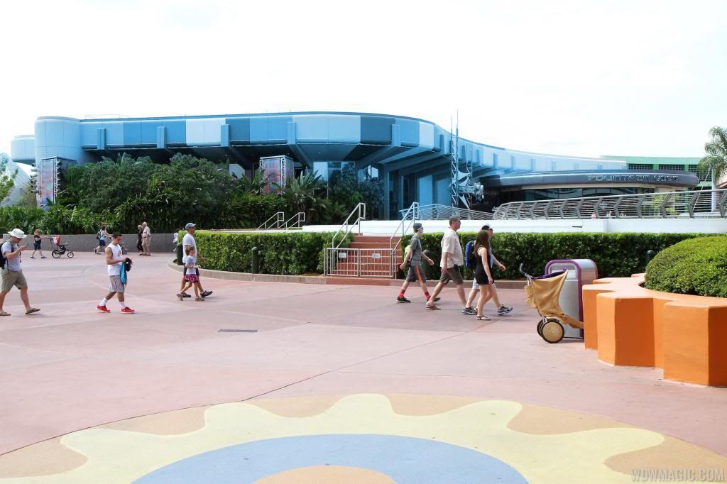
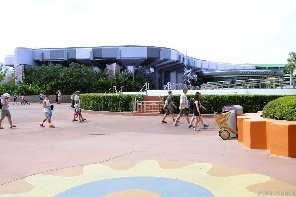
Can someone with photoshop skills retouch these photos with a color scheme that actually makes future world look "futuristic"? I'm thinking the the blue that's similar to fountain view, the darkish gray risers and light grey ascents on large columns and over entryways would look appropriate.


Mmmk. I tried. But it's late, and, to be honest, there's only so much painting of this turd that one can do.
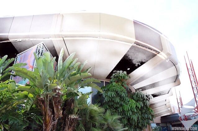
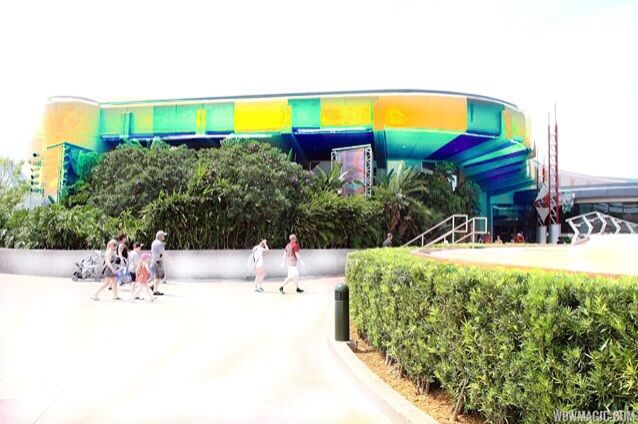


And these are the better ones I tried. It seems the best combinations would be silver, white, copper, gold, and variances of, but the browns and random purple are just... No. They're just no.

Sorry, I tried. I'll take another swing at it tomorrow when I have a better photo editing program available.
 

MarkTwain

Well-Known Member
Can someone with photoshop skills retouch these photos with a color scheme that actually makes future world look "futuristic"? I'm thinking the the blue that's similar to fountain view, the darkish gray risers and light grey ascents on large columns and over entryways would look appropriate.

Working on it. ;) This thing's a pain in the butt lol. Let me see if I can toss up a few concepts into the forum real quick
 

note2001

Well-Known Member
How about mirrors with colors between? Aside from the obvious issues of making it hurricane proof and keeping them clean, mirrors would fit well with the futureworld theme. They can have the roomba people (iRobot) design little window washers for them ... and optionally write out messages on dirty panes :D

Consider the following blog's subject, and replace the wood for a *nice* color painted ... uh... whatever material that is on the outside of communicore, uh, I mean innovations. http://thetrendologie.com/2014/03/24/lucid-stead-mirror-house/
 
Last edited:

MarkTwain

Well-Known Member
Can someone with photoshop skills retouch these photos with a color scheme that actually makes future world look "futuristic"? I'm thinking the the blue that's similar to fountain view, the darkish gray risers and light grey ascents on large columns and over entryways would look appropriate.

I'm going to have start from scratch with a new base photo if I want to do anything but a striped approach (and I might, I'm still convinced a gradient would look best), but for now, here's what I've got.

Let's start with Test Track 2.0's infamous blue (although whether it works in this instance is debatable, I hold strong to the belief that TT2.0 has some good design ideas for Epcot as a whole... haters gonna hate):

FutureWorldTTBlue_zpsca2f7e00.jpg


Here's a blue-ish purple I thought had a pleasant 90s Epcot vibe to it:
FutureWorldBlue_zps03831291.jpg


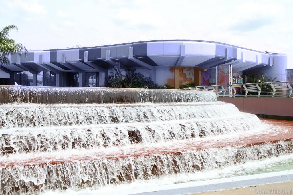
When I applied it to the opposite side of the fountain, it read slightly more purple:

FutureWorldPurple_zpsfbd29895.jpg


Here it is completely grayscale (not a fan but desaturating it was part of the coloration process so it was ready to go):

FutureWorldGrey_zpsaeec49b2.jpg


Kinda makes MouseGears' giant cartoony gears in the foreground stick out all the more, doesn't it?


Here it is with the exact shade of teal used for the new FountainView Starbucks, pretending that WDI designed the Starbucks as part of a larger Innoventions plaza rethinking (lol):

FutureWorldTeal_zps377281d6.jpg


I don't think the last one's bad personally, if a little austere. I somehow derailed several members of my office off of actual work for a solid 20 minutes or so today, as we actively tried to rethink this plaza. Many of their ideas were probably too nutty for Epcot or for easy Photoshopping, and many liked the striping (although neither had been to WDW as an adult). I'll see what others I can make tomorrow.
 
Last edited:

rct247

Well-Known Member
So I hated the initial pictures! I was shocked and was in agreement with the majority that we didn't need new paint colors. I hoped that the test would at least produce more of the blues & silvers rather than the tans and browns.

I went to the park on Saturday and saw it in person. It person, it doesn't seem as bad. I wanted to hate it so bad, but I couldn't really form a solid opinion. The bolder (gold?) pillars really do look better than the muted baige. The colors don't look bad really. I'm actually glad now that it has newer fresher paint. When I looked at the older, it really looked faded and boring. This new colors make it feel newer. That said, the color scheme does seem retro and mismatched. I don't think they really fit Epcot. Now that I come to find that it isn't really a test, but probably the real thing, I am a little disappointed that it it stripes in a strange rainbow of darker color tones.

Final judgment is that I can deal with it. It isn't completely awful. It really is a tad better than what was before, but I would have done it completely differently. It isn't the best they could have done by a long shot!
 

MarkTwain

Well-Known Member
I get the sense that we have reasonably new imagineers/designers making their mark all over Disney with minimal guidance from experienced imagineers. The approval process it seems no longer requires a "Proof of Concept" before implementing the design.

Test Track, refurbishments on VWL and OKW, MK Hub makeover... the list is much larger than this, but point is the experienced imagineers are all off on the "big" projects world-wide leaving the ones who need to learn from them home alone.

This. This this this. And there are still experienced Imagineers in the organization, but they're few and far between, they're stretched too far thin on global projects, and in the end their opinion isn't given the weight it should be anyway. And WDI continues to hire designers with minimal knowledge of Disney simply passing through as a career boost. And to provide little to no hiring channels to employees in other divisions of the company who ARE well-versed in Disney design concepts and with more than enough credentials (not that I'd know anything about that...).


PS if anyone has any "before" pictures of the plaza that show off the curvature of the building like that, that would be fantastic ;)
 
Last edited:

Padraig

Well-Known Member
I'm going to have start from scratch with a new base photo if I want to do anything but a striped approach (and I might, I'm still convinced a gradient would look best), but for now, here's what I've got.

Let's start with Test Track 2.0's infamous blue (although whether it works in this instance is debatable, I hold strong to the belief that TT2.0 has some good design ideas for Epcot as a whole... haters gonna hate):

FutureWorldTTBlue_zpsca2f7e00.jpg


Here's a blue-ish purple I thought had a pleasant 90s Epcot vibe to it:
FutureWorldBlue_zps03831291.jpg


When I applied it to the opposite side of the fountain, it read slightly more purple:

FutureWorldPurple_zpsfbd29895.jpg


Here it is completely grayscale (not a fan but desaturating it was part of the coloration process so it was ready to go):

FutureWorldGrey_zpsaeec49b2.jpg


Kinda makes MouseGears' giant cartoony gears in the foreground stick out all the more, doesn't it?


Here it is with the exact shade of teal used for the new FountainView Starbucks, pretending that WDI designed the Starbucks as part of a larger Innoventions plaza rethinking (lol):

FutureWorldTeal_zps377281d6.jpg


I don't think the last one's bad personally, if a little austere. I somehow derailed several members of my office off of actual work for a solid 20 minutes or so today, as we actively tried to rethink this plaza. Many of their ideas were probably too nutty for Epcot or for easy Photoshopping, and many liked the striping (although neither had been to WDW as an adult). I'll see what others I can make tomorrow.


Somebody put up an old Razzle Dazzle camo scheme on a WW2 ship earlier in the thread. This is even closer. Slight touch of digital camo as well. Works as a Dystopian Future World though.
 

roj2323

Well-Known Member
I'm going to have start from scratch with a new base photo if I want to do anything but a striped approach (and I might, I'm still convinced a gradient would look best), but for now, here's what I've got.

Let's start with Test Track 2.0's infamous blue (although whether it works in this instance is debatable, I hold strong to the belief that TT2.0 has some good design ideas for Epcot as a whole... haters gonna hate):

FutureWorldTTBlue_zpsca2f7e00.jpg


Here's a blue-ish purple I thought had a pleasant 90s Epcot vibe to it:
FutureWorldBlue_zps03831291.jpg


When I applied it to the opposite side of the fountain, it read slightly more purple:

FutureWorldPurple_zpsfbd29895.jpg


Here it is completely grayscale (not a fan but desaturating it was part of the coloration process so it was ready to go):

FutureWorldGrey_zpsaeec49b2.jpg


Kinda makes MouseGears' giant cartoony gears in the foreground stick out all the more, doesn't it?


Here it is with the exact shade of teal used for the new FountainView Starbucks, pretending that WDI designed the Starbucks as part of a larger Innoventions plaza rethinking (lol):

FutureWorldTeal_zps377281d6.jpg


I don't think the last one's bad personally, if a little austere. I somehow derailed several members of my office off of actual work for a solid 20 minutes or so today, as we actively tried to rethink this plaza. Many of their ideas were probably too nutty for Epcot or for easy Photoshopping, and many liked the striping (although neither had been to WDW as an adult). I'll see what others I can make tomorrow.


I think the Tiger striping is the issue. Solid colors look more refined and thus more "futuristic"
 

sshindel

The Epcot Manifesto
Guys, this will all make sense in a few years once they've closed down Imagination and Living with the Land to add 6th and 7th theaters to Soarin'. This is the new paint scheme of the future of Future World --> Soarin' World (over California).
 

Soarin' Over Pgh

Well-Known Member
I'm going to have start from scratch with a new base photo if I want to do anything but a striped approach (and I might, I'm still convinced a gradient would look best), but for now, here's what I've got.

Let's start with Test Track 2.0's infamous blue (although whether it works in this instance is debatable, I hold strong to the belief that TT2.0 has some good design ideas for Epcot as a whole... haters gonna hate):

FutureWorldTTBlue_zpsca2f7e00.jpg


Here's a blue-ish purple I thought had a pleasant 90s Epcot vibe to it:
FutureWorldBlue_zps03831291.jpg


When I applied it to the opposite side of the fountain, it read slightly more purple:

FutureWorldPurple_zpsfbd29895.jpg


Here it is completely grayscale (not a fan but desaturating it was part of the coloration process so it was ready to go):

FutureWorldGrey_zpsaeec49b2.jpg


Kinda makes MouseGears' giant cartoony gears in the foreground stick out all the more, doesn't it?


Here it is with the exact shade of teal used for the new FountainView Starbucks, pretending that WDI designed the Starbucks as part of a larger Innoventions plaza rethinking (lol):

FutureWorldTeal_zps377281d6.jpg


I don't think the last one's bad personally, if a little austere. I somehow derailed several members of my office off of actual work for a solid 20 minutes or so today, as we actively tried to rethink this plaza. Many of their ideas were probably too nutty for Epcot or for easy Photoshopping, and many liked the striping (although neither had been to WDW as an adult). I'll see what others I can make tomorrow.

Fantastic job, Mr. Twain. I was playing with this for a while and couldn't get the desaturation to work (then again I wasn't using a photoshop or paint type program and I'm on an ipad, lol) and balance right... it kept looking off...

I think the Tiger striping is the issue. Solid colors look more refined and thus more "futuristic"

...and this is why I think it kept looking off to me. No matter what I tried, the stripes balled it up. When I think 'future' I don't think of stripes like this- stripes at all, really, but especially like this. And if I did consider stripes, I would expect them to be even, at the very least. This looks very ill planned and haphazardly painted.

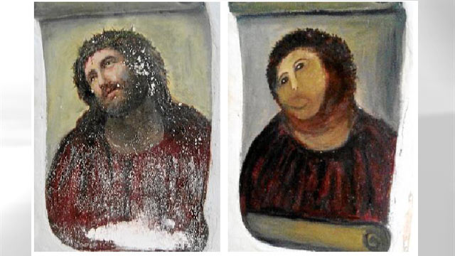
I was stuck staring at that for a couple of minutes. Honestly, it's almost vandalism. Kinda like this, but without the good intentions.

ht-spanish-painting-jesus-badly-restored-thg-120822-wmain-jpg_190910.jpg

Precisely it. It looks like someone spray painted vulgarities and Disney did a quick cover-up job to hide it. I've seen this on the sides of buildings. I'd expect it of a small neighborhood, not a global money making machine like Disney. It cheapens the product. Unfortunately, the product was already cheapened to begin with, this just kind of bargain bins it.

But yet, it's still $90/a day. Unreal.
 

Goofnut1980

Well-Known Member
What are the chances they get rid of the pink neon and make it white neon? I saw a few of the pictures posted by the admin where the neon was missing... makes ya think
 

Soarin' Over Pgh

Well-Known Member
Here's what the future is.

Sustainability, clean lines. Greenery. Lots of it.

For example-

http://inhabitat.com/flowers-top-enviable-recycled-shipping-container-guest-house-in-texas/

And this- please note the use of the silvers and grays-

http://www.smashingapps.com/2009/08/10/27-colorful-and-futuristic-innovations-in-product-design.html


And I really like this.

bing-3.jpg


I think it's important to incorporate nature back into FutureWorld, regardless of what colors they ultimately go with.

(above picture is from here- http://www.thisiscolossal.com/2014/...ted-through-shattered-mirrors-by-bing-wright/ ) @MarkTwain , you would probably like that website, very cool artwork there.
 

Virtual Toad

Well-Known Member
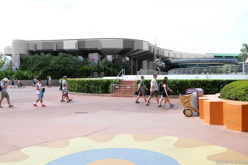
Note how the original paint scheme emphasized the structural elements of the building to give the impression they were supporting the weight of the structure. That's the future-- sleek, nimble, innovative.

Now look at the new scheme. The "supports" are totally lost, painted the same color as the overhang.

Vomit is the appropriate term. How many different colors are present-- the walls, the banners, the "gear" at the bottom? There is no color scheme. No intent, no purpose at all. The grand architecture and its implied message of a hopeful future is lost.

I can't believe management is okay with this. If this was my park, heads would roll. Empress Lilly's visual comparison says it all. What was once conceived, designed and carefully watched over by undisputed masters in the art of design has been hijacked by corporate drones and art school dropouts.

TDO: If this is not a test (and who the hell would approve a test of this scale in an operating theme park?) wake up and demand this atrocity be fixed immediately. EDIT: Or at least have those responsible step up and explain their rationale.
 

Register on WDWMAGIC. This sidebar will go away, and you'll see fewer ads.

Back
Top Bottom