Repainting of Epcot Central Plaza?

Soarin' Over Pgh

Well-Known Member
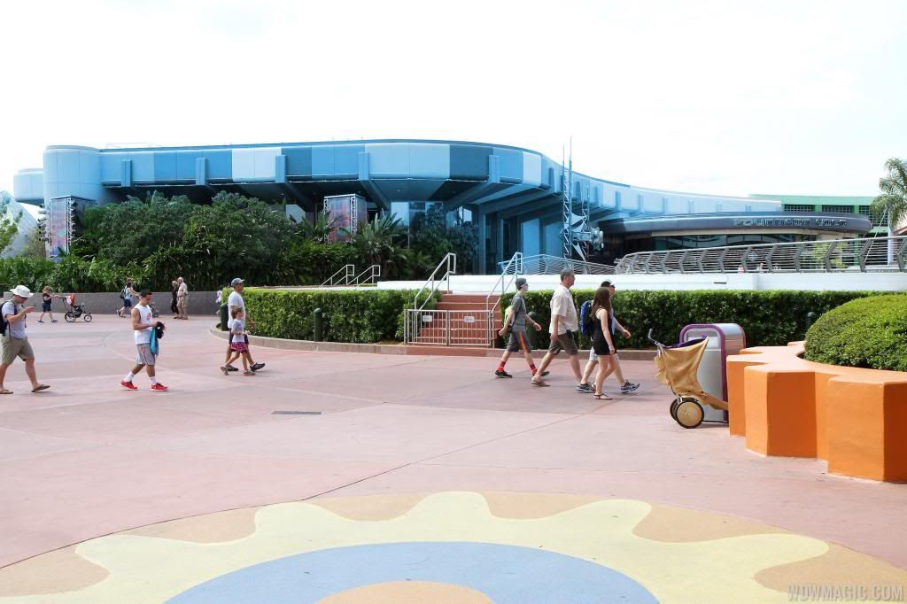
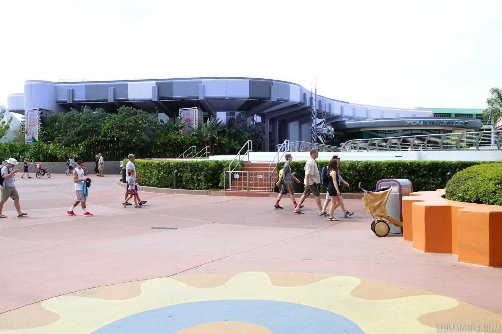
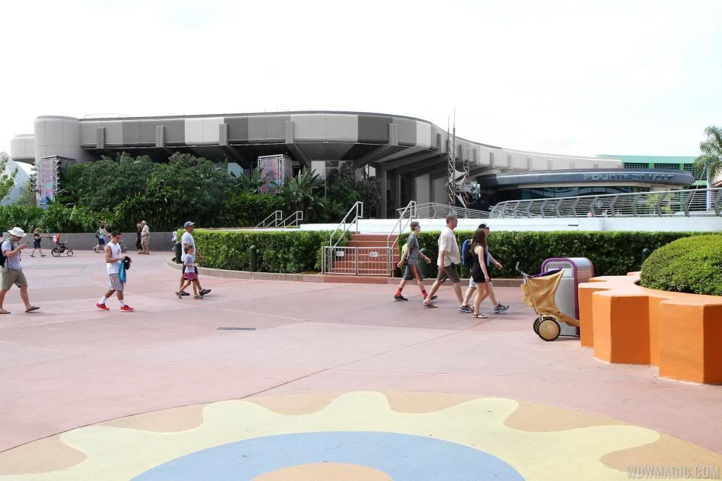
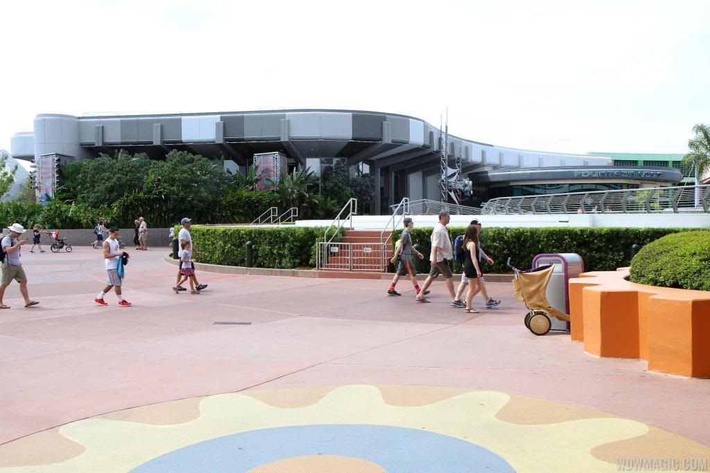
Note how the original paint scheme emphasized the structural elements of the building to give the impression they were supporting the weight of the structure. That's the future-- sleek, nimble, innovative.

Now look at the new scheme. The "supports" are totally lost, painted the same color as the overhang.

Vomit is the appropriate term. How many different colors are present-- the walls, the banners, the "gear" at the bottom? There is no color scheme. No intent, no purpose at all. The grand architecture and its implied message of a hopeful future is lost.

I can't believe management is okay with this. If this was my park, heads would roll. Empress Lilly's visual comparison says it all. What was once conceived, designed and carefully watched over by undisputed masters in the art of design has been hijacked by corporate drones and art school dropouts.

TDO: If this is not a test (and who the hell would approve a test of this scale in an operating theme park?) wake up and demand this atrocity be fixed immediately.


Perhaps the heads should be sat down at a table and shown a slideshow of Epcot's early years and development process. Or just throw John Hench's book at them. Aim for the forehead.

designing_disney.jpg


Even though I was not at Epcot in it's early years (unfortunately, or I'd probably like this park an awful lot more than I do) I believe it had a better, more solid message and architecture that balanced and supported it. Now, not so much.
 

sshindel

The Epcot Manifesto
Here's what the future is.

Sustainability, clean lines. Greenery. Lots of it.

For example-

http://inhabitat.com/flowers-top-enviable-recycled-shipping-container-guest-house-in-texas/

And this- please note the use of the silvers and grays-

http://www.smashingapps.com/2009/08/10/27-colorful-and-futuristic-innovations-in-product-design.html


And I really like this.

bing-3.jpg


I think it's important to incorporate nature back into FutureWorld, regardless of what colors they ultimately go with.

(above picture is from here- http://www.thisiscolossal.com/2014/...ted-through-shattered-mirrors-by-bing-wright/ ) @MarkTwain , you would probably like that website, very cool artwork there.

Have you seen the "Vertical Forest" that is being built in Milan? Ideas like this is what Epcot should be shooting for:
http://www.treehugger.com/green-architecture/stefano-boeris-vertical-forest-gets-planted.html
rederning-bosco.jpg.650x0_q85_crop-smart.jpg
 

Soarin' Over Pgh

Well-Known Member
Have you seen the "Vertical Forest" that is being built in Milan? Ideas like this is what Epcot should be shooting for:
http://www.treehugger.com/green-architecture/stefano-boeris-vertical-forest-gets-planted.html
rederning-bosco.jpg.650x0_q85_crop-smart.jpg


I LOVE treehugger.

And yes, I saw that and I think it's fantastic- we definitely need more of it in this world. What a fantastic idea, especially for cooling those apartments- that there is trees literally outside the door? Love it. Just, love it.

But this is more spot on- nature is our future. Note the sleek, straight lines, the angularity of the buildings- and there's that pesky silver/gray again.

Good post, @sshindel :)
 

Tom Morrow

Well-Known Member
I don't even want Future World to look "futuristic." But it should look modern, sleek, and sophisticated. What is one of the most common negative comments about Epcot you hear from the general public? "It's that outdated 1980s park." Its baffling to me that they would choose a color scheme that makes it look even more 1970's than ever, but also cheapens the product. The only positive thing I can say about this paint scheme so far is that it's less boring.
 

Omnispace

Well-Known Member
Unfortunately, the design of the Communicore buildings is stuck in that strange period of time when a style has lost it's luster, yet it has not yet regained a new appreciation. It happens every time that something new becomes familiar and starts to feel stale. The challenge is to revitalize it without destroying what made it so good to begin with. A good designer will be able to read the "language" of the building and then find sympathetic ways to make the improvements that revitalize it in an appropriate way. A bad designer will take an unrelated element and apply it in the wrong context.

The Communicore buildings were designed to be understated and allow for the "show" to create the excitement. Unfortunately, Barry Braverman's ill-conceived idea that the Plaza should be characterized like the Ginza still seems to be influencing the design direction. When the exciting elements are spread out everywhere, then there is nothing to draw one to what is important. There is no anticipation of approaching something that lies ahead like the famous Disney "weenie" that is so often talked about. What works for the Ginza doesn't necessarily work for a futuristic theme park.

If I was able to wear the King of Epcot crown for a day I would allow the buildings to maintain their calm character. I'd add some cool stuff that would work with the existing design but enliven it, much like the successful remake of Disneyland's Space Mountain. And I would once again open up the buildings and allow for the color and excitement of the various shows and exhibits to enliven the plaza. I honestly think that people are not going to notice the buildings as much when there is something interesting to do.
 

Omnispace

Well-Known Member
I'm going to have start from scratch with a new base photo if I want to do anything but a striped approach (and I might, I'm still convinced a gradient would look best), but for now, here's what I've got.

Let's start with Test Track 2.0's infamous blue (although whether it works in this instance is debatable, I hold strong to the belief that TT2.0 has some good design ideas for Epcot as a whole... haters gonna hate):

FutureWorldTTBlue_zpsca2f7e00.jpg


Here's a blue-ish purple I thought had a pleasant 90s Epcot vibe to it:
FutureWorldBlue_zps03831291.jpg


When I applied it to the opposite side of the fountain, it read slightly more purple:

FutureWorldPurple_zpsfbd29895.jpg


Here it is completely grayscale (not a fan but desaturating it was part of the coloration process so it was ready to go):

FutureWorldGrey_zpsaeec49b2.jpg


Kinda makes MouseGears' giant cartoony gears in the foreground stick out all the more, doesn't it?


Here it is with the exact shade of teal used for the new FountainView Starbucks, pretending that WDI designed the Starbucks as part of a larger Innoventions plaza rethinking (lol):

FutureWorldTeal_zps377281d6.jpg


I don't think the last one's bad personally, if a little austere. I somehow derailed several members of my office off of actual work for a solid 20 minutes or so today, as we actively tried to rethink this plaza. Many of their ideas were probably too nutty for Epcot or for easy Photoshopping, and many liked the striping (although neither had been to WDW as an adult). I'll see what others I can make tomorrow.

Very cool!! I like the neutral tone of the grayscale scheme the best. I would even consider making the differences in tone much more subtle.
 

Figments Friend

Well-Known Member
This. This this this. And there are still experienced Imagineers in the organization, but they're few and far between, they're stretched too far thin on global projects, and in the end their opinion isn't given the weight it should be anyway. And WDI continues to hire designers with minimal knowledge of Disney simply passing through as a career boost. And to provide little to no hiring channels to employees in other divisions of the company who ARE well-versed in Disney design concepts and with more than enough credentials (not that I'd know anything about that...).

Indeed it would seem, but it is a complicated web of reasons.

One has to keep in mind that sadly many of those who were in a position to mentor the new recruits below them with some REAL insight and knowledge were simply not given ample allowance or time to do so.
The elders themselves were either forced to move on, or outright eliminated from the department by various means....sometimes valid reasons, sometimes quite questionable reasons.
This sadly results in them also having to leave the opportunity behind to pass on their extensive knowledge to the newbies just coming into the organization.
The chance to pass on their insights was dramatically shortened compared to the previous generations of Imagineers who seemed to have a much better chance of doing so.

It is a great shame because those that came before you have much to provide insight into...if one has the good sense to LISTEN.

The once present mentorship programs are not what they once were.
 
Last edited:

jessfriends

Active Member
Not a fan of the brown, it seems a little busy too with all the different colors but I will wait to see it in person as someone mentioned it looked better in person. I guess it's better than the color is was before but still it doesn't seem to fit in the area. I like the purple (probably because it's my favorite color) but wouldn't like it all purple. Maybe a silver or light gray with some of the purple?
 

MinnieM123

Premium Member
Unfortunately, the design of the Communicore buildings is stuck in that strange period of time when a style has lost it's luster, yet it has not yet regained a new appreciation. It happens every time that something new becomes familiar and starts to feel stale. The challenge is to revitalize it without destroying what made it so good to begin with. A good designer will be able to read the "language" of the building and then find sympathetic ways to make the improvements that revitalize it in an appropriate way. A bad designer will take an unrelated element and apply it in the wrong context.

The Communicore buildings were designed to be understated and allow for the "show" to create the excitement. Unfortunately, Barry Braverman's ill-conceived idea that the Plaza should be characterized like the Ginza still seems to be influencing the design direction. When the exciting elements are spread out everywhere, then there is nothing to draw one to what is important. There is no anticipation of approaching something that lies ahead like the famous Disney "weenie" that is so often talked about. What works for the Ginza doesn't necessarily work for a futuristic theme park.

If I was able to wear the King of Epcot crown for a day I would allow the buildings to maintain their calm character. I'd add some cool stuff that would work with the existing design but enliven it, much like the successful remake of Disneyland's Space Mountain. And I would once again open up the buildings and allow for the color and excitement of the various shows and exhibits to enliven the plaza. I honestly think that people are not going to notice the buildings as much when there is something interesting to do.

If I was a member of the WDW management team, I'd say, "You're hired!" :)
 

Register on WDWMAGIC. This sidebar will go away, and you'll see fewer ads.

Back
Top Bottom