Note that he didn't mention which year!Oh Martin, I see what you did there. The old If X=Y, and Y=Z, so X must equal March 19-June 20. Clever
-
Welcome to the WDWMAGIC.COM Forums!
Please take a look around, and feel free to sign up and join the community.
You are using an out of date browser. It may not display this or other websites correctly.
You should upgrade or use an alternative browser.
You should upgrade or use an alternative browser.
EPCOT Remy's Ratatouille Adventure coming to Epcot
- Thread starter wdwmagic
- Start date
GimpYancIent
Well-Known Member
Gaudy! Yea, that's France. Will they have rat characters interacting with the guests (socially distanced of course)?I prefer the Paris version -- this one is a bit gaudy for my tastes.
Not saying it's bad, though. A middle ground between the two might be best for me, but between the two I prefer the simpler version. It reminds me more of an actual restaurant sign.
ChewbaccaYourMum
Well-Known Member
That sign looks perfect!
Rich Brownn
Well-Known Member
Gaudy? in France? not possible... lolI prefer the Paris version -- this one is a bit gaudy for my tastes.
Not saying it's bad, though. A middle ground between the two might be best for me, but between the two I prefer the simpler version. It reminds me more of an actual restaurant sign.
brihow
Well-Known Member
Why does the Paris version have an accent above the 'E' in 'Remy' but the US version does not? Too confusing for Americans, I'm guessing?
hpyhnt 1000
Well-Known Member
Overall, I think the design of EPCOT's marquee is light years better than the WDSP version. But I do wish it was scaled down about 15-20%. Just seems a bit too big compared to the rest of the facade.
ImperfectPixie
Well-Known Member
The fastest way to explain is to say it's sort of like Jacques and Jack. One is written in French, with appropriate accents, the other in English.Why does the Paris version have an accent above the 'E' in 'Remy' but the US version does not? Too confusing for Americans, I'm guessing?
JohnD
Well-Known Member
Overall, I think the design of EPCOT's marquee is light years better than the WDSP version. But I do wish it was scaled down about 15-20%. Just seems a bit too big compared to the rest of the facade.
Methinks the French would think the EPCOT version is too gauche. They would rather prefer their sign to be more understated.
ImperfectPixie
Well-Known Member
I'm not a fan of exposed bulbs AT ALL. I would prefer the US version of the sign sans bulbs. I would have put them around the edges of the sign behind a border, so you didn't see the bulbs at all, but so that the face of the sign is illuminated properly.Methinks the French would think the EPCOT version is too gauche. They would rather prefer their sign to be more understated.
You must hate Main Street...I'm not a fan of exposed bulbs AT ALL. I would prefer the US version of the sign sans bulbs. I would have put them around the edges of the sign behind a border, so you didn't see the bulbs at all, but so that the face of the sign is illuminated properly.
Magic Feather
Well-Known Member
And BoardwalkYou must hate Main Street...
ImperfectPixie
Well-Known Member
Main street is lit brightly enough that I don't notice the bulbs much. I'm hoping this area proves to be similar. We haven't seen pics of it lit up at night yet...You must hate Main Street...
(I was in the sign biz for years...what I'm picturing in my head is probably a darker environment than reality.)
lazyboy97o
Well-Known Member
Why not stick to one style for the sign? That Métropolitain-ish letting just looks silly. The name is also still incredibly dumb.
DisneyTransport
Active Member
IMO from the pictures, I think the sign looks too industrial from certain angles. My issue is the HSS bar stock used, and the view of that whole area from skyliner (it does not blend at all). I just think Disney could of done better, but hey, I'm no imagineer.
montydysquith-navarro
Well-Known Member
- In the Parks
- No
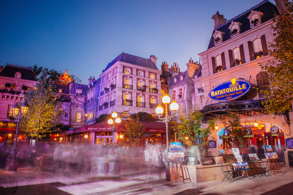
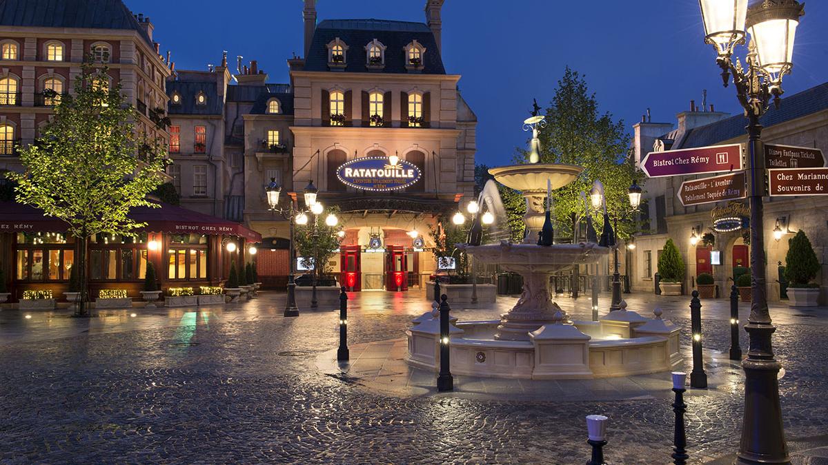
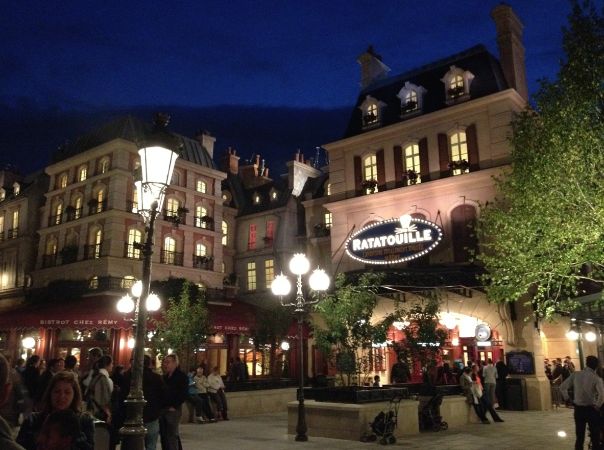
Here's how Place de Remy looks like at Walt Disney Studios Park. I imagine the lighting for the expansion would be similar in some way.Main street is lit brightly enough that I don't notice the bulbs much. I'm hoping this area proves to be similar. We haven't seen pics of it lit up at night yet...
ImperfectPixie
Well-Known Member
Thanks! The top and middle shots aren't bad at all. I'm guessing it's just exposure in the bottom pic that makes them look so bright.Here's how Place de Remy looks like at Walt Disney Studios Park. I imagine the lighting for the expansion would be similar in some way.


MrHappy
Well-Known Member
Yikes. And don’t forget about that floating door. And are there kids on your lawn?Why not stick to one style for the sign? That Métropolitain-ish letting just looks silly. The name is also still incredibly dumb.
ToTBellHop
Well-Known Member
Because one is written in French and one is written in English? Décor vs. decor is another example or télévision vs. television.Why does the Paris version have an accent above the 'E' in 'Remy' but the US version does not? Too confusing for Americans, I'm guessing?
Register on WDWMAGIC. This sidebar will go away, and you'll see fewer ads.
