News Refurbishment coming soon to Disney's Polynesian Village Resort - Moana details to be included

TrainsOfDisney

Well-Known Member
Why would you judge what its going to look like based on what it looks like while they demo?!? If this forum existed when they were building DIsney World, there would be complaining about the big hole being drugged between the Poly and Magic Kingdom. Based on artwork, which I know may not be final result, it looks much grander, potentially better approach.
So when are they going to finish the Riveiera?
 

RadiatorSpringsRacer

Well-Known Member
The more I think about this, the more I think it could be a positive.

It's not like they're using an IP that has nothing to do with the theme of the place. And when it comes to portraying Polynesia accurately, it's not like Moana didn't do a lot of homework.
 

Bocabear

Well-Known Member
Moana was extensively researched...The textiles and patterns are really beautiful.. It is actually one IP i would have no problem with them using in a "Polynesian" style setting... I am more concerned about their record of de-furbishing spaces and removing thematic decor while telling us they are creating a themed interior... Enchanted Rose Lounge ...Looks like a Westin...
 
Last edited:

UNCgolf

Well-Known Member
Why would you judge what its going to look like based on what it looks like while they demo?!? If this forum existed when they were building DIsney World, there would be complaining about the big hole being drugged between the Poly and Magic Kingdom. Based on artwork, which I know may not be final result, it looks much grander, potentially better approach.

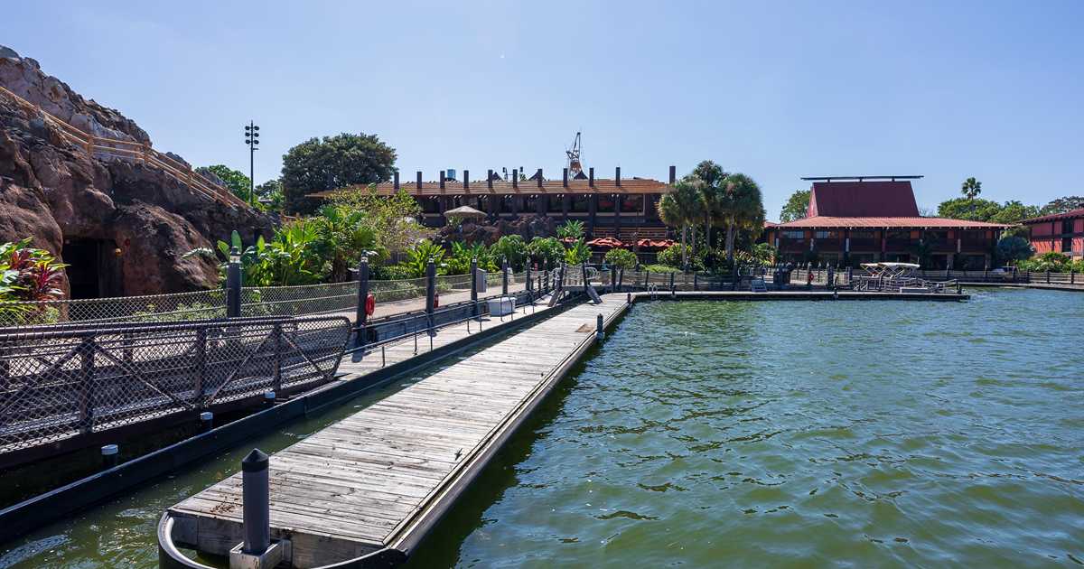
Really? I think it looks terrible in the concept art. Significantly worse.

If we're talking about the roof beams, at least.
 

DisneyOutsider

Well-Known Member
Really? I think it looks terrible in the concept art. Significantly worse.

If we're talking about the roof beams, at least.
You really can't see much of the beams in the art. The beams have always been much more visible from the lagoon side. I don't think there's enough to go off from that angle of the concept art, but it looks much much nicer to me as far as the resort arrival experience goes.

I think "terrible" is a pretty strong word considering it shows nearly the same beam feature, just more spaced out.

I'm nervous about whether they will actually deliver on the concept art, as their recent track record with this is spotty, but the concept would be a much needed improvement for many of my fellow die-hard Poly fans.
 

UNCgolf

Well-Known Member
You really can't see much of the beams in the art. The beams have always been much more visible from the lagoon side. I don't think there's enough to go off from that angle of the concept art, but it looks much much nicer to me as far as the resort arrival experience goes.

I think "terrible" is a pretty strong word considering it shows nearly the same beam feature, just more spaced out.

I'm nervous about whether they will actually deliver on the concept art, as their recent track record with this is spotty, but the concept would be a much needed improvement for many of my fellow die-hard Poly fans.

The spaced out is the problem. The beams don't work when they're spaced out like that -- as I said, they no longer look like they are supposed to be part of the roof of the building. They just look like something stuck on top for no real reason and I do think it looks absolutely terrible. They would be better off with no beams at all if there are only going to be a handful up there with huge gaps.

But as I also said, who knows what the actual plan is. The concept art is exceptionally bad architecturally, though.
 

DisneyOutsider

Well-Known Member
The spaced out is the problem. The beams don't work when they're spaced out like that -- as I said, they no longer look like they are supposed to be part of the roof of the building. They just look like something stuck on top for no real reason and I do think it looks absolutely terrible. They would be better off with no beams at all if there are only going to be a handful up there with huge gaps.

But as I also said, who knows what the actual plan is. The concept art is exceptionally bad architecturally, though.
Hmm, I just don't agree with that. I don't see any reason why it doesn't work with less beams other than it's a bit different than what we're used to seeing.

Maybe part of it is that despite being in love with the resort, I don't have very strong feelings for those beams as they've always appeared. I think having them certainly looks better than not having them, but thehe beams aren't really emulating any sort of well known architectural features from the real world. The overall look of the concept art actually adds more Polynesian inspiration versus what was there before.
 

UNCgolf

Well-Known Member
Hmm, I just don't agree with that. I don't see any reason why it doesn't work with less beams other than it's a bit different than what we're used to seeing.

Maybe part of it is that despite being in love with the resort, I don't have very strong feelings for those beams as they've always appeared. I think having them certainly looks better than not having them, but thehe beams aren't really emulating any sort of well known architectural features from the real world. The overall look of the concept art actually adds more Polynesian inspiration versus what was there before.

The beams are the only part I have a problem with -- and it's just that they no longer even appear to serve any kind of purpose.

They were always a bit strange, since as @_caleb said, it seems like they should have been the supports for a roof rather than just out there in the open, but they were so densely packed it still kind of worked. Once they're spread out, my mind immediately thinks, "what are those even supposed to be? why are they there?"
 

_caleb

Well-Known Member
thehe beams aren't really emulating any sort of well known architectural features from the real world.
Isn't there an architectural roofline actually called "polynesian" truss? Maybe that's not common?

RoofTrussTypes.jpg
 

DisneyOutsider

Well-Known Member
Isn't there an architectural roofline actually called "polynesian" truss? Maybe that's not common?

View attachment 508697
Yes, a Polynesian-inspired roof-line is very distinguishable and an example of this is the new port cochere in the concept art... but those trusses obviously wouldn't be observable external to the structure as the beams are. To me these beams are a sort of caricature-ized feature of Polynesian architecture.. sort of like tiki culture. I'm not saying I'm anti-beam.. just that I don't see any reason why more beams is architecturally superior to less beams in this case.
 
Last edited:

UNCgolf

Well-Known Member
Yes, a Polynesian-inspired roof-line is very distinguishable and an example of this is the new port cochere in the concept art... but those trusses obviously wouldn't be observable external to the structure as the beams are. To me these beams are a sort of caricature-ized feature of Polynesian architecture.. sort of like tiki culture. I'm not saying I'm anti-beam.. just that I don't see any reason why more beams is architecturally superior to less beams in this case.

Again, it's because the beams were so dense that it actually looked like they were the roof (and in the Polynesian style). Fewer beams just looks like nothing; it no longer looks like that style.

I understand if it doesn't matter to you, but it seems so obvious to me that I'm honestly surprised other people don't see it even if they don't care.
 

DisneyOutsider

Well-Known Member
Again, it's because the beams were so dense that it actually looked like they were the roof (and in the Polynesian style). Fewer beams just looks like nothing; it no longer looks like that style.

I understand if it doesn't matter to you, but it seems so obvious to me that I'm honestly surprised other people don't see it even if they don't care.
Well, now I think I see the engine behind our disagreement.

I think you'd be hard-pressed to find many others who thought those beams looked like the roof. They're kinda cool, but they've never given me that effect. Maybe I just spend way too much time there to suspend disbelief.
 

easyrowrdw

Well-Known Member
Again, it's because the beams were so dense that it actually looked like they were the roof (and in the Polynesian style). Fewer beams just looks like nothing; it no longer looks like that style.

I understand if it doesn't matter to you, but it seems so obvious to me that I'm honestly surprised other people don't see it even if they don't care.
Interesting. I never thought of them as actually being the roof. As if they were humongous beams that originated on the ground and formed the frame of the building? Kind of like the top of a teepee, but a different shape?
 

UNCgolf

Well-Known Member
Well, now I think I see the engine behind our disagreement.

I think you'd be hard-pressed to find many others who thought those beams looked like the roof. They're kinda cool, but they've never given me that effect. Maybe I just spend way too much time there to suspend disbelief.
Interesting. I never thought of them as actually being the roof. As if they were humongous beams that originated on the ground and formed the frame of the building? Kind of like the top of a teepee, but a different shape?

I guess I'm not really getting my point across well. It's not that I thought they were actually the roof, but that they were dense enough to actually evoke the Polynesian style roof that @_caleb posted above. With they way they are spaced out in the concept art, they no longer evoke that at all to me.

I definitely seem to be in the minority, but the spaced out beams just look like random dross scattered on top as opposed to evoking the actual Polynesian style that the denser beams did.
 

Bocabear

Well-Known Member
I guess I'm not really getting my point across well. It's not that I thought they were actually the roof, but that they were dense enough to actually evoke the Polynesian style roof that @_caleb posted above. With they way they are spaced out in the concept art, they no longer evoke that at all to me.

I definitely seem to be in the minority, but the spaced out beams just look like random dross scattered on top as opposed to evoking the actual Polynesian style that the denser beams did.
you don't have to over explain it...The beams were a nod to the Polynesian architecture... and a grand and visible feature of the Great Ceremonial Hall. They are visible and recognizable from great distances. If some people don't understand what they are, well there is not convincing we can do about that. I understood them even when I was a child and went to WDW...
and again, without them, the building is a flat roofed box indistinguishable on the skyline of Walt Disney World.
I get it that the Monorail station needed some work...but as for the rest of the project, they just de-furbished the Great Ceremonial House a couple years ago ruining it's iconic lobby... There are many many other places around the property that need more work than this building does...
 

easyrowrdw

Well-Known Member
I guess I'm not really getting my point across well. It's not that I thought they were actually the roof, but that they were dense enough to actually evoke the Polynesian style roof that @_caleb posted above. With they way they are spaced out in the concept art, they no longer evoke that at all to me.

I definitely seem to be in the minority, but the spaced out beams just look like random dross scattered on top as opposed to evoking the actual Polynesian style that the denser beams did.
I think I understand. Thanks for replying.
 

Register on WDWMAGIC. This sidebar will go away, and you'll see fewer ads.

Back
Top Bottom