I get that too. One could argue that Christmas in the contemporary sense is celebrated by many people that are not celebrating the birth of Christ. And there are some British writers in there too, but I don’t think a Mulan song performed in any language is the best representation of actual Chinese Culture. And the same applies across the board to the other IP. Maybe there will also be amazing pieces of music that actually originated from these cultures too. Fingers crossed. That video just doesn’t inspire confidence.I understand what you're saying, I really do, but I'd like to point out that some of the best Christmas songs were written by Jews. Not everything has to be done by the original group of people to become special or authentic.
I think this show will have high guest sat - I just wish the barges went away during the daytime like everyone else.
-
The new WDWMAGIC iOS app is here!
Stay up to date with the latest Disney news, photos, and discussions right from your iPhone. The app is free to download and gives you quick access to news articles, forums, photo galleries, park hours, weather and Lightning Lane pricing. Learn More -
Welcome to the WDWMAGIC.COM Forums!
Please take a look around, and feel free to sign up and join the community.
You are using an out of date browser. It may not display this or other websites correctly.
You should upgrade or use an alternative browser.
You should upgrade or use an alternative browser.
EPCOT Reflections of Earth confirmed to be replaced by Harmonious
- Thread starter wdwmagic
- Start date
As expected, the content is questionable, daytime appearance is hideous, but visuals during the show appear spectacular (to me). I can’t wait to try and ignore the stargate and tacos all day before enjoying this show with my family.
They are going full Coco lately.
And that is most pleasing.
ToTBellHop
Well-Known Member
Absolutely. It’s a gem of a movie. What took them so long! I just hope Enchantment chooses a different song. There’s more than one in the movie!And that is most pleasing.
Absolutely. It’s a gem of a movie. What took them so long! I just hope Enchantment chooses a different song. There’s more than one in the movie!
I always thought the music for the crossing of the Marigold Bridge is one of the prettiest pieces of music ever written. That would make a GREAT projection scene somewhere.
truecoat
Well-Known Member
I'm going to be in Epcot on 10/01 but not because I planned to be there for the 50th. I had a friend who wanted to go for a couple days and picked October 1st as a time to go. It was only after I booked our flights that I thought about the date being the 50th and being in Epcot for the first showing of Harmonious. I hope this show is really good but those structures look out of place.
As a person who usually goes to Disneyland, I've seen some comments on why wasn't it like WOC. I have a feeling this structure is above the water because of WOC. WOC is down right now for an extended refurb and has had several refurbs so far. All that equipment underwater takes it's toll. Even the projector housings above water rotted away and are all backstage torn apart. Those have to be rebuilt now. Epcot can't have a show down for so long with refurbs in my opinion. Time will tell if they made the right choice and if water will still gum up the works so to speak.
As a person who usually goes to Disneyland, I've seen some comments on why wasn't it like WOC. I have a feeling this structure is above the water because of WOC. WOC is down right now for an extended refurb and has had several refurbs so far. All that equipment underwater takes it's toll. Even the projector housings above water rotted away and are all backstage torn apart. Those have to be rebuilt now. Epcot can't have a show down for so long with refurbs in my opinion. Time will tell if they made the right choice and if water will still gum up the works so to speak.
hpyhnt 1000
Well-Known Member
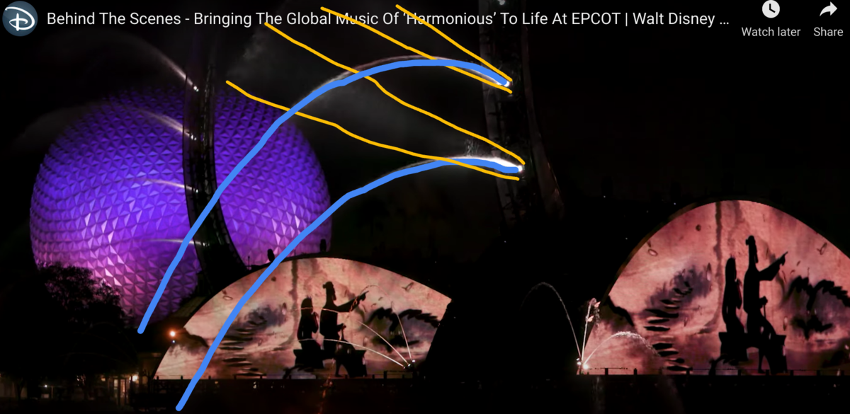
From a show design standpoint, one thing that has bothered me is the team either not taking into account or not really caring about how light and water do very different things once they are off a vertical axis. So, in this screenshot of the Mulan section, you have arcing jets of water (the blue) that are barely illuminated because the lighting (the yellow) is going in a different direction:

You can really see how silly this looks on the arm behind, where only the first few feet of water is visible before it all just disappears because light doesn't bend like water does.
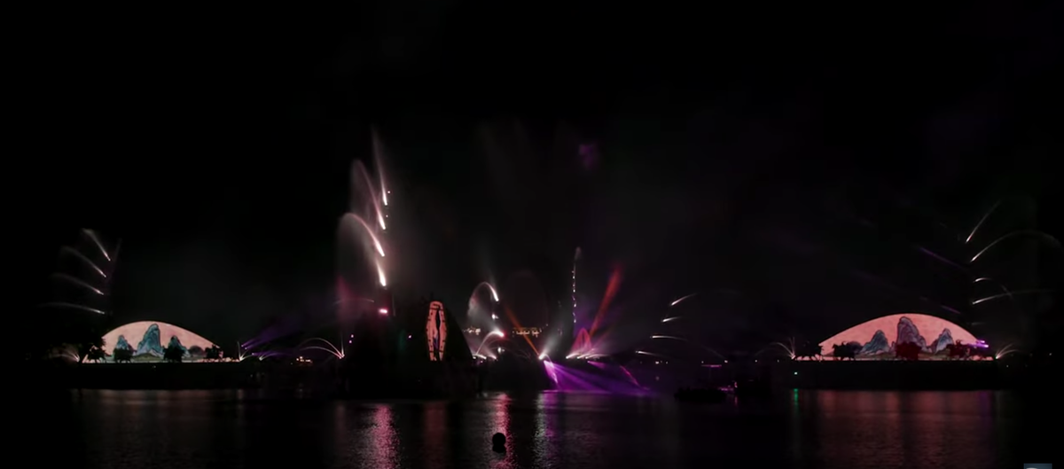
And so you end up with a section like this where a lot of fountains are on, yet you barely see them:

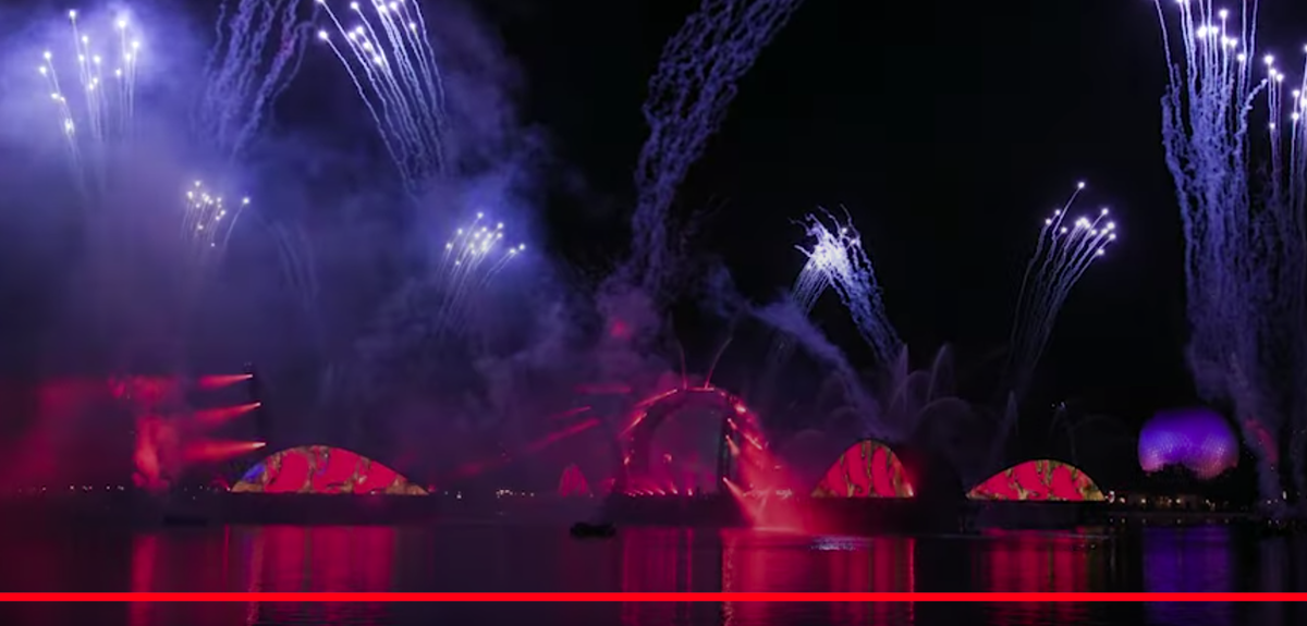
To give another example, here's a close up from one of the video's split screens. In this shot, the fountains on top of the tacos are on but not yet illuminated; we only see them because of the residual glow of the fireworks:

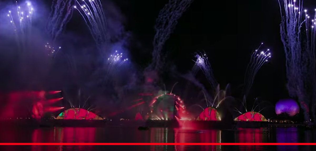
And here's a few frames later with the fountain lights now on. I'm not exactly wowed by the difference:

Maybe this is the look the team were going for. Will everything look better in person with the naked eye? Hopefully. But I'm worried it's just going to look like a mess of bright spotlights and dim fountains going in random directions, because that's kinda how it looks in the videos and pictures.
You can really see how silly this looks on the arm behind, where only the first few feet of water is visible before it all just disappears because light doesn't bend like water does.
And so you end up with a section like this where a lot of fountains are on, yet you barely see them:
To give another example, here's a close up from one of the video's split screens. In this shot, the fountains on top of the tacos are on but not yet illuminated; we only see them because of the residual glow of the fireworks:
And here's a few frames later with the fountain lights now on. I'm not exactly wowed by the difference:
Maybe this is the look the team were going for. Will everything look better in person with the naked eye? Hopefully. But I'm worried it's just going to look like a mess of bright spotlights and dim fountains going in random directions, because that's kinda how it looks in the videos and pictures.
danv3
Well-Known Member
I have a strange suspicion that this show will have terrible pacing and will be in your face from start to finish
I think you meant to say "more Disney, more family, more timeless, more relevant."
Incomudro
Well-Known Member
As expected, the content is questionable, daytime appearance is hideous, but visuals during the show appear spectacular (to me). I can’t wait to try and ignore the stargate and tacos all day before enjoying this show with my family.
They are going full Coco lately.
Yes, the displays do look great.
But they ought to.
There are giant barges sitting there.
Maybe this is the look the team were going for. Will everything look better in person with the naked eye?
Hardly.. Expect your retinas to not adjust quick enough to the video brightness, compared to the fountain brightness and then fireworks on top of that.
Also why does the "Arms" on the barges (and the center stargate in particular) seem like they are kinda, randomly doing things half the time.. I've seen even in these preview video's, 2 or 3 times now where it looks like one or two arm's are just drifting out there in there own little world, pointing out into some jumbled data universe.
Gottliebjess
Member
Unpopular opinion: I think this looks amazing!!! The screens are awesome, the music is awesome and I’m excited for the IP in this show. I dig it! Can’t wait to see it in December!
brb1006
Well-Known Member
What about the tacos during the day?Unpopular opinion: I think this looks amazing!!! The screens are awesome, the music is awesome and I’m excited for the IP in this show. I dig it! Can’t wait to see it in December!
Vinnie Mac
Well-Known Member
What about them?What about the tacos during the day?
Vinnie Mac
Well-Known Member
If the music in the preview video is from the actual show, I'm kinda digging the soundtrack so far.
TikibirdLand
Well-Known Member
oh, and More Flags, More Fun!I think you meant to say "more Disney, more family, more timeless, more relevant."
ToTBellHop
Well-Known Member
I dig it too. I’m trying to embrace the new Epcot (doing otherwise is futile) and this looks like something my family will enjoy. I just wish it didn’t look so awful when the sun is out.If the music in the preview video is from the actual show, I'm kinda digging the soundtrack so far.
THEMEPARKPIONEER
Well-Known Member
I saw the latest behind the scenes, So this is basically Illuminations 25a 2.0. We saw how that went down, I think I was the only person on the planet that liked that show.
How is that any different than the brightness changes of the current set-up with bright floods in the fountains, bursts of fire, the image on the globe and all sorts of fireworks?Hardly.. Expect your retinas to not adjust quick enough to the video brightness, compared to the fountain brightness and then fireworks on top of that.
peter11435
Well-Known Member
It isn’tHow is that any different than the brightness changes of the current set-up with bright floods in the fountains, bursts of fire, the image on the globe and all sorts of fireworks?
Unpopular opinion: I think this looks amazing!!! The screens are awesome, the music is awesome and I’m excited for the IP in this show. I dig it! Can’t wait to see it in December!
Let's be unpopular together! I'm excited for it too and I like the way the images look on the screens so far. Even the music sounds gorgeous (oh my gosh, the Coco part).
Register on WDWMAGIC. This sidebar will go away, and you'll see fewer ads.
