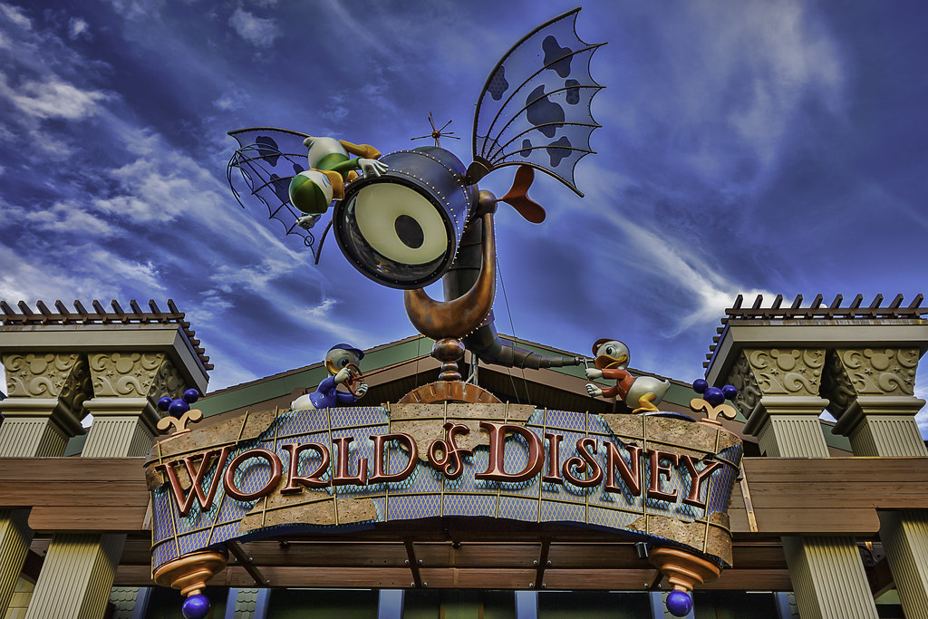
I think the problem is that whimsy simply for the sake of being whimsical doesn't equate to good usability or ability to sell product. Yeah, they are looking to be modern, accessible, and not stuck in the 80's and early 90's from a design perspective. I know people love to just go in an see the design of the store, but that's actually a problem. People spending more time looking at the decor, and not at product. Which in turn crowds the store, those who are actively buying are struggling to get around, items don't really follow any real logical order, mugs mixed in with candy, tshirts mixed with plushies even though the tshirts have a whole section. Is there music playing behind all this din? do those kids parents know they are running? where is a sales associate? I need a bigger size but the only person i see to help is in the cash wrap. Can I get around these strollers? Why do people leave double-wides here? There's no aisle, I'll weave.. oh I wanted to get my niece something... where are the baby items? Is it in girls? Or is there a baby section? Oh it's next to Christmas items (which also has kitchen goods) and purses, yes, why didn't I remember that? Damn, I can get over there... screw it, let's just leave what we have so far on this table of toys and I'll just order online.....


