News PHOTOS - Cinderella Castle at the Magic Kingdom to receive enhancements this summer

The Rocketeer

Well-Known Member
1. The pink color scheme is an eyesore.

2. The best incarnation of the castle was during Disneyland's 50th.
cinderella2005_frontview2006cb.jpg
I know some people didn't like it, but I loved when the castle looked like this.
 

SpectroMan93

Well-Known Member
Something like this?:

#ColorsByPhotoshop
View attachment 485403

It still would have made for a refreshed looking Castle for the 50th without being such an extreme bend on how it's generally appeared for 50 years.

Ironically, this looks a lot closer to the original concept art that what we have now. As much as I like the current color scheme, this would have been really elegant and royal. It feels more like Cinderella Castle in this photoshop. Really nicely done.
 

tirian

Well-Known Member
BCC4489352.jpg


They could have just spruced up the whites/gray/silver bricks and darkened the blues (maybe make them navy blue) turrets.
Something like this?:

#ColorsByPhotoshop
View attachment 485403

It still would have made for a refreshed looking Castle for the 50th without being such an extreme bend on how it's generally appeared for 50 years.
I think you're right. Here's my attempt:

View attachment 485408

Edit to specify, I left the turrets, gold, and curtain wall as they currently are, all I changed was the pink inner walls.

The two edits look good. Let’s also consider how we have fans doing a better job than the company itself for the resort’s 50th anniversary.

The original image from KB is beautiful.
 

yensidtlaw1969

Well-Known Member
The two edits look good. Let’s also consider how we have fans doing a better job than the company itself for the resort’s 50th anniversary.

The original image from KB is beautiful.
I won't pretend it isn't easier to twiddle some knobs in Photoshop than it is to paint a massive, iconic structure . . . but I also won't pretend Disney doesn't have the resources to get it right. Especially when the thing looked great or better for the better part of 5 decades.

This should have been an easy Home Run.
 

nicb88

Well-Known Member
Something like this?:

#ColorsByPhotoshop
View attachment 485403

It still would have made for a refreshed looking Castle for the 50th without being such an extreme bend on how it's generally appeared for 50 years.

You see, I like this. I don’t think I’d ever love it, at least not till seeing something in person. But it works and it’s a refresh that stays consistent with the MK castle vibe! So does the one that followed yours.

Like has been said, those higher up should have got this right. Nevermind eh? Perhaps after a short time they’ll change their minds and decide pink wasn’t the best choice?
 

Bocabear

Well-Known Member
The gold looks like barbed wires wrapped around so no.
In person the "Barbed Wires" were beautiful...studded with giant pailette sequins that were always moving in the breeze making the castle sparkle... The picture does not do that look justice. Maybe the mirror was alittle much, but I loved it all..It was clever and beautiful and engaging...and they did not force another park's signature castle color scheme onto it...it was still WDW's Original.
 

G00fyDad

Well-Known Member
In person the "Barbed Wires" were beautiful...studded with giant pailette sequins that were always moving in the breeze making the castle sparkle... The picture does not do that look justice. Maybe the mirror was alittle much, but I loved it all..It was clever and beautiful and engaging...and they did not force another park's signature castle color scheme onto it...it was still WDW's Original.

I first saw this in photos and thought it was amazing. When we actually went to MK and saw that large "mirror" on the front it looked way too gaudy. The rest was okay but the mirror was too much.
 

_caleb

Well-Known Member
I won't pretend it isn't easier to twiddle some knobs in Photoshop than it is to paint a massive, iconic structure . . . but I also won't pretend Disney doesn't have the resources to get it right. Especially when the thing looked great or better for the better part of 5 decades.

This should have been an easy Home Run.
I think this is exactly what Disney intended for the castle. I think they tuned the colors for Instagram filters. Although some fans miss the cooler colors, it seems like the pinkified color scheme is a home run on social media, which I think was the goal.

Screen Shot 2020-07-22 at 11.58.23 AM.png
 

yensidtlaw1969

Well-Known Member
I think this is exactly what Disney intended for the castle. I think they tuned the colors for Instagram filters. Although some fans miss the cooler colors, it seems like the pinkified color scheme is a home run on social media, which I think was the goal.

View attachment 485556
I don't buy the idea that Disney purposefully painted the icon of their flagship resort colors that look weird in person because they would look good on Instagram. That doesn't pass the sniff test - it's not like the Castle ever looked BAD on Instagram. There's a reason Cinderella Castle regularly ranks as one of the most photographed places on Earth. And even if it didn't look great on Instagram I don't believe they'd really prioritize that over it looking good in person. That's called setting people up for a letdown - hardly the reaction they want Cinderella Castle to inspire as guests turn the corner on Main Street.

I think they made some art, did some tests, and genuinely concluded that the new color scheme was gonna look great in person. But you know what they say - in Theory there is no difference between Theory and Practice, but in Practice there is. I think it's really as simple as "they missed the mark". Surely they didn't spend the money and time to repaint with the intention that it be so divisive, so clearly something went wrong. Even if the Instagrammers love it . . . and not all of them do.

Not to mention that the nature of Instagram Filters is to unify the aesthetic of the image they're laid over, regardless of the subject . . . that's part of why they're so popular, they make pictures look "good" (your mileage may vary) whether they're good pictures or not. There's no need for Disney to undertake a massive repaint to try to calibrate for that.

I think they wanted to try something bold and new for the 50th Anniversary and it just isn't reading like they'd hoped.
 

_caleb

Well-Known Member
I don't buy the idea that Disney purposefully painted the icon of their flagship resort colors that look weird in person because they would look good on Instagram. That doesn't pass the sniff test - it's not like the Castle ever looked BAD on Instagram. There's a reason Cinderella Castle regularly ranks as one of the most photographed places on Earth. And even if it didn't look great on Instagram I don't believe they'd really prioritize that over it looking good in person. That's called setting people up for a letdown - hardly the reaction they want Cinderella Castle to inspire as guests turn the corner on Main Street.

I think they made some art, did some tests, and genuinely concluded that the new color scheme was gonna look great in person. But you know what they say - in Theory there is no difference between Theory and Practice, but in Practice there is. I think it's really as simple as "they missed the mark". Surely they didn't spend the money and time to repaint with the intention that it be so divisive, so clearly something went wrong. Even if the Instagrammers love it . . . and not all of them do.

Not to mention that the nature of Instagram Filters is to unify the aesthetic of the image they're laid over, regardless of the subject . . . that's part of why they're so popular, they make pictures look "good" (your mileage may vary) whether they're good pictures or not. There's no need for Disney to undertake a massive repaint to try to calibrate for that.

I think they wanted to try something bold and new for the 50th Anniversary and it just isn't reading like they'd hoped.
Obviously, what looks good on the castle is a matter of taste. In my opinion, the cooler-toned castle did indeed look bad at times on Instagram- washed out in the oversaturated filters many people use there. In many photos, it looks like modern people in front of the castle in the 1970s.

Did the colors of the castle look weird to you when you saw it in person? I'm sure we can find opinions either way. I agree that Disney wasn't trying to offend people with the new color scheme, but I absolutely think they wanted people to talk about the castle refresh and to share Instagram-filtered photos of it on social media.

While I'm totally open to the idea that Disney may have simply messed up with these colors for the castle, I know that many of the paint refresh projects are aimed (and designed) specifically for the Insta-set. (See the "Purple Wall" and all the accent colors that have been added to the refreshed Tomorrowland.)

It seems like the difference between your opinion and mine here is that you think the designers made a bad choice/mistake, and I think they're pretty savvy and did this strategically and on purpose.
 

nicb88

Well-Known Member
I don't buy the idea that Disney purposefully painted the icon of their flagship resort colors that look weird in person because they would look good on Instagram. That doesn't pass the sniff test - it's not like the Castle ever looked BAD on Instagram. There's a reason Cinderella Castle regularly ranks as one of the most photographed places on Earth. And even if it didn't look great on Instagram I don't believe they'd really prioritize that over it looking good in person. That's called setting people up for a letdown - hardly the reaction they want Cinderella Castle to inspire as guests turn the corner on Main Street.

I think they made some art, did some tests, and genuinely concluded that the new color scheme was gonna look great in person. But you know what they say - in Theory there is no difference between Theory and Practice, but in Practice there is. I think it's really as simple as "they missed the mark". Surely they didn't spend the money and time to repaint with the intention that it be so divisive, so clearly something went wrong. Even if the Instagrammers love it . . . and not all of them do.

Not to mention that the nature of Instagram Filters is to unify the aesthetic of the image they're laid over, regardless of the subject . . . that's part of why they're so popular, they make pictures look "good" (your mileage may vary) whether they're good pictures or not. There's no need for Disney to undertake a massive repaint to try to calibrate for that.

I think they wanted to try something bold and new for the 50th Anniversary and it just isn't reading like they'd hoped.

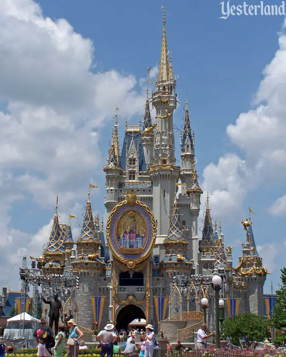
I entirely agree that this was surely not done just to satisfy people’s instagram photos. It makes no sense. Yes, times have changed and photos are now disseminated instantly and globally but surely the point of the castle is first and foremost for visitors to the Magic Kingdom, not those who look at it online.

If the colours had worked out better, it’d have been great on all counts, but the fact so many seem to dislike it (even if only half, it definitely seems more than a small percentage) in person and online says to me it hasn’t worked out how someone had hoped.

Disney are savvy and strategic and did this on purpose for sure (the motive can be called into question), but it doesn’t mean they get it right every time.
 

tirian

Well-Known Member
I don't buy the idea that Disney purposefully painted the icon of their flagship resort colors that look weird in person because they would look good on Instagram. That doesn't pass the sniff test - it's not like the Castle ever looked BAD on Instagram. There's a reason Cinderella Castle regularly ranks as one of the most photographed places on Earth. And even if it didn't look great on Instagram I don't believe they'd really prioritize that over it looking good in person. That's called setting people up for a letdown - hardly the reaction they want Cinderella Castle to inspire as guests turn the corner on Main Street.

I think they made some art, did some tests, and genuinely concluded that the new color scheme was gonna look great in person. But you know what they say - in Theory there is no difference between Theory and Practice, but in Practice there is. I think it's really as simple as "they missed the mark". Surely they didn't spend the money and time to repaint with the intention that it be so divisive, so clearly something went wrong. Even if the Instagrammers love it . . . and not all of them do.

Not to mention that the nature of Instagram Filters is to unify the aesthetic of the image they're laid over, regardless of the subject . . . that's part of why they're so popular, they make pictures look "good" (your mileage may vary) whether they're good pictures or not. There's no need for Disney to undertake a massive repaint to try to calibrate for that.

I think they wanted to try something bold and new for the 50th Anniversary and it just isn't reading like they'd hoped.
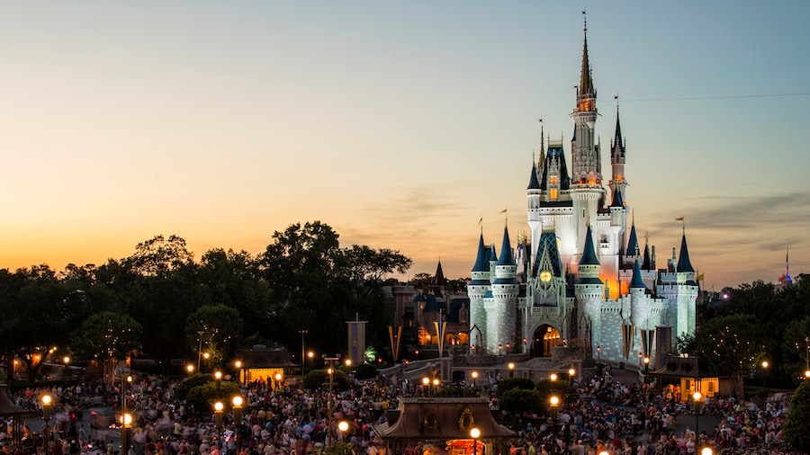
Not to mention, tests wouldn’t have been difficult for anyone who could afford a can of paint.
 

yensidtlaw1969

Well-Known Member
Not to mention, tests wouldn’t have been difficult for anyone who could afford a can of paint.
It surprised me that we never saw them test samples on a tower or two on the backside of the castle. Especially since they knew they were getting into metallics - a model or ground-level sample isn't gonna give you a clear idea of how that will actually look on a structure this scale.

Potential colors should have been looked at in-situ and viewed at different times of day and in different weather scenarios before deciding to ensure they picked something that had the best shot at looking good most of the time. I still remember seeing photos of them testing paint on secluded towers at Disneyland before repainting Sleeping Beauty Castle for its 50th, and that paint job was far less "risky" than this one in terms of variables.
 

Register on WDWMAGIC. This sidebar will go away, and you'll see fewer ads.

Back
Top Bottom