News PHOTOS - Cinderella Castle at the Magic Kingdom to receive enhancements this summer

KBLovedDisney

Well-Known Member
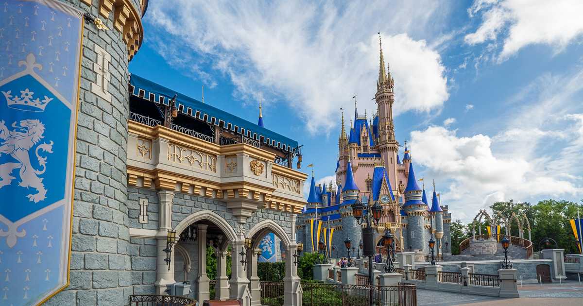
The blue-gray walls look nice, but still don't like the shiny pink, the blue turrets remain off-putting, and the metallic accents too gaudy.

Overall, I find it lousy and unattractive. It'd be one thing if this was a temporary scheme for the 50th, but as a permanent change it's unfortunate.
original.gif
 

MagicWDI

Well-Known Member
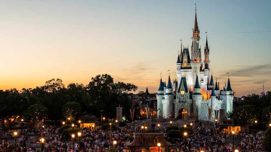
I've said it before, the castle is definitely "photogenic" and now seeing it mostly finished seems this was the main factor they were going for, shiny and new for the photos. It seems to be working, too.

We still have to wait for whatever hardware they may add as the actual 50th decorations, but as it stands now I am not a fan of the purple/blue and even the pink is too deep and bold. I'm a little disappointed because I really liked that concept art. However, I do like the gold trim for the golden anniversary and do like the new stone colors.
 

wdwmagic

Administrator
Moderator
Premium Member
Original Poster
I've said it before, the castle is definitely "photogenic" and now seeing it mostly finished seems this was the main factor they were going for, shiny and new for the photos. It seems to be working, too.

We still have to wait for whatever hardware they may add as the actual 50th decorations, but as it stands now I am not a fan of the purple/blue and even the pink is too deep and bold. I'm a little disappointed because I really liked that concept art. However, I do like the gold trim for the golden anniversary and do like the new stone colors.
I think you are right. The new colors work well on Instagram, and it responds to filters to give it pop. However, the look is definitely polarizing in person. Guess you cant please all the people all the time :)
 

Brian

Well-Known Member
The blue-gray walls look nice, but still don't like the shiny pink, the blue turrets remain off-putting, and the metallic accents too gaudy.

Overall, I find it lousy and unattractive. It'd be one thing if this was a temporary scheme for the 50th, but as a permanent change it's unfortunate.

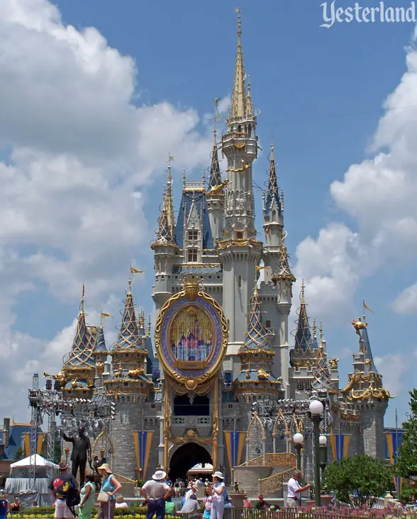
The castle is nearly 50 years old at this point.. no paint job is "permanent."
 

yensidtlaw1969

Well-Known Member
Journey with me again to the land of Photoshop Dreaming . . .

. . . I know the stone curtain wall is still being painted, but I can't help but imagine if instead of looking like this (Actual photo):

Cinderella-Castle_Full_38409.jpg


The color looked more like this (Photoshopped):

Cinderella-Castle_Full_38409 edit 2.jpg


It's an even greater departure from the traditional color scheme, but I think something like this would be more cohesive than what they're doing now. The warmth of the new color on the keep doesn't jibe with the coolness in the gray color on the curtain wall, but if they're really committed to that pink then at least paint the stone in something more harmonius.
 

nicb88

Well-Known Member

_caleb

Well-Known Member
I think the paint scheme would work fine with just one change: ditch the pink.

If they went back towards the ‘grey white’ inner portion, they could have their shiny blue, greyer greys and gaudy gold and it would probably look alright. With the pink it just doesn’t work.
Looks like the gray stones are being, um, enhanced(?) with blues, purples, and browns. See the lowest parts of the castle walls that have been repainted? Does that change your opinion at all?
 

nicb88

Well-Known Member
Looks like the gray stones are being, um, enhanced(?) with blues, purples, and browns. See the lowest parts of the castle walls that have been repainted? Does that change your opinion at all?

Sadly, no. I don’t think the pink fits the castle in Orlando the way it does in other parks/for other castles, warmer lower walls or not, haha. Thanks for trying to soften the blow, though!
 

yensidtlaw1969

Well-Known Member
I think the paint scheme would work fine with just one change: ditch the pink.

If they went back towards the ‘grey white’ inner portion, they could have their shiny blue, greyer greys and gaudy gold and it would probably look alright. With the pink it just doesn’t work.
Something like this?:

#ColorsByPhotoshop
Cinderella-Castle_Full_38409 Whites 2.jpg


It still would have made for a refreshed looking Castle for the 50th without being such an extreme bend on how it's generally appeared for 50 years.
 

kevlightyear

Well-Known Member
I think the paint scheme would work fine with just one change: ditch the pink.

If they went back towards the ‘grey white’ inner portion, they could have their shiny blue, greyer greys and gaudy gold and it would probably look alright. With the pink it just doesn’t work.

I think you're right. Here's my attempt:

Cinderella-Castle_Pinkless.png


Edit to specify, I left the turrets, gold, and curtain wall as they currently are, all I changed was the pink inner walls.
 

dmw

Well-Known Member
In the Parks
No
In one of the pictures I see rock work and trees at the base of the castle. Are those new? I don't recall seeing them before.
 

yensidtlaw1969

Well-Known Member
In one of the pictures I see rock work and trees at the base of the castle. Are those new? I don't recall seeing them before.
They've been there since the beginning, but I don't blame you for not noticing. Your attention is drawn very much upward when you're standing in the shadow of Cinderella Castle.
 

JusticeDisney

Well-Known Member
I think you are right. The new colors work well on Instagram, and it responds to filters to give it pop. However, the look is definitely polarizing in person. Guess you cant please all the people all the time :)
What’s your opinion of how it looks in person? I haven’t seen it firsthand yet, but I’m really starting to like what I see in pictures. Just curious what your thoughts are. Thanks!
 

Register on WDWMAGIC. This sidebar will go away, and you'll see fewer ads.

Back
Top Bottom