tirian
Well-Known Member
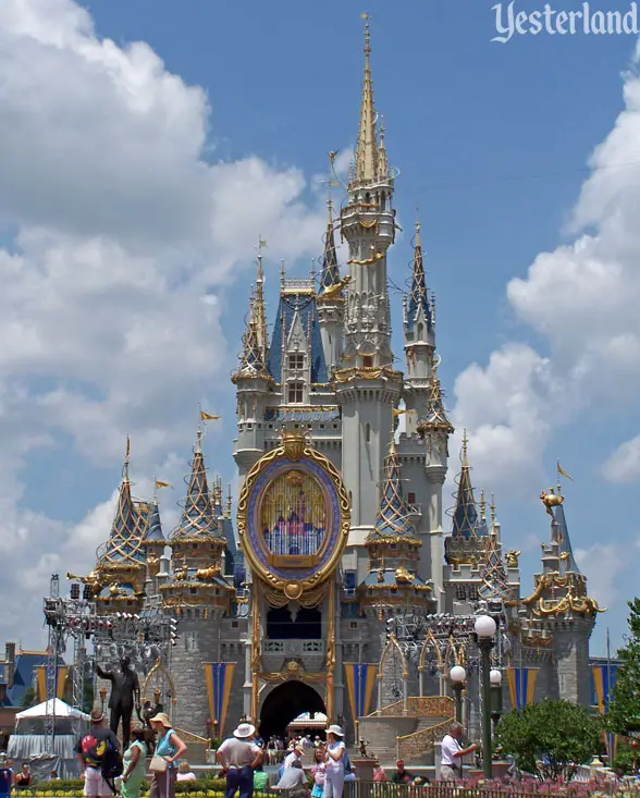
I know you’re talking about Disney, but that goes for me too. I’m referencing the bloggers and Twitter crowd saying, “You have to see it in person!!!!! (Gasp gosh squeal),” not anyone with a thoughtful response here.It's entirely possible that the design was Disney "bending over backwards to appeal to Instagram influencers" (like they do in LOTS of other areas) AND the result is a bad paint job.
I'm not a defender. I haven't seen the castle in person, I don't exactly love what I've seen in photos (hate the salmon look), and I preferred the previous colors. But I have said (and do continue to think) that the designers definitely had the Instagram set in mind with this color scheme.
Maybe the final result wasn't exactly what they intended, or maybe it is. At any rate, I don't think most of the people with strong opinions here were the primary intended audience.
Edit: in 1982, Disney consulted with Kodak to make sure Epcot’s concrete was tinted a specific color to make the greenery and trees pop in photographs. That’s the sort of care the company used to have.

