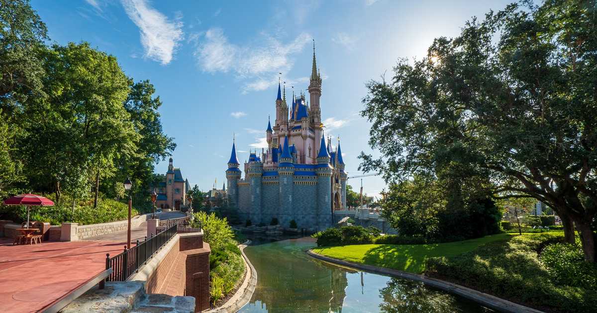
News PHOTOS - Cinderella Castle at the Magic Kingdom to receive enhancements this summer

tirian

Well-Known Member
Every single person that I have talked too that has seen the castle in person has commented on the same thing: the castle looks very different in different lighting. Everything from sunset to high noon to cloudy skies make the castle look incredibly different. At times the castle looks better than the old color scheme (supposedly best in softer lighting when the sun is closer to the horizon) and other times it looks dark and over saturated (supposedly heavy clouds are not a good look for it). Regardless, the variance is clear.
It’s in central Florida.

Central Florida.

How often do those perfect hazy lighting conditions exist?

Does California-based WDI even try anymore? An adjusted lighting package could’ve pulled off a similar effect at sunset.
 
Last edited:

tirian

Well-Known Member
In the warped mind of some interior decorator who loves pink. I have had bad experiences with some of those..... One new building where I was responsible for IT design an area was going to be used as an office space for a few months while another building was being remodeled. The area was ultimately to be a lobby area. The decorator had put in a change order to delete all a.c. outlets and communications outlets because she didn't want it to mess up the way she wanted the walls to look.
Some people don’t realize the phrase “Beauty is in the eye of the beholder” is intended to be snarky. In other words, it’s something you say to someone with bad taste—similar to what “Bless your heart” means in the Deep South. ;)
 

_caleb

Well-Known Member
Nobody. It’s a fan theory that’s been repeated to justify a bad decision. ;)

It’s kinda like the BAH that never needed to block the Chinese theater...
Hey! I admitted that I bought this theory, but as an explanation rather than a justification. I don't actually care for the new paint job, but I think they did it on purpose (with social media in mind).

And the hat was just bad. I literally visited on the week it came down and was cleared out just to finally get a good photo of the theater at the end of Hollywood Boulevard!
 

easyrowrdw

Well-Known Member
Every single person that I have talked too that has seen the castle in person has commented on the same thing: the castle looks very different in different lighting. Everything from sunset to high noon to cloudy skies make the castle look incredibly different. At times the castle looks better than the old color scheme (supposedly best in softer lighting when the sun is closer to the horizon) and other times it looks dark and over saturated (supposedly heavy clouds are not a good look for it). Regardless, the variance is clear.

It looks different shades of awful. Haha

The single time when it allegedly looks better than the previous iteration hardly seems to justify the other ~23 hours of bad.
 

wdwmagic

Administrator
Moderator
Premium Member
Original Poster
Every single person that I have talked too that has seen the castle in person has commented on the same thing: the castle looks very different in different lighting. Everything from sunset to high noon to cloudy skies make the castle look incredibly different. At times the castle looks better than the old color scheme (supposedly best in softer lighting when the sun is closer to the horizon) and other times it looks dark and over saturated (supposedly heavy clouds are not a good look for it). Regardless, the variance is clear.
Yep absolutely. You can even see it clearly in this sequence of photos - all taken at the same time, basically a 360 walk around the castle. The strong light on one side makes it look very different than the opposite side.


wdwmagic

Administrator
Moderator
Premium Member
Original Poster
The new castle look is a bit of a headache for marketing. All of the old shots of so many events and seasons are now unusable.

Holiday Services had to make a quick two light post mockup of the Halloween decor for today's announcement.

MagicKingdomFallDecor-scaled.jpg
 

tirian

Well-Known Member
Hey! I admitted that I bought this theory, but as an explanation rather than a justification. I don't actually care for the new paint job, but I think they did it on purpose (with social media in mind).

And the hat was just bad. I literally visited on the week it came down and was cleared out just to finally get a good photo of the theater at the end of Hollywood Boulevard!
:cool: Yeah, but you should read the fan comments on the official FB page. “I’m glad it looks more like a toy, it looks good with Insta filters,” etc.
 
Last edited:

brihow

Well-Known Member
They haven't redone the blue roofs on either side of the castle, where Sir Mickey's and Castle Couture is, and it really stands out.
Could be a sign they don't plan on keeping this new paint scheme for too long? Or maybe I'm just wishful thinking.
 

cheezbat

Well-Known Member
Finally saw it in person yesterday. I like the gold accents and the darker grey stone. Hate the pink. The metallic blue needs to be a more muted color too.
Really looked like they were going for Sleeping Beauty Castle East.
 

Register on WDWMAGIC. This sidebar will go away, and you'll see fewer ads.

Back
Top Bottom