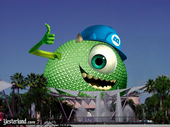
These brands ARE controlled. They're Disney brands. Are you okay with Siemens, Chevrolet, etc sponsoring Epcot attractions? No snark there, I'm legitimately trying to understand where you draw the line.
No snark assumed. I think we're talking two different issues. I'm fine with sponsors, and I'm fine with integration of/for those sponsors. I'm obvioiusly happiest when we find ways to integrate creatively, for example, when we can put a brand or sponsor in the story in a way that blends, as opposed to beats you over the head, but I do understand the need to keep the money happy. So when the opening announce for ROE says "brought to you by our friends at Siemens" that's fine. The Siemens/Sylvania/GE branding on SSE post show is non-obtrusive, and there's a "coolness" factor because of the laser used to project it, so I'm ok with that as well. It's end of the night, you've just ended on an emotional high note, there's nothing still open, and it draws your attention to the exit and to SSE's majesty. That's ok. If they ended by projecting a full scale commercial for Siemens or Sylvania or GE on the face of SSE, that is not - it's obtrusive, and breaks a wall of the theme that Epcot is built around.
The monorails are a different story. They're transportation, and they're not sponsored, nor are they in a park. As such, they are a part of the overall structure and theme of the property. That overall story is one of leaving the outside world behind, and entering a zone that is free of visual intrusion, unsightly utilities, et al. You don't see bus benches with ads or strip malls with ugly signage or city buses with ads on them like you do when you exit Lake Buena Vista and travel down Sand Lake Road or OBT or what have you. Further, the monorails are a fairly one-of-a-kind sight or experience. You don't see sleek monorails gliding down the street in your average city. So, they're something that catches the eye. By adding advertisements, you cheapen them. Even for an in-house synergy, it's heightening brand awareness of one product at the expense of the visual experience of what is generally looked at as a high-class form of transportation. Made worse by the fact that these types of ads are ubiquitous on city busses now, which are generally looked at as one of the more mundane forms of transportation...it blindly equates the monorails to city busses in our minds, intentional or not, and it takes us right back to the world that LBV is trying to differentiate from. Plus, they don't need this advertising. There are other ways to get mindshare without it being at the expense of something else.
I'd be more willing to say, fine, if the Studio wants ad space, give them an extra billboard on the property. Make it clean, and match the other highly stylized ones on the property. Put up period ads over at Boardwalk - blend them to the surroundings. Pixar would jump at the chance to create some 20s style ads for MU. That is creative that Walt would have gone for. Slapping the characters on the monorail is not. It's just lazy creative because the designer doesn't know the monorail is anything more than what he would design for a bus. I'd even be fine with putting the characters up on the Earful Tower hanging a sheet with the MU logo/some catchphrase/whatever else off the side, because although it's a cheap way to get away with doing minimal creative work, it's a prank that a college character would do, and therefore fits the theming, plus it's at Studios, where there's already a Pixar presence, in arguably a higher visibility location on the Tower next to major roadways. It's just no one thought of that - because it's now the new "thing" there's a thought process of "hey, what can we put on the monorail now?" instead of thinking "what's the best way to creatively advertise this IP/property/movie that fits the surroundings?"
Make sense?


