-
Welcome to the WDWMAGIC.COM Forums!
Please take a look around, and feel free to sign up and join the community.
You are using an out of date browser. It may not display this or other websites correctly.
You should upgrade or use an alternative browser.
You should upgrade or use an alternative browser.
News Paradise Pier Becoming Pixar Pier
- Thread starter iHeartDisneylandCats
- Start date
Disney Analyst
Well-Known Member
Removing that sign, at great expense no doubt, is a real head-scratcher. I guess they really wanted to go hard with the Pixar Ball graphic and to do that they had no choice but to eliminate the sign.
I mean, that Paradise Pier sign has been down since the DCA redo originally.
mickEblu
Well-Known Member
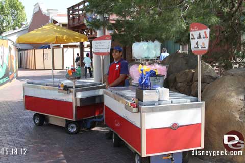
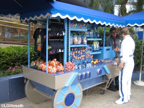
I don't love them, but to me the food stands at least tell a story (yet contrived and convoluted) and follow along somewhat with the kitsch of a seaside pier. I'm sure they'll be Instagrammed to death.
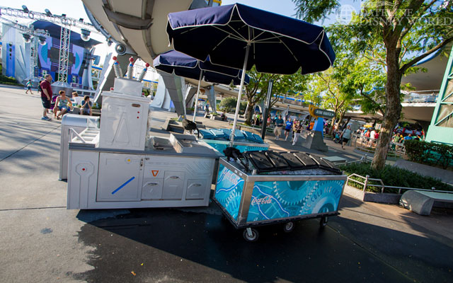
Those "ugly" food kiosks don't appear that they'll be as much of a atmosphere killer as the fleet of generic and awkward ODV carts scattered around DLR.


These carts don’t look great in the pics but I’ve never really giving them a second thought when at the parks. Maybe that ll happen with the Pixar Pier kiosks too. Although they definitely appear to be more attention grabbing in the concept art.
D
Deleted member 107043
These carts don’t look great in the pics but I’ve never really giving them a second thought when at the parks.
They are visual intrusions, and I can't help but see them every time I'm there. They immediately zap me out of the illusion and remind me that I'm in a theme park. Goes to show how personal the Disney park experience is and how individuals react differently to the same things.
Last edited by a moderator:
Curious Constance
Well-Known Member
I literally see them every time I'm there and they immediately zap me out of the illusion and remind me that I'm in a theme park. Goes to show how personal the Disney park experience is and how individuals react differently to the same things.
Maybe when you see the new carts in Pixar Pier, instead of thinking to yourself, "I'm in a theme park.", you'll think, "I"m in hell."
D
Deleted member 107043
I mean, that Paradise Pier sign has been down since the DCA redo originally.
I'm talking about this one.

Disney Analyst
Well-Known Member
I'm talking about this one.

Oh my gosh I forgot about it already
D
Deleted member 107043
Maybe when you see the new carts in Pixar Pier, instead of thinking to yourself, "I'm in a theme park.", you'll think, "I"m in hell."
LOL, yeah they aren't that bad to me. ¯\_(ツ)_/¯
I'm more bothered by the cynical impetus coming from Burbank to drown us all in Pixar. The fanciful new food stands aren't even close to the biggest issues I have with this project, which are all related to the unsophisticated approach to storytelling and forcing yet another inescapable Disney brand experience on visitors.
TROR
Well-Known Member
I'm talking about this one.

That MM paint scheme is seriously so much better.
Ismael Flores
Well-Known Member
I mean, that Paradise Pier sign has been down since the DCA redo originally.
The one on the coaster that was Above the circle just came down a couple months ago.
When Midway mania was built they added a Paradise Pier sign on the roofline of that building And they left the the large mickey circles on the coaster.
When DCA was remodeled I clueing parts of the pier they removed the Paradise sign from
Midway mania and added the large lit sign above the loop. That is when the mickey ears were also removed.
Disney Analyst
Well-Known Member
The one on the coaster that was nice the role just came down a couple months ago
I know, I realized my mistake a bit back. I had complete Amnesia over that sign.
Ismael Flores
Well-Known Member
They are visual intrusions, and I can't help but see them every time I'm there and they immediately zap me out of the illusion and remind me that I'm in a theme park. Goes to show how personal the Disney park experience is and how individuals react differently to the same things.
I agree, what makes it worse is that many of them are old ice cream ODV carts that just had shelves added to them and were placed everywhere without considering theme.
Even the newly repainted carts are just rolled over to the middle of a path and just parked. I see Carsland themed carts in Buena vista street which is very annoying
Ismael Flores
Well-Known Member
I know, I realized my mistake a bit back. I had complete Amnesia over that sign.
I should have read the rest of the posts, I noticed you had already answered previously.
But going back to that sign, it’s dificult to tell but I wonder if they could just have modified a couple letters, recentered them over the loop and used them.
The only letter they were missing was the “X”
TROR
Well-Known Member
The entire sign is one singular piece so they can't really just rearrange the letters.I should have read the rest of the posts, I noticed you had already answered previously.
But going back to that sign, it’s dificult to tell but I wonder if they could just have modified a couple letters, recentered them over the loop and used them.
The only letter they were missing was the “X”
D
Deleted member 107043
The entire sign is one singular piece so they can't really just rearrange the letters.
Funny I realized that a little while ago when I took a second look at the picture I posted earlier. Pixar also has fewer letters than Paradise.
Disneylover152
Well-Known Member
The entire sign is one singular piece so they can't really just rearrange the letters.
And it probably was "too much" money to take down the old sign AND create a new sign to be put up. God forbid spending an extra thousand dollars to create a new sign...
Also, with it painted on the loop rather than placed above, you can change out the theme of the land easier/quicker.
Phroobar
Well-Known Member
That is when it gets rethemed to Stark Pier.And it probably was "too much" money to take down the old sign AND create a new sign to be put up. God forbid spending an extra thousand dollars to create a new sign...
Also, with it painted on the loop rather than placed above, you can change out the theme of the land easier/quicker.
TragicMike
Well-Known Member
I visited the Pier today, it absolutely looks aesthetically pleasing in person.Everyone here is talking about overall aesthetic improvements, meanwhile I can’t stop thinking about this:
View attachment 278862
But yeah, I HATE that stupid Happy Meal Box along with the Señor Buzz Churros. Hopefully, they get replaced in the upcoming years.
TROR
Well-Known Member
"Hopefully"I visited the Pier today, it absolutely looks aesthetically pleasing in person.
But yeah, I HATE that stupid Happy Meal Box along with the Señor Buzz Churros. Hopefully, they get replaced in the upcoming years.
My friend, it's a guarantee. Nothing at DCA ever stays the same. If I'm not mistaken, the only opening day attractions left at DCA are Grizzly River Run, Redwood Creek Challenge Trail, and the Bakery Tour.
Shigg. W. McGee
Well-Known Member
Don't Forget:"Hopefully"
My friend, it's a guarantee. Nothing at DCA ever stays the same. If I'm not mistaken, the only opening day attractions left at DCA are Grizzly River Run, Redwood Creek Challenge Trail, and the Bakery Tour.
- The Animation Building
- The Golden Zephyr
Register on WDWMAGIC. This sidebar will go away, and you'll see fewer ads.
