-
Welcome to the WDWMAGIC.COM Forums!
Please take a look around, and feel free to sign up and join the community.
You are using an out of date browser. It may not display this or other websites correctly.
You should upgrade or use an alternative browser.
You should upgrade or use an alternative browser.
News Pacific Wharf to be Reimagined into San Fransokyo
- Thread starter DCBaker
- Start date
Disney Analyst
Well-Known Member
More views:
NobodyElse
Well-Known Member
I love how they didn't even remove the truss. Disney's really committed to this overlay, huh?
As I recall, that was in their original artwork. A bridge on a bridge.
Vegas Disney Fan
Well-Known Member
Would have totally defeated the purpose of a low budget overlay.to remove the trusses would require an all new bridge, that would in turn prob cost 10 million dollars and double the cost of this overlay
waltography
Well-Known Member
In person, the towers are a lot wider than the concept art suggested. I hope the string lights are enough to make it still look a bit like a suspension bridge.
NobodyElse
Well-Known Member
Forgive my quick and sloppy edit, but would it kill them to just mute the color of the original bridge structure? Was paint not in the budget?


waltography
Well-Known Member
Personally, it'd look a lot weirder if the truss was painted in a muted orange compared to the torii towers; it only works in your edit because it's depicting the bridge at night, so the trusses more easily recede into the background. That same muted or dark color I think would look distracting in the daytime.Forgive my quick and sloppy edit, but would it kill them to just mute the color of the original bridge structure? Was paint not in the budget?
View attachment 727750
View attachment 727751
NobodyElse
Well-Known Member
Personally, it'd look a lot weirder if the truss was painted in a muted orange compared to the torii towers; it only works in your edit because it's depicting the bridge at night, so the trusses more easily recede into the background. That same muted or dark color I think would look distracting in the daytime.
View attachment 727799
Well, in that concept they show the low fence and hand railing painted that light blue / grey color. Perhaps that's the answer, or should it be "go-away green"? Personally I'll never get past having one style of bridge plopped on top of another, so I would like them to do what they can to avoid drawing my attention to that fact.
And for the record, I think that taking the iconic Golden Gate Bridge and adding Shinto-style elements to it is a pretty great way of visually conveying the concept of "San Fransokyo". Without casting judgement on the whole project, it they would reproduce that design, I wouldn't mind at all.
I guess I should wait to see the final product, but based on every rendering I've seen, I'm just going to think it looks dumb. (Which will just be my opinion.)
Last edited:
Disney Analyst
Well-Known Member
I’m not seeing any added elements, just a fresh paint job (the second photo).
TP2000
Well-Known Member
I’m not seeing any added elements, just a fresh paint job (the second photo).
Yeah, none of those barrels or pipes or water tanks are new. They've all been there since 2001.
TP2000
Well-Known Member
I really do love how DCA went from having a pathetic recreation of the Golden Gate Bridge, to no Golden Gate Bridge, and is now putting money into a new pathetic Golden Gate Bridge. It really showcases the stupidity of Disney in their handling of this park.
No kidding.
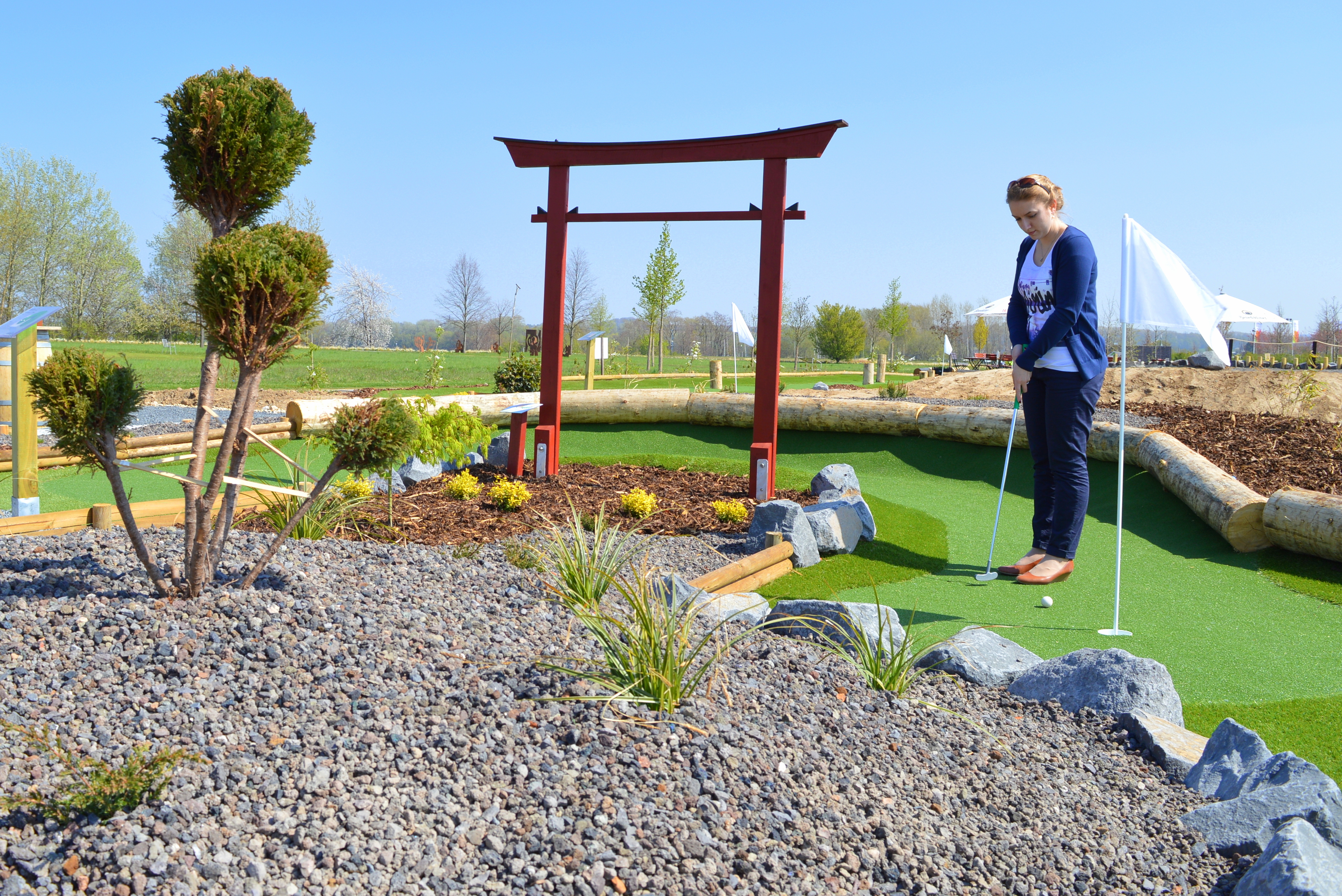
I don't care how much we try and edit the paint and trusses on this thing, when I look at that San Fransokyo bridge to the food court in DCA I will never NOT just see a Miniature Golf Course.
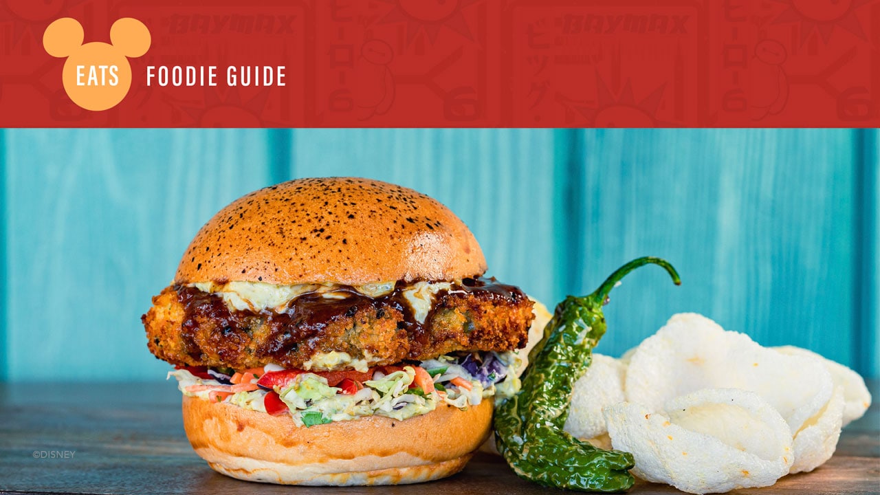
Here's the Foodie Guide for new eats and drinks coming to San Fransokyo Square.


Disney Eats: Foodie Guide to San Fransokyo Square
I am pleased to share with you the eats and sips coming soon to Disney California Adventure park in Disneyland Resort in this San Fransokyo Square Foodie Guide.
disneyparks.disney.go.com
Vegas Disney Fan
Well-Known Member
After reading that menu I’ll still end up getting the Teriyaki chicken at Lucky Fortune… I’m a creature of habit and nothing on that menu looks good enough to change that. The sipper is cute though.Here's the Foodie Guide for new eats and drinks coming to San Fransokyo Square.

Disney Eats: Foodie Guide to San Fransokyo Square
I am pleased to share with you the eats and sips coming soon to Disney California Adventure park in Disneyland Resort in this San Fransokyo Square Foodie Guide.disneyparks.disney.go.com
NobodyElse
Well-Known Member
No kidding.
I don't care how much we try and edit the paint and trusses on this thing, when I look at that San Fransokyo bridge to the food court in DCA I will never NOT just see a Miniature Golf Course.

Perhaps somewhat ironically, the old Disneyland Hotel adjacent miniature golf course featured elements that were much more highly-detailed, properly scaled, yet less nonsensical than that double-down bridge.
By the way, have I mentioned lately how inane I feel that "bridge on a bridge" design is? Perhaps this strapping young South African understands and appreciates it, but I still don't.
Too Many Hats
Well-Known Member
DCA 3.0 is the embodiment of "a hat on a hat."
Consumer
Well-Known Member
Hard to believe these two photos are the same person.Perhaps somewhat ironically, the old Disneyland Hotel adjacent miniature golf course featured elements that were much more highly-detailed, properly scaled, yet less nonsensical than that double-down bridge.
View attachment 729439
By the way, have I mentioned lately how inane I feel that "bridge on a bridge" design is? Perhaps this strapping young South African understands and appreciates it, but I still don't.
View attachment 729440
TP2000
Well-Known Member
Hard to believe these two photos are the same person.
I'm pretty sure the second child is a photo of a young Elon Musk. Perhaps the best thing to come out of South Africa in a very long time.
And thank God that Elon is on OUR side, instead of aligning with the Russians or Chinese. Cause we'd be screwed if his brain power was controlled by avowed Communists and/or former KGB agents instead of being used to the benefit of American democracy and free market capitalism.
Disney Irish
Premium Member
How would you know if he really his or not......I'm pretty sure the second child is a photo of a young Elon Musk. Perhaps the best thing to come out of South Africa in a very long time.
And thank God that Elon is on OUR side, instead of aligning with the Russians or Chinese. Cause we'd be screwed if his brain power was controlled by avowed Communists and/or former KGB agents instead of being used to the benefit of American democracy and free market capitalism.
Register on WDWMAGIC. This sidebar will go away, and you'll see fewer ads.
