New Walt Disney World logo,

flynnibus

Premium Member
The dropping of Walt in the pictures logo is due to Mobile phones. Smaller screens required a simpler logo that was more legibible.

That excuse is complete crap and was just fluff thrown around. It's about branding - not technology limitations. Besides the fact most video resolutions are higher than what Disney did for decades on VHS.. and the clarity on screens is higher than ever.. and the text beyond the placard is far smaller.. That was just some dreamt up response.
 

TRONorail10

Active Member
It seems in 2013 Walt Disney World will be getting this new retro-informed logo as seen here. To our insiders when should we expect resort signage to reflect the new logo?
IMG_9697-X2.jpg

Not a big fan of Sorcerer Mickey being incorporated into the logo. Sorcerer Mickey was a specific CHARACTER portrayed by Mickey Mouse, it should be used in specifc merchandise, but not as a logo. We already have had to deal with a giant hat that is supposed to represent everything about the film industry, this is just some absurd idea thrown out there by a high up exec who had to get himself known in the company.
 

flynnibus

Premium Member
Not a big fan of Sorcerer Mickey being incorporated into the logo. Sorcerer Mickey was a specific CHARACTER portrayed by Mickey Mouse, it should be used in specifc merchandise, but not as a logo.

So you also think the Castle shouldn't be used in the logo either.. since that was a specific setting from a specific film?

Sorry - I don't agree with that train of thought...

Fantasia represents one of Walt's most ambitious, bold, and creative efforts.. what better to represent the Disney way?
 

lazyboy97o

Well-Known Member
That excuse is complete crap and was just fluff thrown around. It's about branding - not technology limitations. Besides the fact most video resolutions are higher than what Disney did for decades on VHS.. and the clarity on screens is higher than ever.. and the text beyond the placard is far smaller.. That was just some dreamt up response.
Yes, but its not the first time Mr. Hill has expected fans to buy into utter nonsense.
 

TRONorail10

Active Member
So you also think the Castle shouldn't be used in the logo either.. since that was a specific setting from a specific film?

Sorry - I don't agree with that train of thought...

Fantasia represents one of Walt's most ambitious, bold, and creative efforts.. what better to represent the Disney way?

You are missing the point. Picture Fiesta Donald in the logo for EPCOT, Safari Mickey in the logo for Animal Kingdom, Hollywood Mickey for Studios. Disney doesn't need to incorporate a specific character into their already recognizable park name logos. Look at how much of an impact those 3 circles have in the shape of Mickey. Those three circles will always represent so much more than Sorcerer Mickey ever will. They represent DISNEY. Sorcerer Mickey represents Fantasia. And to add to your castle argument, Cinderella Castle was built for the sole purpose of being the centerpiece and icon of the Magic Kingdom. It was built as a MARKETING tool from the start.
 

flynnibus

Premium Member
You are missing the point. Picture Fiesta Donald in the logo for EPCOT, Safari Mickey in the logo for Animal Kingdom, Hollywood Mickey for Studios. Disney doesn't need to incorporate a specific character into their already recognizable park name logos

Sometimes your existing 'recognizable' logo needs a refresh - for any number of motivations. Point being, just because the old logo 'worked' doesn't mean it is hands off forever. I don't see this as an attempt to 'plus' the logo before because it 'needed something' - but rather for change.

Look at how much of an impact those 3 circles have in the shape of Mickey. Those three circles will always represent so much more than Sorcerer Mickey ever will. They represent DISNEY

Because Disney has built that image - there is nothing to say Disney couldn't build new impressions too. You're using the argument of past history to say how things 'can only be this..'. That's not the case.. before the impression was set.. the object didn't carry the same message before.

Sorcerer Mickey has been associated with WDI and imagineering in the park for decades. It's not just about the segment in the movie. They can establish new associations in the future as well..
 

Darth Sidious

Authentically Disney Distinctly Chinese
Sometimes your existing 'recognizable' logo needs a refresh - for any number of motivations. Point being, just because the old logo 'worked' doesn't mean it is hands off forever. I don't see this as an attempt to 'plus' the logo before because it 'needed something' - but rather for change.


Because Disney has built that image - there is nothing to say Disney couldn't build new impressions too. You're using the argument of past history to say how things 'can only be this..'. That's not the case.. before the impression was set.. the object didn't carry the same message before.

Sorcerer Mickey has been associated with WDI and imagineering in the park for decades. It's not just about the segment in the movie. They can establish new associations in the future as well..

Not to mention Iger has said they want to begin featuring Mickey more. I know he's featured a lot as it is but I think they want a Mickey movie to re establish his character rather than spokesman. This could signal the future of those plans in either direction though lol.
 

TRONorail10

Active Member
Sometimes your existing 'recognizable' logo needs a refresh - for any number of motivations. Point being, just because the old logo 'worked' doesn't mean it is hands off forever. I don't see this as an attempt to 'plus' the logo before because it 'needed something' - but rather for change.


Because Disney has built that image - there is nothing to say Disney couldn't build new impressions too. You're using the argument of past history to say how things 'can only be this..'. That's not the case.. before the impression was set.. the object didn't carry the same message before.

Sorcerer Mickey has been associated with WDI and imagineering in the park for decades. It's not just about the segment in the movie. They can establish new associations in the future as well..

If Sorcerer Mickey is supposed to represent Disney Imagineering, Disneyland, and Walt Disney World where is the product differentiation from a marketing standpoint? Oh wait, there isn't because Disney is now blending their logos together. I get it, you like Sorcerer Mickey. But from a business standpoint, Disney is making another cardinal mistake that we will ultimately pay for with our own money down the road. All this is, is some hotshot executive trying to leave his mark in the company to say "I did that." That's what most of Disney's change has been about, I am actually surprised that Fantasyland and NextGen were even able to get off the ground because they involved so much planning through different channels and departments.
 

dopeylover

Well-Known Member
It seems in 2013 Walt Disney World will be getting this new retro-informed logo as seen here. To our insiders when should we expect resort signage to reflect the new logo?
IMG_9697-X2.jpg

I'm not sure if what I'm looking at, but it's ugly as sin!!! I LOVE vintage and retro stuff, esp. Disney, but this is just horrid. It reminds me of what a clown in my nightmares would wear.
 

Darth Sidious

Authentically Disney Distinctly Chinese
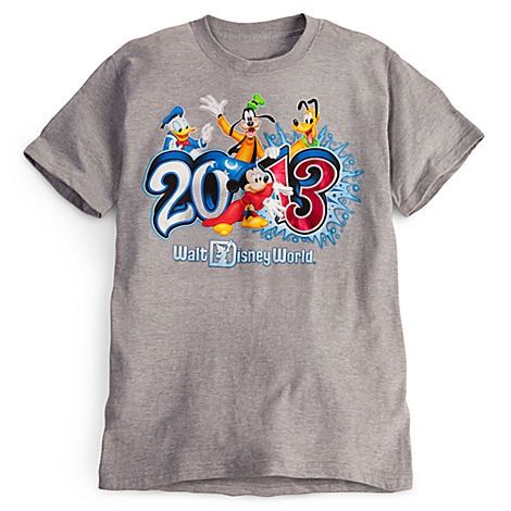
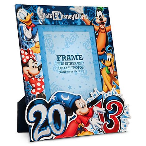
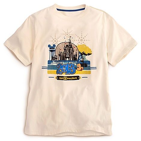
Perhaps these new items will indicate this is the new logo for WDW...

image-7_zps231dffc5.jpg


image-7_zps1a8f056f.jpg


And this ties more into another thread here but it appears the Earful tower is back to icon status as opposed to the BAH. (Or perhaps the new logo having the hat featured... They chose to use the tower instead)

image-7_zps798e6205.jpg
 

tirian

Well-Known Member
The sorcerer Mickey is not the only version being used. The original Walt Disney World logo with the globe is being printed on most of the adult merchandise, and the sorcerer Mickey version is used on everything for kids and the 2013 campaign. The logotype is here to stay, but the Image within the "D" depends on the product line.
 

lazyboy97o

Well-Known Member
I wonder if the archway for WDW will get the new logo as well?
How 'bout we just get rid of the ugly things?

The sorcerer Mickey is not the only version being used. The original Walt Disney World logo with the globe is being printed on most of the adult merchandise, and the sorcerer Mickey version is used on everything for kids and the 2013 campaign. The logotype is here to stay, but the Image within the "D" depends on the product line.
That's good to hear.
 

flavious27

Well-Known Member
It seems in 2013 Walt Disney World will be getting this new retro-informed logo as seen here. To our insiders when should we expect resort signage to reflect the new logo?
IMG_9697-X2.jpg

They also have an older dlr logo on there. I really don't think this is any kind of signaling from tdo or burbank
 

Rasvar

Well-Known Member
My parents told me about people they knew who came back from Disneyland in the late 60s with booklets of A, B, and C tickets that they never used and kept trying to sell...all because they just wanted the one or two D and E tickets that came in a booklet. You were NOT allowed to just buy an E or a D ticket...you had to buy the whole booklet. There was a sort of black market in play in the park where people would try to sell E or D tickets separately but people caught doing that were ejected.

Ok, this one I have to refute. First, you could pay cash at the entrance to the ride instead of a ticket. There was no need for a "black market" in E or D tickets. The ticket books included the general admission ticket. There were also tickets for individual sale at the ticket booths inside the parks. There is so much else wrong with the rest of the post but I'm not going to bother.
 

Register on WDWMAGIC. This sidebar will go away, and you'll see fewer ads.

Back
Top Bottom