CastAStone
5th gate? Just build a new resort Bob.
A swing? Not really sure.Any idea what it is? Everything I can think of that would normally be in roughly that shape doesn't really make sense because of both the location and the overall size.
A swing? Not really sure.Any idea what it is? Everything I can think of that would normally be in roughly that shape doesn't really make sense because of both the location and the overall size.
A swing? Not really sure.
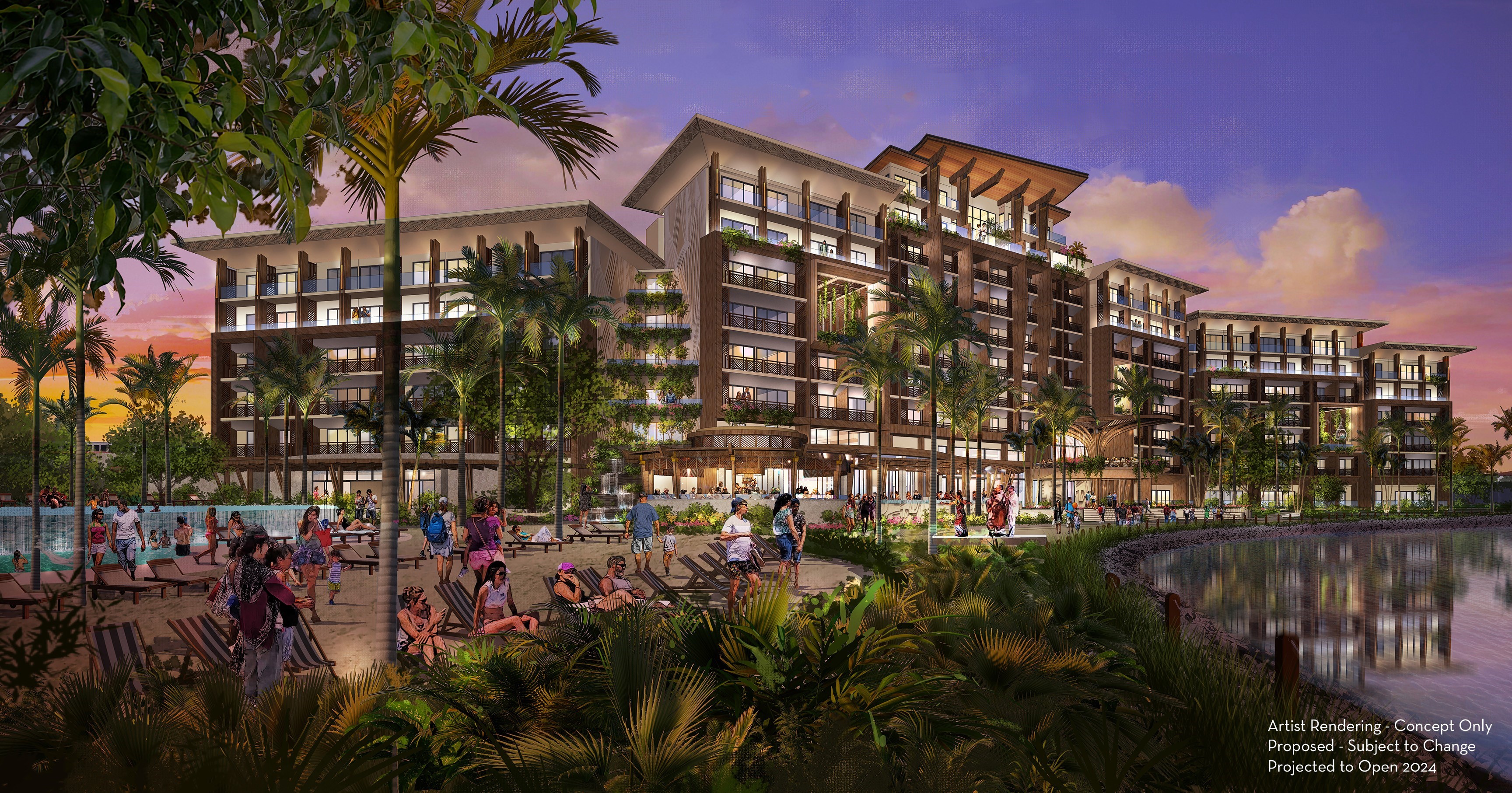
It’s nice that they are improving the hotels, but they are adding more guests to the over crowded parks. It’s hard enough now getting park reservations. What will happen when they add another 500 rooms?View attachment 627156

Disney Vacation Club announces plans for a new tower at Disney's Polynesian Village Resort
Disney's Polynesian Village Resort will expand its DVC offerings with a new tower expected to open in 2024www.wdwmagic.com
I can't wait to use my Boardwalk Villas points I bought direct in 1999 for $55 a point.Pretty!!!
I can't wait for someone to purchase $50,000 worth of points so I can rent them and stay here for the price of CBR.
There are some decent things about it. The roofline is just really wrong stylistically and it's in a very tight spot. Also, the stuff that looks like wood in the rendering had better either be actual wood or a convincing composite, not the brown beams of the porte cochère.This water feature looks nice:
Most likely will be cut due to budget...This water feature looks nice:
View attachment 627276
I agree that it does look like reflectionsSure, if you put it in the middle of a city or a beachside resort that isn't supposed to be themed. It doesn't look anything like the rest of the Polynesian.
It reminds me of the concept art for the cancelled Reflections.
I'm thinking more like a Cake and Bake Shop.For dining, you will have a choice of a filet, chicken, scallops and something plant based. But you will be afforded to opportunity to pay top dollar because each entree will have a fancy, Polynesian name.
There are some decent things about it. The roofline is just really wrong stylistically and it's in a very tight spot. Also, the stuff that looks like wood in the rendering had better either be actual wood or a convincing composite, not the brown beams of the porte cochère.
The other issue is that it doesn't fit in with the rest of the resort in either overall style or size. It's going to tower over the other buildings at the Polynesian.
Wait…the WOO has a website?!?There is a former poster here who has a site now. This Disney Tourist has a write up that pretty much expresses what many of us are feeling on this.
I don’t think so. The customers no longer care or even know the difference. They show up with cards at the ready as if they’ve been to sea for six months and the ship just pulled up in Singapore.This era of WDW will be defined by the alarming number of big, uninspired boxes that are being plopped down wherever on property with zero consideration for their surroundings.
There’s nothing “grand” about the grand Floridian…If “it looks nice” means it looks like the new Marriott Courtyard they’re putting up next to the Wal-Mart down by the interstate then ok. I guess. But it most certainly does NOT look like it belongs at the Polynesian Villiage. Or near the Grand Floridian.
I don’t know how to post the full resolution picture without it automatically being downscaled. But yes, I have a higher res version.
Edit: here try this, you should be able to pinch and zoom on mobile
Register on WDWMAGIC. This sidebar will go away, and you'll see fewer ads.
