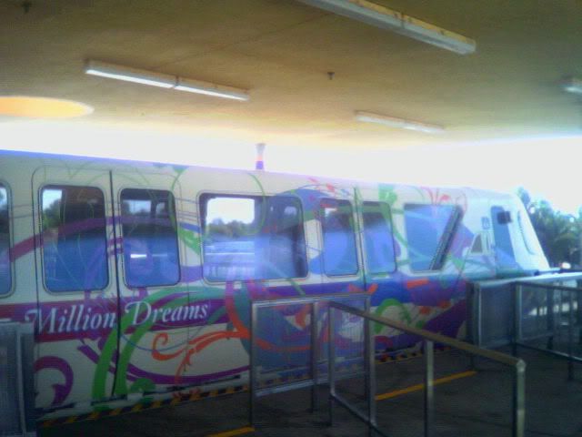
New monorail purple skin

joel_maxwell

Permanent Resident of EPCOT
i honestly cant decide if this is worse then the stitch rolling the castle. both tragic..... one just looks like fluorescent paint puked on it. just not sure how this works with the clouds of the normal advertisment
 

luckyeye13

New Member
The new graphics job on monorail purple is now complete and an identical sticker is now on the opposite side at the front of the monorail.
 

Mr.EPCOT

Active Member
Ironically, it kind of reminds me of the style of the original Journey Into Imagination.

They have the decals on Monorail Yellow, and were adding them to Monorail Blue last night.

By the way, that was me in those photos in the first post.
 
Ironically, it kind of reminds me of the style of the original Journey Into Imagination.

They have the decals on Monorail Yellow, and were adding them to Monorail Blue last night.

By the way, that was me in those photos in the first post.

I didn't read back through everything, but I thought someone said that it was just on the first car of Monorail Purple. Is it now covering all of Monorail Purple, Yellow, and Blue?
 

Mr.EPCOT

Active Member
I didn't read back through everything, but I thought someone said that it was just on the first car of Monorail Purple. Is it now covering all of Monorail Purple, Yellow, and Blue?

It is currently on Monorail Purple. They are on Monorail Yellow, and are being affixed to Monorail Blue. They will only be on Car One and Car Six, on opposite sides.
 

beefog

Member
This just in, a full skin pic w/ doors closed.

Image059.jpg
I say sweet, its awesome, anything to liven up the white is a great idea. I think the buses should get a whole wrap as well. And to top that off wrap the Contemporary as well. MORE COLOR PLEASE!!!!!!!

On top of that i think the Stitch stuff is awesome, the WDi & marketing should push more with whats selling. Just go with the flow
 

BeachClubVillas

Well-Known Member
I kinda like it. It's different and it livens things up. And it's not forever. It will (hopefully) come down when the celebration ends.

I have one question though: does it look "half done" with only one side of one car being different on each monorail?
 

Epcot82Guy

Well-Known Member
The concept's not bad. It's just too much (it's the opposite of Dinorama to be effective). The really odd thing is that the rest of the marketing/decoration for this has been fairly subtle and well done. This seems just too garrish for everything else going on.

But, who's up for CLUB MONORAIL: The Disney Party Bus! Pack cars 1 and 6, bust out the jello shots, and make a few more dreams come true! :drevil: :lookaroun
 

LilRoo714

New Member
Seriously these pictures make it much worse than it really is. When I saw the pictures I thought, :eek: they must have added more since I saw it this weekend. But that's not the case. It's just that when photographing only the last car it looks overwhelming. Standing on the ground in Epcot as the monorail passes through it looks good IMO. I thought it was a nice touch to match the wing/leaves things that are everywhere, although it does not match the new "Where Dreams Come True" signage on the main entrance gates.

Do the yellow and blue designs have the same color scheme which appears heavy on purple? I thought that was interesting too since much of the YoMD stuff is predominantly blue.
 

Fievel

RunDisney Addict
I'll concur on the fact that the pictures don't do it justice. It's only on the nose of the monorail, and as a whole, looks pretty good in my opinion. I would not like the whole monorail to be like this, however, as it would be too much.
 

Register on WDWMAGIC. This sidebar will go away, and you'll see fewer ads.

Back
Top Bottom