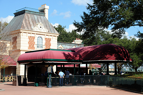
Theming was French since it's visible from France, though technically it's on the UK side of the water.The International Gateway always seemed more French to me. It's not very close to the UK pavilion, even though it's on the same side of the canal. But maybe they're redoing the shop.
-
Welcome to the WDWMAGIC.COM Forums!
Please take a look around, and feel free to sign up and join the community.
You are using an out of date browser. It may not display this or other websites correctly.
You should upgrade or use an alternative browser.
You should upgrade or use an alternative browser.
News New Gondola Transportation - Disney Skyliner
- Thread starter danlb_2000
- Start date
dreamscometrue
Well-Known Member
Should have probably been white cliffs then.Theming was French since it's visible from France, though technically it's on the UK side of the water.
")
deeevo
Well-Known Member
How aboutThat's not color, that is design. The design at TTC doesn't express any date to me. It is a show piece. So again, we are talking about individual tastes, not a hard fact of easily defined parameters. We may think of it as 90's because that is when we started to see it, to people that never saw it before it doesn't define any era. We must grasp that a place like WDW has to be neutral in the respect that you don't alter things because a few have an image. It is done to work with the majority and in this case, the majority doesn't give a rats tail about it except in the sense that it helps identify a feeling. I have always felt that the feeling was that of happy and fun, bright and cheery!

...it's a yungle
Well-Known Member
Ew, call a litter gitter, clean-up at TTC...someone puked the 90's all over the place! Now back to thread, I am so glad to see a new form of transportation coming to WDW! And thanks so much to the insiders for the amazing information!!!How about
jt04
Well-Known Member
It's neither.
The astehtics need changing but as a function it ain't broke so don't fix it. Unlike so many other things.
It's sorta broke. Just that nobody has come up with a better solution.
They did. It was called the Great Movie Refresh.It's sorta broke. Just that nobody has come up with a better solution.
They wouldn't pay for it.
jt04
Well-Known Member
They did. It was called the Great Movie Refresh.
They wouldn't pay for it.
I was talking about the TTC in 2017. But yeah I get what you are saying.
Gotcha.I was talking about the TTC in 2017. But yeah I get what you are saying.
TTC just needs a cohesive makeover that's not stuck in 1996. And the placement and amount of ticket desks vs present day guest flow looked at.
And did I say shelters for the new tram loading?
brb1006
Well-Known Member
Purple,Orange,Green and Blue (But Purple stands out) as 90's colors.I guess that is what I don't understand. What exactly is a 90's color. Do we not have the same color pallet today that we had 20 years ago. Did someone change colors on us. What would make it look like the 2000's? What would be different if you were trying to convey light hearted fun, whimsy and entertainment? I don't understand. I can understand clothing fashion changing with the times, but, I do not understand what color(s) the look should be like for now.
Is it, once again, a problem that is confined to only those of us that go there often and feel the need to see something different or do we feel that it affects or "turns off" first timers as well as veterans? Please don't tell me that it should be some type of variation of that godawful purple that they have painted the rocks in Tomorrowland, because that color is terrible and doesn't even have a connection to anything that means the future. Besides there is enough purple in WDW already.
brb1006
Well-Known Member
Needs more purplePersonally, this is what I think of in terms of 90s colors.
Notes from Neverland
Well-Known Member
I know that pattern. Soda cup?
Bingo!
Incomudro
Well-Known Member
Needs more purple
This paint splash/brush stuff was actually more 80's.
It began in the 80s...
Maybe we can get the gondolas to have the same color scheme as the TTA so they match?
Maybe we can get the gondolas to have the same color scheme as the TTA so they match?
Haymarket2008
Well-Known Member
Gotcha.
TTC just needs a cohesive makeover that's not stuck in 1996. And the placement and amount of ticket desks vs present day guest flow looked at.
And did I say shelters for the new tram loading?
Is there any current plans to do so? I would imagine, given the 50th fast approaching. That being said, I have a soft spot for the kitschiness of the TTC.
Cosmic Commando
Well-Known Member
Teal/light blue and purple are the ultimate 90s colors; you can track it easily with sports. It started in the late 80s with the Charlotte Hornets. Then the Mighty Ducks, the Sharks, two different Kings teams, the Grizzlies, the Marlins, the Cavaliers, the Pistons, the Timberwolves, the Bucks, the Spurs, the Raptors, the Jazz, the Wizards, the Capitals, the Coyotes, the Avalanche, the Islanders, the Carolina Panthers, the Ravens, (breathe), the Jaguars, the Titans, the Mariners, the Diamondbacks, the Devil Rays, the Angels, the Rockies, and the Brewers all added one of those colors or started the team with them in about a 10-year period. That's just the four major sports.
RSoxNo1
Well-Known Member
Will you elaborate on this after the Mickey ride is announced (or earlier)?They did. It was called the Great Movie Refresh.
They wouldn't pay for it.
TeriofTerror
Well-Known Member
"Red, yellow, green, red, blue, blue, blue, red, purple, green, yellow, orange, red, red."
Register on WDWMAGIC. This sidebar will go away, and you'll see fewer ads.