-
The new WDWMAGIC iOS app is here!
Stay up to date with the latest Disney news, photos, and discussions right from your iPhone. The app is free to download and gives you quick access to news articles, forums, photo galleries, park hours, weather and Lightning Lane pricing. Learn More -
Welcome to the WDWMAGIC.COM Forums!
Please take a look around, and feel free to sign up and join the community.
You are using an out of date browser. It may not display this or other websites correctly.
You should upgrade or use an alternative browser.
You should upgrade or use an alternative browser.
EPCOT New Epcot logo
- Thread starter wdwmagic
- Start date
Movielover
Well-Known Member
What an awful logo. What is it with Disney lately? They seem to be making things way too generic. Like World of Disney for example. It used to be so fun inside with all of it's character statues.
Funny since it's pretty much a reuse of the original Epcot Center logo...
I guess you don't like classic WDW do you?
brb1006
Well-Known Member
I agree, the current Magic Kingdom logo isn't as charming or eye popping as the older designs.The Magic Kingdom really needs to get its original logo back, especially as we approach 50 years of the Vacation Kingdom.

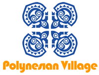
Remember when the old logos Contemporary Resort and the Polynesian Resort (Then called Polynesian Village) used to look like this?

brb1006
Well-Known Member
How long has the current logo for the Magic Kingdom been used? It felt like forever at this point.
Rich Brownn
Well-Known Member
I actually don't like the current WDW logo. It always seems to me "world" should go under the Walt Disney signature. Otherwise it seems to "lean" left to me visually.
brb1006
Well-Known Member
I seriously hoped they would have changed the current WDW back to this design with a small modern touch. These days you only see this logo in merchandise and a few flags around the resort.I actually don't like the current WDW logo. It always seems to me "world" should go under the Walt Disney signature. Otherwise it seems to "lean" left to me visually.

Rich Brownn
Well-Known Member
Alas they are in love with the pseudo-signature and they slap it on every park everywhere nowadays. (Ironic, because its actually a corporate logo and isn't Walt's signature at all).I seriously hoped they would have changed the current WDW back to this design with a small modern touch. These days you only see this logo in merchandise and a few flags around the resort.
oogie boogie man
Well-Known Member
Who did this logo the Brooklyn Nets? It is so boring.
Casper Gutman
Well-Known Member
Except the extra curves on the new logos C make it look like the parks name is “Epoot.” Which lacks a certain dignity.Funny since it's pretty much a reuse of the original Epcot Center logo...
View attachment 414420
I guess you don't like classic WDW do you?
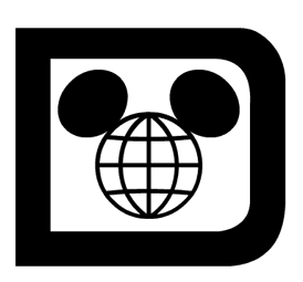
That font is disturbingly bad. There's no reason for the Ws to be below the baseline. The tail of the y does appropriately drop below the baseline, but the bottom of the upper loop misses the base line. Everything that is horizontal is skinnier than the vertical -- except when it isn't. The D is a ridiculous shape that doesn't match the rest of the type. The globe looks more like a web than a globe. The ears are tangent to the globe instead of being slightly behind the 'face' as is usually depicted.
ImperfectPixie
Well-Known Member
I agree on the typeface - it's as if someone who doesn't know the rules of letter/font design created it. The curved parts of letters (the bottoms of the "w"s, the "s"s, top of the "n", etc.) are supposed to extend slightly beyond the line used to determine letter height, but so slightly so that you don't notice it...they took it way too far and applied the rule haphazardly.That font is disturbingly bad. There's no reason for the Ws to be below the baseline. The tail of the y does appropriately drop below the baseline, but the bottom of the upper loop misses the base line. Everything that is horizontal is skinnier than the vertical -- except when it isn't. The D is a ridiculous shape that doesn't match the rest of the type. The globe looks more like a web than a globe. The ears are tangent to the globe instead of being slightly behind the 'face' as is usually depicted.
Brer Oswald
Well-Known Member
Honestly, the current one is fine.The Magic Kingdom really needs to get its original logo back, especially as we approach 50 years of the Vacation Kingdom.
Brer Oswald
Well-Known Member
There was always something a little off about the original logo for me. That being said, the current isn’t much better. I think if it was more consistent like the image I’m attaching, it’d be better. Kinda like the Disneylands.That font is disturbingly bad. There's no reason for the Ws to be below the baseline. The tail of the y does appropriately drop below the baseline, but the bottom of the upper loop misses the base line. Everything that is horizontal is skinnier than the vertical -- except when it isn't. The D is a ridiculous shape that doesn't match the rest of the type. The globe looks more like a web than a globe. The ears are tangent to the globe instead of being slightly behind the 'face' as is usually depicted.
Rambozo
Well-Known Member
Funny since it's pretty much a reuse of the original Epcot Center logo...
View attachment 414420
I guess you don't like classic WDW do you?
Not if it's boring. I don't care if Walt himself came up with it. A turd is a turd no matter how much you try to spit shine it.
Rich Brownn
Well-Known Member
The font is supposed to be curvy as in non-threading. The large D is the actual symbol that was used all over Disney and the largeness of th e D helps center the entire logo. Its not supposed to be in a straight baseline, as the idea was that is a "fun" logo and as such it tends to draw the eye in a pleasant, easy way.That font is disturbingly bad. There's no reason for the Ws to be below the baseline. The tail of the y does appropriately drop below the baseline, but the bottom of the upper loop misses the base line. Everything that is horizontal is skinnier than the vertical -- except when it isn't. The D is a ridiculous shape that doesn't match the rest of the type. The globe looks more like a web than a globe. The ears are tangent to the globe instead of being slightly behind the 'face' as is usually depicted.
ImperfectPixie
Well-Known Member
I disagree. There are good ways to break design rules and bad ones - they used bad ones.The font is supposed to be curvy as in non-threading. The large D is the actual symbol that was used all over Disney and the largeness of th e D helps center the entire logo. Its not supposed to be in a straight baseline, as the idea was that is a "fun" logo and as such it tends to draw the eye in a pleasant, easy way.
Sir_Cliff
Well-Known Member
I'm with you. Whatever rules they broke, I think they came up with an aesthetically pleasing and distinctive design. The D with the mouse ears was a particularly good piece of design as it gave them a shorthand for the entire resort which they still use despite the logo being discontinued.The font is supposed to be curvy as in non-threading. The large D is the actual symbol that was used all over Disney and the largeness of th e D helps center the entire logo. Its not supposed to be in a straight baseline, as the idea was that is a "fun" logo and as such it tends to draw the eye in a pleasant, easy way.
The current WDW logo is utterly generic and forgettable. It only really works on the level that it is straightforwardly descriptive, featuring the company logo with "World" tacked on in a generic typeface. Definitely the most bland of all the Disney resorts worldwide.
BoarderPhreak
Well-Known Member
Yup... October 1st... 1996.Do we know if Future World is gone on October 1st?
This.The font is supposed to be curvy as in non-threading. The large D is the actual symbol that was used all over Disney and the largeness of th e D helps center the entire logo. Its not supposed to be in a straight baseline, as the idea was that is a "fun" logo and as such it tends to draw the eye in a pleasant, easy way.
Fixed the most egregious parts...

Still an awful typeface.
Still an awful typeface.
Register on WDWMAGIC. This sidebar will go away, and you'll see fewer ads.