-
The new WDWMAGIC iOS app is here!
Stay up to date with the latest Disney news, photos, and discussions right from your iPhone. The app is free to download and gives you quick access to news articles, forums, photo galleries, park hours, weather and Lightning Lane pricing. Learn More -
Welcome to the WDWMAGIC.COM Forums!
Please take a look around, and feel free to sign up and join the community.
You are using an out of date browser. It may not display this or other websites correctly.
You should upgrade or use an alternative browser.
You should upgrade or use an alternative browser.
EPCOT New Epcot logo
- Thread starter wdwmagic
- Start date
Fear
Well-Known Member
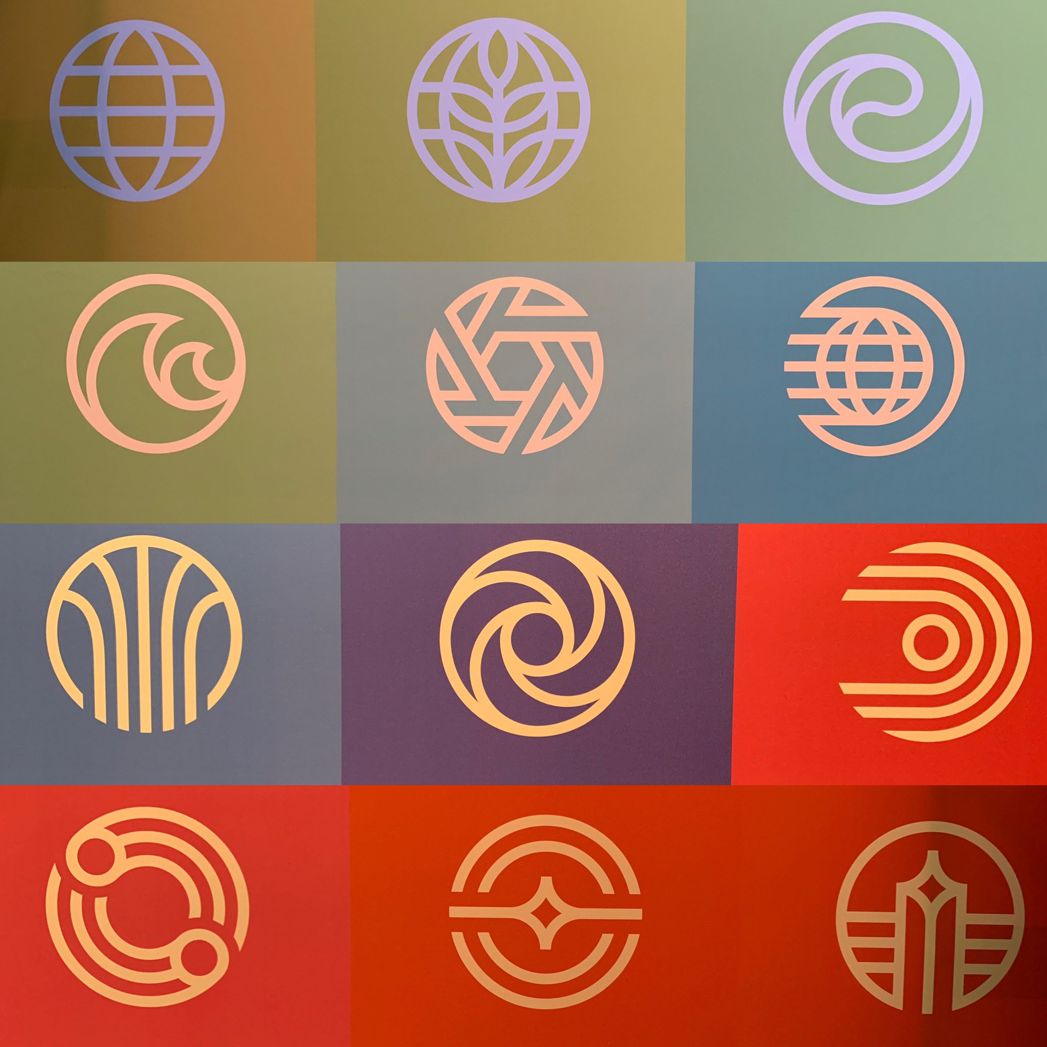
Here's a bigger photo of the new logos for the other attractions at Epcot.

Thanks for putting these all in one place. I say, in order:
1) Food service / MouseGear replacement
2) The Land
3) Moana/Water
4) The Seas with Nemo
5) Guardians of the Galaxy
6) Spaceship Earth
7) Events Center
8) Imagination
9) Test Track
10) Play!
11) Odyssey
12) Mission: Space
That would account for all of the buildings / pavilions we have without doubling up any.
TOCPE82
Well-Known Member
The original logo on the 21st century poster even had Walt Disney World above it.At least it’s not “Disney Epcot” or “Disney’s Epcot” or whatever grammatical iteration they’re using for the next ten minutes.
Now it's just EPCOT. I miss the Center, but at least it's refreshingly un-Disney-branded.
justintheharris
Well-Known Member
Much better than the Hollywood Studios logo earlier this year.
hpyhnt 1000
Well-Known Member
It's like the people behind the redesign/rebrand either:
A. Know and love the true EPCOT Center and want to hold onto as much of it as they can with this new mandate (giving me hope that one day someone new in the Bob's chairs will undo this mess with support from Imagineering)
-or-
B. They're just screwing with us.
@WDW Pro had mentioned this in another thread:
I'm very excited about the changes and announcements for Epcot. Based on the people involved, the budget, etc, I'm convinced this will be extremely well-received. There's a different feel for this project than for SWGE, with several people having told me that there's a strong emphasis to get this right coming all the way from Iger down. While some people may disagree with some of the new names or having a Marvel-based ride in Epcot, the people doing this are passionate about EPCOT.
I'd say that passion is coming through everything we've seen thus far. The modernization of the original EPCOT Center typography, the new attraction logos, the posters, the new entry plaza, even the style of the concept art - it all points to people who at least know the park's history and/or have some understanding of what made it so special.
I don't agree with or love everything so far - GotG is the most egregious, a thematic (and literal) blemish for decades to come unfortunately - but there's also reasons for optimism. Disney has the fans' attention on this EPCOT transformation; let's just hope they don't screw it up with the actual announcements on Sunday.
Transferrin
Active Member
Last edited:
We don't like Frank Wells?
I'll allow it.
wedenterprises
Well-Known Member
love it, and everything else we're seeing
Clyde Birdbrain
Unknown Member
Much better than the Hollywood Studios logo earlier this year.
You don't like the new Hollywood Studios logo? Doesn't it fit perfectly with the other logos?
justintheharris
Well-Known Member
I said it before and I'll say it again, it honestly looks like they threw it together 40 seconds before the presentation started and used Microsoft paint to make it. It's hideous and stupid.You don't like the new Hollywood Studios logo? Doesn't it fit perfectly with the other logos?
View attachment 401195
Last edited:
Epcot82Guy
Well-Known Member
I really like the new main logo and secondary logos (EPCOT, not DHS - That one is awful.)
I still wish they would have kept the Spine a bit more intact and called that "neighborhood" Epcot Center. Then you have the Discovery side, Natural side and World Showcase side.
I still wish they would have kept the Spine a bit more intact and called that "neighborhood" Epcot Center. Then you have the Discovery side, Natural side and World Showcase side.
IWant2GoNow
Well-Known Member
I feel like 7 is FoN. But that's just my opinion though.Thanks for putting these all in one place. I say, in order:
1) Food service / MouseGear replacement
2) The Land
3) Moana/Water
4) The Seas with Nemo
5) Guardians of the Galaxy
6) Spaceship Earth
7) Events Center
8) Imagination
9) Test Track
10) Play!
11) Odyssey
12) Mission: Space
That would account for all of the buildings / pavilions we have without doubling up any.
Fear
Well-Known Member
I feel like 7 is FoN. But that's just my opinion though.
That was my thought at first, but check out the concept art, specifically the supports:
IWant2GoNow
Well-Known Member
Fair enough. Didn't look around enough, I guess. Good spot!That was my thought at first, but check out the concept art, specifically the supports:
View attachment 401208
View attachment 401210
So I think there's a big hint here with the color scheme. They are roughly broken into 3 groups of 4, which would comprise the three different neighborhoods.
The yellows/greens are World Nature: Land, ?Air (or just Soarin), Living Seas and the Moana Water area.
The blues/purples are World Celebration: Spaceship Earth, Imagination, and then I think the tree trunk thing is the Festival Center as others have alluded to, and the hexagonal interlocking T's, I think are reminiscent of the area around Odyssey, so whatever that is going to be.
The reds/red-violets are World Discovery: So we clearly see WoM logo (Test Track). The other three have got to represent Play, Mission Space and GotG. Which is which is a matter of debate. I could see M:S being either the whirly circle thing or the spaceship looking thing slashed with Horizons old logo. I think the other one is probably GotG, but not sure. And there's always the possibility that there's something new coming, who knows.
I'm sure we'll know soon. The pin collection at Mickey's of Glendale might have the info in it.
Here's a bigger photo of the new logos for the other attractions at Epcot.

Forgot One
Dizknee_Phreek
Well-Known Member
THIS is how you do a logo redesign, Disney! Well done! I was so worried after the DHS mess they revealed.
KBLovedDisney
Well-Known Member
Register on WDWMAGIC. This sidebar will go away, and you'll see fewer ads.

