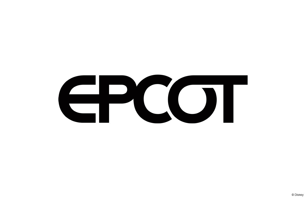
News New Epcot logo

Princess Leia

Well-Known Member
Would it be off topic to discuss the old-is-new attraction logos too? Because they are awesome but I can’t figure them all out. The one with the three “T”s in a spiral (because they already have the World of Motion logo, so I don’t think it’s TT), and the one that looks like a fountain, specially.


The one on the far right, bottom right looks like Guardians.
 

Mike S

Well-Known Member
1- ? 2- The Land, 3- Journey of Water; 4- The Seas; 5- ? 6- Spaceship Earth; 7- ?; 8- Imagination; 9- World of Motion/ Test Track; 10- ?; 11-?; 12- ?

We're missing Mission: Space, Guardians, Play, Festival Center (if we're counting that)... 2 more?
5. Guardians
10. Play
12. Mission: SPACE

Info from other threads. Don’t know the others that you also don’t know.
 

The Mighty Tim

Well-Known Member
Would it be off topic to discuss the old-is-new attraction logos too? Because they are awesome but I can’t figure them all out. The one with the three “T”s in a spiral (because they already have the World of Motion logo, so I don’t think it’s TT), and the one that looks like a fountain, specially.


My guesses are as follows:

Top row left to right: World Showcase, The Land, Moana (?), The Seas, Play Pavilion, Spaceship Earth
Bottom row left to right: ???, Imagination, Test Track, Guardians of the Galaxy, ???, Mission: SPACE

I'm stuck on the fountain looking one and the one with the diamond in the middle. Could one be for Future World (or whatever it's going to be called) and one for whatever takes the place of Communicore Innoventions East?
 

No Name

Well-Known Member
The new logo looks good. Far better than the DHS logo. It’s very close to the original Epcot Center logo but looks a bit softer with more flow.

Imagining Tomorrow, except for Guardians of the Galaxy which is a few years in the past and is obsessed with the 80's.

I’m sure some goon in TWDC is thinking that’s exactly why it fits Epcot, because it’s obsessed with the 80s. I hope they limit the nostalgia to things that actually add to the attraction.
 

Brer Oswald

Well-Known Member
Jokes aside, I’m going to make some wild predictions on the logos, cause why not.

If the light blue hexagon one isn’t Guardians, perhaps it’s for the central area of Future World, for the replacement of the former Communicore/Innoventions area.

My first guess on Guardians was symbol 11, the star. But if it’s the hexagon one, maybe this is for another minor attraction coming to the “Space Pavilion”? I doubt it’s for the restaurant. Maybe something else?

As for the “fountain-like” symbol on the left of Imagination, I doubt it’s for any of the central fountains. Instead, I think it might be for whatever ends up in Magic Eye. I might be stretching here, but 5 lines... What else comes in 5? Kinda looks like a mental/emotional explosion. Perhaps they got some sense in them and switched the IP that they were going to put in the ride with the show in the theatre, all while the characters that belong in the pyramids are actually going to said pyramids?
 

brb1006

Well-Known Member
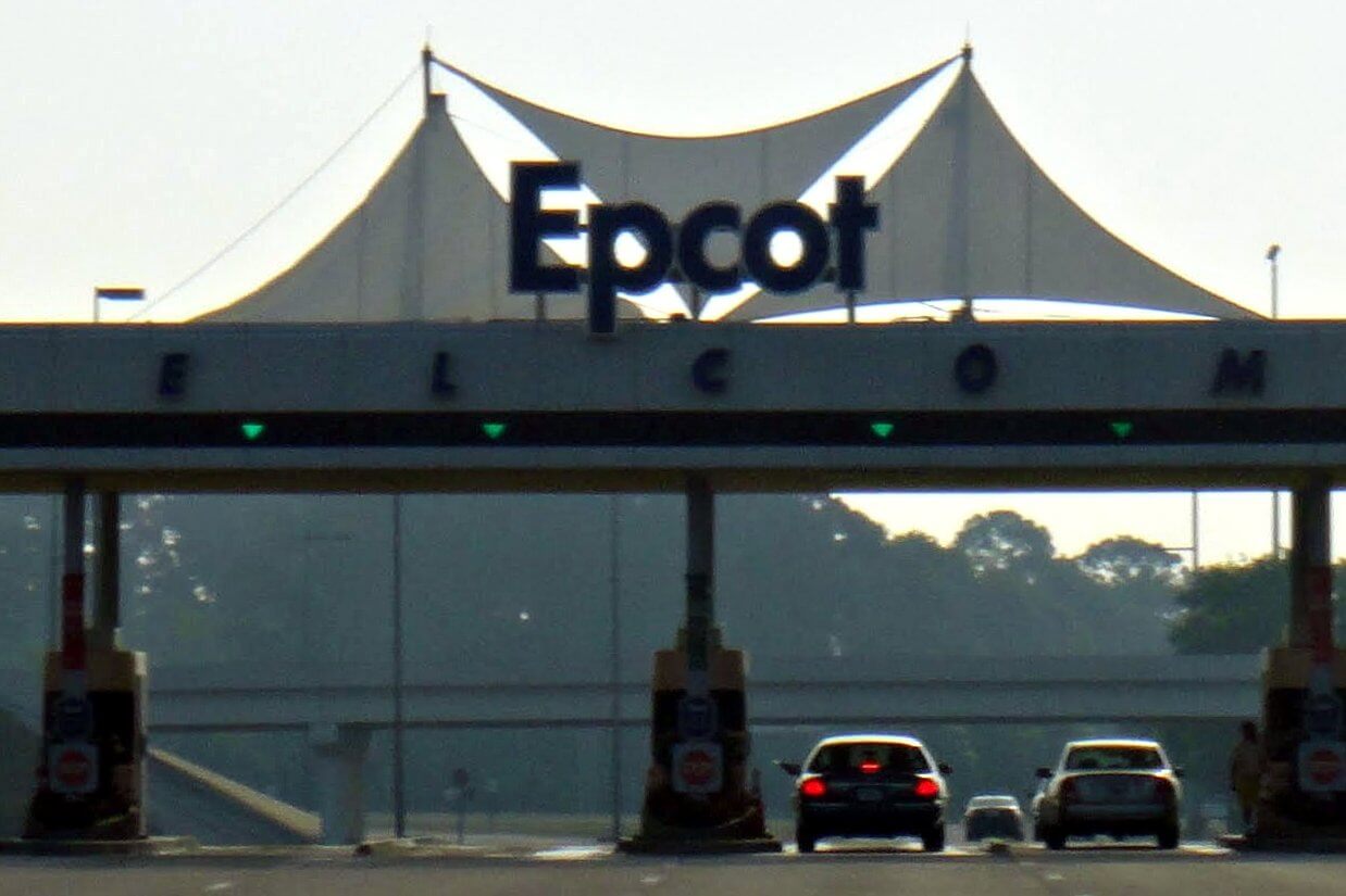
Does this mean they might finally update this?
DSC02989.jpg
 

jpeden

Well-Known Member
In the Parks
No
It's like the people behind the redesign/rebrand either:

A. Know and love the true EPCOT Center and want to hold onto as much of it as they can with this new mandate (giving me hope that one day someone new in the Bob's chairs will undo this mess with support from Imagineering)

-or-

B. They're just screwing with us.
 

Register on WDWMAGIC. This sidebar will go away, and you'll see fewer ads.

Back
Top Bottom