LittleBuford
Well-Known Member
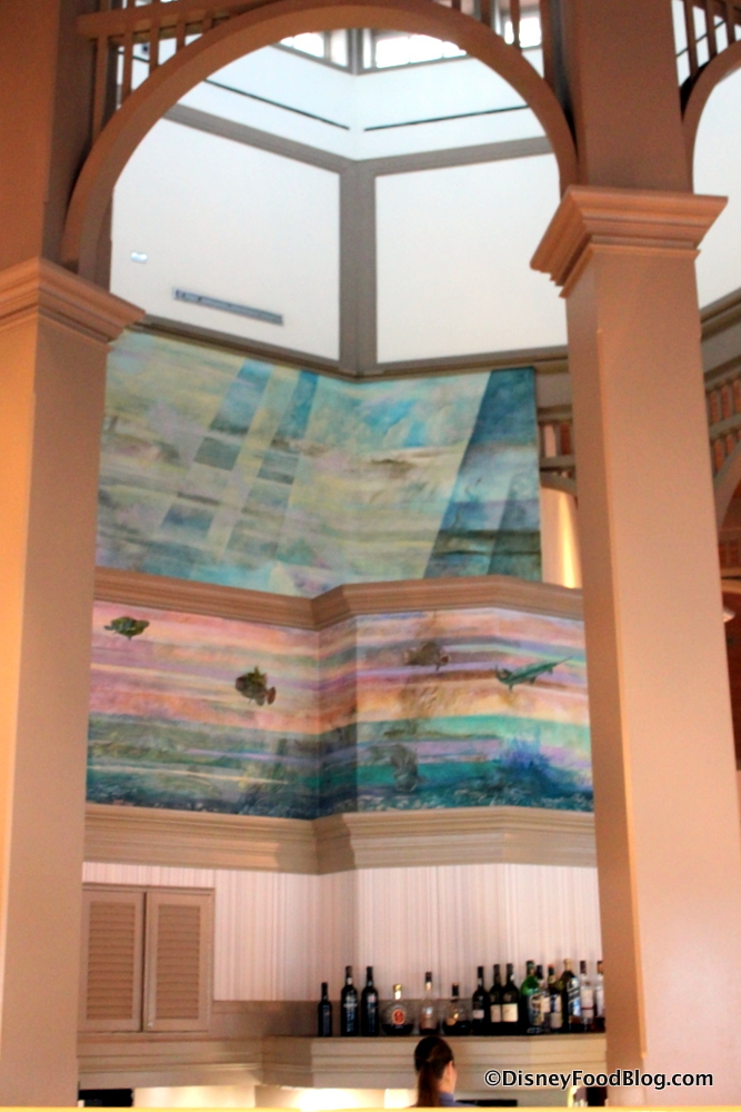
Overall no, but I’d say the floor is worse now, and at least there was a vintage charm to the wall art that was previously there.
Overall no, but I’d say the floor is worse now, and at least there was a vintage charm to the wall art that was previously there.
To be fair, I don't think it's any less themed than it was before. But now it has the added disadvantage of looking unthemed and contemporary, which adds to the overall sense of blandness.I like themed resorts.
The only thing that looks legitimately contemporary is the check-in desk. This restaurant has always been pretty minimalist because it's about the view, which is perhaps even better emphasized now with the booths ringing the bar.To be fair, I don't think it's less themed than it was before. But now it has the added disadvantage of looking unthemed and contemporary, which adds to the overall sense of blandness.
What I mean is that the old version (contemporary though it would have looked in its own time) had acquired a certain vintage charm that the new version lacks. Apart from the blue tablecloths, I personally preferred the way it looked before, at least based on what the photos show.The only thing that looks legitimately contemporary is the check-in desk. This restaurant has always been pretty minimalist because it's about the view, which is perhaps even better emphasized now with the booths ringing the bar.

Those seem like typical 80s and 90s style decorations in my opinion. I’ve seen videos of this restaurant and it always seem very bare bones and disconnected from the rest of the resort property.What I mean is that the old version (contemporary though it would have looked in its own time) had acquired a certain vintage charm that the new version lacks. Apart from the blue tablecloths, I personally preferred the way it looked before, at least based on what the photos show.
I realise this is subjective, and I should also note that I'm someone with a huge soft spot for '80s and '90s design, which isn't a sensibility that everyone shares.

I adore it. The old interiors were all Louis Cataffo of Intradesign, a very prolific but short lived hospitality interior designer of the late 1980s who tragically died in a skiing accident.What I mean is that the old version (contemporary though it would have looked in its own time) had acquired a certain vintage charm that the new version lacks. Apart from the blue tablecloths, I personally preferred the way it looked before, at least based on what the photos show.
I realise this is subjective, and I should also note that I'm someone with a huge soft spot for '80s and '90s design, which isn't a sensibility that everyone shares.
Thanks! I couldn't find anything online about who was responsible for the original design, so I'm grateful for this information.I adore it. The old interiors were all Louis Cataffo of Intradesign, a very prolific but short lived hospitality interior designer of the late 1980s who tragically died in a skiing accident.
Disney hired him because he had just completed the interiors for properties like the Hotel Bel Air, the Four Seasons Los Angeles and Shutters on the Beach in Santa Monica. FSLA is probably the closest relative to the Grand Floridian, with identical art pieces from Disney's Garden View Tea Room appearing in the FS' Windows Lounge.
They badly wanted a five diamond resort that would compete with the best of Southern California.
It's a shame Disney has gone back to trying to hide which artists design their properties, because the thing I loved the most about the Eisner era of Disney was making high art and cuisine accessible to the average customer.
That was my point. Enough time has passed since then that the murals could be considered historical works of design in their own right. Now they're gone, replaced by something pleasant but bland.Those seem like typical 80s and 90s style decorations in my opinion.
Those aren't original. Narcoossee's was built as a supper club/nightclub type venue typical of the 1980s. Those are all false walls covering up the original stage. Not entirely sure when the concept changed - probably the mid 1990s when the Top of the World also closed.That was my point. Enough time has passed since then that the murals could be considered historical works of design in their own right. Now they're gone, replaced by something pleasant but bland.
Ah, thank you. I still like them and think it’s a shame they’re gone. Do you know if they were hand-painted?Those aren't original. Narcoossee's was built as a supper club/nightclub type venue typical of the 1980s. Those are all false walls covering up the original stage. Not entirely sure when the concept changed - probably the mid 1990s when the Top of the World also closed.
I've tried to find an empirical answer and I can't quickly. My gut says probably not.Ah, thank you. I still like them and think it’s a shame they’re gone. Do you know if they were hand-painted?
While do they look nice they’re nothing special and look tacky and outdated for this “upscale” restaurant.That was my point. Enough time has passed since then that the murals could be considered historical works of design in their own right. Now they're gone, replaced by something pleasant but bland.
Again, I accept that my view is very much a reflection of my own penchant for '80s and '90s aesthetics. Had they got rid of the artwork for something with a Victorian or Edwardian flavour, I wouldn't have minded. It's the loss of something with character for something generic and bland that bothers me. The most distinctive thing in the photos they've released is the wooden mandala, which has nothing to do with anything.While do they look nice they’re nothing special and look tacky and outdated for this “upscale” restaurant.
I’m sorry the colors alone seem stuck in a Time Machine. I can see if this venue was attached to the main resort but it’s not.
My favorite restaurant on the face of this planet is Napa Rose at the Grand Californian. The front of house was designed by Marty Dorf, who designed the original California Grill, Storytellers Café, Flying Fish, Criticos, Coral Reef at Epcot and Palo on the Magic and Wonder. Napa Rose is probably the most intact of all of them.Again, I accept that my view is very much a reflection of my own penchant for '80s and '90s aesthetics. Had they got rid of the artwork for something with a Victorian or Edwardian flavour, I wouldn't have minded. It's the loss of something with character for something generic and bland that bothers me. The most distinctive thing in the photos they've released is the wooden mandala, which has nothing to do with anything.
I have to agree. I haven't had the chance to eat here and was about to state that I actually like these upgrades for once (although the original seems to have had a certain charm) but seeing that there were painted murals on the ceiling now replaced with non descript planks is, once again and par for the course another downgrade in favor of minimalism like they did to the Disney Store in Disney Springs.What I mean is that the old version (contemporary though it would have looked in its own time) had acquired a certain vintage charm that the new version lacks. Apart from the blue tablecloths, I personally preferred the way it looked before, at least based on what the photos show.
I realise this is subjective, and I should also note that I'm someone with a huge soft spot for '80s and '90s design, which isn't a sensibility that everyone shares.

WDW has pool towel attendants, the issue is the program is still newish and really needs a formal SOP to make it noticeable and useful. They also need to bring back poolside merch locations to the deluxe resorts. And room service. Stop cutting so many services.Also: DLR has a posted job opening for pool towel concierges at GCH, a service they don't currently offer, specially with the intention of bumping the Forbes rating. Meanwhile the GF can't even consistently schedule poolside cocktail service, let alone food, let alone towels.
When pushed, FL management thinks guests should adjust their "Grand Expectations". I don't miss WDW GEM culture.
Is it people who are guarding the towel dispersal checking for room keys? With the same crappy property wide sandpaper towels?WDW has pool towel attendants, the issue is the program is still newish and really needs a formal SOP to make it noticeable and useful. They also need to bring back poolside merch locations to the deluxe resorts. And room service. Stop cutting so many services.
Register on WDWMAGIC. This sidebar will go away, and you'll see fewer ads.
