My digital Disney pages

OhioDVCgal

New Member
Original Poster
Oh, I'm so excited that I just found this area of the forum...woohoo! I've been digital scrapbooking for over 2 years now - it's how I do all my scrapping. I never got the hang of the traditional method...always got glue and paper stuck to my fingers!

Here are a few of my pages:

From our trip in 12/2005:
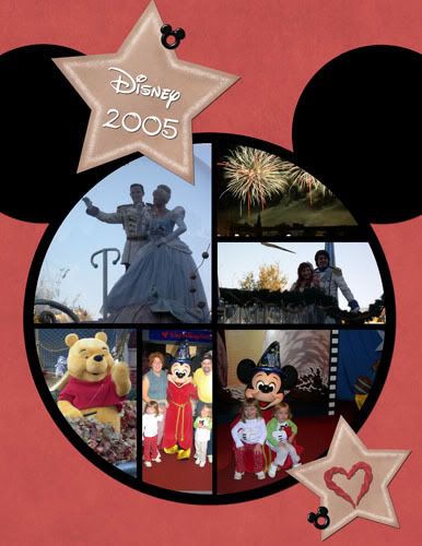
CoverPage2005.jpg

Credits here

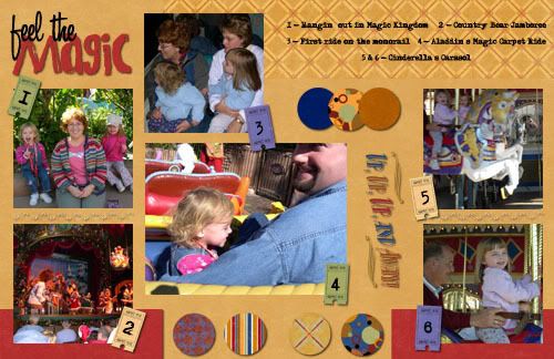
mlg_0603_FeelTheMagic_QP_Prev_01.jpg

Credits here

From our trip two weeks ago - 10/8/07 - 10/12/07:

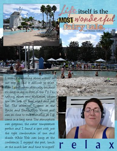
Relax_web.jpg

Credits here

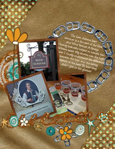
2007-10_BeerSeminar_web.jpg

Credits here

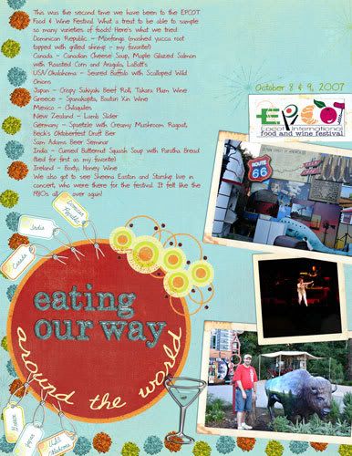
JenTripp_EPCOTFest2007_web.jpg

Credits here

As you can see I scrap everything 8.5x11. I just print them on a color laser printer using the nice heavy paper and I get great results. Then I put the pages in the clear plastic page protectors and store them in a 3 ring binder.

Thanks for looking!
 

Disneyfalcon

Well-Known Member
I just went back and looked again. Did you scan some things like Figment (like the Epcot logo) or did you find them somewhere online? I assume the pages aren't hybrid?

They do look great though.
 

OhioDVCgal

New Member
Original Poster
I just went back and looked again. Did you scan some things like Figment (like the Epcot logo) or did you find them somewhere online? I assume the pages aren't hybrid?

They do look great though.

I found the EPCOT logo online. It was low-res but still printed okay.

I need to start adding more of my collectible stuff onto my pages.
 

WDWFigment

Well-Known Member
Those pages are great. My only suggestions would be to add more Disney stuff and fill up blank space. Someone looking at the pages (besides the first page) may not even know this was of a Disney trip. I think it's important to make that stand out, but that could just be a matter of personal perference.

I would also consider how you manage blank space on the pages. Some of them have a lot of blank space along with very small pictures. You did a nice job of eliminating blank space in the "Relax" page, I would go for that kind of use of space on all the pages. After all, ink is expensive, why not get the most out of each page!

Other than that, the pages are great. Where do you find all the embellishments and such? Is there a specific website? I searched for packages on a few, but I found that most websites are, pardon my language, weighed down with a lot of crap you have to sift through before you get to the little bit of actual content.
 

Charlie Brown

New Member
Those pages are great. My only suggestions would be to add more Disney stuff, as someone looking at the pages without knowing (besides the first) may not even know this was of a Disney trip. I think it's important to make that stand out, but that could just be a matter of personal perference.

I would also consider how you manage blank space on the pages. Some of them have a lot of blank space along with very small pictures. You did a nice job of eliminating blank space in the "Relax" page, I would go for that kind of use of space on all the pages. After all, ink is expensive, why not get the most out of each page!

Other than that, the pages are great. Where do you find all the embellishments and such? Is there a specific website? I searched for packages on a few, but I found that most websites are, pardon my language, weighed down with a lot of crap you have to sift through before you get to the little bit of actual content.
I agree with the "needs more Disney." Those are awesome pages! Good for you!:animwink:
 

mouselvrmom

Well-Known Member
I think your pages are great! I don't necessarily agree with the needs more disney or less blank spaces comments. I think your pages look great as they are. Scrapbooking is largely a personal thing, how you do your pages is up to you. I think some blank space is nice, sometimes if you try to do too much it ends up looking sort of busy.

I really loved your beach club page. We stayed there last year so it brought back good memories for us. I really like how you used the relaxation idea and had a picture of yourself relaxing. It was really great!

Oh, and I loved all of the neat little embellishments that you used. They really added to the pages.
 

Charlie Brown

New Member
I think your pages are great! I don't necessarily agree with the needs more disney or less blank spaces comments. I think your pages look great as they are. Scrapbooking is largely a personal thing, how you do your pages is up to you. I think some blank space is nice, sometimes if you try to do too much it ends up looking sort of busy.

I really loved your beach club page. We stayed there last year so it brought back good memories for us. I really like how you used the relaxation idea and had a picture of yourself relaxing. It was really great!

Oh, and I loved all of the neat little embellishments that you used. They really added to the pages.
All of that is true!
 

OhioDVCgal

New Member
Original Poster
Those pages are great. My only suggestions would be to add more Disney stuff and fill up blank space. Someone looking at the pages (besides the first page) may not even know this was of a Disney trip. I think it's important to make that stand out, but that could just be a matter of personal perference.

I would also consider how you manage blank space on the pages. Some of them have a lot of blank space along with very small pictures. You did a nice job of eliminating blank space in the "Relax" page, I would go for that kind of use of space on all the pages. After all, ink is expensive, why not get the most out of each page!

Other than that, the pages are great. Where do you find all the embellishments and such? Is there a specific website? I searched for packages on a few, but I found that most websites are, pardon my language, weighed down with a lot of crap you have to sift through before you get to the little bit of actual content.

Aaaaaaahhhhh, yes. Well, I wasn't really looking for CC (since I'm quite happy with my pages the way they are :p) but since you offered it, let me address my stylistic choices.

Blank space: this is simply a stylistic choice. Almost all of my pages are multi-photo pages, and I'm in the minority in the digital scrapbooking world. Now I agree with you on the ink issue, which is why I do put several photos on a page. But I like to try out different styles and looks, so my goal is not simply to "fill up the page" with as many photos as possible. On this particular trip, I didn't take very many photos (what was I thinking?) and I only had 3 photos from the Beer Seminar. It didn't make sense to me to jam those in with other photos. And on the EPCOT page, the focus was really more on the journaling and again, I didn't have many photos from that.

Disney-themed stuff: As I mentioned in another post (I believe it was in the thread where you are showing your own pages), this is something I'd like to do more of. But since I have a separate album for Disney trips, I don't feel the need to add all the extra stuff, since I already know I'm looking at photos from a Disney trip. :animwink:

Embellishments: I am on several creative teams for digital designers, so I get their art for free. Otherwise, I either download freebies or purchase items from digital scrapbook stores. It may seem strange to actually have to BUY these items, but if you want quality, you generally have to pay for it.

Other things I consider are using realistic drop shadows (which took me a long time to learn), color choices, etc.

Thanks for looking at my pages. I hope we can agree that everyone has different styles and we can all learn something from each other. :animwink:
 

WDWFigment

Well-Known Member
Aaaaaaahhhhh, yes. Well, I wasn't really looking for CC (since I'm quite happy with my pages the way they are :p) but since you offered it, let me address my stylistic choices.

Blank space: this is simply a stylistic choice. Almost all of my pages are multi-photo pages, and I'm in the minority in the digital scrapbooking world. Now I agree with you on the ink issue, which is why I do put several photos on a page. But I like to try out different styles and looks, so my goal is not simply to "fill up the page" with as many photos as possible. On this particular trip, I didn't take very many photos (what was I thinking?) and I only had 3 photos from the Beer Seminar. It didn't make sense to me to jam those in with other photos. And on the EPCOT page, the focus was really more on the journaling and again, I didn't have many photos from that.

Disney-themed stuff: As I mentioned in another post (I believe it was in the thread where you are showing your own pages), this is something I'd like to do more of. But since I have a separate album for Disney trips, I don't feel the need to add all the extra stuff, since I already know I'm looking at photos from a Disney trip. :animwink:

Embellishments: I am on several creative teams for digital designers, so I get their art for free. Otherwise, I either download freebies or purchase items from digital scrapbook stores. It may seem strange to actually have to BUY these items, but if you want quality, you generally have to pay for it.

Other things I consider are using realistic drop shadows (which took me a long time to learn), color choices, etc.

Thanks for looking at my pages. I hope we can agree that everyone has different styles and we can all learn something from each other. :animwink:

I hope I didn't offend you, I didn't mean to suggest the pages were lacking in any way. I thought you were looking for constructive criticism (why, I don't know, since you didn't ask for it). I apologize if I came across the wrong way. I think your pages are great!
 

OhioDVCgal

New Member
Original Poster
Nah...no sweat Figment. Things are different out here in the "real world", rather than in the protected little world of digiscrapping, where we praise each other almost too much at times! :lol:
 

eagles

Active Member
i love your pages! thanks so much for sharing. and i hope you decide to join us here in the scrappers forum. we need more digi scrappers.

i agree about the drop shadows being so important, and making them realistic is hard. i know everytime i submit a layout to anysite, that is the first thing that takes a hit.

so i, like everyone else, just finally goes with what I like. (although, i don't always like my pages, i feel something is missing or i need to add something but can't figure it out).

anyway, i am glad you found us and again i love your pages!
 

trose61

Member
I really enjoyed seeing all of your pages.

I've always worried that I leave too much blank space, or cluttered up a page too much - but in the end, I just have to go with what looks right to me and hope others like it. If not, to each their own! :shrug: I really ought to take a class... :)

Thanks for sharing!

Tami
 

celticdog

Well-Known Member
I really enjoyed seeing all of your pages.

I've always worried that I leave too much blank space, or cluttered up a page too much - but in the end, I just have to go with what looks right to me and hope others like it. If not, to each their own! :shrug: I really ought to take a class... :)

Thanks for sharing!

Tami

You don't need to take classes. The fun of scrapbooking is doing it for fun. You do what you like. The wife has taken many classes and goes to many seminars, I on the other hand, have never taken a class and use tools that would be considered primative. Classes can teach you to use new technology and new equipment, but a straight edge, circle template and a Xacto kinfe are all thats needed to produce good layouts. Classes can also clutter your mind with too many options and techniques. The wife is amazed that I can do 8 pages in two hours. She ponders a layout longer than that.

Create the pages to your taste, not someone else's.


To OhioDVCGal: those are some great pages. I especially like the use of space and the pages dedicated to a single topic. Good job :sohappy:
 

Three Lights

New Member
I love your digi Disney pages. Where did you find the digi eyelet embellie? I'm doing some of my Disney pages digitally and I would LOVE to find that file! I use a lot of freebies, but my searches aren't turning up a lot of Disney stuff even for things I'd pay for!

Thanks!

-- Florrie
 

Register on WDWMAGIC. This sidebar will go away, and you'll see fewer ads.

Back
Top Bottom