mergatroid
Well-Known Member
Strange seeing video from the cat walk of the building gutted, hard to believe it used to house TGMR 
What video?!?Strange seeing video from the cat walk of the building gutted, hard to believe it used to house TGMR
What video?!?
Surprised nobody's talking about this yet. The art for the new DHS projection show on the Chinese Theater shows what the Runaway Railway signage will look like on the building.
View attachment 326580
Surprised nobody's talking about this yet. The art for the new DHS projection show on the Chinese Theater shows what the Runaway Railway signage will look like on the building.
View attachment 326580
Except that's a direct lift from an old Mickey Mouse cartoon that took place at the Chinese TheaterBecause the backstory on the Mickey ride is that you're going to a premier. That's what the signage shows, and it makes sense to me because there is a sign in the middle. I saw recently that they were putting hooks in the middle for sign prep.
I could be wrong, but I feel like they want to show what the building will look like in the concept art.
Not sure if I like the Runaway Railway typeface.
")
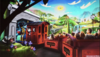
Came across this new image.
Came across this new image.
I don't see any A/C on the carts!
I believe it’s leaving load.Looks like a continuation of the older screenshot. This must be near the beginning of the ride or the very end of the ride. Can just barely make out a Mickey and Minnie setting up for a picnic in the background.
I found it an odd choice too. That style of flare-serif lettering evokes more of an exotic Jungle Cruise / Tarzan vibe. It seems to be based on Spurred Egyptian from Letterhead Fonts (a go-to source for Disney).Given it some thought. Yep, still don't like it. I think it's a combination of a few things. Not enough exaggeration on the RR serif font to differentiate it from the M&M font. It's too matchy-matchy both in color and visual weight. I also think the word "railway" needs to be either larger or smaller so the sign has more of an asymmetrical design.
Would I nitpick such a thing? Of course! And what better place than on a forum where I can voice my opinion on something that displeases me!
I found it an odd choice too. That style of flare-serif lettering evokes more of an exotic Jungle Cruise / Tarzan vibe. It seems to be based on Spurred Egyptian from Letterhead Fonts (a go-to source for Disney).
One posted above.I know there was an event surrounding this ride at Destination D earlier, did any new info/images surface?
Register on WDWMAGIC. This sidebar will go away, and you'll see fewer ads.