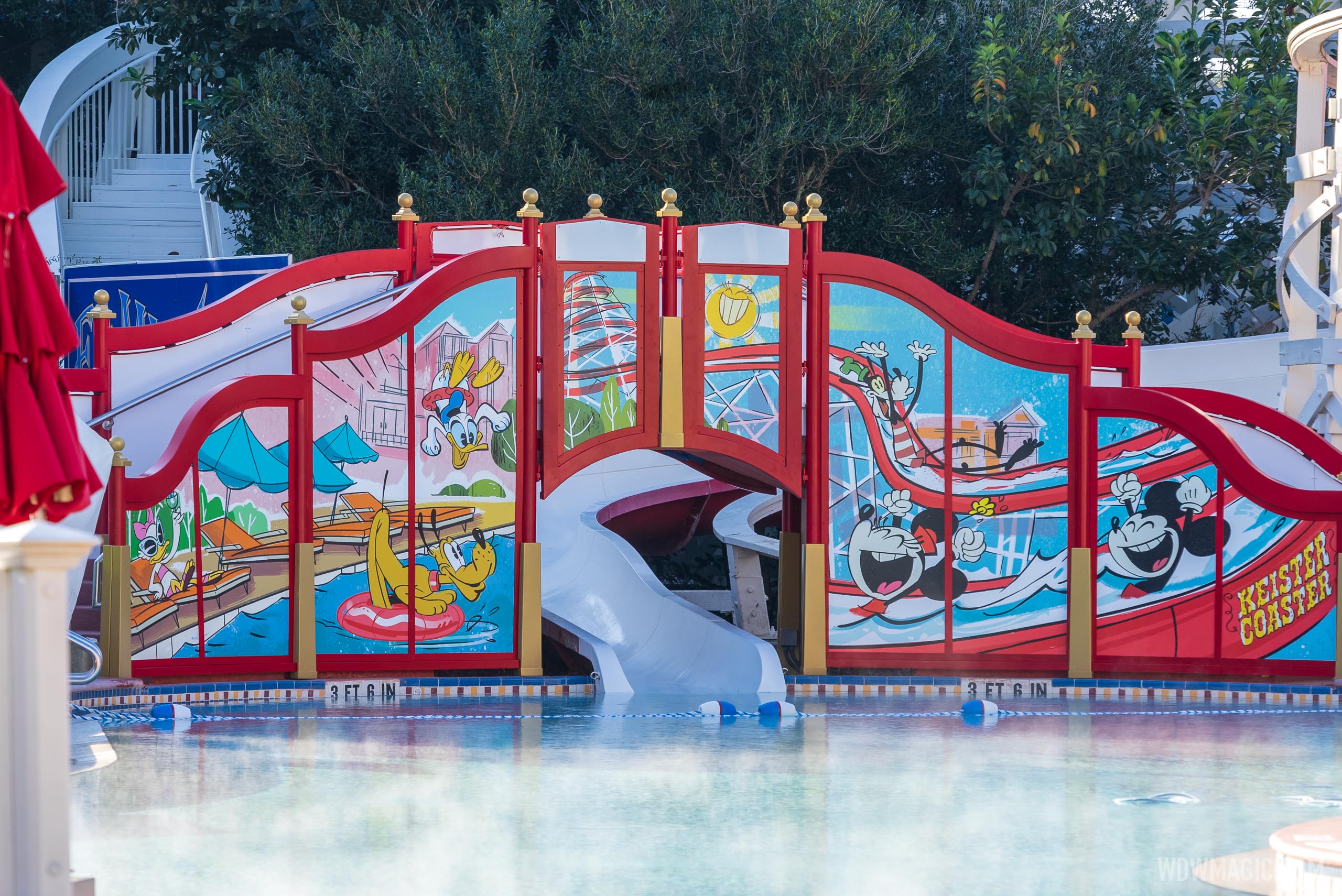
Keister Coaster waterslide at Disney's BoardWalk Inn closing for refurbishment in October

Dizknee_Phreek

Well-Known Member
Welp, chalk another one up for a mediocre redesign by Disney. I agree it should have been something cool and 3D and there were a ton of options. But my biggest issue is the use of the modern Mickey and friends. Just...why? It doesn't fit with anything else at the resort. It just feels clunky and like an afterthought. Clearly theme continuity is pretty low on the list of Disney priorities these days.
 

lazyboy97o

Well-Known Member
Welp, chalk another one up for a mediocre redesign by Disney. I agree it should have been something cool and 3D and there were a ton of options. But my biggest issue is the use of the modern Mickey and friends. Just...why? It doesn't fit with anything else at the resort. It just feels clunky and like an afterthought. Clearly theme continuity is pretty low on the list of Disney priorities these days.
It’s “More Disney.” People don’t stay at the Deluxe resorts so Disney has to make them better with large character graphics.
 

ElvisMickey

Well-Known Member
Aside that Disney does a cheap job at whatever they decide to change these days, I’ve never understood why they even spend money on crap like this. I mean, do you honestly think by removing the clown you’re going to make more money as a company by more guests staying at the Boardwalk? The same thing with the Moana rooms at the Poly...complete waste of money from a business standpoint. In the meantime there are things that actually need funding in WDW...forget about the B.S.
 

easyrowrdw

Well-Known Member
That sounds cool, but I think Disney rightly wants to steer clear of circus animals when possible.
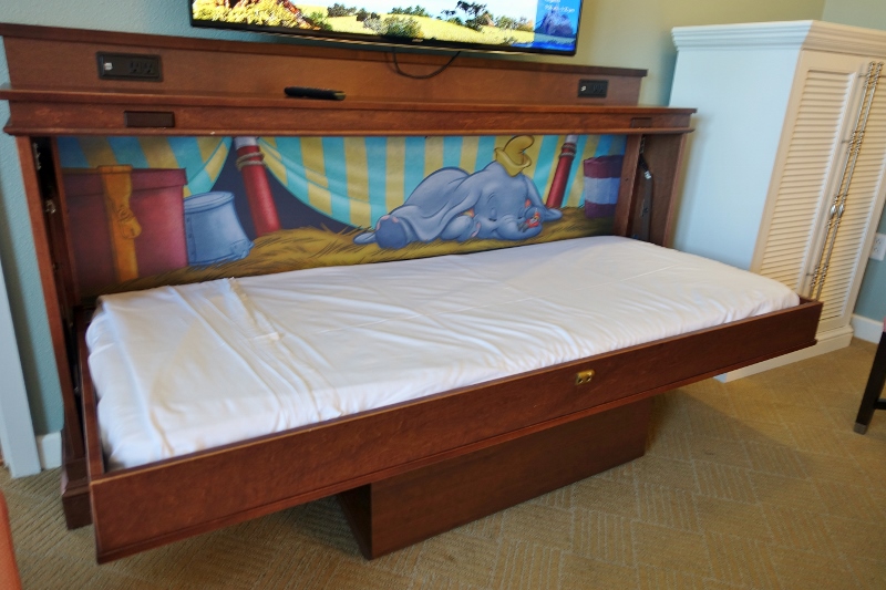
I think Dumbo could've worked. They have him in the Boardwalk Villas and it's adorable.

Fold-Down-Bed-Studio-Disneys-BoardWalk-Villas-from-yourfirstvisit.net_.jpg
 

Dizknee_Phreek

Well-Known Member
It’s “More Disney.” People don’t stay at the Deluxe resorts so Disney has to make them better with large character graphics.
Honestly I can't tell if you're being facetious or not. But I do not see that throwing some cartoon graphics on a pool slide is going to make any more guests cough up the kind of cash required for that resort. If people truly aren't staying at deluxe resorts the problem isn't lack of cartoons, it's outrageous cost (which is honestly all Disney resorts at this point, not just deluxe). And if people aren't staying at them, why on earth does Disney keep insisting on building more and more deluxe/DVC resorts?
 

the.dreamfinder

Well-Known Member
There's some complications with the Swan/Dolphin and them being required to operate a nightclub there. They would love to not operate it. Compounding things is that you can't really draw anybody not staying at those resorts, as there is no real parking. I do think it would do well if there was better/easier access and they really marketed it.
Why?
 

_caleb

Well-Known Member
Eh, I prefer the clown, that at least was interesting, this sort of looks like a temporary thing, nothing tactile to it, just a flat wall no lights or anything. Something more 3 dimensional would have been so much more fun. Its also distracting that it doesn't really seem to match the real wood of the slide(why have cartoon depiction of the slide literally in front of the real slide). If they are doing this, I feel they should repaint the wood around the slide, to add more red, and make it look fresher. All in all, considering how long the slide has been out of commission this is disappointing.
You prefer the clown? With those dead eyes and that wall of curly hair?
 

UNCgolf

Well-Known Member
It's a nice piece of artwork, albeit featuring the wrong versions of Mickey and friends.

My issue is that it really doesn't fit the theme of the resort at all. They could just as easily be at the pool at the Riviera based on the art; there's nothing really connecting it to the boardwalk aesthetic or the time period.

The clown was awful and needed to go, but they could have come up with something better.
 

WondersOfLife

Blink, blink. Breathe, breathe. Day in, day out.
That looks a lot more pleasing to the eye. I like it a lot better than that clown.

I have no "attachment" to the clown. Never stayed at the hotel before, never will, and this thread is the first time I ever saw the clown... And quite frankly, upon first impression via pics here, that clown looked absolutely terrible. Who the heck did that?

Much better. Could it have been a bit more creative? Yes. But to me, it's astronomically better than that hideous clown.
 

Register on WDWMAGIC. This sidebar will go away, and you'll see fewer ads.

Back
Top Bottom