Jungle Cruise Re-Imagining

celluloid

Well-Known Member
That new artwork is an odd direction that does not match the others. It does not seem to come across as rugged artwork like the previous murals and it seems rather polished like something maybe trying to be a 1940s ad, but not in any style and would look rough even at Disney's Hollywood Studios.

Also, the mural that features the path of the ride is something that belongs on a park map or art for something of that nature, as it is a cruise around the rivers of the world and magic of time. A montage. It seems weird to see it as a course of the ride path in the queue for this fictional cruise company.

I think so much focus is on graphic design these days with theme park design without as much thought on direction and show writing.
 

UNCgolf

Well-Known Member
Also, the mural that features the path of the ride is something that belongs on a park map or art for something of that nature, as it is a cruise around the rivers of the world and magic of time. A montage. It seems weird to see it as a course of the ride path in the queue for this fictional cruise company.

Yeah, this is even worse than the mural pictured above. The one pictured above is out of theme for the reasons already mentioned -- it doesn't look anything like travel posters from the period -- but actually putting in a map of the ride essentially trashes theme all together.
 

Castle Cake Apologist

Well-Known Member
Do you have a picture of the mural you're talking about? It would be such a shame if this new painting has replaced something more effective.

I'm starting to think I was wrong about this replacing another mural. I thought this replaced the big wall at the entrance that was painted with an advertisement for the JNC, but I think that might still be there.

EDIT: WOW, my memory must be getting really faulty with age. Research is showing me that the mural I thought this replaced was actually replaced in 2000 when they added Fastpass. This is the mural I was thinking of, which I swear was still there recently:
jcqapainting1.jpg
 
Last edited:

Bocabear

Well-Known Member
According to this link, she’s supposedly the granddaughter of Dr. Albert Falls and started the tour company in 1931: https://disney.fandom.com/wiki/Albert_Falls

Terrible Horrible use of SEA...and the art is COMPLETELY wrong for the ride's tone and timbre.
This looks more like 6 Flags fake advertisements they did in the 80s for some"theming"...
awful.
 

Demarke

Have I told you lately that I 👍 you?
That new artwork is an odd direction that does not match the others. It does not seem to come across as rugged artwork like the previous murals and it seems rather polished like something maybe trying to be a 1940s ad, but not in any style and would look rough even at Disney's Hollywood Studios.

Also, the mural that features the path of the ride is something that belongs on a park map or art for something of that nature, as it is a cruise around the rivers of the world and magic of time. A montage. It seems weird to see it as a course of the ride path in the queue for this fictional cruise company.

I think so much focus is on graphic design these days with theme park design without as much thought on direction and show writing.

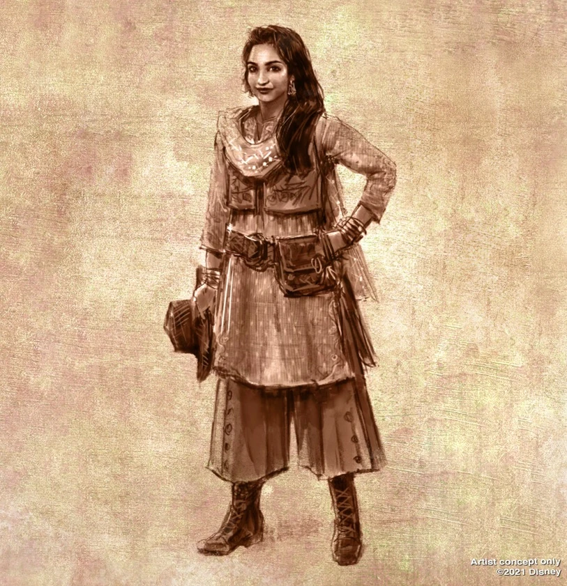
To me, this thing looks way too much like those architect renderings where they paste stock photo models into the design. I can’t imagine that someone like Joe Rohde would have allowed this pictorial venture into “uncanny valley” to make it outside of the concept art table and actually install it in the queue.

The content could work for an aged-black and white photo of the proprietor with staff in the background. But I don’t think I’ve ever seen a vintage travel poster that featured the proprietor grinning and posing prominently in the foreground, rather than focusing on the adventure itself. Seems much more like trying to shoehorn more recent self-promotion-styled advertising into a half-arsed, “trying to seem vintage without knowing what you’re doing” scene.
 
Last edited:

Sir_Cliff

Well-Known Member
What happened at WDI? This isn't a budget issue, is it? I would think the difference in cost would be minimal. Once upon a time painstaking effort was taken to work in time-accurate idioms.
Yeah, I find this project overall to be one where the quality of the additions isn't bad, but the theming just seems a little off. It's like the team working on it haven't quite grasped the world of The Jungle Cruise or known how to execute it.

I don't think it's a budget issue. As you say, a bit disappointing as this is one of the key skills that is supposed to set Imagineering and Disney parks apart.
 

Animaniac93-98

Well-Known Member
The content could work for an aged-black and white photo of the proprietor with staff in the background. But I don’t think I’ve ever seen a vintage travel poster that featured the proprietor grinning and posing prominently in the foreground, rather than focusing on the adventure itself. Seems much more like trying to shoehorn more recent self-promotion-styled advertising into a half-arsed, “trying to seem vintage without knowing what you’re doing” scene.

They want to highlight the new PoC character , even though she's absent from the ride itself and no one would know about her if it were not for blog posts.

No, it does not look good or period accurate, but that doesn't seem to be the goal here.
 

Demarke

Have I told you lately that I 👍 you?
They want to highlight the new PoC character , even though she's absent from the ride itself and no one would know about her if it were not for blog posts.

No, it does not look good or period accurate, but that doesn't seem to be the goal here.
Yep, I think the goal must be making it as Instagramable as possible, haha. The “hand on the hip with elbow pointing out” pose seems to have taken over the last ten years.

I’ve got no problem with changes to be more inclusive (and think that was a good idea that could have been executed better), but if the idea is for the ride to be set in an older time when there were more mysterious places to explore, you’d think at least using older-style haircuts and vintage-style eyeglasses for the new in-ride explorers and such might have been a good start for attention to detail (but, strangely enough, no one from WDI has reached out to me for my opinion 😁).
 
Last edited:

owlsandcoffee

Well-Known Member
Yep, I think the goal must be making it as Instagramable as possible, haha. The “hand on the hip with elbow pointing out” pose seems to have taken over the last ten years.

Once upon a time a photo-op could still be integrated in the larger theme. A family member has a lovely photo from 1972 of their mother standing with the drumming logs in Adventureland. I completely agree with you, though. It all makes me think that WDI has had considerably less creative control in recent years. You look at the original plans for SWGE, brilliant. Cars Land, brilliant. And yet the products we get all scream Corporate.
 

FigmentJedi

Well-Known Member
Disagree with posting a map of the river circle. A rider should be “lost” in proximity and scale, not reminded it’s a mere small circle ride in a theme park.
It's set up for a joke on the chimp boat. One of the reasons the skipper on the Trapped Safari crashed the boat is because he packed Disneyland's map for an excursion on Magic Kingdom's river, while at Disneyland, it's the other way around. Either way, there's a chimp messing around with the map and tearing it up.
Here's the Disneyland map for comparison.
2214aac9168071d20c42de67893f381ec1cc01a1.jpg
 

Register on WDWMAGIC. This sidebar will go away, and you'll see fewer ads.

Back
Top Bottom