JustInTime
Well-Known Member
It’s pretty awful.hilarious. worthy of an article... no wonder nobody likes that site.
It’s pretty awful.hilarious. worthy of an article... no wonder nobody likes that site.
 www.wdwmagic.com
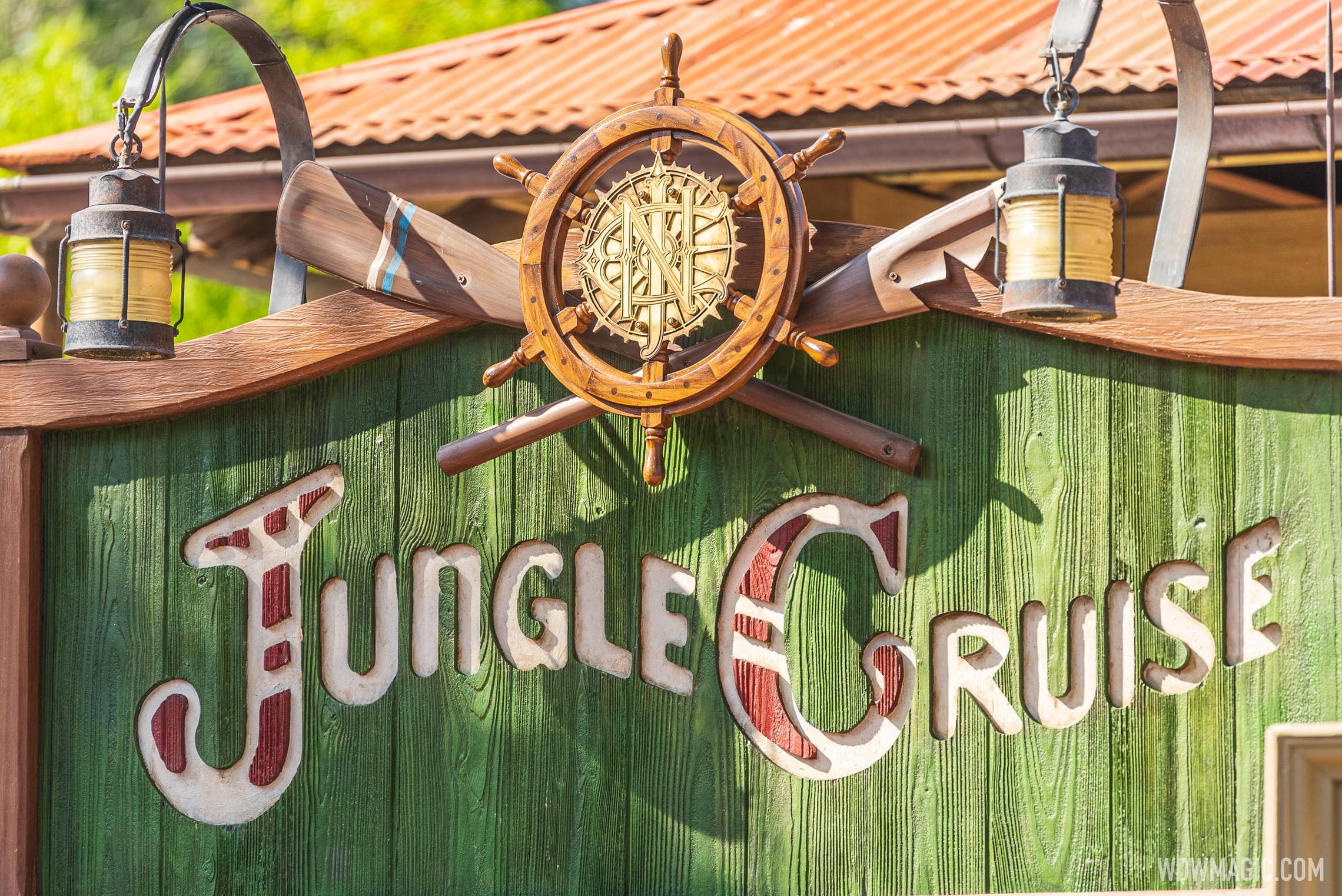
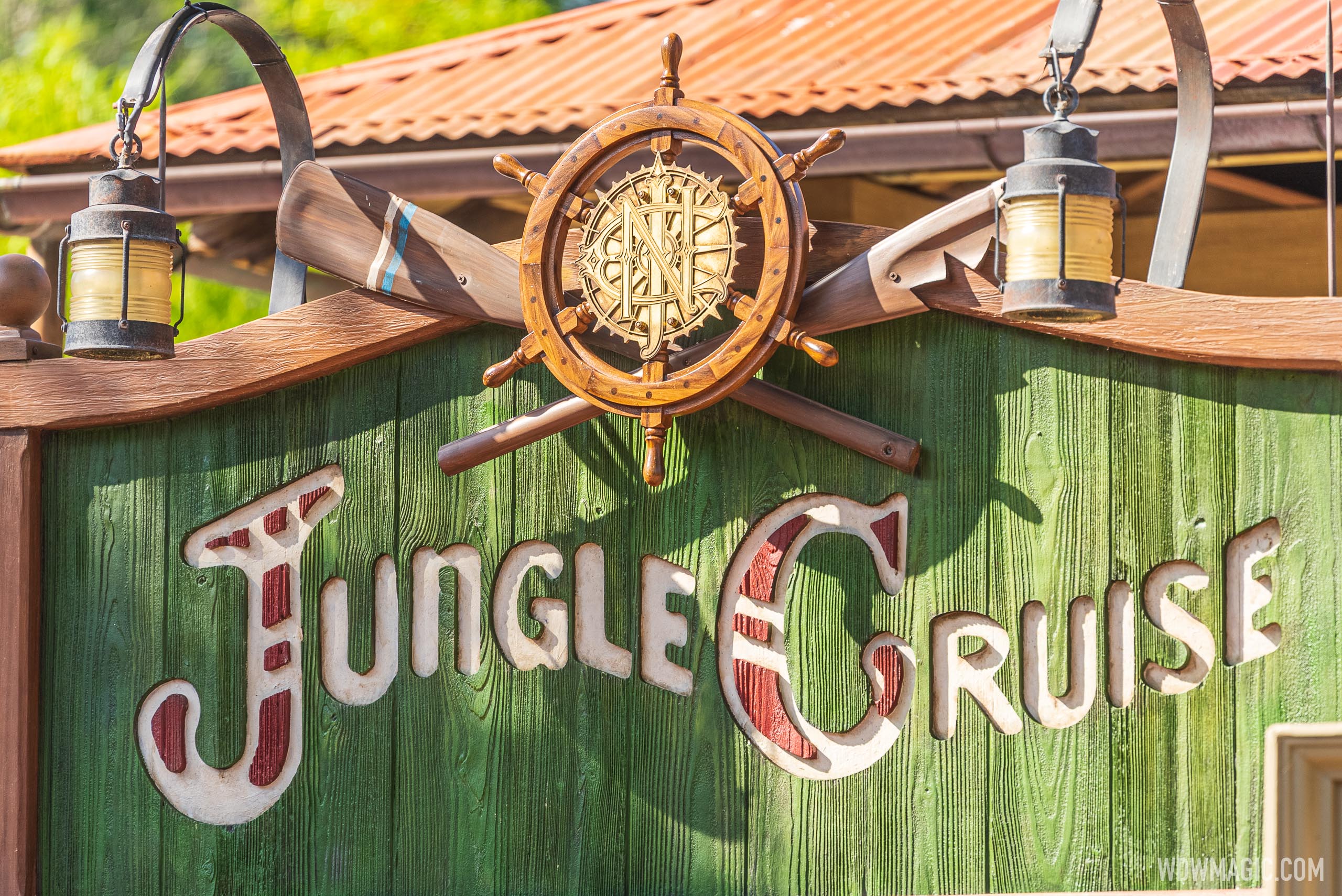
New sign at the Jungle Cruise replaces spears and masks with Jungle Navigation Co. logo
New sign at the Jungle Cruise replaces spears and masks with Jungle Navigation Co. logo
The new additions to the Jungle Cruise continue this week with work on the main entrance sign.
New sign at the Jungle Cruise replaces spears and masks with Jungle Navigation Co. logo
New sign at the Jungle Cruise replaces spears and masks with Jungle Navigation Co. logo
The new additions to the Jungle Cruise continue this week with work on the main entrance sign.
Look carefully at the photos in the article. They included one of the old sign. Here's a link:Looks good. Old photos for comparison?
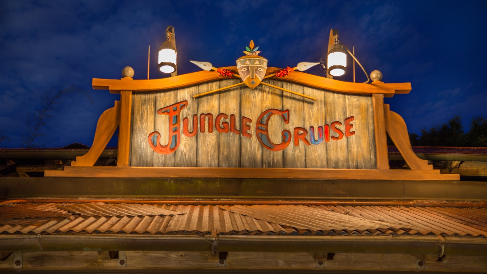
Looks good. Here's the old sign for comparison.


I would comment further about the old sign vs the new sign but… I’m sure most can figure out where I stand on the topic.
New sign looks top notch, the ship wheel and logo look great!
Now why did they remove SEA logos and is there something else big SEA that no one noticed yet???
was it replaced with an updated SEA logo or something else?One logo was removed and replaced. The other thing Kevin Lively was talking about was the new sign.
was it replaced with an updated SEA logo or something else?
is there a pic around? seems odd to take off SEAIt was replaced with the Hightower graphic.
Register on WDWMAGIC. This sidebar will go away, and you'll see fewer ads.