Iconic Purple Directional Signs Being Replaced

sy278

Member
Something looked familiar to me when I saw the new signs. Then, it hit me. It's almost the same color scheme and font that you see on the German Autobahn network, minus the white border:

View attachment 617920
If we see the word "Ausfahrt" or an Umlaut slip through on any of the new signs, then we'll know Chapek bought them as cheap surplus from Germany.
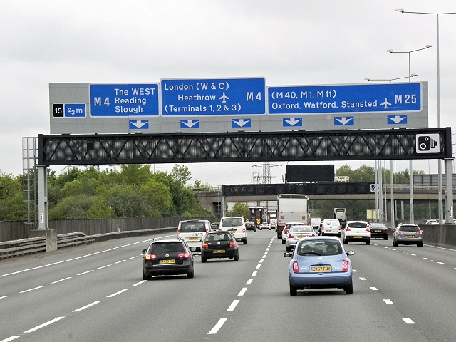
Very similar to UK motorway signage :


3725609_2c3030ec.jpg
 

Twirlnhurl

Well-Known Member
I also wonder if Disney maybe might have been told by the State that since those roads are the equivalent of any other highway in the state that they needed to conform to the accepted safer road sign colors.
The new signs are in just as much violation of the Manual of Uniform Traffic Control Devices (MUTCD), which is the standard for roadway signage in the US. However, the state of Florida has no control over the signage. Generally, the MUTCD is enforced by the federal government through the allocation of highway trust fund revenue (federal gas tax plus general fund dollars that are given to states to build the national system of highways). Since Disney doesn't get any money for this (and I don't think RCID does, usually either), they can do whatever they like.

Personally, I prefer the blue over purple, but would like MUTCD standard coloring better than both. But I think color is far less important than symbology, and I am disappointed to see the old style lane assignment arrows (the downward pointing squat arrows which have been phased out over the last ~20 years) are still in use on the new signs. The new arrow design is the narrower upward pointing arrows that includes turns and divergences in a more intuitive fashion.
 

JoeCamel

Well-Known Member
Personally, I prefer the blue over purple, but would like MUTCD standard coloring better than both. But I think color is far less important than symbology, and I am disappointed to see the old style lane assignment arrows (the downward pointing squat arrows which have been phased out over the last ~20 years) are still in use on the new signs. The new arrow design is the narrower upward pointing arrows that includes turns and divergences in a more intuitive fashion.
Also matches Google maps upper navigation bar (which I love) or did GM match the standard? I would like it but this is a huge rip for them and maybe they have to take an intermediate step.
I think of these as the Eisner signs
 

Goofyernmost

Well-Known Member
The new signs are in just as much violation of the Manual of Uniform Traffic Control Devices (MUTCD), which is the standard for roadway signage in the US. However, the state of Florida has no control over the signage. Generally, the MUTCD is enforced by the federal government through the allocation of highway trust fund revenue (federal gas tax plus general fund dollars that are given to states to build the national system of highways). Since Disney doesn't get any money for this (and I don't think RCID does, usually either), they can do whatever they like.

Personally, I prefer the blue over purple, but would like MUTCD standard coloring better than both. But I think color is far less important than symbology, and I am disappointed to see the old style lane assignment arrows (the downward pointing squat arrows which have been phased out over the last ~20 years) are still in use on the new signs. The new arrow design is the narrower upward pointing arrows that includes turns and divergences in a more intuitive fashion.
The WERE cool and different and they had their time but sharpness and easy visibility are far more important than some imagined tradition. It was time for a change in conjunction with all the other changes lately. The visuals now need to be attractive to the current generations and more functional as well. After all road signs are mostly a utility function. And have little to no connection with the Walt era. It is a good change that will have little impact emotionally on the current guest list. (until they change them again)
 

Gringrinngghost

Well-Known Member
Let's just hope these signs hold up and don't become too much of a nightmare to read when faded. I've not been on property for the last few weeks but these do look pleasant on the eyes compared to the honestly dated purple and red.
 

Heppenheimer

Well-Known Member
Norway and Sweden have such a big rivalry, they took it to the motorway signs. They need to calm down before a war breaks out.
Sweden's also the only country where I've driven that uses a red and yellow color scheme for signs where other countries would use a red and white pattern. Norway went with the usual European color patterns.
 

*Q*

Well-Known Member
It kind of reminds me of when they redesigned the McDonald's on property. It used to look colorful and fun, and now it's just drab and generic. How is that an improvement?
The McDonald's was indeed very generic for a while, but is now very unique and interesting since they rebuilt it once again. It's not as colorful as the original Happy Meal building, but that would be as outdated as the purple road signs now.
Imagine if today’s kids/millennials had to bear it through the brown signs and AM radio information driving up World Drive.
I think the loss of the AM radio station is waaaay more heartbreaking than the loss of the purple signs.
Interesting. Wonder why they got rid of Mickey.
The Mickeys were placed on the first road sign as you entered WDW as a shorthand visual clue that you've entered Disney property, so they went away when they were made redundant by the giant entrance arches that scream "WALT DISNEY WORLD" in 1996.
While once pointed out you can see that it kind of matches the 50th color scheme (which seems like a dumb color scheme to match on as, presumably, the 50th color scheme will be gone with the 50th), it doesn't strike me as a particularly good match to the 50th color scheme.
People keep referring to the new design for the arches, the TTC, and the road signs as the "50th color scheme" but I feel like a more accurate description is the "make WDW feel like it's not stuck in the '90s anymore color scheme." I have no doubt that these changes are something someone with some sense have wanted to do for a long time now and the 50th anniversary was just finally the point where they could get the budget approved for it. I expect the blue will turn out to feel much more timeless (which is generally the hallmark of a good Disney experience, with a few notable exceptions) than the purple ever was.
 

Casper Gutman

Well-Known Member
People talking about how dated and 90s the vibrant, fun color scheme was just remind me how much more enjoyable 90s WDW was.

I mean, the “earidescent” nonsense they picked for the 50th translates in most cases to pale and nondescript - a very apt comparison with the old color scheme.

I guess I’m largely alone in not particularly caring how “fashionable” the giant theme park resort pretends to be.
 

correcaminos

Well-Known Member
People talking about how dated and 90s the vibrant, fun color scheme was just remind me how much more enjoyable 90s WDW was.

I mean, the “earidescent” nonsense they picked for the 50th translates in most cases to pale and nondescript - a very apt comparison with the old color scheme.

I guess I’m largely alone in not particularly caring how “fashionable” the giant theme park resort pretends to be.
Yes, the 90s was just stunning with the 25th birthday ;)

disney-world-25-th-anniversary_1_4d75c7201b1e6a5288e3532dc747d51c.jpg


Honestly I love iridescent colors so I am biased. My car has portions wrapped with iridescent glitter.
 

Casper Gutman

Well-Known Member
Yes, the 90s was just stunning with the 25th birthday ;)

View attachment 619693

Honestly I love iridescent colors so I am biased. My car has portions wrapped with iridesent glitter.
I mean… yes, that is stunning. Tacky and silly and bright and bold and daring and colossal in scope. Love it or hate it, you’ll remember it. The contrast with the pale and massively underwhelming 50th is absolutely glaring. The last thing I want at a theme park is bland.
 

Andrew C

You know what's funny?
I mean… yes, that is stunning. Tacky and silly and bright and bold and daring and colossal in scope. Love it or hate it, you’ll remember it. The contrast with the pale and massively underwhelming 50th is absolutely glaring. The last thing I want at a theme park is bland.
Hah. You’re stretching to make a point now. Good news for you is that 90s is back in so you may end up getting a lot of tacky back. 😂
 

correcaminos

Well-Known Member
I mean… yes, that is stunning. Tacky and silly and bright and bold and daring and colossal in scope. Love it or hate it, you’ll remember it. The contrast with the pale and massively underwhelming 50th is absolutely glaring. The last thing I want at a theme park is bland.
No, that was ugly as all get out. To the point that brides had a fake picture of the castle from the wedding pavilion instead of that monstrosity. It was bad. I intentionally avoided it. I didn't ever want pictures of that castle.

So point? What one loves another hates. I dislike the brighter pink on the castle now,b ut I love the shimmer. That's my style though. No one will ever agree totally. Though I'd say 99% hated that cake castle.
 

Casper Gutman

Well-Known Member
Hah. You’re stretching to make a point now. Good news for you is that 90s is back in so you may end up getting a lot of tacky back. 😂
I’m not stretching even a little bit. That castle cake was absolutely great. You want subtle and fashionable? Don’t go to the place with the giant fairytale castle or the singing hillbilly bears or the goofy ghosts.

Oh, and another thing - worrying about whether WDW is “fashionable” completely misses the point that it should be leading not following trends. WDW is one of, if not THE, biggest movers-and-shakers in the entertainment architecture and decoration field. There was a time they set trends. But to do that, executive leadership can’t be embarrassed by theme parks.
 

Andrew C

You know what's funny?
I’m not stretching even a little bit. That castle cake was absolutely great. You want subtle and fashionable? Don’t go to the place with the giant fairytale castle or the singing hillbilly bears or the goofy ghosts.

Oh, and another thing - worrying about whether WDW is “fashionable” completely misses the point that it should be leading not following trends. WDW is one of, if not THE, biggest movers-and-shakers in the entertainment architecture and decoration field. There was a time they set trends. But to do that, executive leadership can’t be embarrassed by theme parks.
I didn’t say anything about it needing to be fashionable or even subtle. But I’m also not going to get upset because they get rid of some tackiness. A purple sign wasn’t setting any trends. Neither was a birthday cake castle.
 

Casper Gutman

Well-Known Member
No, that was ugly as all get out. To the point that brides had a fake picture of the castle from the wedding pavilion instead of that monstrosity. It was bad. I intentionally avoided it. I didn't ever want pictures of that castle.

So point? What one loves another hates. I dislike the brighter pink on the castle now,b ut I love the shimmer. That's my style though. No one will ever agree totally. Though I'd say 99% hated that cake castle.
Honestly, the whole castle is tacky. A LOT of intellectuals have written about how it embodies the cheapness, lack of sophistication, and inauthenticity at the core of American culture. Probably best to rip it out and build a water feature.
 

Goofyernmost

Well-Known Member
I’m not stretching even a little bit. That castle cake was absolutely great. You want subtle and fashionable? Don’t go to the place with the giant fairytale castle or the singing hillbilly bears or the goofy ghosts.
I absolutely agree. The people that couldn't see the fun and humor in the castle cake must not find much of anything fun. It was festive and differently unexpected not to mention enormously expensive. You don't see them doing that anymore. You do hear many complaining about how they are cheap and unimaginative these days. As far as Wedding Pictures in front of a plastic castle I would wish that those people took the wedding more seriously than the need of a fake castle.
 

Poseidon Quest

Well-Known Member
Honestly, the whole castle is tacky. A LOT of intellectuals have written about how it embodies the cheapness, lack of sophistication, and inauthenticity at the core of American culture. Probably best to rip it out and build a water feature.

Usually I'm a critic of the "generic" direction that current leadership is taking, but I think the 50th castle is actually fine. I'm not a huge fan of it, but considering how divisive the birthday cake castle was, it would have been a mistake to go back to something in that spirit. I look back nostalgically on the Eisner era and even appreciate the cake castle for what it was, but I also think the complaints were justified.

In my opinion, the 50th castle is a decent compromise. It's different and celebratory in nature, but not so tacky that it compromises the experience of the "once in a life time" vacationers.
 

JoeCamel

Well-Known Member
Usually I'm a critic of the "generic" direction that current leadership is taking, but I think the 50th castle is actually fine. I'm not a huge fan of it, but considering how divisive the birthday cake castle was, it would have been a mistake to go back to something in that spirit. I look back nostalgically on the Eisner era and even appreciate the cake castle for what it was, but I also think the complaints were justified.

In my opinion, the 50th castle is a decent compromise. It's different and celebratory in nature, but not so tacky that it compromises the experience of the "once in a life time" vacationers.
As long as they repaint it in 2024
 

Register on WDWMAGIC. This sidebar will go away, and you'll see fewer ads.

Back
Top Bottom