-
The new WDWMAGIC iOS app is here!
Stay up to date with the latest Disney news, photos, and discussions right from your iPhone. The app is free to download and gives you quick access to news articles, forums, photo galleries, park hours, weather and Lightning Lane pricing. Learn More -
Welcome to the WDWMAGIC.COM Forums!
Please take a look around, and feel free to sign up and join the community.
You are using an out of date browser. It may not display this or other websites correctly.
You should upgrade or use an alternative browser.
You should upgrade or use an alternative browser.
Haunted Mansion has glowing entrance signs now
- Thread starter djkidkaz
- Start date
MotherOfBirds
Well-Known Member
Haunted Mansion IIIIIIIN SPAAAAAAAACE
Clever Name
Well-Known Member
I think we need to look at the bright side. The lights are most likely LED and if they dial back the brightness of Madame Leota's crystal ball they'll end up saving some carbon credits and make the world a better place to live for all of us.When I saw the title for this thread, I just expected the famous Haunted Mansion sign to eerily glow with a similar effect to the sign outside Tower of Terror. I got kind of excited, but after seeing this picture, I definitely do not like what they did.
")
lazyboy97o
Well-Known Member
The Empress Lilly
Well-Known Member
Competent design designs a good-looking entrance sign.
Brilliant design designs a entrance that is unmistakable without glowing neon letters and gates and 15 foot tall marquees.


DL and DLP. Subtlety, great placemaking and storytelling. The Mansion begins when you leave civilization, be it New Orleans, Thunder Mesa, or Liberty Square's fishing village. When you walk into the wild, howling wolves in the distance. Like those masters of building eerie suspense, Hitchcock and Spielberg, many of the orginal designers had backgrounds in film. So they understood how to set a scene, how to work with long shots, how to tell a story through a progression of events. And especially how to deploy it all to build suspense.
The current Mansion build-up is the biggest steaming pile of crap to grace WDW since the events half an hour after @Wdwprince went berserk with a bottle of tabasco on his San Angel Inn chili bean dish.
On the left, the keelboats have long left. In their place an oversized, scale and view ruining extention to the dock was build. With they plug Disney credit cards. On the right, there is a cartoon tower. Gone is the short but oh-so important walk through the wilderness up the Hudson Valley. The queue itself is a carnival. More clutter but less wit and suspense than ever. The view of the Mansion is compromised by two very unfortunately placed trees. And now Tomorrowlandesque neon signs.
Brilliant design designs a entrance that is unmistakable without glowing neon letters and gates and 15 foot tall marquees.
DL and DLP. Subtlety, great placemaking and storytelling. The Mansion begins when you leave civilization, be it New Orleans, Thunder Mesa, or Liberty Square's fishing village. When you walk into the wild, howling wolves in the distance. Like those masters of building eerie suspense, Hitchcock and Spielberg, many of the orginal designers had backgrounds in film. So they understood how to set a scene, how to work with long shots, how to tell a story through a progression of events. And especially how to deploy it all to build suspense.
The current Mansion build-up is the biggest steaming pile of crap to grace WDW since the events half an hour after @Wdwprince went berserk with a bottle of tabasco on his San Angel Inn chili bean dish.
On the left, the keelboats have long left. In their place an oversized, scale and view ruining extention to the dock was build. With they plug Disney credit cards. On the right, there is a cartoon tower. Gone is the short but oh-so important walk through the wilderness up the Hudson Valley. The queue itself is a carnival. More clutter but less wit and suspense than ever. The view of the Mansion is compromised by two very unfortunately placed trees. And now Tomorrowlandesque neon signs.
articos
Well-Known Member
Competent design designs a good-looking entrance sign.
Brilliant design designs a entrance that is unmistakable without glowing neon letters and gates and 15 foot tall marquees.
DL and DLP. Subtlety, great placemaking and storytelling. The Mansion begins when you leave civilization, be it New Orleans, Thunder Mesa, or Liberty Square's fishing village. When you walk into the wild, howling wolves in the distance. Like those masters of building eerie suspense, Hitchcock and Spielberg, many of the orginal designers had backgrounds in film. So they understood how to set a scene, how to work with long shots, how to tell a story through a progression of events. And especially how to deploy it all to build suspense.
The current Mansion build-up is the biggest steaming pile of crap to grace WDW since the events half an hour after @Wdwprince went berserk with a bottle of tabasco on his San Angel Inn chili bean dish.
On the left, the keelboats have long left. In their place an oversized, scale and view ruining extention to the dock was build. With they plug Disney credit cards. On the right, there is a cartoon tower. Gone is the short but oh-so important walk through the wilderness up the Hudson Valley. The queue itself is a carnival. More clutter but less wit and suspense than ever. The view of the Mansion is compromised by two very unfortunately placed trees. And now Tomorrowlandesque neon signs.
This.
Lee
Adventurer
In the same vein...Competent design designs a good-looking entrance sign.
Brilliant design designs a entrance that is unmistakable without glowing neon letters and gates and 15 foot tall marquees.
DL and DLP. Subtlety, great placemaking and storytelling. The Mansion begins when you leave civilization, be it New Orleans, Thunder Mesa, or Liberty Square's fishing village. When you walk into the wild, howling wolves in the distance. Like those masters of building eerie suspense, Hitchcock and Spielberg, many of the orginal designers had backgrounds in film. So they understood how to set a scene, how to work with long shots, how to tell a story through a progression of events. And especially how to deploy it all to build suspense.
The current Mansion build-up is the biggest steaming pile of crap to grace WDW since the events half an hour after @Wdwprince went berserk with a bottle of tabasco on his San Angel Inn chili bean dish.
On the left, the keelboats have long left. In their place an oversized, scale and view ruining extention to the dock was build. With they plug Disney credit cards. On the right, there is a cartoon tower. Gone is the short but oh-so important walk through the wilderness up the Hudson Valley. The queue itself is a carnival. More clutter but less wit and suspense than ever. The view of the Mansion is compromised by two very unfortunately placed trees. And now Tomorrowlandesque neon signs.
EPCOTCenterLover
Well-Known Member
^^^ It is a stunning entrance isn't it?
Last edited:
Tigger1988
Well-Known Member
Amazing, isn't it?Scrolled through 7 pages of angst in this thread and still the only image of the sign at night is the crappy smartphone pic at the start.
Wake me when we have a decent quality photo of the sign.
lazyboy97o
Well-Known Member
Will a better quality nighttime shot somehow make the poor design, clearly visible in the daytime photos, amazingly better?Amazing, isn't it?
Wake me when we have a decent quality photo of the sign.
hpyhnt 1000
Well-Known Member
Competent design designs a good-looking entrance sign.
Brilliant design designs a entrance that is unmistakable without glowing neon letters and gates and 15 foot tall marquees.
DL and DLP. Subtlety, great placemaking and storytelling. The Mansion begins when you leave civilization, be it New Orleans, Thunder Mesa, or Liberty Square's fishing village. When you walk into the wild, howling wolves in the distance. Like those masters of building eerie suspense, Hitchcock and Spielberg, many of the orginal designers had backgrounds in film. So they understood how to set a scene, how to work with long shots, how to tell a story through a progression of events. And especially how to deploy it all to build suspense.
The current Mansion build-up is the biggest steaming pile of crap to grace WDW since the events half an hour after @Wdwprince went berserk with a bottle of tabasco on his San Angel Inn chili bean dish.
On the left, the keelboats have long left. In their place an oversized, scale and view ruining extention to the dock was build. With they plug Disney credit cards. On the right, there is a cartoon tower. Gone is the short but oh-so important walk through the wilderness up the Hudson Valley. The queue itself is a carnival. More clutter but less wit and suspense than ever. The view of the Mansion is compromised by two very unfortunately placed trees. And now Tomorrowlandesque neon signs.
Not necessrily disagreeing with your points, but I do disagree with the level of angst about the new entry. At the end of the day, this sign is in a theme park where tens of thousands of guests, many of them first time and infrequent visitors, will be trying to find the entrance to the Haunted Mansion. In the early days where there was only one line and one entrance a simple set of pillars worked. But in today's world of multiple lines (Fastpass+' stand by, etc) and larger crowds, larger signs with clear markings are needed. You dont have to necessarily like that, but I think its fairly clear why this new sign was constructed.
And I happen to think it does a decent job of matching the look of the Haunted Mansion. Still waiting on a decent set of night pics to judge the lighting.
Will a better quality nighttime shot somehow make the poor design, clearly visible in the daytime photos, amazingly better?
Poor design? In what way? Because it mimics the brick work of the Mansion? Because the color of the wrought iron matches the ironwork of the conservatory? Because it clearly marks for all guests where the stand by entrance, Fastpass+ entrance, and exit is located?
You may not entirely approve of the scale of the sign, but I would hardly call it poorly designed. It fits with the look of the Mansion while conveying in a clear manner practical information to park guests.
hpyhnt 1000
Well-Known Member
In the same vein...
View attachment 31744
^^^ It is a stunning enhance isn't it?
It is a stunning entry... followed by one of the most poorly design locker rental/line separation points in any theme park. That locker area may adhere to the design aesthetic of Hogwarts and Hogsmeade, but its a complete and uttter clusterf@#k in terms of crowd control and line management. Its crowded, poorly lit, claustrophobic, loud, and all together an uncomfortable place to be, even on lightly crowded days.
Good design also requires good functionality; the entrance to Forbidden Journey fails the functionality test.
lazyboy97o
Well-Known Member
Brick and color do not make for a match. The design of the gates themselves do not fit into the aesthetic of the experience.Poor design? In what way? Because it mimics the brick work of the Mansion? Because the color of the wrought iron matches the ironwork of the conservatory? Because it clearly marks for all guests where the stand by entrance, Fastpass+ entrance, and exit is located?
You may not entirely approve of the scale of the sign, but I would hardly call it poorly designed. It fits with the look of the Mansion while conveying in a clear manner practical information to park guests.
Tom Morrow
Well-Known Member
Absolutely agree here. Queuing up for Forbidden Journey is almost always frustrating.It is a stunning entry... followed by one of the most poorly design locker rental/line separation points in any theme park. That locker area may adhere to the design aesthetic of Hogwarts and Hogsmeade, but its a complete and uttter clusterf@#k in terms of crowd control and line management. Its crowded, poorly lit, claustrophobic, loud, and all together an uncomfortable place to be, even on lightly crowded days.
Good design also requires good functionality; the entrance to Forbidden Journey fails the functionality test.
That is the advantage of having big, clearly labeled, separated entrances like this. It may not be as aesthetically pleasing, but it avoids a big cluster****.
hpyhnt 1000
Well-Known Member
One more thing while I'm on a roll with my rantings here...
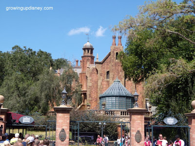
Lets not pretend that this new sign fundamentally changes the entrance area of The Haunted Mansion. The pillars and iron gates/arches have always been there and they have always been the same scale and size. The only difference is that now there is some writing attached to them letting guests know where the different entrances are located.
Before:

After:
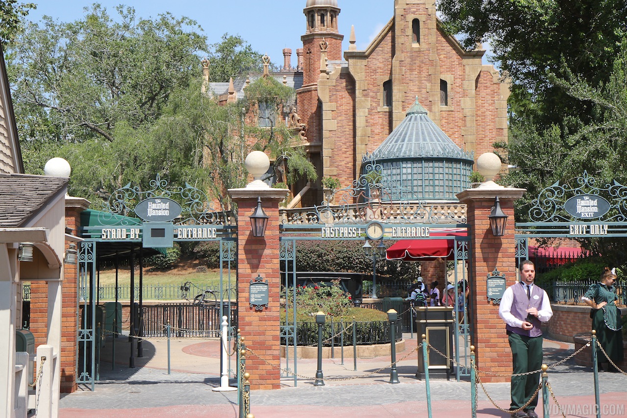
Practically the SAME entrance design, only now with clear indications of where the entrance actually is. In the normal world, this would be called improvement (dare I say, plussing). But not on WDWMagic.
Lets not pretend that this new sign fundamentally changes the entrance area of The Haunted Mansion. The pillars and iron gates/arches have always been there and they have always been the same scale and size. The only difference is that now there is some writing attached to them letting guests know where the different entrances are located.
Before:
After:
Practically the SAME entrance design, only now with clear indications of where the entrance actually is. In the normal world, this would be called improvement (dare I say, plussing). But not on WDWMagic.
Thrill
Well-Known Member
wow.
so subtle.
such lights.
This is the second worst Haunted Mansion update in recent memory. Thanks a lot.
I could help guests find the entrance with flashing street arrows, but I don't, because that has nothing to do with the Haunted Mansion.
The KISS principle would dictate that there isn't a FastPass+ entrance, because we don't need FP+ for an Omnimover ride. There you go, 33% easier for guests to navigate.
so subtle.
such lights.
This is the second worst Haunted Mansion update in recent memory. Thanks a lot.
KISS.
Helping guests find the entrance so there isn't extra unnecessary congestion at the entry is now concidered a bad thing?
I could help guests find the entrance with flashing street arrows, but I don't, because that has nothing to do with the Haunted Mansion.
The KISS principle would dictate that there isn't a FastPass+ entrance, because we don't need FP+ for an Omnimover ride. There you go, 33% easier for guests to navigate.
Last edited:
jdmdisney99
Well-Known Member
Wow, never noticed. The lights at the top of the pillars moved down also. This picture makes me wish they kept the plaques in the middle.One more thing while I'm on a roll with my rantings here...
Lets not pretend that this new sign fundamentally changes the entrance area of The Haunted Mansion. The pillars and iron gates/arches have always been there and they have always been the same scale and size. The only difference is that now there is some writing attached to them letting guests know where the different entrances are located.
Before:
After:
Practically the SAME entrance design, only now with clear indications of where the entrance actually is. In the normal world, this would be called improvement (dare I say, plussing). But not on WDWMagic.
Register on WDWMAGIC. This sidebar will go away, and you'll see fewer ads.