Guardians of the Galaxy Mission Breakout announced for Disney California Adventure

Ismael Flores

Well-Known Member
Any chance they see how ugly this thing looks and decide to rethink the facade? I don't care if it's delayed another year. Take your time.

EDIT: Change the color scheme or at least mute those colors a bit. Let's rethink the pipes. @BrianLo brought up a good point, the bottom half of the tower does look better than the top (in the model at least) Unfortunately, it's the less important half.

I have seen buildings that have used some of those bright color oranges and reds in shopping centers.
There is one not to far from where I live.
The people
Complained that it was to vibrant so they toned it down and repainted. Within a little over a year the paint faded badly and now the same group of people are complaining that the huge buildings need to be repainted because the paint looks too faded and makes the mall Look old.
The owners responded with that's what you wanted and the mall is not scheduled to get a facelift for a few more years.

People don't realize that paints are not made like they used to be and anything that gets direct sunlight and contains lots of yellow and red pigments fade fast. If a color scheme using red, yellows are used it's best to have them be bright because they will naturally fade.

Even the original paint scheme had faded and I doubt Disney will want to paint this huge tower again constantly. It's not as easy as re-painting small bright buildings like toontown which fade faster than they can paint it
 

Ismael Flores

Well-Known Member
IMG_3756.JPG
IMG_3758.JPG
Would people be upset if they built something themed to 1930's Hollywood/ Los Angeles that looked like this?

If yes why? It's themed appropriate?

Is a building with a somewhat strange architecture like the new tower really out of place for 1930's if slightly seen at a distance behind the Carthay?
California had some pretty interesting architecture co-existing in the 1930's, 40's, 50's and 60s
Are eras the park represents.

By the way the first picture is actually Los Angeles Blvd and there are other pics of some very industrial looking buildings in Spring street right next to Art Deco and mission style structures along with other ornate ones as well
 
Last edited:

Californian Elitist

Well-Known Member
View attachment 190074 View attachment 190075 Would people be upset if they built something themed to 1930's Hollywood/ Los Angeles that looked like this?

If yes why? It's themed appropriate?

Is a building with a somewhat strange architecture like the new tower really out of place for 1930's if slightly seen at a distance behind the Carthay?
California had some pretty interesting architecture co-existing in the 1930's, 40's, 50's and 60s
Are eras the park represents.

By the way the first picture is actually Los Angeles Blvd and there are other pics of some very industrial looking buildings in Spring street right next to Art Deco and mission style structures along with other ornate ones as well

This wouldn't bug me at all.

Yes, Los Angeles had and still has some strange looking structures. But the new Tower is completely out of reach and very futuristic-looking and looks like absolutely nothing like early 20th-century Los Angeles. Are Art Deco, Mission, Spanish, etc. Californian? Definitely, but the architecture of the new Tower doesn't match any of those styles. Plus Guardians of the Galaxy itself doesn't fit with 1930's/40's Hollywood/Los Angeles. There's really nothing one could say that would justify the new Tower's theme/placement/IP.
 

Practical Pig

Well-Known Member
View attachment 190074 View attachment 190075 Would people be upset if they built something themed to 1930's Hollywood/ Los Angeles that looked like this?

If yes why? It's themed appropriate?

Is a building with a somewhat strange architecture like the new tower really out of place for 1930's if slightly seen at a distance behind the Carthay?
California had some pretty interesting architecture co-existing in the 1930's, 40's, 50's and 60s
Are eras the park represents.

By the way the first picture is actually Los Angeles Blvd and there are other pics of some very industrial looking buildings in Spring street right next to Art Deco and mission style structures along with other ornate ones as well

I also would have no problem with the examples you posted if they were appropriate to the theme of their attractions or land, and didn't contradict the themed views of other lands as extremely as this does. I'm also not one of the people who think that the GOTG tower is ugly incarnate. Within it's limited Marvel world, in the potential future context with the other coming Marvel developments, I can see this design working just fine. But it is an alien world that has no Earth-based precedent except for the functionality of pipes, in Los Angeles or anyplace else, even in offshore oil rigs.

I understand that there are practical reasons that our themed experiences with Disney have compromises, and I'm completely willing to suspend my disbelief when Disney has made a respectable effort to respect my ability to do so. I also anticipate that the ride experience could be an improvement over TOT. But the view of this behind the Carthay Circle feels like a big middle finger to the delicate dance of theme and practicality that Disney has famously done so well elsewhere. In DL, the alien world of SWL is being carefully and expensively placed behind a veil. In DCA, this Marvelization feels like "just screw it, we need this, and we don't want to pay to do it right." It feels like Universal in the old days.
 

mickEblu

Well-Known Member
View attachment 190074 View attachment 190075 Would people be upset if they built something themed to 1930's Hollywood/ Los Angeles that looked like this?

If yes why? It's themed appropriate?

Is a building with a somewhat strange architecture like the new tower really out of place for 1930's if slightly seen at a distance behind the Carthay?
California had some pretty interesting architecture co-existing in the 1930's, 40's, 50's and 60s
Are eras the park represents.

By the way the first picture is actually Los Angeles Blvd and there are other pics of some very industrial looking buildings in Spring street right next to Art Deco and mission style structures along with other ornate ones as well

Would I want to see a huge 15 story E ticket themed to these structures? No. But at least they would be thematically appropariate. I would prefer something that is pleasing to look at and thematically appropriate like all of the mountains at DLR.

GOTG isn't pleasing to look at and the theme doesn't work.
 

mickEblu

Well-Known Member
I have seen buildings that have used some of those bright color oranges and reds in shopping centers.
There is one not to far from where I live.
The people
Complained that it was to vibrant so they toned it down and repainted. Within a little over a year the paint faded badly and now the same group of people are complaining that the huge buildings need to be repainted because the paint looks too faded and makes the mall Look old.
The owners responded with that's what you wanted and the mall is not scheduled to get a facelift for a few more years.

People don't realize that paints are not made like they used to be and anything that gets direct sunlight and contains lots of yellow and red pigments fade fast. If a color scheme using red, yellows are used it's best to have them be bright because they will naturally fade.

Even the original paint scheme had faded and I doubt Disney will want to paint this huge tower again constantly. It's not as easy as re-painting small bright buildings like toontown which fade faster than they can paint it

Well hopefully that's why they are going so bright. I'm not sure I'm confident that it's the reason they are going so bright but it will fade in the California sunshine. And for that I am glad.
 

Practical Pig

Well-Known Member
Well hopefully that's why they are going so bright. I'm not sure I'm confident that it's the reason they are going so bright but it will fade in the California sunshine. And for that I am glad.

Yeah, with the huge scale of a tower repainting refurb, I expect we will see fading. There are UV resistant coatings available, but I don't know their cost/effectiveness ratio.
 
D

Deleted member 107043

GOTG isn't pleasing to look at

You keep saying this, but it wasn't "pleasing" to the eye when it was ToT, which had a design meant to look like an old abandoned hotel that had been devastated by a freak lightning storm. We all have our opinions, and no one can disagree with your personal preference for the previous facade, but it's disingenuous to use the "it's ugly" argument against MB when you know very well that ToT wasn't going to win any architectural beauty awards.

and the theme doesn't work.

For now apparently.
 

mickEblu

Well-Known Member
You keep saying this, but it wasn't "pleasing" to the eye when it was ToT, which had a design meant to look like an old abandoned hotel that had been devastated by a freak lightning storm. We all have our opinions, and no one can disagree with your personal preference for the previous facade, but it's disingenuous to use the "it's ugly" argument against MB when you know very well that ToT wasn't going to win any architectural beauty awards.


For now apparently.


I never thought TOT was something beautiful. I didn't think it was ugly either. It blended into the surroundings a lot better, was thematically appropriate and wasn't painted bright orange. I think the differences are pretty clear.

Yes and for now apparently is right....but I'm not so sure I want to see a whole land dedicated to an industrial look with that color scheme, do you? Looks like kind of a lose lose situation. I'm sure the rides will be fun though. Well I know one will be cuz I've ridden it a bunch of times already. Lol
 

Practical Pig

Well-Known Member
You keep saying this, but it wasn't "pleasing" to the eye when it was ToT, which had a design meant to look like an old abandoned hotel that had been devastated by a freak lightning storm. We all have our opinions, and no one can disagree with your personal preference for the previous facade, but it's disingenuous to use the "it's ugly" argument against MB when you know very well that ToT wasn't going to win any architectural beauty awards.

No, it wasn't pleasing. The very concept of it inflicted a certain visual blight, and the cheaped-out execution exacerbated the issue. But it still belonged in the world as they had chosen to define it. It didn't deny the expensive, redefining placemaking of DCA 2.0.
 

mickEblu

Well-Known Member
IMO there are three scenarios that would of obviously been better for the park long term. I don't really want to spell out why because I already did a few pages ago but here they are...

1. GOTG: MB could have been a temporary overlay until Marvel Land opens

2. Star Tours could have been rethemed to GOTG.

3. GOTG gets a brand new ride in Marvel Land

The reason that not 1 of these 3 things happened is because short term sacrifices were not willing to be made, this project is rushed and just a plain old lack of creativity. Each scenario above would have been better for the resort - long term. Short term gains are the only motivating factor here.
 
D

Deleted member 107043

I never thought TOT was something beautiful. I didn't think it was ugly either. It blended into the surroundings a lot better, was thematically appropriate and wasn't painted bright orange. I think the differences are pretty clear.

Oh the differences are very clear, and again, I'm not bothered that you prefer the previous look. I'm reacting to your argument that the new look is ugly. They are both ugly by any standard, but by what degree is up for debate. Point is in my view, and looking at the building and nothing else, nothing has been lost or gained in the aesthetics department. And the fact that they're switching out a non-Disney franchise for the first big Disney/Marvel experience (though I am worn out from all the IP everywhere) in the US is a huge win for DCA and DLR.

Yes and for now apparently is right....but I'm not so sure I want to see a whole land dedicated to an industrial look with that color scheme, do you?

That's a good question, and I admit I'm hesitant. I agree with you and others that the GoTG look clashes with the Red Car and the immediate story surrounding the attraction in Hollywood Land, not to mention the park's retro California narrative. Maybe I've seen enough of these controversial changes at Disneyland come and go to the point that I'm immune to them, but I kind of feel like I'd rather wait to see how things develop before getting too worked about it. Also, the premise of the ride sounds a bit more novel to me than a haunted hotel.
 
D

Deleted member 107043

No, it wasn't pleasing. The very concept of it inflicted a certain visual blight, and the cheaped-out execution exacerbated the issue. But it still belonged in the world as they had chosen to define it. It didn't deny the expensive, redefining placemaking of DCA 2.0.

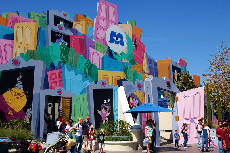
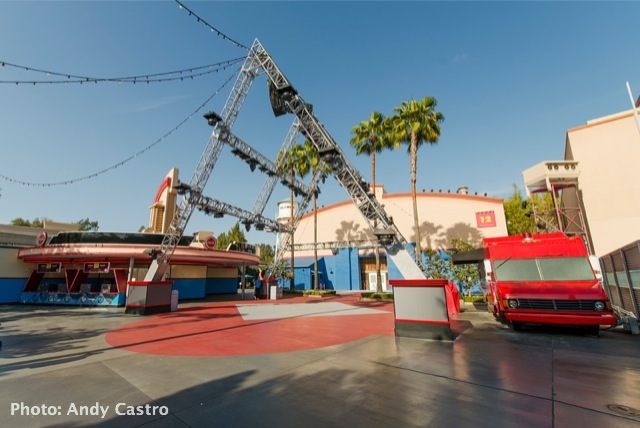
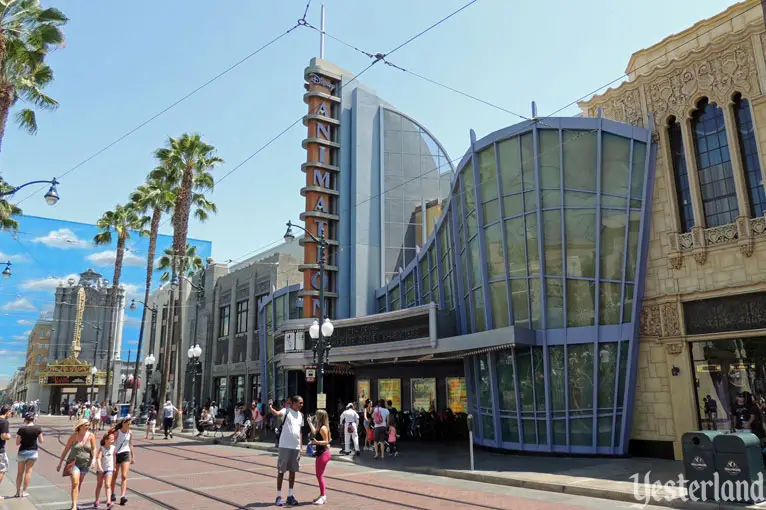
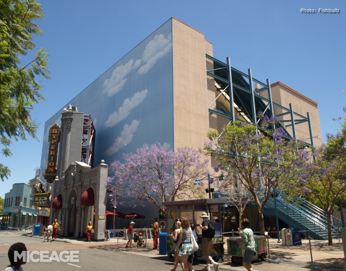
I'd prefer to avoid a nitpicking debate about placemaking details and theming, but I will share a few examples of why I think some of you might be putting too much emphasis on the misalignment of MB's exterior with its immediate setting. As these photos show the land is not, and has never been, a faithful and immersive recreation of old Hollywood.

al060110d.jpg


monsters-inc-ride-disneyland-resort-14067222-800-532.jpg


MA-Stage-12.jpg


hollywoodwishlist_animation2015ww.jpg


Again, I agree that MB continues to confuse the hodge-podge storytelling, but you aren't going to convince me that Hollywood Land as it exists right now has a visually cohesive and clearly defined theme.
 
Last edited by a moderator:

Register on WDWMAGIC. This sidebar will go away, and you'll see fewer ads.

Back
Top Bottom